HomeListsChatDirectory
Typedex
HomeChatListsDirectory
Collection

Monospace fonts

Monospace fonts give every character the same width, which makes them ideal for code, terminals, tabular data, and anywhere alignment matters. Below are the mono typefaces in the Typedex catalog. If you're choosing one for an AI coding setup, see our fonts for AI coding tools guide.

Fonts flagged as monospace, newest first · 60 fonts

Aptos Mono

Aptos Mono

Adobe Fonts · Microsoft

0123456789

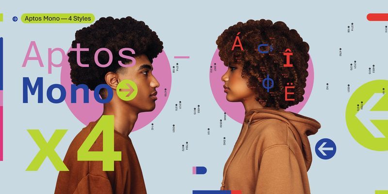
Aptos Mono is a monospaced typeface – that is, every letter has exactly the same width. It is the monospaced complement to the contemporary sans serif typeface Aptos. Aptos Mono is essentially sans serif in style, although letters like ‘i’, ‘l’, and ‘r’, which might otherwise be somewhat narrow, feature stubby flat serifs that help to fill the space as well as keeping them easily distinguishable. Aptos Mono has strokes of even thickness, wide letter width, and generous spacing between letters, all of which contributes to its legibility. Like many monospaced fonts, it is most at home in code, but it could also be used in spreadsheets, labels, or small amounts of information signage. Aptos Mono has two weights, Regular and Bold, with italic complements; all versions have identical letter widths. The fonts offer extended support of the Latin, Greek, and Cyrillic alphabets, along with fractions, arrows, and both black and white circled numbers. Aptos Mono is the monospaced companion to Aptos, Aptos Narrow and Aptos Display and was also designed by Steve Matteson.
mono
foundry
commercial
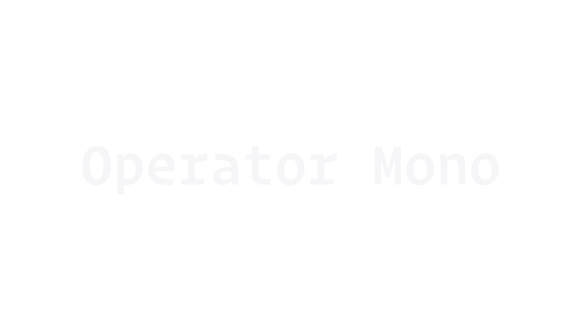
Operator

Operator

Hoefler&Co.

0123456789

Operator is a modern sans-serif typeface designed for optimal legibility on screens. It was created to address the unique challenges of digital typography, making it suitable for both text and display use. Known for its clean lines and versatility, Operator is often utilized in user interfaces and digital products.

mono
modern
sans-serif
Dot.Font

Dot.Font

Hvnter

0123456789

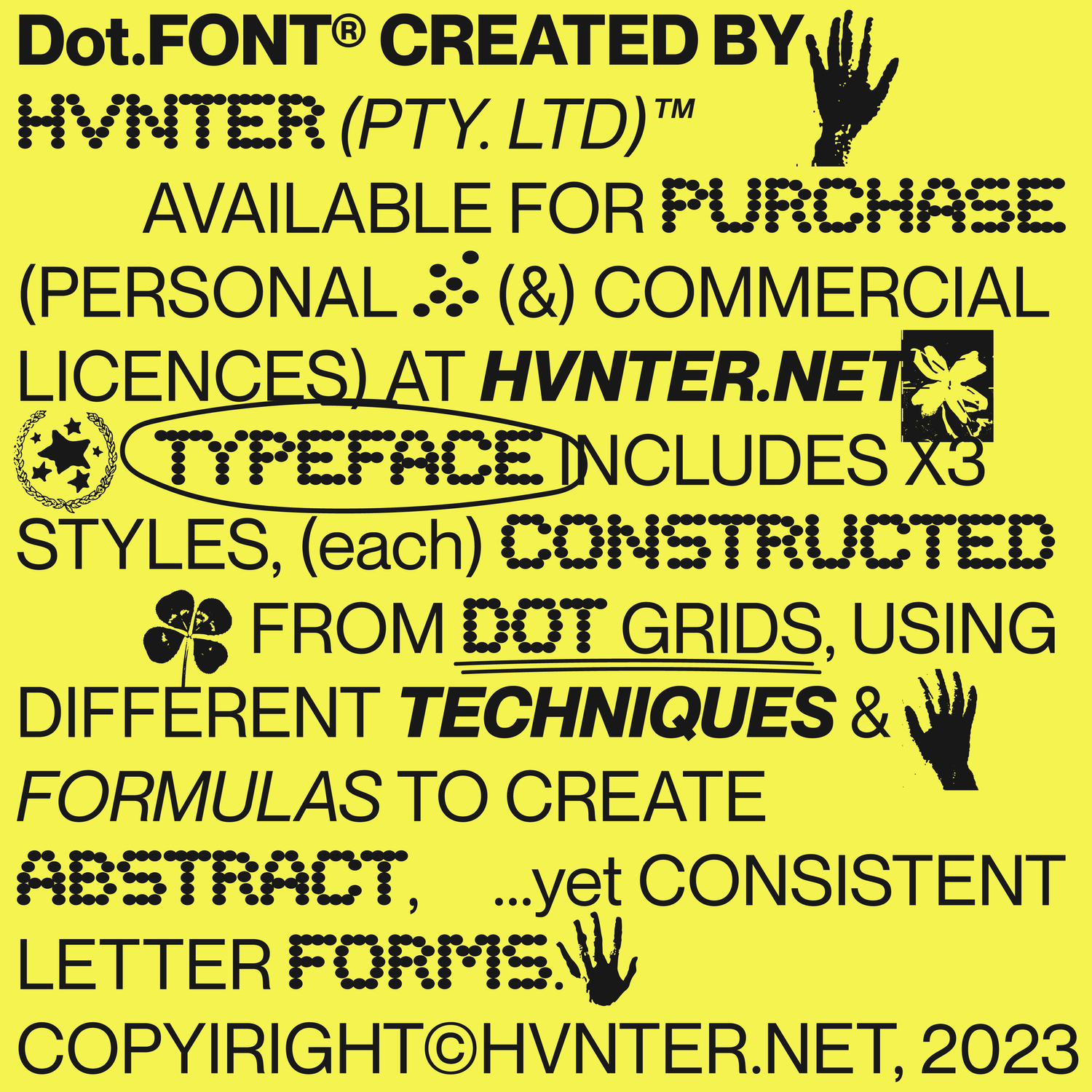
Dot.Font Typeface bundle including x3 font styles, all constructed with dot grids. Each font style includes A-Z, 0-9 + basic symbols (.otf font file) For Personal & Commercial Use :D

display
foundry
commercial
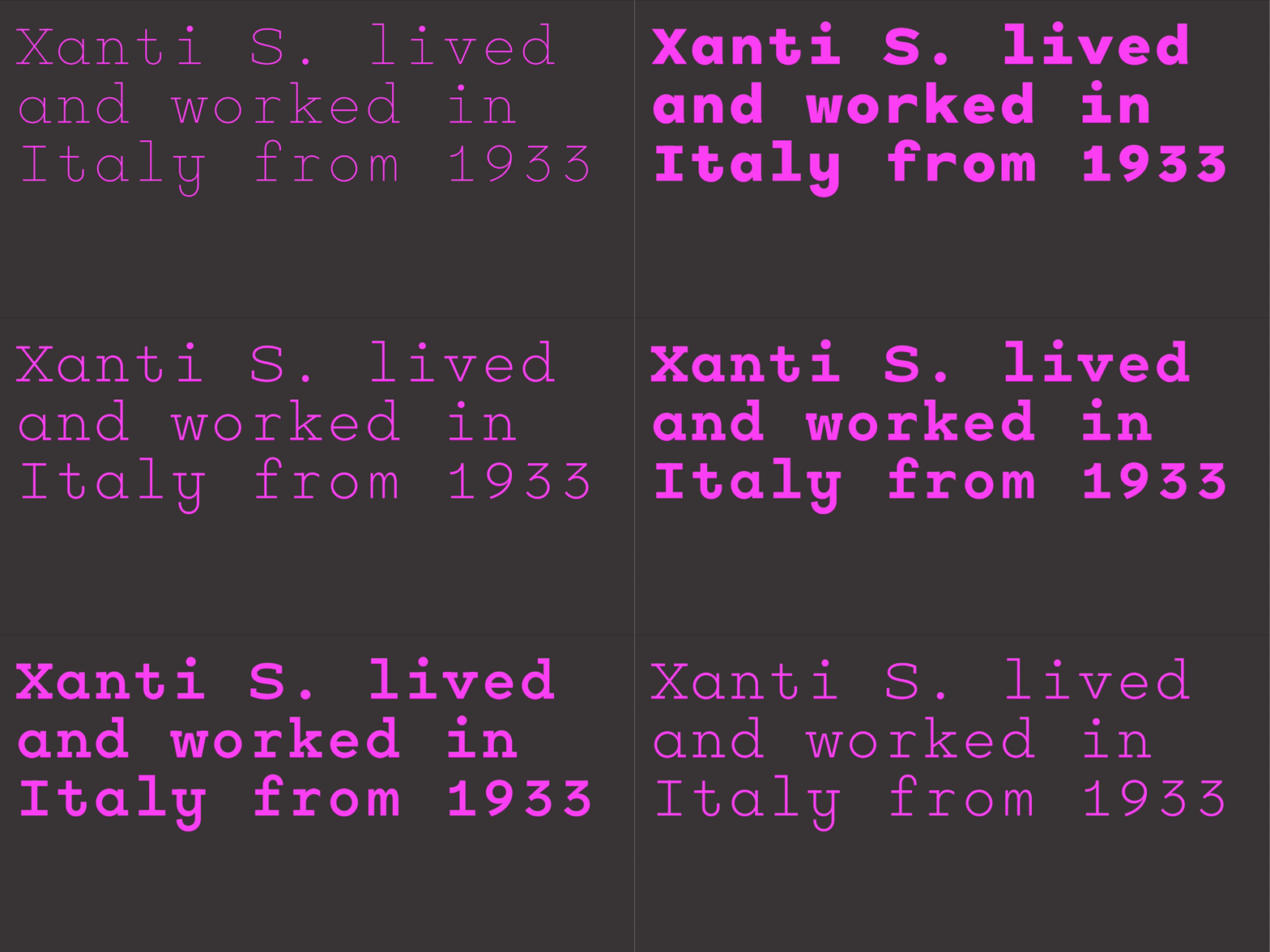
Xanti Typewriter Variable

Xanti Typewriter Variable

Adobe Fonts · CAST

0123456789

Explore Xanti Typewriter Variable designed by Gianluca Sandrone at Adobe Fonts.

mono
foundry
commercial
Source Code

Source Code

Adobe Fonts · Adobe Originals

0123456789

Explore Source Code designed by Paul D. Hunt, Teo Tuominen at Adobe Fonts.

mono
foundry
commercial
Secret Service Typewriter

Secret Service Typewriter

Adobe Fonts · Red Rooster Collection

0123456789

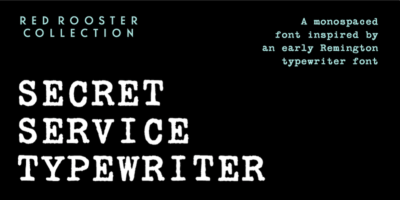
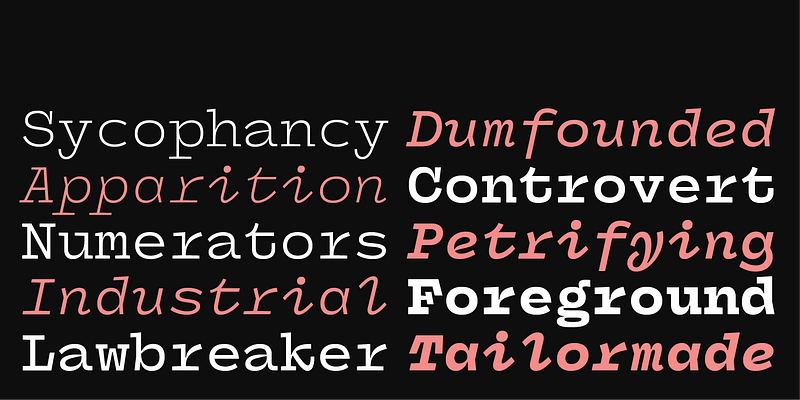
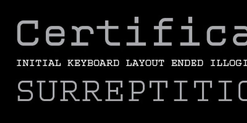
Secret Service Typewriter draws its inspiration from an early Remington typewriter font, originally created by the Keystone Type Foundry around 1905. Its monospaced characters and slightly rough texture capture the charm of vintage mechanical typewriters, complete with their telltale imperfections. This typeface is perfect for adding a retro or historical touch to your designs—whether working on a themed periodical, crafting a poster, retro brand identity, or spy-themed museum exhibits.

mono
foundry
commercial
Prestige Elite

Prestige Elite

Adobe Fonts · Adobe Originals

0123456789

Prestige Elite is a slab serif monospaced typeface originally intended for use on a typewriter. It was designed in 1953 by Howard Kettler for IBM. Prestige Elite is a good choice for price lists, tabular material, and informal office correspondence. Typefaces that were originally designed as monospaced typewriter types are effective in materials for personal communication or for capturing the look and feel of bygone days.

mono
foundry
commercial
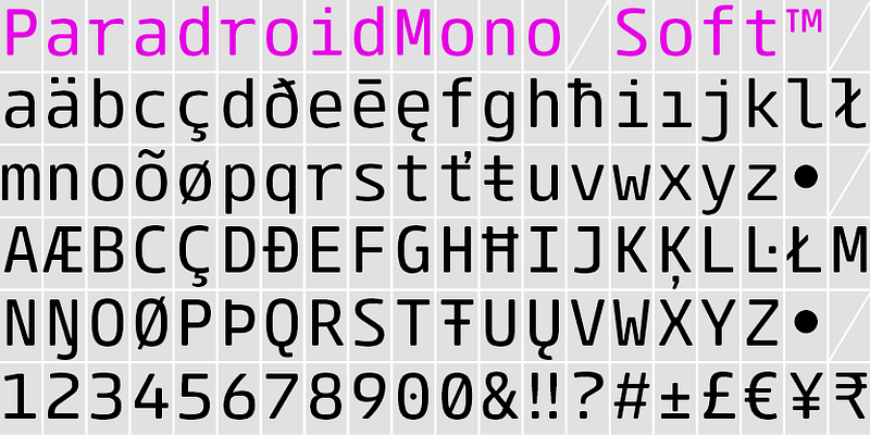
Paradroid Mono Soft

Paradroid Mono Soft

Adobe Fonts · The Northern Block

0123456789

Explore Paradroid Mono Soft designed by Jonathan Hill at Adobe Fonts.

mono
foundry
commercial
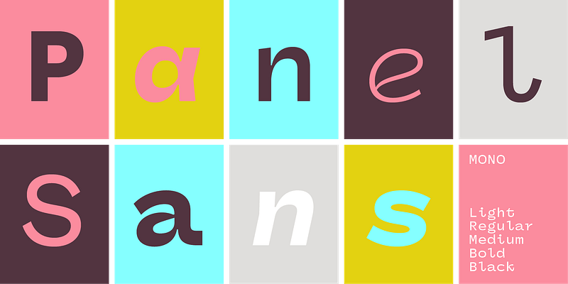
Panel Sans Mono

Panel Sans Mono

Adobe Fonts · ps Type

0123456789

Explore Panel Sans Mono designed by Mark Caneso at Adobe Fonts.

mono
foundry
commercial
Panel Mono

Panel Mono

Adobe Fonts · ps Type

0123456789

Explore Panel Mono designed by Mark Caneso at Adobe Fonts.

mono
foundry
commercial
Orator

Orator

Adobe Fonts · Adobe Originals

0123456789

Orator is a monospaced typeface made up of capitals and small capitals only; it can be used for tabular material or technical documentation. The name Orator comes from the notion that capitals and small capitals are clearer than upper and lowercase letters, thus making it useful for speech notes. It was designed for IBM typewriters by John Scheppler.

mono
foundry
commercial
Odisseia

Odisseia

Adobe Fonts · Plau

0123456789

Explore Odisseia designed by Flora de Carvalho, Rodrigo Saiani at Adobe Fonts.

mono
foundry
commercial
OCR B

OCR B

Adobe Fonts · Adobe Originals

0123456789

In 1968, American Type Founders produced OCR-A, one of the first optical character recognition typefaces to meet the criteria set by the U.S. Bureau of Standards. The design is simple so that it can be OCR-A follows the 1981 standard set by the American National Standards Institute (ANSI), X-3.17-1981 (size I). The same design is also specified for the German DIN 66008 standard. OCR-B was designed in 1968 by Adrian Frutiger for Monotype. This design pushes the limits of the optical reader, but is easier for people to OCR-B’s construction follows the ISO 1073/II-1976 (E) standard, with 1979 corrections (letterpress design, size I). Both OCR-A and OCR-B have “alternate” versions, which have the standard ISO-Adobe character set instead of the more limited OCR character set.

mono
foundry
commercial
OCR A

OCR A

Adobe Fonts · Adobe Originals

0123456789

In 1968, American Type Founders produced OCR-A, one of the first optical character recognition typefaces to meet the criteria set by the U.S. Bureau of Standards. The design is simple so that it can be OCR-A follows the 1981 standard set by the American National Standards Institute (ANSI), X-3.17-1981 (size I). The same design is also specified for the German DIN 66008 standard. OCR-B was designed in 1968 by Adrian Frutiger for Monotype. This design pushes the limits of the optical reader, but is easier for people to OCR-B’s construction follows the ISO 1073/II-1976 (E) standard, with 1979 corrections (letterpress design, size I). Both OCR-A and OCR-B have “alternate” versions, which have the standard ISO-Adobe character set instead of the more limited OCR character set.

mono
foundry
commercial
Novel Mono

Novel Mono

Adobe Fonts · Atlas Fonts

0123456789

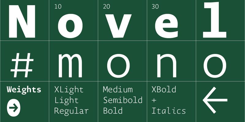
Explore Novel Mono designed by Christoph Dunst at Adobe Fonts.

mono
foundry
commercial
Motor

Motor

Adobe Fonts · EuropaType

0123456789

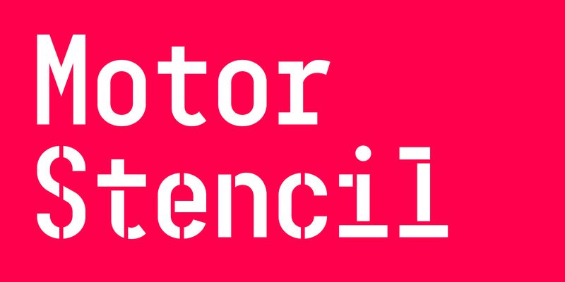
Motor Normal and Motor Stencil are monospaced fonts with technical charm. In its monotone and reliable rhythm it tends towards condensed proportions reminding of old poster fonts. Its origins lie in the typeface Mono45 Headline and the manually stamped tickets found at the University-hospital in Zurich.

display
foundry
commercial
Monotype Grotesque

Monotype Grotesque

Adobe Fonts · Monotype

0123456789

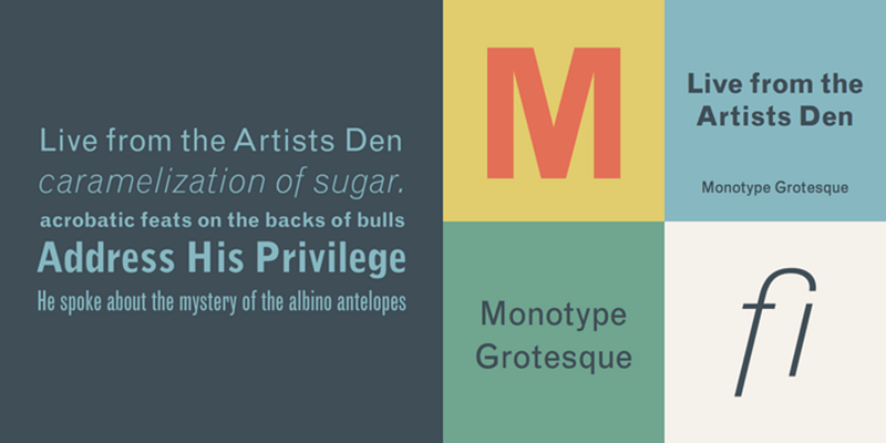
License [Monotype Grotesque](https://www.myfonts.com/fonts/mti/grotesque-mt/) on MyFonts

sans-serif
foundry
commercial
Monotalic

Monotalic

Adobe Fonts · Kostic Type Foundry

0123456789

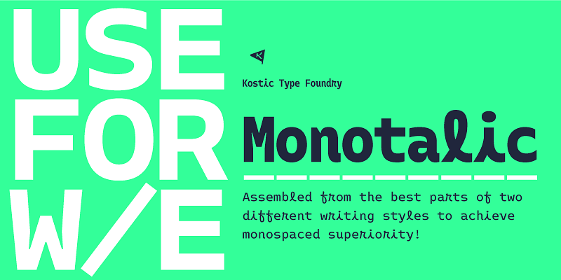
Explore Monotalic designed by Nikola Kostić, Zoran Kostić at Adobe Fonts.

mono
foundry
commercial
Mono45 Headline

Mono45 Headline

Adobe Fonts · EuropaType

0123456789

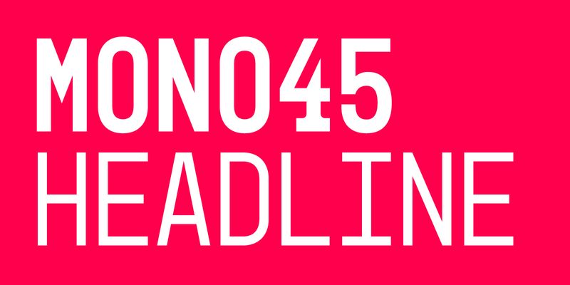
Mono45 Headline is an uppercase font which has got its origins in stamped tickets numbers issued by the University Hospital in Zurich for queuing up to get inoculated. It is thought to be a headline typeface and reminds with its strong character and rustic charm of old condensed poster typefaces and such used in factories or for industrial purposes.

display
foundry
commercial
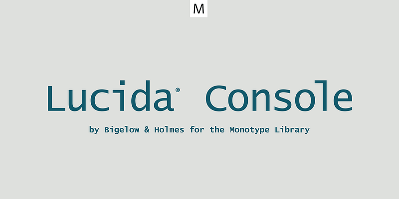
Lucida Console

Lucida Console

Adobe Fonts · Monotype

0123456789

Explore Lucida Console available at Adobe Fonts.

mono
foundry
commercial
LTC Hess Monoblack

LTC Hess Monoblack

Adobe Fonts · Lanston Type Co.

0123456789

LTC Hess Monoblack was a rare metal face, and only made a brief appearance in Lanston Specimen—in fact no examples of the metal font seem to exist. Heavy and well suited for headlines and packaging.

serif
foundry
commercial
Logic Monospace

Logic Monospace

Adobe Fonts · MCKL

0123456789

Explore Logic Monospace designed by Jeremy Mickel at Adobe Fonts.

script
foundry
commercial
LFT Etica Mono

LFT Etica Mono

Adobe Fonts · TypeTogether

0123456789

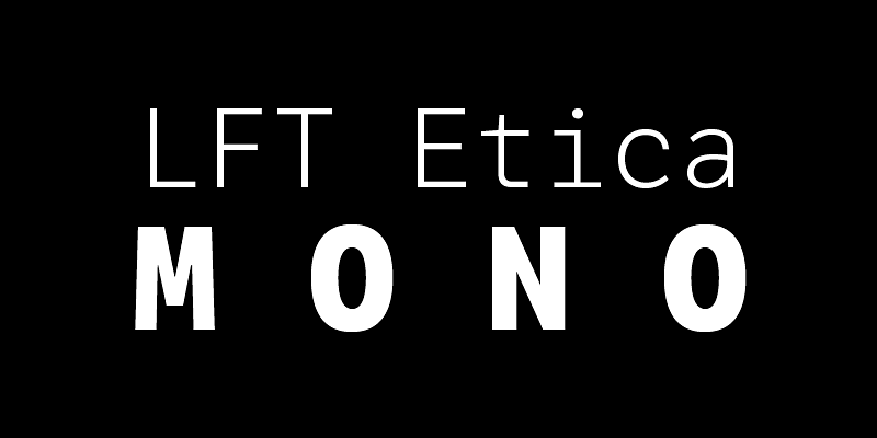
Technical but not limiting, a monospaced sans that encodes the bytes of a beautiful life.

sans-serif
foundry
commercial
Lexia Mono

Lexia Mono

Adobe Fonts · Dalton Maag

0123456789

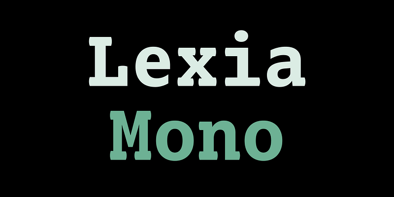
Lexia Mono, Lexia’s monospace cousin, was designed for programmers and those who work with tough compositional issues. Its clean, uninterrupted rhythm and even colour make it remarkably easy to

mono
foundry
commercial
Letter Gothic

Letter Gothic

Adobe Fonts · Adobe Originals

0123456789

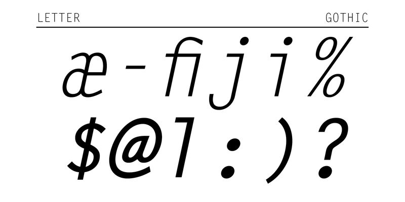
Letter Gothic was designed by Roger Roberson for IBM sometime between 1956 and 1962. Inspired by Optima, the typeface originally had flared stems. A monospaced sans serif font designed for use on an IBM Selectric typewriter, Letter Gothic is a good choice for tabular material.

mono
foundry
commercial
Larabiefont

Larabiefont

Adobe Fonts · Typodermic

0123456789

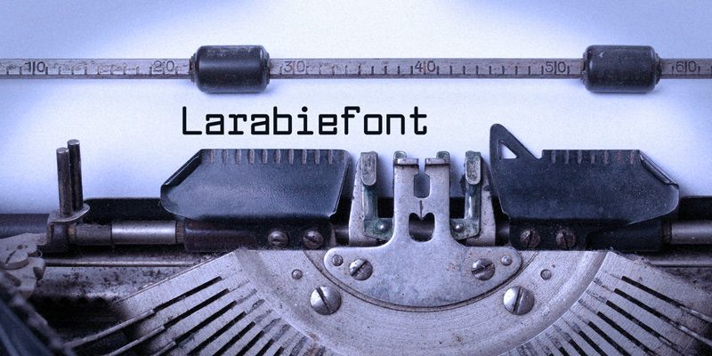
Larabiefont was inspired by an early 1970’s manual typewriter. This monospaced typeface features even stem widths and well defined shapes with rounded corners.

mono
foundry
commercial
Kettler

Kettler

Adobe Fonts · Process Type Foundry

0123456789

Explore Kettler designed by Eric Olson at Adobe Fonts.

mono
foundry
commercial
Interstate Mono

Interstate Mono

Adobe Fonts · Frere-Jones Type

0123456789

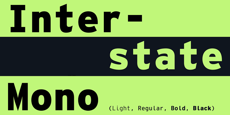
Efficient and gruff, Interstate has become a favorite for branding, packaging, publications, and more. The family is a reinterpretation of Highway Gothic, which has been the official typeface for American highway signage for decades. Its design is ultimately based on signage alphabets developed in the late 1940s by Dr. Theodore Forbes, assisted by J.E. Penton and E.E. Radek. The family was expanded to include full support for Central and Eastern Europe languages, as well as Cyrillic and Greek.

mono
foundry
commercial
Input Mono

Input Mono

Adobe Fonts · DJR

0123456789

Like many programmers, David Jonathan Ross had used monospaced fonts for his code. That was before he questioned the convention and answered with a fresh approach for data and programming aesthetics. Input finds inspiration in early computer consoles but looks towards a typographically rich future, where coding environments overcome technical limitations and allow you to have full control over your display. For additional license options like app and enterprise, visit Input Mono on [Type Network](https://store.typenetwork.com/foundry/djr/fonts/input-mono).

mono
foundry
commercial
Heimat Mono

Heimat Mono

Adobe Fonts · Atlas Fonts

0123456789

Explore Heimat Mono designed by Christoph Dunst at Adobe Fonts.

mono
foundry
commercial
Gemeli Mono

Gemeli Mono

Adobe Fonts · Production Type

0123456789

Gemeli is built upon the same simple, human framework as its counterpart Cogito, but its vertical stroke endings lend it a crisper, machined appearance and strikingly different personality.

mono
foundry
commercial
Galix Mono

Galix Mono

Adobe Fonts · Dave Rowland Type

0123456789

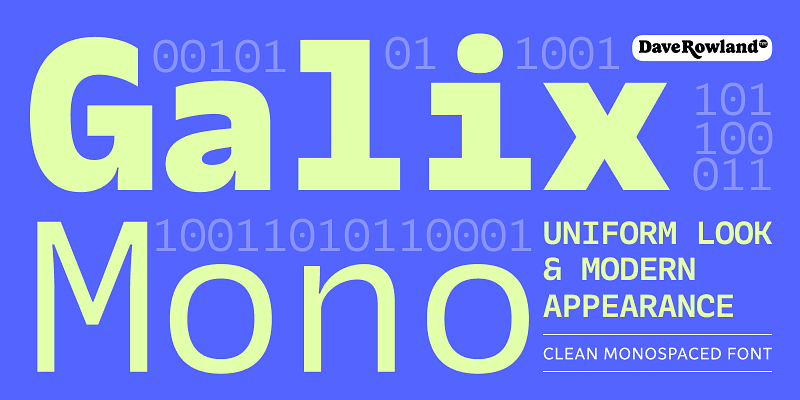
Galix Mono is a monospace font patterned after Galix, a technical sans designed to look futuristic without any of the retro appearance. It has a squarish, slightly condensed anatomy characterized by thin joints and deep ink traps that add a sparkle to the otherwise monoline typeface. In the italics, these cuts are accentuated even more, which creates a sense of speed in the letterforms. Galix Mono is perfect for coding, apps, infographics, and other design situations that require structure.

mono
foundry
commercial
Forma DJR Mono

Forma DJR Mono

Adobe Fonts · DJR

0123456789

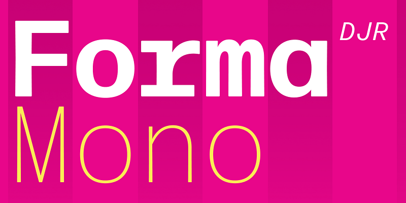
In Forma DJR Mono, Ruggero Magrì has taken David Jonathan Ross’s revival of the classic neo-grot from Nebiolo and brought it in harmony with the limitations of the monospaced grid. On its own, it excels at conveying technical data with clarity and poise; paired with its proportional cousin, it is the perfect option for charts, graphs, and tabular data. It strikes a distinctive tone, preserving the warmth of Forma DJR with inky, rounded corners, while never making you feel like it was produced by a typewriter. For additional license options like app, enterprise, multi-user, and self-hosted web, visit [Forma DJR Mono on Type Network](https://store.typenetwork.com/foundry/djr/fonts/forma-djr-mono).

mono
foundry
commercial
Fiora Monograms

Fiora Monograms

Adobe Fonts · Tart Workshop

0123456789

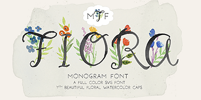
Fiora Monograms is a sweet handpainted monogram font in full color. The uppercase contains decorative floral caps designed for monograms and drop caps. The lowercase is composed of All CAPS watercolor characters with full punctuation and European language support allowing the font to be used in other text applications. Fiora is delightful for stationery & products. Isolated flowers icons are accessible as alternate numeral glyphs or through glyphs chart. View posters for monogramming ideas.

serif
foundry
commercial
Nexus Typewriter

Nexus Typewriter

Adobe Fonts · Martin Majoor

0123456789

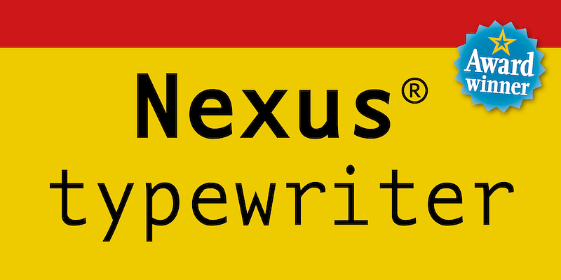
License [Nexus Typewriter](https://www.myfonts.com/collections/nexus-typewriter-pro-font-martin-majoor) on MyFonts

mono
foundry
commercial
FF Attribute Mono

FF Attribute Mono

Adobe Fonts · FontFont

0123456789

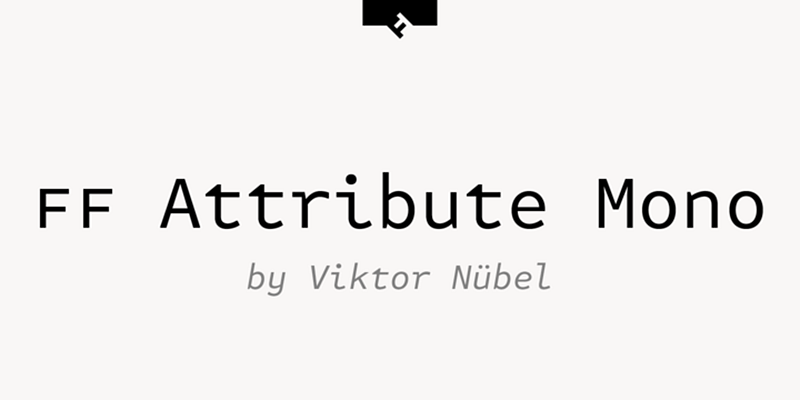
License [FF Attribute Mono](https://www.myfonts.com/fonts/fontfont/ff-attribute-mono/) on MyFonts

mono
foundry
commercial
MVB Fantabular Sans

MVB Fantabular Sans

Adobe Fonts · MVB Fonts

0123456789

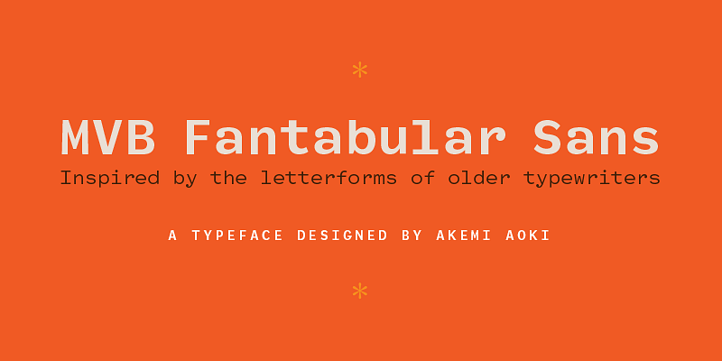
MVB Fantabular proves that monospaced faces needn’t be formal or bland. Inspired by the letterforms of older typewriters, Akemi Aoki designed a playful family of three weights with italics. With every character the same width MVB Fantabular works wherever a monospaced font is needed, but the face is so loose and carefree it hides its fixed pitch construction well, allowing it to be used in other settings too. MVB Fantabular Sans is the sans serif version of MVB Fantabular.

mono
foundry
commercial
MVB Fantabular

MVB Fantabular

Adobe Fonts · MVB Fonts

0123456789

MVB Fantabular proves that monospaced faces needn’t be formal or bland. Inspired by the letterforms of older typewriters, Akemi Aoki designed a playful family of three weights with italics. With every character the same width MVB Fantabular works wherever a monospaced font is needed, but the face is so loose and carefree it hides its fixed pitch construction well, allowing it to be used in other settings too. A sans serif version—MVB Fantabular Sans—is also available.

mono
foundry
commercial
Droid Sans Mono

Droid Sans Mono

Adobe Fonts · Open Source

0123456789

Explore Droid Sans Mono available at Adobe Fonts.

mono
foundry
commercial
Divenire Mono

Divenire Mono

Adobe Fonts · CAST

0123456789

Explore Divenire Mono available at Adobe Fonts.

mono
foundry
commercial
Dico Mono Slab

Dico Mono Slab

Adobe Fonts · Bold Monday

0123456789

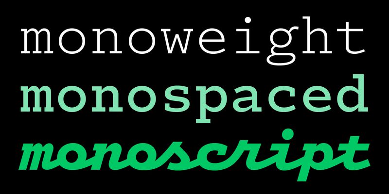
The basic structure and feel of Dico (Latin for “I speak, I talk, I give a speech”) is shaped by compact proportions and open, yet restrained letterforms that gain in friendliness and warmth when accompanied by their more swinging italics. Monospaced script styles – loosely based on Corinthian Script for the IBM Selectric – can bring things into an even more delightful direction. The weight range may seem small compared to other large type families but Dico more than makes up for that with other matching variations on the theme. Next to the Sans you can choose from a Slab-serif, the rounded Dico Soft, monospaced Sans and Slab, two Code variants, and Dico Typewriter containing “rough” versions of Dico Mono Sans, Mono Slab and Mono Script. 45 fonts in total. For additional license options like app, enterprise, multi-user, and self-hosted web, visit [Dico Code One on Type Network](https://store.typenetwork.com/foundry/boldmonday/series/dico?family=dico-code-one).
mono
foundry
commercial
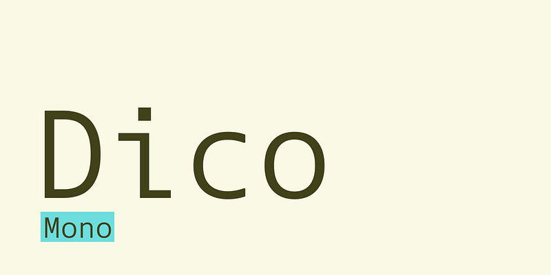
Dico Mono

Dico Mono

Adobe Fonts · Bold Monday

0123456789

The basic structure and feel of Dico (Latin for “I speak, I talk, I give a speech”) is shaped by compact proportions and open, yet restrained letterforms that gain in friendliness and warmth when accompanied by their more swinging italics. Monospaced script styles – loosely based on Corinthian Script for the IBM Selectric – can bring things into an even more delightful direction. The weight range may seem small compared to other large type families but Dico more than makes up for that with other matching variations on the theme. Next to the Sans you can choose from a Slab-serif, the rounded Dico Soft, monospaced Sans and Slab, two Code variants, and Dico Typewriter containing “rough” versions of Dico Mono Sans, Mono Slab and Mono Script. 45 fonts in total. For additional license options like app, enterprise, multi-user, and self-hosted web, visit [Dico Code One on Type Network](https://store.typenetwork.com/foundry/boldmonday/series/dico?family=dico-code-one).

mono
foundry
commercial
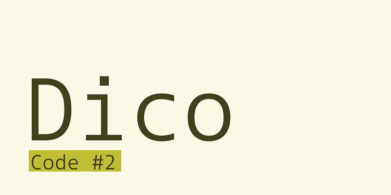
Dico Code Two

Dico Code Two

Adobe Fonts · Bold Monday

0123456789

The basic structure and feel of Dico (Latin for “I speak, I talk, I give a speech”) is shaped by compact proportions and open, yet restrained letterforms that gain in friendliness and warmth when accompanied by their more swinging italics. Monospaced script styles – loosely based on Corinthian Script for the IBM Selectric – can bring things into an even more delightful direction. The weight range may seem small compared to other large type families but Dico more than makes up for that with other matching variations on the theme. Next to the Sans you can choose from a Slab-serif, the rounded Dico Soft, monospaced Sans and Slab, two Code variants, and Dico Typewriter containing “rough” versions of Dico Mono Sans, Mono Slab and Mono Script. 45 fonts in total. For additional license options like app, enterprise, multi-user, and self-hosted web, visit [Dico Code One on Type Network](https://store.typenetwork.com/foundry/boldmonday/series/dico?family=dico-code-one).

mono
foundry
commercial
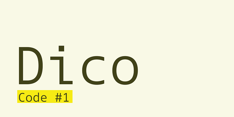
Dico Code One

Dico Code One

Adobe Fonts · Bold Monday

0123456789

The basic structure and feel of Dico (Latin for “I speak, I talk, I give a speech”) is shaped by compact proportions and open, yet restrained letterforms that gain in friendliness and warmth when accompanied by their more swinging italics. Monospaced script styles – loosely based on Corinthian Script for the IBM Selectric – can bring things into an even more delightful direction. The weight range may seem small compared to other large type families but Dico more than makes up for that with other matching variations on the theme. Next to the Sans you can choose from a Slab-serif, the rounded Dico Soft, monospaced Sans and Slab, two Code variants, and Dico Typewriter containing “rough” versions of Dico Mono Sans, Mono Slab and Mono Script. 45 fonts in total. For additional license options like app, enterprise, multi-user, and self-hosted web, visit [Dico Code One on Type Network](https://store.typenetwork.com/foundry/boldmonday/series/dico?family=dico-code-one).

mono
foundry
commercial
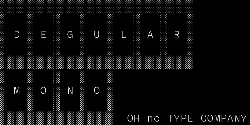
Degular Mono

Degular Mono

Adobe Fonts · OH no Type Co.

0123456789

Explore Degular Mono designed by James Edmondson at Adobe Fonts.

mono
foundry
commercial
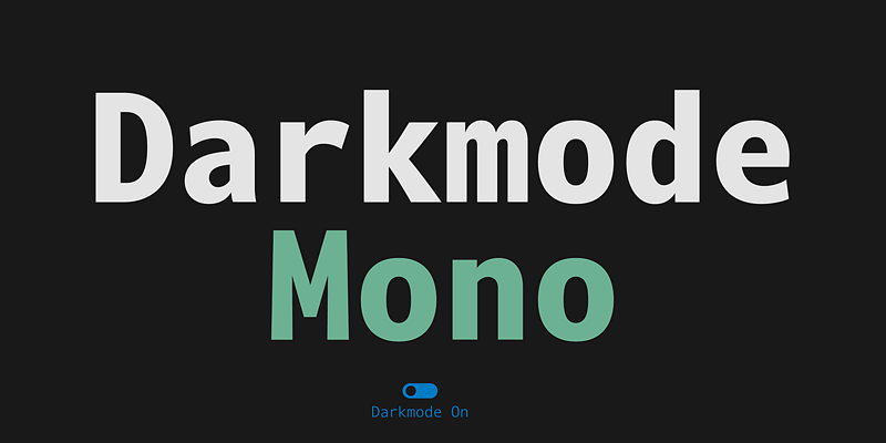
Darkmode Mono

Darkmode Mono

Adobe Fonts · Dalton Maag

0123456789

Explore Darkmode Mono available at Adobe Fonts.

mono
foundry
commercial
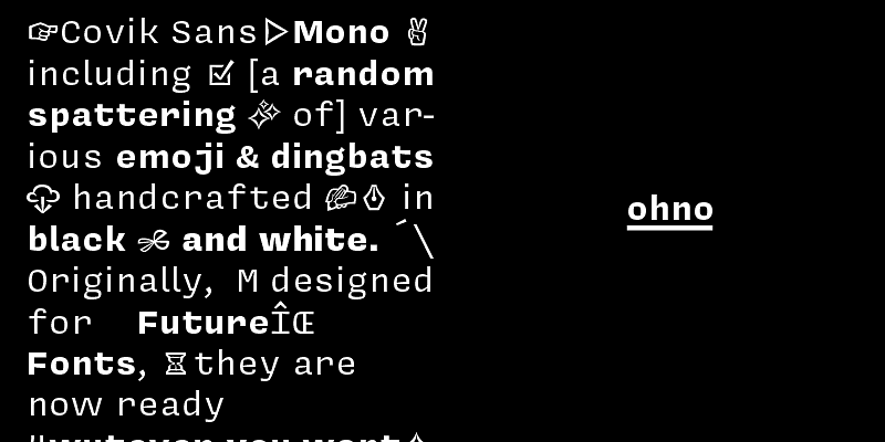
Covik Sans Mono

Covik Sans Mono

Adobe Fonts · OH no Type Co.

0123456789

Explore Covik Sans Mono designed by James Edmondson at Adobe Fonts.

mono
foundry
commercial
Courier

Courier

Adobe Fonts · Adobe Originals

0123456789

Courier is a monospaced typeface for use in tabular material, technical documentation, and word processing. It was designed in the mid-1900s by Howard Kettler of IBM as a typewriter face, and was later redrawn by Adrian Frutiger for the IBM Selectric series.

mono
foundry
commercial
Courier New

Courier New

Adobe Fonts · Microsoft

0123456789

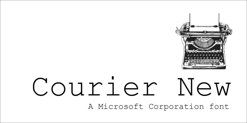
Courier New is a monospaced typeface – that is, every letter is exactly the same width. They look like they were typed on a typewriter, because that’s exactly where the typeface came from: the original Courier was designed for IBM typewriters. Courier New has fairly wide letters, so it tends to sprawl across the page. For many years, it has been the default choice for manuscripts that authors send to publishers, because at 12-point it’s readable and doesn’t cram too many words onto each line. It is very appropriate for correspondence, or for any document that you’d like to look as though it came from a typewriter. Because it is monospaced, all the numbers and letters will line up vertically. The original Courier was designed by Howard “Bud” Kettler in 1955 or 1956 for IBM typewriters and later revised with input from type designer Adrian Frutiger for IBM’s Selectric typewriter series, where it became the most common office typeface. It was adapted as a computer typeface to become one of the core Windows typefaces.

mono
foundry
commercial
Consolas

Consolas

Adobe Fonts · Microsoft

0123456789

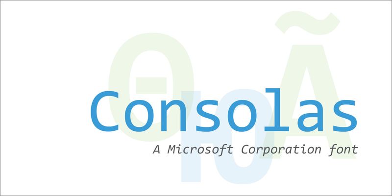
Consolas is a “monospaced” typeface, where every letter is exactly the same width. In most typefaces, the widths of the letters vary; an ‘I’ for instance is usually a lot narrower than a ‘w’. Consolas is ideal for computer code, but it’s also useful in personal and business correspondence, and in any situation where numbers or letters need to line up vertically. In both upright and italic styles, Consolas makes a clear distinction between capital ‘I’, lowercase ‘l’, and the numeral ‘1’, which in some typefaces are easy to confuse. Although Consolas works best in text, sometimes its peculiarities can impart what its designer calls “a punkish radiation” to headlines. Consolas was designed to be easy to Type designer Lucas de Groot, who also designed Calibri, wanted to create a “really usable monospaced typeface.” The proportions of Consolas are more comfortably readable than the very wide proportions of an older monospaced typeface like Courier New.

mono
foundry
commercial
Code Saver

Code Saver

Adobe Fonts · Dharma Type

0123456789

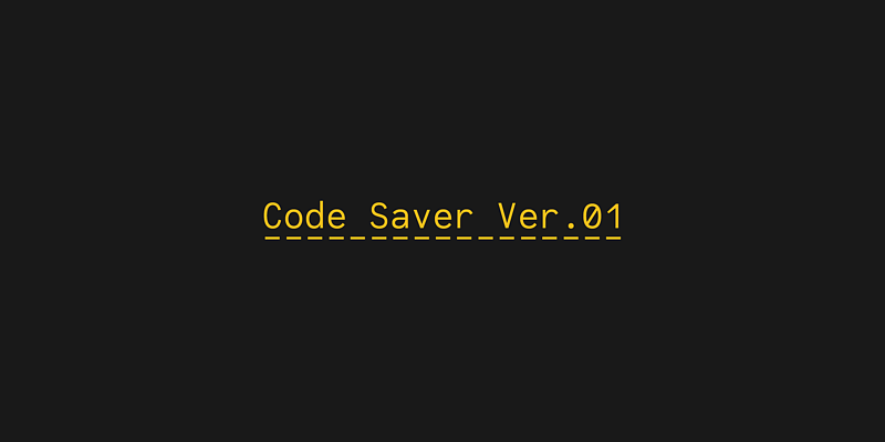
Code Saver is a monospaced font family for coding and tabular layout. This font has good distinguish-ability and legibility especially numerals.

mono
foundry
commercial
Calling Code

Calling Code

Adobe Fonts · Dharma Type

0123456789

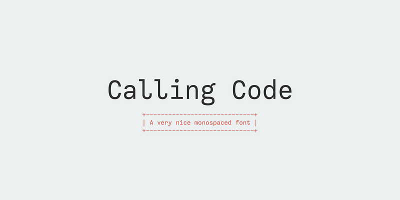
Calling Code is a monospaced font family for coding and tabular layout. This font has slightly condensed width and also has good distinguish-ability and legibility and cute curly tails.

mono
foundry
commercial
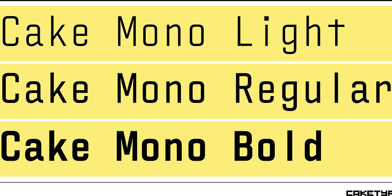
Cake Mono

Cake Mono

Adobe Fonts · CakeType

0123456789

Explore Cake Mono designed by Pieter van Rosmalen at Adobe Fonts.

mono
foundry
commercial
Botanika Mono

Botanika Mono

Adobe Fonts · Suitcase Type Foundry

0123456789

Explore Botanika Mono designed by Tomáš Brousil at Adobe Fonts.

mono
foundry
commercial
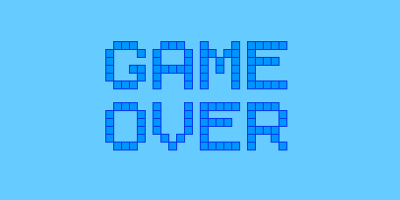
Bitcount Mono Single

Bitcount Mono Single

Adobe Fonts · TYPETR

0123456789

For additional license options like app and enterprise, visit Bitcount on [Type Network](https://store.typenetwork.com/foundry/typetr/fonts/bitcount).

display
foundry
commercial
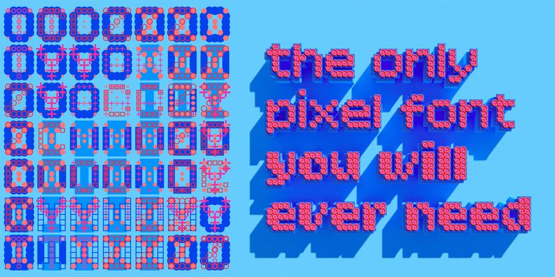
Bitcount Mono Double

Bitcount Mono Double

Adobe Fonts · TYPETR

0123456789

For additional license options like app and enterprise, visit Bitcount on [Type Network](https://store.typenetwork.com/foundry/typetr/fonts/bitcount).

display
foundry
commercial
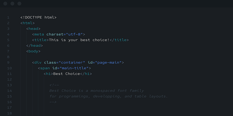
Best Choice

Best Choice

Adobe Fonts · Dharma Type

0123456789

Best Choice is a family of next-generation monospaced fonts for developing, programming, coding, and table layout.

mono
foundry
commercial
BDR Mono

BDR Mono

Adobe Fonts · Buro Destruct

0123456789

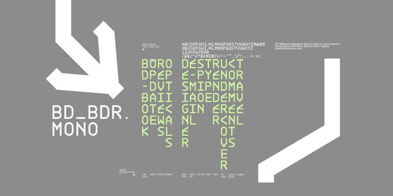
BDR Mono is an uppercase alphabet with alternative characters on the lowercase letters. It contains the three styles: Light, Regular and Bold. Designed by Lopetz in 2006.

display
foundry
commercial
BD Kickrom Mono

BD Kickrom Mono

Adobe Fonts · Buro Destruct

0123456789

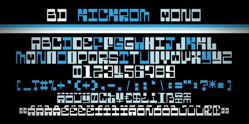
BD Kickrom Mono is a retro futuristic monospaced, uppercase font with variants on the lowercase characters. Designed by Lopetz in 2016.

mono
foundry
commercial
BC Sklonar

BC Sklonar

Adobe Fonts · Briefcase Type

0123456789

Explore BC Sklonar designed by Marek Pistora at Adobe Fonts.

mono
foundry
commercial

Frequently asked

What's a monospace font?

A typeface where every glyph occupies the same horizontal space, so characters line up in columns. That's why it's the standard for code editors and terminals.

Are monospace fonts only for code?

No. They also suit tables, data, price lists, and technical or utilitarian branding where a precise, mechanical feel helps.

Explore more collections

Trending fonts this weekNew fontsVariable fontsIndie fontsFonts for AI coding tools