Red Rooster Collection

10 fonts
Alphabet Soup

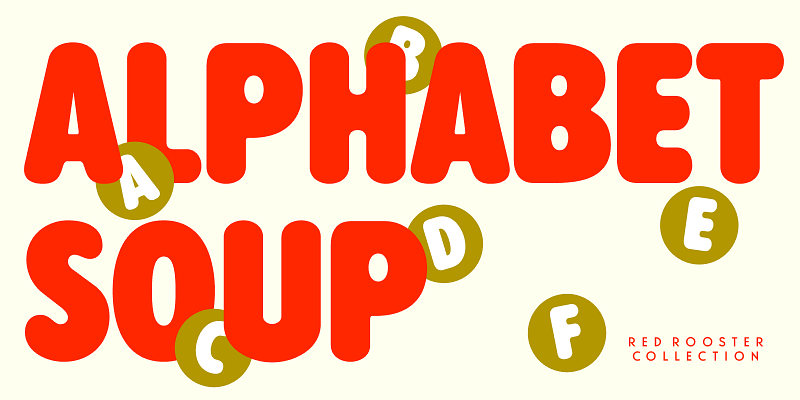
Alphabet Soup is a rounded sans typeface. It was designed and produced by Steve Jackaman (ITF) in 2010. In the early 1980s, Jackaman worked at Typographic House in Boston, Massachusetts. At the time, ‘Typo’ House, as it was affectionately known, was the largest type house in New England. The base typeface, called TH Alphabet Soup, was designed and produced during his tenure. It was so popular that the typeface became available commercially through Visual Graphics Corporation (VGC).

sans-serif
rounded
display
Basset

Basset is a blocky all-caps display family designed by Pat Hickson and later redrawn and expanded by Steve Jackaman. With its bold retro-futuristic forms and striking silhouettes, Basset will make a statement at large sizes. The family includes eight styles, each with unique visual energy—from solid and heavy to outlined and layered. Basset is ideal for sci-fi titles, gaming graphics, event branding, bold posters, or anything that demands a loud, attention-grabbing typographic voice.

sans-serif
foundry
commercial
Connemara Old Style

Connemara Old Style is an uncial typeface embodying a distinct Celtic charm. Drawing inspiration from traditional Irish script styles with broad, rounded, calligraphic shapes, it is perfect for mimicking something written with a quill on parchment or vellum. This all-caps design is well-suited for giving a historical or decorative look to projects such as festivals or fairs, museum exhibits, fantasy novels, archeological magazines, craft beer labels, artisanal food packaging, and handmade goods.

script
foundry
commercial
El Paso

In the 1970s, Face Photosetting, London, was known as the preeminent typesetting house. Steve Jackaman (ITF) worked at Face in the original studios located on Newman Street, and then later at their new location at Hanway Place. El Paso was a unique single typeface design from the Face archives. It was redesigned and expanded into a family in 2011 by Steve Jackaman and Ashley Muir. El Paso has a celebratory, south-of-the-border, relaxed feel and parties hard in all sizes.

sans-serif
foundry
commercial
Faust

Faust is a soft-serif font family created by Steve Jackaman (ITF) in 1993 exclusively for the Red Rooster Collection. It was inspired by “Faust Antiqua,” which was designed by German designer Albert Kapr for Typoart in 1959. “Faust Antiqua’s” original design only included a roman and italic weight; Jackaman built four additional weights to flesh out the family. Faust’s slightly geometric, sloped curves evoke a Victorian or Baroque look. The caps are wide and lower than the ascenders, and there is some squaring up of the round letters.

slab-serif
foundry
commercial
Flexion

Flexion is a decorative font family. Designed by Hal Taylor and John Langdon and produced by Steve Jackaman and Ashley Muir. While working on the movie adaptation of “Angels and Demons,” Dan Brown approached Langdon with the idea of creating title credits based on ambigrams. The film ended up being too long, but Langdon decided to release it instead of shelving the family. Flexion is reminiscent of branding irons and could easily be used to create strongly imaginative identities.

display
foundry
commercial
Hauser Script

Hauser Script is a freely drawn brush script typeface, exclusively licensed from the Ludlow Collection. Designed in 1936 by George Hauser for Ludlow, Hauser took advantage of the slanting matrices of the Ludlow machine to create what is possibly the most informal of American brush scripts. Steve Jackaman (ITF) created and produced a digital version of the typeface in 1998. Hauser Script has a graceful, calligraphic look that brings class to any project at display and subhead sizes.

script
foundry
commercial
Overtime LCD

Overtime LCD is a decorative typeface replicating the pixelated look of older liquid crystal displays. Available in Regular and Bold, graphic designers can use it to design electronic displays, digital clocks, album covers, book jackets, club flyers, product packaging, or any other situation where you want to mimic this specific vintage vibe. Treat it like a puzzle and get creative! Break it apart, and create your word shapes for clever typographic lockups.

foundry
commercial
adobe
Secret Service Typewriter

Secret Service Typewriter draws its inspiration from an early Remington typewriter font, originally created by the Keystone Type Foundry around 1905. Its monospaced characters and slightly rough texture capture the charm of vintage mechanical typewriters, complete with their telltale imperfections. This typeface is perfect for adding a retro or historical touch to your designs—whether working on a themed periodical, crafting a poster, retro brand identity, or spy-themed museum exhibits.

mono
foundry
commercial
Shamus

Shamus is an uncial font family designed by Steve Jackaman and Ashley Muir in 2010. As its name suggests, Shamus is a Gaelic-themed script combining uppercase and lowercase characters. Available in Light, Medium, and Bold! Just think of it! Old-fashioned pub and restaurant branding, modern fantasy products, rustic wedding invitations, and travel brochures, Shamus will surely give any project an air of mysticism without the blarney.

script
foundry
commercial