0123456789
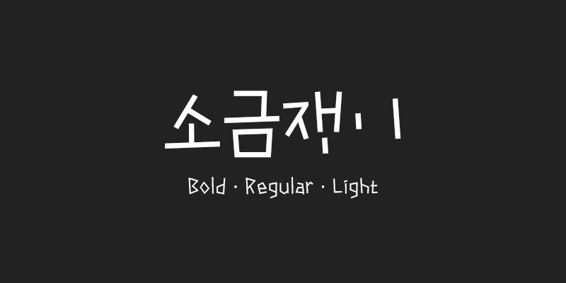
Explore 210 Sogeumjaengi available at Adobe Fonts.
foundry
commercial
adobe
Adobe Fonts is an in-house type foundry established in 1989, known for creating original typefaces that are regarded as industry standards for their design quality and technical fidelity. The full library of Adobe Fonts is available for both personal and commercial use.
Explore 210 Sogeumjaengi available at Adobe Fonts.
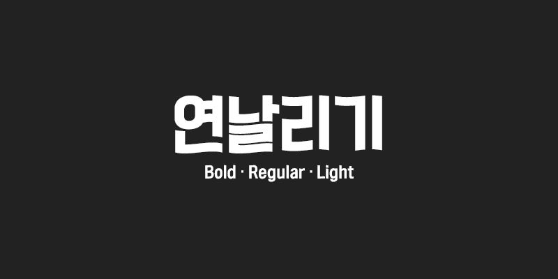
Explore 210 Yeonnalligi available at Adobe Fonts.
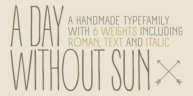
A Day Without Sun is an ultra-condensed version of Panforte, created by Cosimo Lorenzo Pancini on the original design by Debora Manetti. Hand drawn in easy big strokes, it's an extremely condensed typeface that allows you to typeset text in faux-handmade fashion, with the subtle elegance of vintage hand lettered menus. Lovers of world cuisine will be delighted to discover that this typeface supports over forty languages using the latin alphabet, spiced with hand-picked diacritics and it also comes with a tasty side dish of greek and cyrillic glyphs. Its grungy, handmade details are visible at medium and high point sizes but do not impact the effect of the font when set in text. A Day Without Sun OpenType features include small case characters, oldstyle numerals and a series of ligatures that help keep the distinctive handmade look (they can be switched off by unchecking the “standard ligatures” option in your design software).
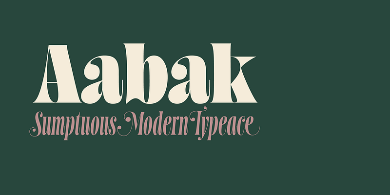
Aabak is a sumptuous modern typeface family. The high contrast, super elegant, didone like shapes were infused with a little fluidity from 60’s psychedelic lettering, the results is a contemporary face that screams freshness. It is ideal for branding, advertising, headlines, posters, movie titles, and much more! This design deliberately sabotages a lot of white space to have that compressed punchy look. The tear drop terminals and the melting serifs create a surprisingly superb combo. Sharp joints were smoothen to convey a warm and subtle feeling. Aabak comprises a total of 18 styles, 6 weights in 3 different cuts: Upright, Italic and Swash. The Swash styles have also a terminal forms feature that gives that extra lush feel. Have fun playing with it!
Explore Aaux Next designed by Neil Summerour at Adobe Fonts.
License [Abadi](https://www.myfonts.com/fonts/mti/abadi-mt/) on MyFonts
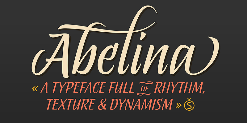
Explore Abelina designed by Yanina Arabena at Adobe Fonts.
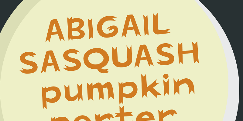
Explore Abigail designed by Ethan Dunham at Adobe Fonts.
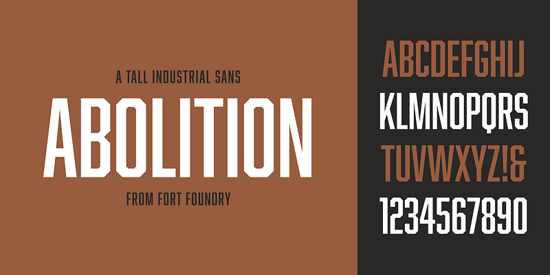
Explore Abolition designed by Mattox Shuler at Adobe Fonts.
Explore Aboreto available at Adobe Fonts.
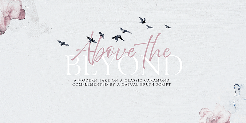
Explore Above The Beyond designed by Elena Genova at Adobe Fonts.
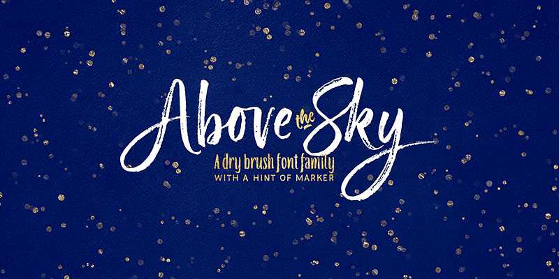
Please welcome a new brush written font family Above the Sky which also includes a long requested all-caps marker font, the one you can use to add a “secondary” text to your designs. All fonts make good companions and can be used for all sorts of type-based creations, quotes, branding, merchandise, packaging, invites, greeting cards and so on. You will be over the moon when you find out all Above the Sky possibilities. The brush script has tons and tons of alternates, ligatures, swashes - more than 1200 glyphs are here to serve you well. It can be successfully combined with the Condensed font or/and with the Marker font!
A credible, contemporary interpretation of a classic newsface.
A low contrast font family for trustworthy, impactful headlines.
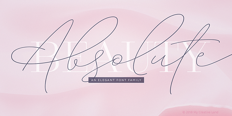
Explore Absolute Beauty designed by Elena Genova at Adobe Fonts.
Letraset’s talented type designer Vince Whitlock was inspired by the elegant Caslon series when he created Academy Engraved. The exquisite letterforms of this traditional Roman typestyle make it ideal wherever an elegant and classical titling face is desired.
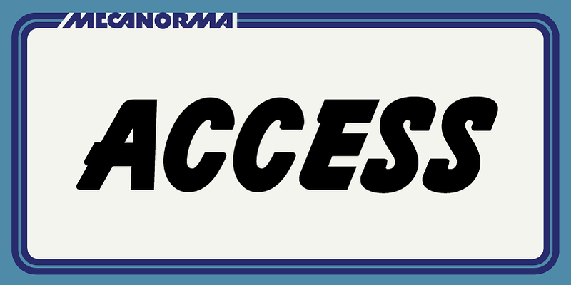
Explore Access MN available at Adobe Fonts.
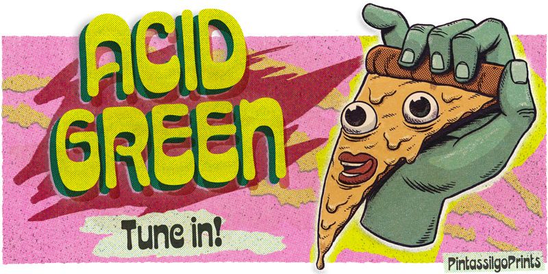
Acid Green is a display typeface with psychedelic flair. Its roots date back to 1914, from an unnamed alphabet by J.M. Bergling, a jewelry engraver and “letterform inventor” whose books on art alphabets and lettering influenced countless artists, including those involved with the genesis of Art Nouveau and Art Deco movements. Perfect for display use when your aim is for retro design or trippy letters. Acid Green has an extensive character set and stylistic alternates for extra grooviness.
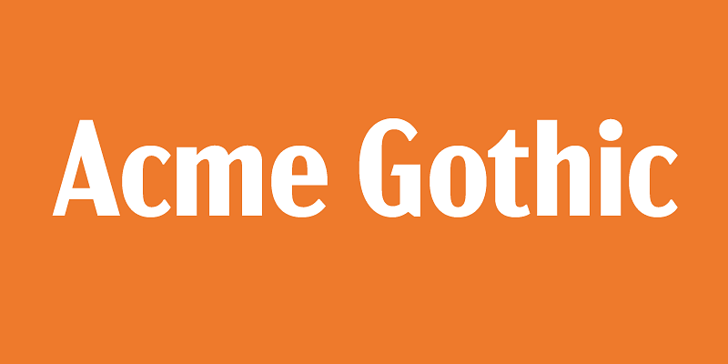
Acme Gothic (2018) is based on the thick-and-thin gothic lettering style popular in the U.S. in the first half of the twentieth century. There have been typefaces in this genre before, but they were either too quirky (Globe Gothic), too English (Britannic), too Art Deco (Koloss), too modern (Radiant), or too Art Nouveau (Panache). None captures the plain, workman-like, vernacular style of Acme Gothic. There are five widths (Compressed, Condensed, normal, Wide, and Extrawide) each with five weights (Light, Regular, Semibold, Bold, and Black) for a total of 25 different styles.

Acroterion is an elegant "Copperplate" style script font that is revived from an older photo-typositing face from the early 20th Century.
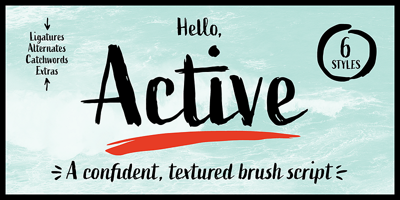
Active is a hand-drawn script with brush and ink. It is confident while expressive, and has a textured appearance. The slightly condensed proportions help it stand a little taller.
Acumin is a versatile sans-serif typeface family intended for a balanced and rational quality. Solidly neo-grotesque, it performs beautifully at display sizes but also maintains an exceptional degree of sensitivity for text sizes. Learn more at this [microsite](https://acumin.typekit.com/).
Explore Acumin Condensed designed by Robert Slimbach at Adobe Fonts.