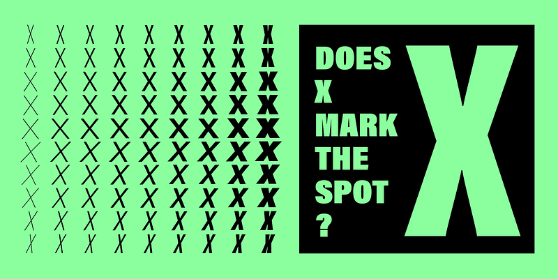
Acumin is a versatile sans-serif typeface family intended for a balanced and rational quality. Solidly neo-grotesque, it performs beautifully at display sizes but also maintains an exceptional degree of sensitivity for text sizes. Learn more at this [microsite](https://acumin.typekit.com/).
Adobe Originals
Explore Acumin Condensed designed by Robert Slimbach at Adobe Fonts.
Explore Acumin Extra Condensed designed by Robert Slimbach at Adobe Fonts.
Explore Acumin Semi Condensed designed by Robert Slimbach at Adobe Fonts.
Explore Acumin Wide designed by Robert Slimbach at Adobe Fonts.
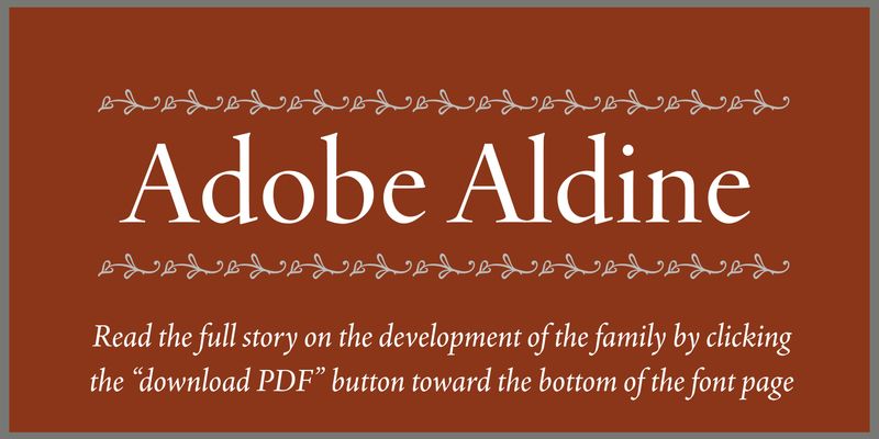
Many years in the making, the latest Adobe Originals typeface from illustrious type designer Robert Slimbach is finally released! Aldine is a contemporary interpretation of the humanist book types developed at the Aldine Press at the turn of the 15th century. Complete with language coverage for Latin, Greek, and Cyrillic as well as multiple figure styles and beautiful ornaments. Available in both Variable and static format, the family gives designers the ability to create custom fonts in any combination of weight and optical size. Adobe Aldine was designed with on-screen usage in mind, providing a coordinated system of highly readable typefaces that bring a classical type of the past tailored for modern digital work environments.
William Caslon released his first typefaces in 1722. Caslon's types were based on seventeenth-century Dutch old style designs, which were then used extensively in England. Because of their remarkable practicality, Caslon's designs met with instant success. Caslon's types became popular throughout Europe and the American colonies; printer Benjamin Franklin hardly used any other typeface. The first printings of the American Declaration of Independence and the Constitution were set in Caslon. For her Caslon revival, designer Carol Twombly studied specimen pages printed by William Caslon between 1734 and 1770. The OpenType Pro version merges formerly separate fonts (expert, etc.), and adds both central European language support and several additional ligatures. Ideally suited for text in sizes ranging from 6- to 14-point, Adobe Caslon Pro is the right choice for magazines, journals, book publishing, and corporate communications.
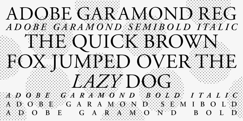
An Adobe Originals design, and Adobe's first historical revival, Adobe Garamond is a digital interpretation of the roman types of Claude Garamond and the italic types of Robert Granjon. Since its release in 1989, Adobe Garamond has become a typographic staple throughout the world of desktop typography and design. Adobe type designer Robert Slimbach has captured the beauty and balance of the original Garamond typefaces while creating a typeface family that offers all the advantages of a contemporary digital type family. With the introduction of OpenType font technology, Adobe Garamond has been reissued as a Pro type family that takes advantage of OpenType's advanced typographic capabilities. Now this elegant type family can be used with even greater efficiency and precision in OpenType-savvy applications such as Adobe InDesign.
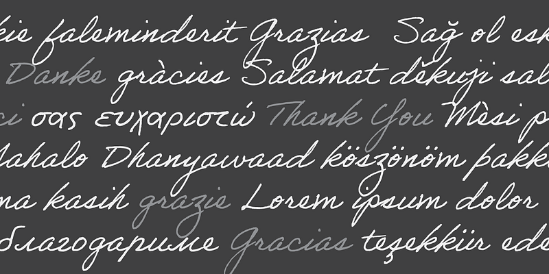
A trio of fonts based on the handwriting of some of Adobe's own designers. The three eponymous styles of the family — Ernie, Frank, and Tiffany — each have a unique flavor with its own rhythm and character. These fonts were originally created in 2012 so Acrobat users could sign documents electronically, but they were capable of so much more, and we’re happy to share them for general use. Images created by [Ivana Quintanar](https://www.behance.net/ivanaquintanar).
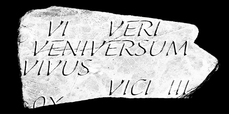
Adobe Jenson Pro captures the essence of Nicolas Jenson's roman and Ludovico degli Arrighi's italic typeface designs. The combined strength and beauty of these two icons of Renaissance type result in an elegant typeface suited to a broad spectrum of applications. Designed by Robert Slimbach of the Adobe type design team, Adobe Jenson Pro is part of the family of Adobe Originals historical revivals, including Adobe Garamond Pro and Adobe Caslon Pro. With its many OpenType features, extended language support and typographic refinement, Adobe Jenson Pro provides a power and flexibility for text composition rarely found in digital type.
Adobe Kis (pronounced "Kish") is the latest revival of a classical book type to be offered by Adobe. Designer Robert Slimbach has sought to capture the vitality and nuance of the original types, while adapting them to the evolving demands of the digital medium. Adobe Kis is a sturdy, versatile text typeface in the style of 17th-century Dutch types, although its creator Nicholas Kis was a Hungarian. It is well suited for use in books: novels, history, popular science, essays, travel books, cookbooks, and reference books. It can function well in both reports and publication designs.
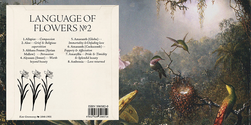
Note: This is an icon font which does not support A-Z characters. Once it is added to use in an Adobe app, a quick shortcut is to find the ¶ (Pilcrow) symbol in the default font you are using, and highlight it. Change it to Adobe Pi standard and then use the Glyph panel to locate all of the characters and substitute your pilcrow with any other icons you want to use.
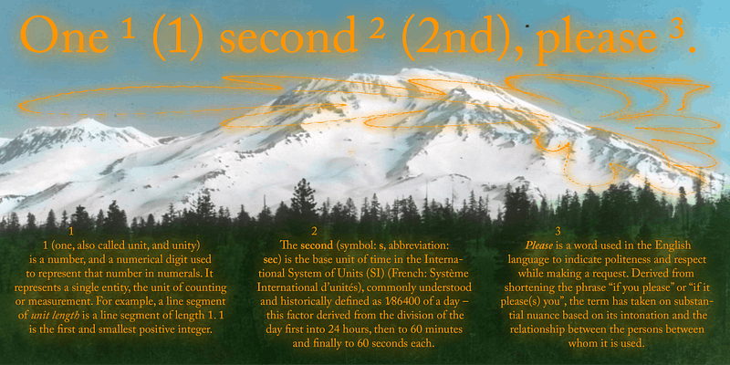
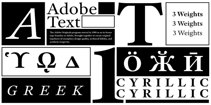
Explore Adobe Text designed by Robert Slimbach at Adobe Fonts.
America's most famous carver of inscriptions, including those at the John F. Kennedy Memorial in Arlington National Cemetery, John Benson modeled this friendly, casual script after his own handwriting and gave it the name of his beloved niece. Although based on the cancelleresca style of 16th-century Italian writing masters, Alexa has no swash terminals or ligatures. The absence of these features and its pronounced slope give this 1995 Adobe Originals release a distinctly modern look for lively lines and pages. Use Alexa at both text and display sizes.
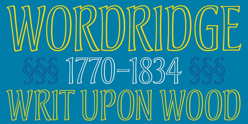
Michael Harvey first drew the lettering that became the foundation for Andreas in 1988 as part of the book jacket design for The Studios of Paris, a Yale University Press publication. In keeping with the book's subject, Harvey wanted letterforms that reflected the Art Nouveau period. In addition, the type had to be narrow enough to fit the title across the top so as not to intrude on the Van Gogh painting that filled the rest of the jacket. To accomplish this end, he drew the letterforms freehand, giving them shapely stems and the high-waisted look characteristic of Art Nouveau lettering. He also added distinctive junctions to the D, P, and R. The jacket's design further required that the title reverse out in white. Harvey felt that a solid letter would have been too heavy, so he drew it in outline, which contributes to its graceful, ethereal impression. All of which makes Andreas a good choice for wine labels, upscale food packaging, resort brochures and identities, book design, and magazine titling.
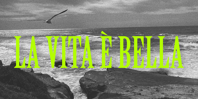
Named after the Florentine river which runs through the heart of the Italian Renaissance, Arno draws on the warmth and readability of early humanist typefaces of the 15th and 16th centuries. While inspired by the past, Arno is distinctly contemporary in both appearance and function. Designed by Adobe Principal Designer Robert Slimbach, Arno is a meticulously-crafted face in the tradition of early Venetian and Aldine book typefaces. Embodying themes Slimbach has explored in typefaces such as Minion and Brioso, Arno represents a distillation of his design ideals and a refinement of his craft. As a multi-featured OpenType family, with the most extensive Latin-based glyph complement Adobe has yet offered, Arno offers extensive pan-European language support, including Cyrillic and polytonic Greek. The family also offers such typographic niceties as five optical size ranges, extensive swash italic sets, and small capitals for all covered languages.
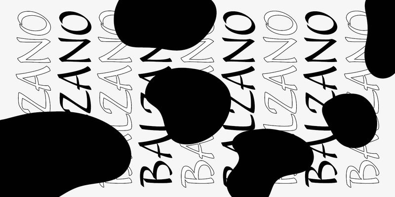
America’s most famous carver of inscriptions, including those at the John F. Kennedy Memorial in Arlington National Cemetery, John Benson conceived Balzano (Italian for “bouncing”) as an upright script whose character would come from active individual strokes and letter shapes. He was particularly inspired by a page of pen-written letters by calligrapher Raphael Boguslav. As a result, Balzano features thin hairlines and pronounced vertical strokes with active terminals. Open counterforms and varying letter heights contribute to the vitality of this 1995 Adobe Originals release. Although suitable for brief copy in larger text sizes, Balzano excels in display settings.
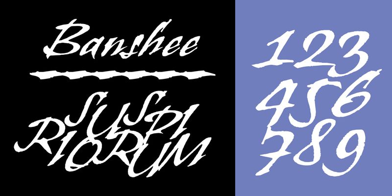
Often working into the wee hours of the night while the wind howled, British type designer and lettering artist Tim Donaldson created the Adobe® Originals typeface: Banshee. This vividly expressive display face is modeled after one of Donaldson’s handwritten lettering styles. Banshee began as letters rapidly written by Donaldson with one of his homemade “ruling” pens. The letterforms are, however, firmly rooted in the tradition of classical chancery italics. With its ragged lines and counters, Banshee realistically captures the irregularity of pen and ink on paper, lending an immediacy to packaging, advertisements, posters, and invitations that few digital typefaces can match. U.S. Patent Design 407,431.
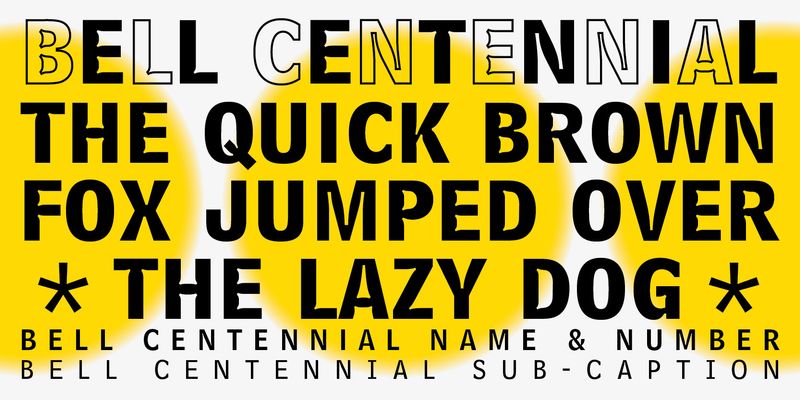
Matthew Carter designed Bell Centennial in 1978 specifically for AT&T Corporation (the name honors their 100th anniversary) to use in telephone books. Carter developed it to have high legibility at small sizes, and for composition on high-speed, cathode-ray-tube composing machines. (Bell Gothic, the typeface originally designed for telephone books in 1937 and for composition on the hot metal Linotype machines, was no longer usable in the new technology.) Bell Centennial is a sturdy, condensed sans-serif design that achieves great economy of space while being highly legible. Bell Centennial can be used for modern display purposes and, of course, for small print and lists. The Alternate version of Bell Centennial Bold Listing sits on a standard baseline; the original version sits far below the baseline, and cannot mix properly with other fonts on the same line.
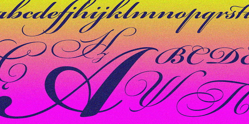
Richard Lipton's Bickham Script is a flowing, formal script typeface based on the lettering of 18th century writing masters, as rendered in the unparalleled engravings of George Bickham. This ornate script lends a signature flourish to invitations, menus, annual reports, restaurant logos, and packaging. With dozens of alternate letterforms in addition to its range of weights, Bickham Script's personality can range from poised to extravagant. It is intended primarily for display settings. U.S. Patent Designs 407,108 and 426,570.
Birch is an Adobe Originals typeface designed in 1990 by Kim Buker Chansler. Birch is based on a Latin Condensed wood type found in a 1879 William Page specimen book; Birch is a particularly legible condensed display typeface notable for its angled serifs. Use frugally in display work.
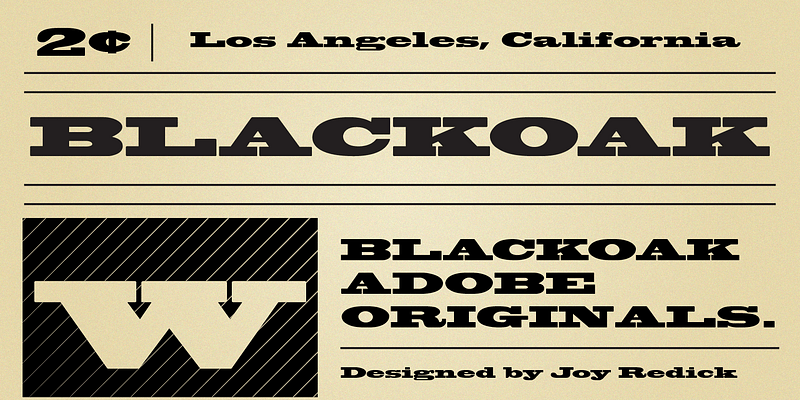
Blackoak is an Adobe Originals typeface designed in 1990 by Joy Redick. Blackoak, adapted from proofs of wood type from the collection at the Smithsonian Institution, has slab serifs and extremely wide letterforms. Used sparingly, Blackoak makes an arresting display type.
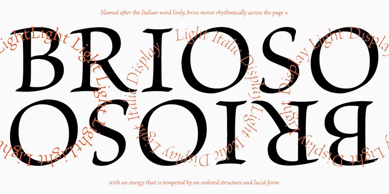
Brioso Pro is a new typeface family designed in the calligraphic tradition of the Latin alphabet. Brioso displays the look of a fi nely-penned roman and italic script, retaining the immediacy of hand lettering while having the scope and functionality of a contemporary composition family. Brioso blends the humanity of written forms with the clarity of digital design, allowing designers to set pages of refined elegance. Designed by Robert Slimbach, this energetic type family is modeled on his formal roman and italic script. In the modern calligrapher's repertoire of lettering styles, roman script is the hand that most closely mirrors the oldstyle types that we commonly use today; it is also among the most challenging styles to master. Named after the Italian word for lively, Brioso moves rhythmically across the page with an energy that is tempered by an ordered structure and lucidity of form.
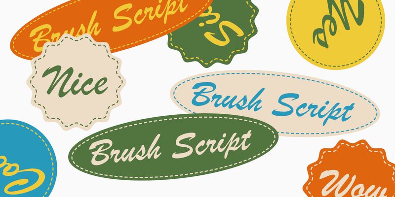
Brush Script was designed in 1942 by Robert E. Smith for American Type Founders. It has a spontaneous, brush-written look, and the lowercase letters are connected as in handwriting. Brush Script is ideal for casual display work where an informal, handwritten style might be advantageous, such as posters and signage.
