Zetafonts

10 fonts
A Day Without Sun

A Day Without Sun is an ultra-condensed version of Panforte, created by Cosimo Lorenzo Pancini on the original design by Debora Manetti. Hand drawn in easy big strokes, it's an extremely condensed typeface that allows you to typeset text in faux-handmade fashion, with the subtle elegance of vintage hand lettered menus. Lovers of world cuisine will be delighted to discover that this typeface supports over forty languages using the latin alphabet, spiced with hand-picked diacritics and it also comes with a tasty side dish of greek and cyrillic glyphs. Its grungy, handmade details are visible at medium and high point sizes but do not impact the effect of the font when set in text. A Day Without Sun OpenType features include small case characters, oldstyle numerals and a series of ligatures that help keep the distinctive handmade look (they can be switched off by unchecking the “standard ligatures” option in your design software).

serif
handwritten
vintage
Adlery Pro

Adlery is a brush typeface designed by Cosimo Lorenzo Pancini for display use. It has a handmade feel and it’s optimized for maximum readability at medium sizes. The typeface comes in three styles: Basic, Swash and Blockletter Uppercase and has a double set of lowercase alphabets that alternate in writing, so that no double letters are the same.

script
brush-pen
brush
Anaphora Stencil

Anaphora is a contemporary serif typeface designed by Francesco Canovaro with Cosimo Lorenzo Pancini and Andrea Tartarelli. It features nine weights, from thin to fat, each with true italics style, for a full range of editorial and advertising uses. Its wide counters and low x-height make it pleasant and readable at text sizes, while the uncommon shapes make it strong and recognizable when used in display sizes. Four additional stencil weights provide options for fancy titling and logo creation. Anaphora features an extended character set that covers over forty languages using the latin alphabet, as well as Greek and Russian Cyrillic. Open type features include small caps, four sets of figures, fractions, superior & inferior figures, alternate forms and discretionary ligatures.

slab-serif
stencil
serif
Bimbo Pro

Bimbo is a monoline script font family created by Francesco Canovaro. The typeface is characterized by a handmade spontaneous aesthetic, essentially for display use, minimal lettering and logos. This handwritten sensibility is enhanced by the built-in letter swapping open type feature that makes sure double letters are always different from one to another. Open counters and a monoline design allow for great readability at small sizes, making Bimbo the ideal font for creating fake handwritten notes and metatextual jokes. The typeface includes six weights and over 300 glyphs to cover over 70 languages using the latin, greek and cyrillic alphabets.

script
foundry
commercial
Blackest

Blackest is an inverse contrast wedge serif typeface family, designed by Francesco Canovaro and Andrea Tartarelli as a development of the design space of Blacker typeface, designed by Cosimo Lorenzo Pancini. It keeps the classical skeleton and sharp edges of the original, while bringing the contrast of the typeface into the realm of the so-called "Italian" or reverse-contrast typefaces. The result is a typeface family that manages to be quirky yet classical, and at the same time playful without losing elegance. With its exuberance and six weights characterized by eye-catching proportions, Blackest is perfect for display use, such as in editorial & magazine design, poster design and logo development. A text variant in two weights, with less contrast, looser spacing, and high readability, has been developed for typesetting of longer texts. Blackest features an extended character set that covers over 220 languages using the Latin alphabet, as well as Russian Cyrillic. Open Type features include small caps, positional figures, alternate letter forms, stylistic sets, arrows and extra punctuation and discretionary ligatures.

serif
foundry
commercial
Bogart

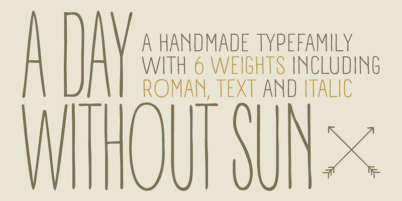
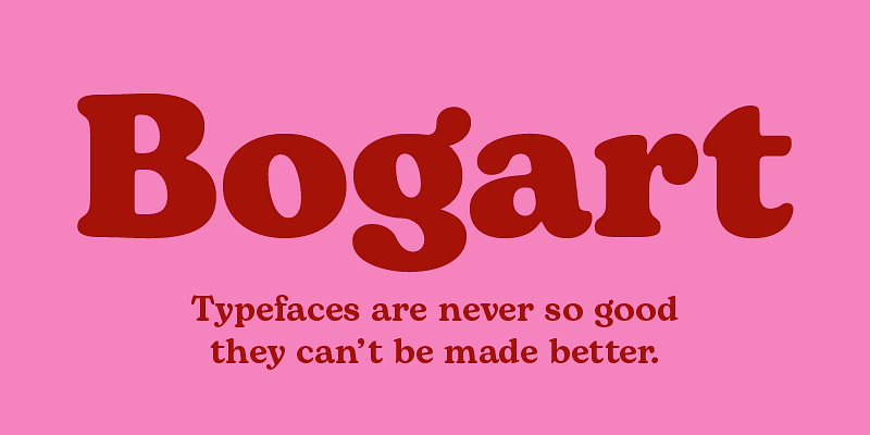
Bogart has been designed by Francesco Canovaro as a personal homage to the iconic look of low-contrast oldstyle fat faces, like Cooper Black (Oswald Bruce Cooper, 1922) and Goudy Heavy Face (Frederic W. Goudy and Sol Hess, 1925-1932). Originating from the modern old style of Bookman, these muddy, goopy shapes found their pop culture iconic status thanks to rub-on transfers and phototypesetting systems in the 1960s and 1970s. Positively bursting with hippie energy and exuberant vitality, they often included an extensive repertoire of swash characters, bridging the space between lettering and typography. In researching these shapes, Canovaro decided to include also the influence of another idiosyncratic american old style typeface, Windsor, quoting its sloping shapes and quirky solutions, and expanding the weight range of Bogart to include a selection of display light weights where the muddy shapes of the heavy weights distill into elegant teardrop terminals. All the nine weights of Bogart, as well the matching true italics forms, feature an extended charset of over 1600 glyphs, covering 219 languages using latin, cyrillic and greek alphabets, and sporting a complete set of Open type features including alternate forms, discretionary ligatures, small capitals, stylistic sets, positional numbers, case-sensitive, terminal and initial swash forms. To add flexibility for editorial usage, a text-oriented Bogart Alternate set of nine weights was added to the family keeping the design more similar to its modern old style model and allowing for a heavy readable mid-weight range. The latest update introduces new Compressed and Condensed weights, as well as technical enhancements, updated kerning, and redesigned Greek letterforms, making this beloved family even more adaptable for diverse design needs. Hollywood icon Humprey Bogart famously said: “things are never so bad they can’t be made worse.“. This typeface was named after him, aiming at a way to embody the moody spirit of vintage typography, from film noir aesthetics, to the pop culture reference, from joyous swash titling and logo design to strict, balanced text typesetting. Because “typefaces are never so good that they can’t be made better”

serif
foundry
commercial
Calvino

In designing the Calvino typeface family Andrea Tartarelli set himself the challenge to follow the principles expressed by the italian writer Italo Calvino in his masterpiece Six memos for the next millenium. Exactitude and visibility are translated typographically through the reference to sixteen century garalde typography and its controlled, highly legible letterforms. To balance this formal rigour, lightness and quickness were added by letting the design be inspired by the calligraphic hand, following the lesson of Gudrun Zapf. The idea of multiplicity was kept central, developing Calvino in a range of weights encompassing both display and text use cases, and then expanding the design space with the inclusion of a display sub-family, Calvino Grande, to provide users with a full typographic palette to cover all editorial needs. Sharing the same formal structure, Calvino Grande sports condensed proportions, sharper details and tighter metrics. Both Calvino and Calvino Grande are complemented with a set of italic letterforms, with differences in design and slant to better work at different point size. All the 34 weights of the Calvino family come with an extended latin and cyrillic charset, covering over two hundred languages, and all equipped with a wide range of open type features including positional numerals, alternate forms, and stylistic sets. Four variable typefaces are also included in the full package, for any need of fine-tuning the typeface grade of weight. Special thanks go to Laurène Girbal for the help in developing the regular weight.

serif
foundry
commercial
DoubleBass

There's no way for a true lettering aficionado to avoid falling in love with Saul Bass’s vibrating, almost brutal cut-out aesthetics. As an humble homage to Bass’s inspiration and sensibility, and inspired also by cartoon modern lettering and jazzy graphics of the fifties, Cosimo Lorenzo Pancini decided to work on a typeface that could show interlocking rhythm and variation in design without resorting to thousands of ligature special letters, but rather by virtue of its modular structure. The result is DoubleBass, a jazzy four-weights display family that provides an out-of-the-box tool for cartoon modern style logo and heading design. The alternating sets of capital letters and numbers make sure that a bouncy rhythm is kept while you type away, thanks to open type ligature substitution. Lighter weights can work for small blocks of text, while the regular and heavy weights show their best in big sizes and display uses. Foreign languages using the Latin alphabet are covered, as well as Russian Cyrillic. Anytime you need that jazzy retro vibe, just put on your turntable some cool bebop record and start designing!

sans-serif
foundry
commercial
Erotique

Designed by Cosimo Lorenzo Pancini and Maria Chiara Fantini with the help of Solenn Bordeau, Erotique is an evolution of the original design by Zetafonts for Lovelace, that challenges its romantic curves with the glitchy & fluid aesthetic of transmodern neo-brutalist typography. The seductive "evil serif" look of the Pheimester-like Oldstyle letter shapes is made edgier by the quirky connections and unexpected calligraphic twirls that marry digital distortions to traditional penmanship. Sensuous but sharp, Erotique speaks the language of teasing, and unrequited love, over-the-top and restrained like a show of japanese Kinbaku, and beautifully heartbreaking like a friendzone valentine. Designed for display use, this high-contrast serif typeface is ready to take center stage in projects where a subtle elegance and an edgy, aggressive touch are required. For branding use it is paired by Erotique Ornaments, a set of interlocking patterns based on the font letter-shapes, allowing for striking packaging, digital and ambient design. For editorial use it can add a sharp sensuality to logos and titles thanks to an impressive array of alternate glyphs, subtle ligatures and a set of whiplike fleurons, collected in the Erotique Flourishes pack. The typeface has been developed in the regular, medium and bold weight plus a monoline version, all of which have been paired with an Alternate version to give immediate access to the more exotic alternate letterforms. With a character set of over five hundred glyphs, all the the weights of Erotique cover almost 200 languages using extended latin, and include advanced Open Type features as Stylistic Alternates, Standard and Discretionary Ligatures, Positional Numerals, Swash and Case Sensitive Forms. If you are a typeface lover, be warned: Erotique could be your fatal attraction!

serif
foundry
commercial
Hagrid

Cosimo Lorenzo Pancini designed Hagrid as a celebration of the expressive potential of grotesque letterforms when exposed to the crypto-typographer’s love for the strange and the overlooked. Hagrid blends grotesque structure with calligraphic counterspaces, inverted contrast, and brutalist shapes to create a bold, impactful voice for both print and digital use. Originally released as a display family, Hagrid was expanded and redesigned in 2025 to improve readability and functionality. The updated Text family features refined proportions, and optimized spacing for long-form reading, while the Display family introduces subtle contrast in lighter weights and a new Black style with fully closed counterspaces for maximum visual impact. The family supports Extended Latin, Cyrillic, Greek, and Arabic scripts, with the Arabic set revised in collaboration with Murad Alsharaweb. OpenType features include positional numbers, discretionary ligatures and a playful "Monsters" stylistic set that transforms letters into expressive, creature-like forms. Hagrid is ideal for editorial, branding, and expressive typography projects that embrace originality and typographic personality.

sans-serif
foundry
commercial