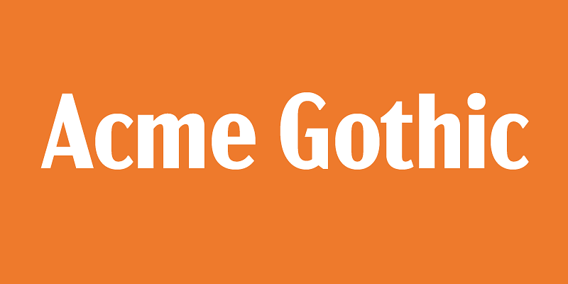
Acme Gothic (2018) is based on the thick-and-thin gothic lettering style popular in the U.S. in the first half of the twentieth century. There have been typefaces in this genre before, but they were either too quirky (Globe Gothic), too English (Britannic), too Art Deco (Koloss), too modern (Radiant), or too Art Nouveau (Panache). None captures the plain, workman-like, vernacular style of Acme Gothic. There are five widths (Compressed, Condensed, normal, Wide, and Extrawide) each with five weights (Light, Regular, Semibold, Bold, and Black) for a total of 25 different styles.
Mark Simonson Studio
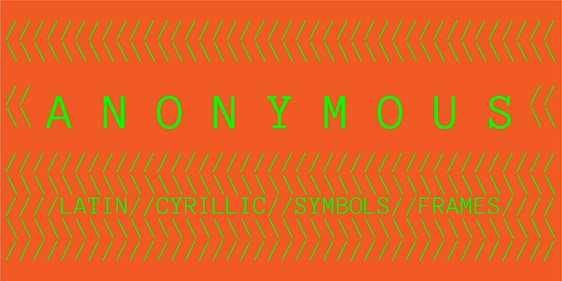
Anonymous Pro (2009) is a family of four fixed-width fonts designed with coding in mind. Anonymous Pro features an international, Unicode-based character set, with support for most Western and Central European Latin-based languages, plus Greek and Cyrillic. Anonymous Pro is based on an earlier font, Anonymous™ (2001), my TrueType version of Anonymous 9, a Macintosh bitmap font developed in the mid-’90s by Susan Lesch and David Lamkins. Anonymous Pro is distributed with the Open Font License (OFL). There are two versions: Anonymous Pro and Anonymous Pro Minus. Anonymous Pro contains embedded bitmaps for smaller sizes, Anonymous Pro Minus does not. More info about this in the Usage Notes.
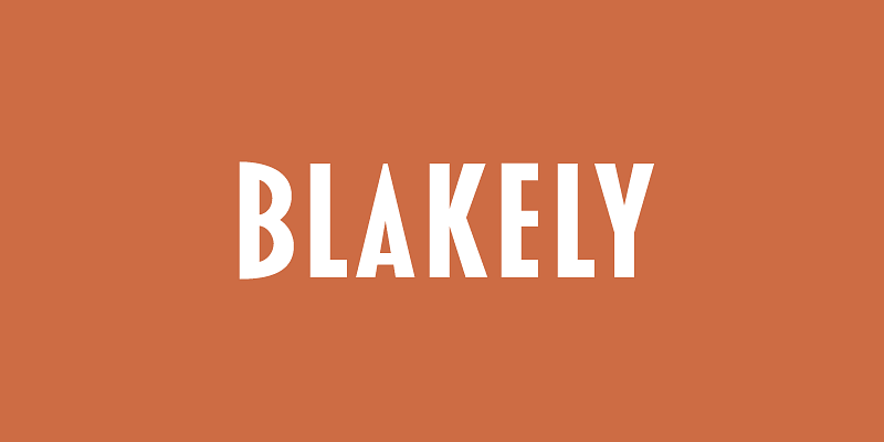
Blakely (2000, 2003) was originally developed as a custom font based on a logo I designed in the early ’90s for the Signals mail order gift catalog. It’s a condensed, sans serif Art Deco design, similar in some ways to Kabel Condensed and Newport, both from around 1930. It’s a caps-only design, and the spacing is optimized for all-caps settings, nearly letter-spaced in the Light weight. I added the Bold and Black weights in 2003, which were in the back of my mind from the beginning.
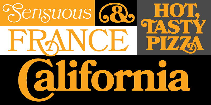
Bookmania (2011) combines the sturdy elegance of the original Bookman Oldstyle (1901) with the swashy exuberance of the Bookmans of the 1960s. With over 680 swash characters, more than any previous Bookman, the possibilities are endless. The broad range of weights make it great for display use, but it also works well for text. Unlike some Bookman revivals, it retains the original classic sloped roman for the italic. Bookmania includes all the features you would expect in a modern digital font family. **Download the Bookmania Cookbook [here](https://www.marksimonson.com/assets/content/fonts/BookmaniaCookbook.pdf).** **Download the Bookmania Specimen [here](https://www.marksimonson.com/assets/content/fonts/BookmaniaSpecimen.pdf).**
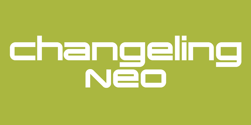
Changeling Neo (2008, originally released as Changeling in 2003) is my redesign and expansion of China, a VGC Photo-Typositor face released 1975. China had only one weight (similar to Changeling Neo Bold) in all-caps with only a few alternate characters. In Changeling Neo, I redesigned many characters for better type color. I also added a complete set of lowercase-style variants, providing endless “unicase” combinations. I also added four more styles—Light, Regular, Stencil, and Inline.
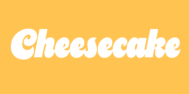
Cheesecake (2024) is an ultra-bold script inspired by lettering of the sixties and seventies. It’s a design that Mark Simonson found himself compulsively drawing during the development of Dreamboat (2022). Cheesecake is simpler and less formal—almost a caricature of the style—with a larger x-height and more extreme forms. It has an alternate to the default cursive-style lowercase “s” and a full set of dingbats. It’s keen for branding, advertising, posters, book covers, packaging, and the like.
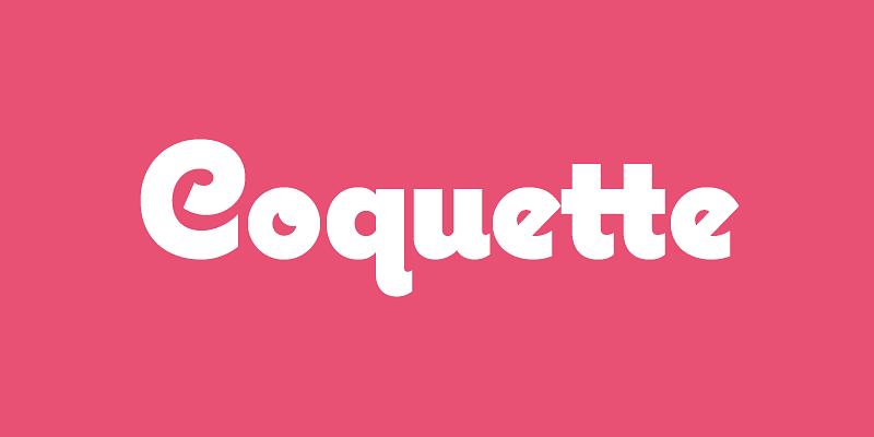
Coquette (2001, 2017) is an unconnected upright script, a sort of hybrid between French scripts, such as Typo Upright, and 1930s-era geometric sans serifs, such as Kabel. The idea for this typeface came to me in the early ’90s while I was designing a logo. It took me several tries over several years to get it to look the way I wanted it to, a process that taught me a lot about type design and drawing letters. Since its release, it’s become one of my more popular fonts, which is very gratifying since it’s my favorite of all the fonts I’ve designed. In 2017, I expanded the original three weights (Light, Regular, and Bold) to six with the addition of Thin, Extrabold, and Black. I also added several alternate characters (lowercase b, o, s, and ampersand) as well as arbitrary fractions, superscript, a full set of f-ligatures, and a bunch of math characters which were not included in earlier versions.
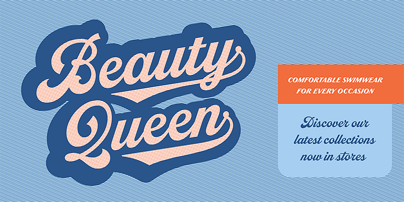
Dreamboat (2022) is typeface nearly 20 years in the making, It’s my take on the bold script style popular during the first few decades of the 20th century and revived later in custom lettering and logos starting in the 1960s, sometimes evolving into psychedelic or pop-art forms. Numerous familiar trademarks and brands still sport this style of lettering like Ford, Coca-Cola, Schlitz and any number of baseball club logos. The original single style would become the Bold weight and the full family expanded into six weights, ranging from Light to Black. There are numerous features like small caps, tails, and an alternate lowercase t with a high crossbar. Dreamboat is ready to knock your branding out of the park.
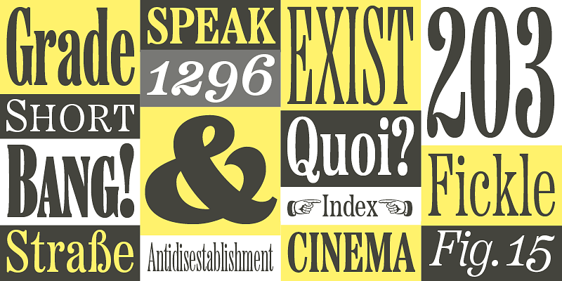
Etna (2020) was inspired by the Aetna wood type style of the late nineteenth century. Etna tames this quirky Victorian design into a complete family suitable for modern use, adding a full range of six weights and italics, allowing it to work equally well for both text and display. Etna includes three different condensed widths in all six weights (intended for display use), four different figure styles, alternate characters, true small caps, and a selection of dingbats, including arrows, stars, asterisks, and manicules (pointing hands).
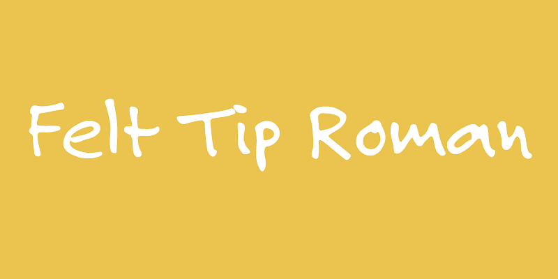
Felt Tip Roman (1992, 2003) is one of my most popular fonts, and the first font I ever released. It’s my own handwriting carefully digitized by hand (not auto-traced). Handwriting fonts are very common now, but they weren’t in 1989 when I started working on it. I just wanted to (Thank you, Mark Solsburg of FontHaus for encouraging me to release it.) I added two more weights, Bold and Heavy, in 2003 to create a more versatile set of fonts.
Felt Tip Senior (2000) is a facsimile of my dad’s handwriting, which of course had a big influence on my own handwriting ( He almost always writes in caps, so the lowercase has some surprising and idiosyncratic forms. I originally created this font as a gift to my dad in 1995. His name is Leroy so I called it “Leroy Lettering.” But since that’s a brand name of a lettering tool that some people still use, it could be confusing. I released it as Felt Tip Senior, with my dad’s permission.
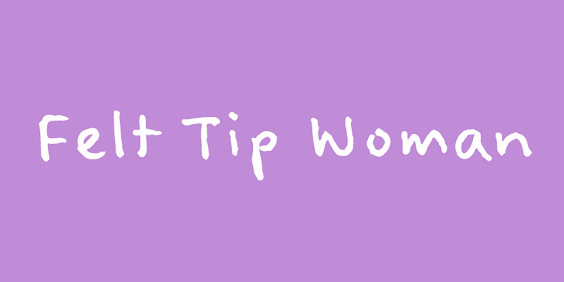
Felt Tip Woman (2003) is based on the handwriting of graphic designer Pat Thompson. The name was inspired by a misunderstanding: Pat was working with the editor of a children’s book journal when she noticed that one of the books they were reviewing was set in my Felt Tip Roman. Pat pointed this out to the editor who replied, “Did you say Felt Tip Woman? What a strange name for a typeface!” We decided this would be the perfect name for a font based on her handwriting.
Gertie (2024) was inspired by the lettering of comic artist and animation pioneer Winsor McCay—specifically the title lettering in his “Little Nemo” comic strip, which ran in Sunday newspapers from 1905–1927. The name comes from his 1914 animated short, “Gertie the Dinosaur,” which is considered the first to portray a character with personality. Gertie (the font) is an ultra-bold all-caps spur-serif design for display use with an early 20th-century feel and includes a set of matching dingbats.
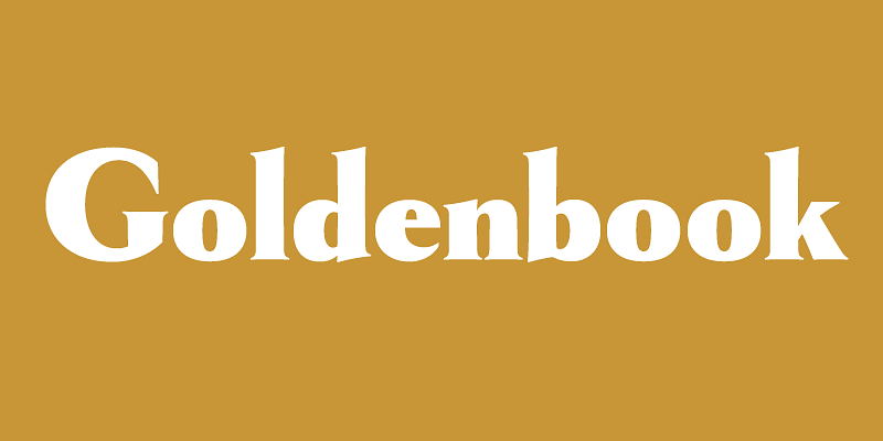
Goldenbook (2003) is based on the logotype of a literary magazine from the late 1920s called, The Golden Book Magazine. It’s an art deco take on the classic Roman letterforms, kind of an art deco Trajan, but with lowercase. There were only the letters in the logotype to work from, so I used my imagination for the rest. I tried to be true to the period, as if it had been a an actual font, and not the work of a lettering artist. With its fine features, it is best used large. I don’t know if it’s because of the name, but I
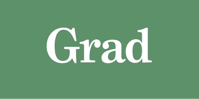
Grad (2004) was designed in the early ’90s by Phil Martin, creator of over 400 typefaces back in the ’60s and ’70s, and founder of Alphabet Innovations and Typespectra. Phil conceived of Grad as a redesign of Century Schoolbook. Editing bitmapped fonts on a DOS PC, he made design changes, some subtle and some obvious. He also added features like small caps, old style figures, ligatures, and swash capitals. Working with Phil, I brought Grad into the 21st century as a family of three feature-rich OpenType fonts.
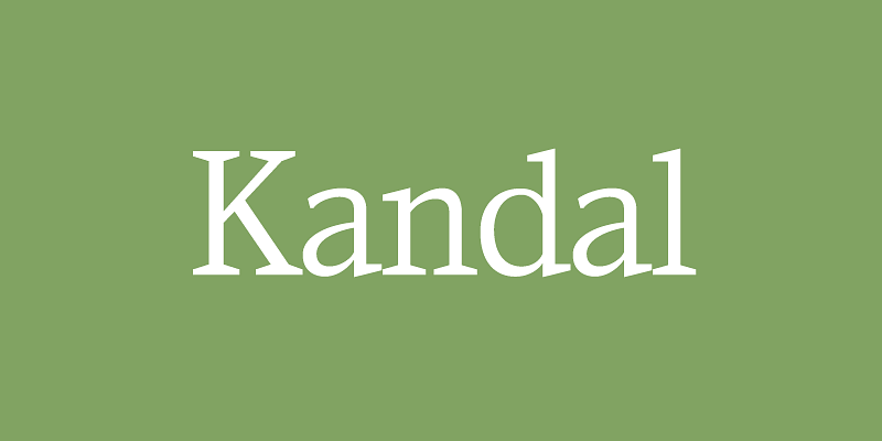
Kandal (1994) is a wedge serif design with some old style characteristics. It follows the weight scheme typically used for slab-serif typefaces, where the contrast between the thick and thin strokes remains relatively constant as they get thicker. Its proportions are rather narrow compared to other serif typefaces, especially the caps. The italic follows a modern cursive style of construction. The name comes from the name of a small town in Norway where some of my ancestors were from. It rhymes with “bundle.”
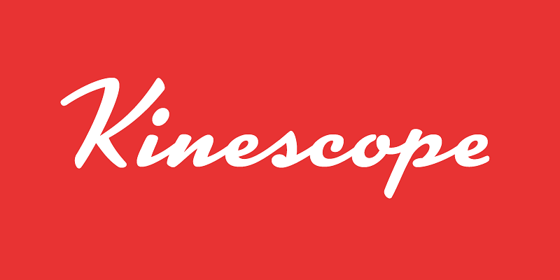
Kinescope (2007) is a dashing 1940s-style brush script, inspired by hand-lettered titles in Fleischer Brothers’ Superman cartoon series. Although I used that as a starting point, there was much room for interpretation, and many characters had to be invented. Kinescope uses some OpenType magic to mimic hand lettering, automatically choosing the best character shape based on its position in a word. Kinescope was designed along side of and released with another Fleischer Brothers-inspired design, Snicker.
Lakeside (2008) is a flowing 1940s-style brush script, inspired by hand-lettered titles in Otto Preminger’s classic 1944 film noir movie “Laura.” Lakeside uses OpenType magic to automatically mimic real Script lettering, choosing the best letter shapes based on where they fall in a word and what letters are nearby. It also includes three sizes of capitals: Normal capitals for typical settings, tall capitals for a more elegant effect, plus a small, plain set of capitals for setting in all caps, something not usually possible with script faces.
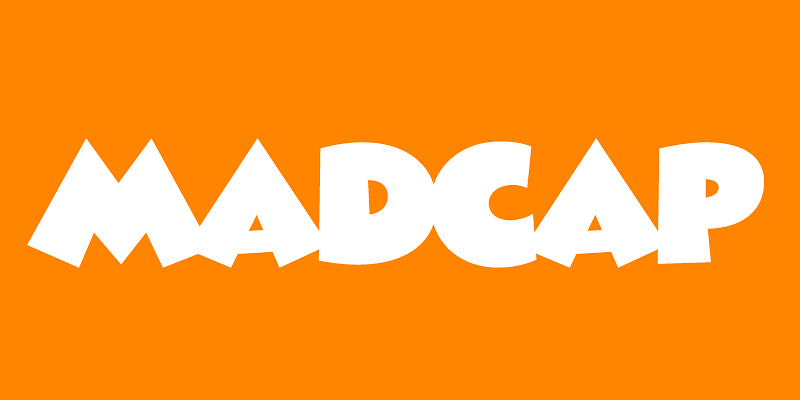
Madcap (2024) has its roots in a style of lettering that its designer, Mark Simonson, used frequently when he was in high school in the early seventies. He was inspired by comic book and greeting card lettering from the sixties. Madcap’s lively appearance comes from its skewed geometry, which avoids anything aligning to a square axis or grid, yet does so with a rhythmic and consistent logic. It’s an all-caps design, and features an alternate lowercase-style “E” and a full set of dingbats.
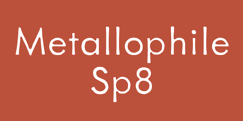
Metallophile Sp8 (2003, 2008) is a facsimile of 8-point sans serif type as set on a hot metal typesetting machine. The effect is very different from modern digital renditions of its cousin, Futura, which are coldly precise in and look quite different at text sizes. Hot metal faces were designed for specific point sizes, while modern digital faces take a one-font-for-all-sizes approach. Metallophile Sp8 captures much of the characteristic warmth of hot metal, which is particularly refreshing in such a geometric design. Download the MetallophileSp8 Specimen [here](https://www.marksimonson.com/assets/content/fonts/MetallophileSp8Specimen.pdf). Download the MetallophileSp8 User Guide [here](https://www.marksimonson.com/assets/content/fonts/MetallophileUserGuide.pdf).
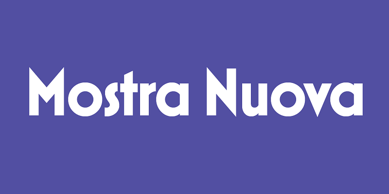
Mostra Nuova (2009) is based on a style of lettering seen on Italian Art Deco posters and advertising of the 1930s. Although it’s very geometric, I made subtle optical adjustments to keep it from looking too severely mechanical. I first released it in 2001 as Mostra, a caps-only design. Mostra Nuova has more weights, better language support, and lowercase letters. It features dozens of alternate characters providing endless stylistic possibilities within the basic design, from fairly plain to quite stylized. **Download the User Guide [here](https://www.marksimonson.com/assets/content/fonts/MostraNuovaUserGuide.pdf).**
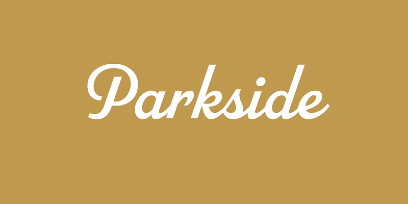
Parkside (2018) is a script typeface inspired by typefaces and lettering of the 1930s and 1940s. Unlike metal typefaces from that era, it takes advantage of modern digital typography, where letters may overlap and automatically change shape to better flow with surrounding letters. There are six weights (Hairlline, Thin, Light, Regular, Bold, and Black). Parkside has extensive language support, covering most Latin-based writing systems. Parkside uses OpenType magic to automatically select letter variations that seamlessly connect to the letters coming before and after.
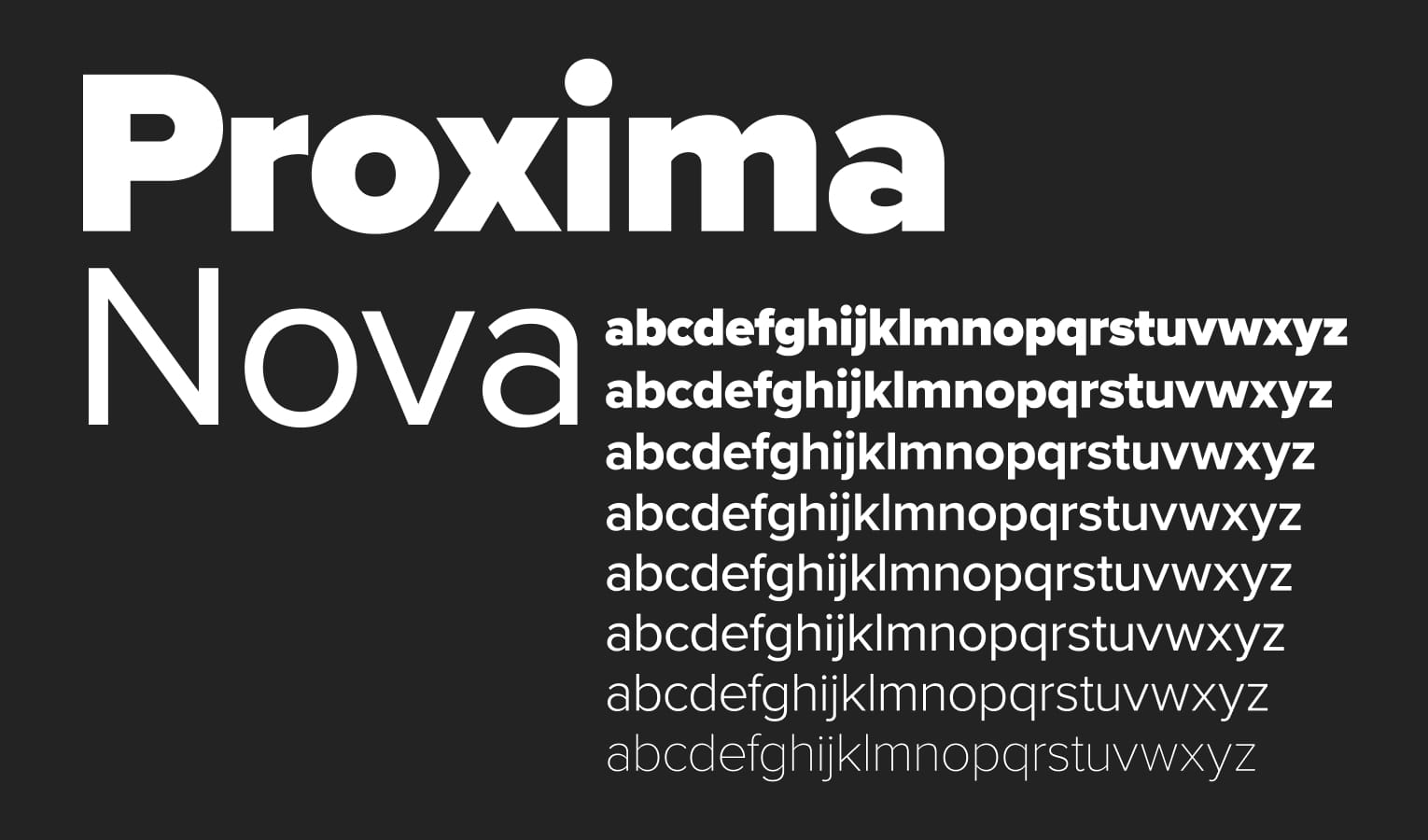
Proxima Nova, released in 2005, is a modern typeface that blends the geometric style of Futura with the versatility of Akzidenz Grotesk. Originally launched as Proxima Sans in 1994, it was reimagined into a broader family featuring modern proportions and a clean, geometric aesthetic. It has become one of the most widely used commercial fonts on the web since 2010.
Proxima Sera (2022) answers the question that designers and typographers have asked for more than fifteen years—what serif typeface should I pair with Proxima Nova? Proxima Sera is a hybrid design, combining characteristics of old style and modern serif typefaces into something new that is clean and highly readable. While its proportions and range of weights are designed to harmonize with Proxima Nova, it stands alone just as well. Its even color and large x-height make it a logical choice for text settings, but Proxima Sera still has enough warmth for display use—especially Thin and Black.
