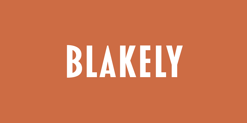
Blakely (2000, 2003) was originally developed as a custom font based on a logo I designed in the early ’90s for the Signals mail order gift catalog. It’s a condensed, sans serif Art Deco design, similar in some ways to Kabel Condensed and Newport, both from around 1930. It’s a caps-only design, and the spacing is optimized for all-caps settings, nearly letter-spaced in the Light weight. I added the Bold and Black weights in 2003, which were in the back of my mind from the beginning.

