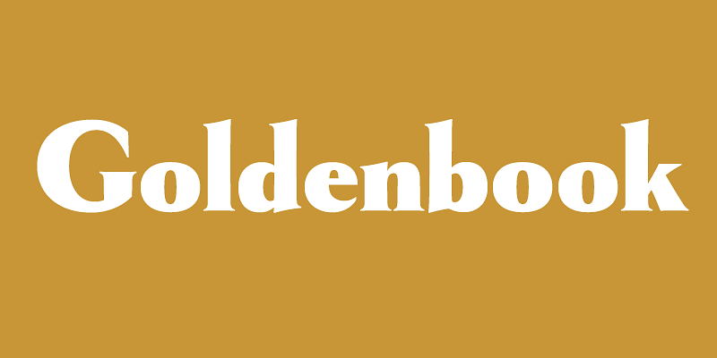
Goldenbook (2003) is based on the logotype of a literary magazine from the late 1920s called, The Golden Book Magazine. It’s an art deco take on the classic Roman letterforms, kind of an art deco Trajan, but with lowercase. There were only the letters in the logotype to work from, so I used my imagination for the rest. I tried to be true to the period, as if it had been a an actual font, and not the work of a lettering artist. With its fine features, it is best used large. I don’t know if it’s because of the name, but I