CAST
36 fonts
0123456789
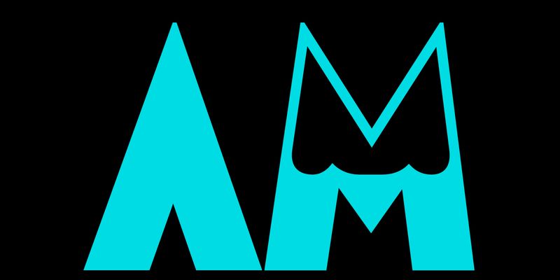
Assab is an all-caps geometric sans of elementary construction, based on circles, triangles and rectangles, with (almost) no contrast and no counters – only the open counters have been kept, such as in C, E and the like. Assab was produced as a wood type by Xilografia Ruggero Zuliani & C. (Verona) in the early 1930s, when the company changed its name to Xilografia di Verona. Ruggero Zuliani must have been an important character in the wood type industry of the time, as he is also recorded as a director of Xilografia Italiana (Badia Polesine, near Verona) in its early years. We are sure that Luca Lattuga’s research will shed some light on this important chapter of Italian vernacular typography. Assab interpreted the counterless sanserifs of the 1930s, a style of lettering popular in Italy in the growing field of advertising. It was a powerful expression of both Modernism and the Fascist regime, which used cutting-edge graphics of the time as corporate design. This kind of letterforms were incorporated into Fortunato Depero’s special variations of sanserifs and used in all kinds of graphic works. Baby Teeth, designed by Milton Glaser in 1964 for his famous Dylan record cover, can be considered the most famous heir of Assab and the counterless sans of the 1930s. The AM Assab digital revival stays remarkably close to the original. The designer, Alessandro Bombieri says: ‘All the shapes have been rectified to polish up the roughness of the wooden letters and an alternative S has been added. In fact, the peculiar shape of S (two semicircles on top of each other) and the elementary design of the other Assab letters create small overlaps in letter combinations such as ST, SZ and LS. Barely noticeable in wood type printing, these overlaps can actually be avoided in the digital environment thanks to this new alternate S.’ OpenType Features: Calt – Contextual alternate S
sans-serif
foundry
commercial
0123456789
Augusta is an all-caps inline geometric typeface of rather complex construction. Each character has a solid and a shaded side, the latter consisting of a grid of thin parallel lines. It is a prime example of modernist type design, albeit with some letterforms with Art Nouveau traits ( Augusta was a metal type produced by the Fonderia Tipografica Meridionale Armando De Luca (Naples), a family-run type foundry about which very little information is available. It was founded in 1896 and ceased activity in the 1970s or early 1980s, when the De Luca family switched to the manufacture of printing inks. Their greatest success seems to have been Napoli, a sanserif very similar to Schriftguss’s Super-Grotesk. Released in six sizes, from 20 to 72 points, Augusta shares a family likeness with some German inline typefaces which were popular in the late 1920s. Nonetheless, as far as we can tell, Augusta is an original design. In the words of the designer Riccardo Olocco ‘the AM Augusta digital revival is faithful to the original even though many small details have been improved to make the grid construction of the letters consistent throughout the character set. In conformity with modern taste, letter spacing has also been improved and is now much tighter than the original. Some figures have been modified, because their original shapes did not fit well with the others.’ OpenType Features: ss01 – Round E
sans-serif
foundry
commercial
0123456789
Explore AM Futurismo designed by Alessandro Bombieri at Adobe Fonts.
display
foundry
commercial
0123456789
Lombardia was an all-caps condensed sanserif with a modular design, a high thick/thin contrast and a distinctive 8-degree slant. Its geometric rhythm is emphasised by the swelling at the terminals of the letters, while another distinctive feature is the small curve at the central intersection of letters such as B, K and R. Lombardia was a metal type patented by Pierallini, Turchi & Co. in Florence in 1941. It was released in six body sizes ranging from 24 to 72 points. Although little is known about the type foundry, which was later acquired by Azzaro in Rome, the patent provides information about its designer, Egidio Bozzolo. Bozzolo was a graphic designer (he designed a cover of Campo Grafico) and a member of a group of modernist-inspired graphic designers (including Antonio Cane, Stanislao Defilippi, Ezio D’Errico and Paolo Alcide Saladin), who authored Tipo. Impostazioni tipografiche create e realizzate dal Gruppo Cinque T., a stylish essay on modern industrial graphics published in 1939. Lombardia’s design features reflect the spirit of late 1930s Italy, with geometric letterforms recalling Nebiolo’s popular Neon, while Lombardia’s high contrast and the rounded intersection of B, K and R are reminiscent of Nebiolo’s other best seller, Fluidum. The AM Lombardia digital revival closely mirrors the original design regarding uppercase, figures and punctuation. Curves and thicknesses were reviewed and fine-tuned – and these are standard procedures for adapting printed letters to the digital environment. ‘Since Lombardia was caps-only – say the designers, Carlotta Albiero and Luciano Perondi – we decided to add the lowercase letters that are missing in the original model following a similar process to that adopted by the Fundición Tipográfica Nacional (Madrid): in 1954 they released Ilerda, very similar to Lombardia, though darker and less slanted, and with lowercase letters. Alternates for a, k, and t were also provided, along with alternate E and M, which were part of the original typeface. OpenType Features: Case-sensitive Forms ss01 – Alternative E, M ss02 – Alternative a, k, t
serif
foundry
commercial
0123456789
Majella was a lowercase-only, joined-up script typeface with a strong geometric design, a big x-height and no thick-thin contrast – an ‘outrageous’ fusion of handwriting and geometrical sans. The proportions, strictly based on a circle, and the entry and exit strokes at almost 45°, give the face an unmistakably rationalist design and a general sense of movement and dynamism. Majella, which takes its name from a massif in the central Apennines (Italy), was a wood type released by Xilografia di Verona in three sizes (3, 4 and 5 lines or 36, 48 and 60 points) probably between 1937 and 1939. The same design, named Volturno, appears in a 1941 catalogue of Xilografia Italiana. Evidence of the popularity of letterforms such as these in the 1930s can be seen in the Vibram logo on the Carrarmato (‘tank’ in English), the first rubber mountaineering sole designed and launched in 1937 by Vitale Bramanti, a successful Italian alpinist and entrepreneur. The AM Majella digital revival stays true to the original lowercase design and adds a new set of uppercase letters. These are based on the design of the figures, which were part of the original character set, along with the punctuation marks. Though they also follow a modular construction, the figures and capitals are highly condensed compared to the lowercase and they don’t relate to its ductus and don’t connect – neither with each other nor with the lowercase. Furthermore, the designer of AM Majella, Valentina Casali, perfected the connections because ‘some of the lowercase letters were wonky or did not connect smoothly.’ Using OpenType features, AM Majella offers a much smoother text-composition experience than its original model. The shapes of the connecting strokes change according to the position of the letter in the world (initial, medial, final and isolated). ‘I’ve tricked the system – points out Casali – by adding the feature to the standard ligature, not the contextual alternative, so that the letters join up by default in software such as Indesign.’ OpenType Features: Liga – to activate positional alternates: isol, init, fina ss01 – Circular O
script
wood-type
geometric
0123456789
Explore AM Marche designed by Fabrizio Falcone at Adobe Fonts.
sans-serif
job-fair
modern
0123456789
Explore AM Novecento designed by Alessandro Bombieri at Adobe Fonts.
display
geometric
modern
0123456789
Panama is a dark sanserif typeface with a big x-height, compact letterforms, and no thick/thin contrast, except for a few thin strokes in characters such as H, e, f, t, 4 – one of Panama’s many idiosyncratic details. In fact, its geometric structure is enhanced by expressive features such as the exaggerated apertures of C, S, c and s, a diamond (the same as the dot of i) in place of the middle strokes of E, F and the terminal of r as well as the missing horizontal bar in A. Classical modernist features include pointed apexes on A, M and N, spurless n, m, u, sharp joins of bowls and stems, and diagonal terminals at the horizontal strokes of the capitals, as in E, F and the like. Finally, the wide circular o and the wide e combined with the rest of the compact letters provide a distinctive rhythm to the lowercase. The overall appearance is of a loud and sharp product of the Art Deco genre. In the wood type catalogue of the Xilografia Meneghello e Belluzzo (Legnago, near Verona), Panama was available in six body sizes, from 4 to 15 lines (48–180 points) along with Suez, which is the same type design in a semi-outlined version which was released as a separate type. The company operated during the 1930s and 40s and changed names twice, perhaps because the two owners (Meneghello and Belluzzo) split up. They released several unusual modernist wood type designs, and one of their recurring features was a thin central stroke (usually oblique) in letter e – such as in Tirana.’ True to the original, the AM Panama digital revival has been fine-tuned to perform best in the digital environment. ‘Compared to the original – says the designer Giulio Galli – the proportions have been made more consistent, because some characters in the original model were far too narrow. As the original model also has some letters with an almost inverted contrast, which makes them look unbalanced, this has been optically adjusted where necessary. The aim was to maintain the monolinear look while improving the overall visual balance.’ AM Panama includes two typefaces in one: the original Suez with its distinctive outlines is accessible as a stylistic set via Opentype. OpenType Features: ss01 – Suez
sans
wood-type
sans-serif
0123456789
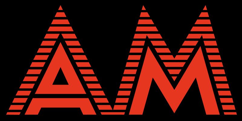
Serie 610 is an all-caps typeface with a striking feature: all letters and glyphs are divided into an upper black half and a lower white half on a black band. In keeping with the Art Deco tendency of the 1930s, the letterforms are based on straight lines and circles. Notable shapes are the round apex of A, the ‘horseshoe’ N, and the vertical tail of Q. Serie 610 was produced as a wood type by Xilografia Milanese (Milan) in the 1930s, and was released in several body sizes ranging from 3 to 40 lines (roughly 36–500 points). We know that the company also manufactured typecases, miniature cabinets (containing cases of different designs of type) and other items for printers. We don’t know when the company was founded, but it advertised in the famous Campo Grafico magazine from 1936 onwards, and closed its offices in 1968. The typeface was offered along with angled, rounded, arrowed, and forked pieces of the band to be placed at the beginning and end of titles of one or a few words. These special sorts – an idea picked up from decorative styles successfully purveyed by 19th-century typefounders – have been reproduced in the digital revival and are available through OpenType features. ‘The AM Serie 610 digital revival – assures the designer, Riccardo Olocco – is very true to the original, with virtually no modified letterforms or glyphs. Each wood letter in the original Serie 610 was produced with a thin white vertical line on the left and right sides, so that a word set in this typeface would have had a thin line between each letter. The repetition of these thin lines creates a kind of visual Larsen effect in the digital environment, and so the letters of AM Serie 610 are now all connected without lines between them. However, a version of the letters with white lines has been included as a stylistic set which can be activated via OpenType features.’ OpenType Features: ss01 – White lines between characters ss02 – Front and end pieces = (e); >e<; \e/; «e»
display
art deco
geometric

0123456789
Explore AM Sirte designed by Fabrizio Falcone at Adobe Fonts.
sans-serif
job-fair
modern
0123456789
Tirana is a condensed geometric sans with caps and lowercase. It is rich in colour, with a geometric flavour and sharp details. It has a large x-height, low contrast, and very open apertures. Some of the letterforms come from classic modernist lettering, such as the exceedingly open C and S, or the pointed A and N. However, the design is defined by its treatment of spurs and joints, which are either squared or closed at a sharp angle, and its lenticular and lemon-slice counters. Tirana was a wood type cut by Xilografia Italiana, a company operating at Badia Polesine (Veneto region, between Verona and Rovigo), most likely between 1938 and 1941. It was released in several body sizes ranging from 4 to 30 lines (roughly 50 and 380 points), and Xilografia Italiana also sold a slanted version of Tirana under the name of Corsica. The two original designs have been reunited as a family: Corsica, with its dramatic 20º slant, lives on as AM Tirana’s italic. Regarding references and models, the designer Leo Philp says: ‘I haven’t seen anything with Tirana and Corsica’s crowd of features before. Some can be found in other typefaces: the spurless n, m, u in Dax and its successors, the sharp join of bowl and stem is echoed (much less severely) in Cyrus Highsmith’s Relay. I haven’t seen the sharp, lenticular counters in a sanserif typeface, but I have seen similar forms in letters cut into wood with a router.’ ‘Many of my changes feel like necessary adjustments for a wood type's translation into a digital font,’ remarks Philp of the AM Tirana digital revival. ‘I made optical corrections, the weight of upper and lowercase characters more consistent, and gently harmonised them and the shapes within them. Tirana’s terminals, sometimes oblique, sometimes sheared, were made more systematic, and some characters were redrawn.’ Most of AM Tirana’s OpenType features are derived from their wood type source. For tightly leaded all-caps settings, there are raised dashes, guillemets, @, and more compact parentheses. Stylistic sets preserve alternate characters originally available with the type: the large-countered 6 and 9 and the more conventional ‘closed’ C and G (to which a companion lowercase c has been added); the original ampersand has been kept. To these alternates have been added rounded variants of the u, m and w. OpenType Features: Case sensitive dashes, parentheses, guillemets and @ ss01 – Closing C, G, c ss02 – Round bottomed u ss03 – Rounded m, w ss04 – Original alt 6, 9 ss05 – Original ampersand
sans-serif
wood-type
geometric
0123456789
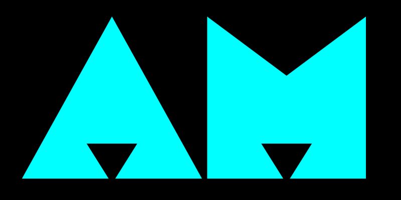
Tripoli is a dark, uppercase sanserif with a strong expressionist feel. Its geometric letterforms feature slightly flattened arches, tiny counters and sharp edges as well as the peculiar sharp triangular shapes in the central strokes of E and F. Some arches have been replaced by curved strokes that become abrupt sharp angles, such as in S and the figure 3. Tripoli was produced as a wood type by Xilografia Italiana (based in Badia Polesine, between Verona and Rovigo), probably shortly after 1934, when the company was founded. We can assume this from the historical context, as Tripoli is the capital of Libya, and Mussolini instigated large-scale immigration of Italian settlers to Libya in the early 1930s (after a war against local insurgents in which Italian troops committed several war crimes). The overall effect is as if Tripoli’s letters were made with hand-held cutting tools; they convey an idea of the ‘unpremeditated and accidental’ as Walter Tracy described Rudolf Koch’s Neuland, or rather the style of lettering that Neuland exemplifies. Neuland was most likely influenced by Viennese artists such as Oskar Kokoschka, with their bold expressionist paper-cut letters. This was a popular style for poster lettering throughout Central Europe in the early decades of the 20th century, and it is the style on which Tripoli was designed. True to the original, the AM Tripoli digital revival features characters that have been carefully rectified and fine-tuned. As its designer Alessandro Bombieri explains, ‘In addition to making necessary visual improvements, many of the “flaws” in the original outlines have been rationalised to ensure they are visible in the digital environment without being obtrusive or distracting. Letter spacing has been improved and tightened to align with contemporary typesetting standards.’
sans
wood-type
bauhaus
0123456789
Udine is an all-caps, modular sanserif that shows clear Art Deco influences in its narrow proportions and geometric shapes. This type design is very similar to Neon, one of Nebiolo’s most iconic typefaces. In fact, it is similar to the point that we would be talking about plagiarism if they had not been created within the same company. Udine was produced as a wood type by the Nebiolo company in Turin. It first appeared in a 1933 catalogue in five sizes, from 8 to 40 lines (roughly from 100 to 500 points). Letters H and O are the basic modular shapes used to construct the entire alphabet. Almost every letter has the same width, with counters that create a predictable, regular pattern. A few letters such as A, B, E, G, H, K, P and R display horizontal strokes that extend leftwards. This feature, along with the low barycentre of all letters with central strokes, is part of the Art Deco vocabulary. The resemblance to Neon is so striking that it is likely that Udine was the first attempt at a modular typeface which, after further development, became the Neon family. Giulio Da Milano and Alessandro Butti, the former as an art director and the latter as a draftsman, are no doubt the designers of this type (though reducing Butti’s contribution to preparing the pattern drawing for production probably does little justice to him). After the Second World War, the production of wood-type Neon made Udine redundant, and it disappeared from Nebiolo’s catalogues. AM Udine digital revival reflects the original with great accuracy. ‘Some details – says the designer Michele Patanè – have been revised for optimal performance in the digital environment. Firstly, the distinctive monolinear strokes of the original model have been fine-tuned by reducing the horizontal strokes by a few units. Secondly, slight adjustments were made to the curves and the transitions between curves and straight lines, and the typeface’s modular appearance was also carefully crafted to avoid the impression of basic geometric shapes glued together. All of this compensates for the unevenness perceived when looking at the letters on screen, while retaining a sense of analog stiffness that is part of the personality of the original typeface.’ The original Udine was offered along with a negative version, in which each character is set in a black rectangle, and with decorative pieces to be placed at the beginning and end of titles of one or a few words. These features are available in AM Udine digital revival through OpenType features. OpenType Features: ss01 – Negative shapes + front and end pieces = ))e((; }}e{{ ss02 – Alternative @ ss03 – Original ampersand ss04 – 2nd alternative ampersand
display
foundry
commercial
0123456789
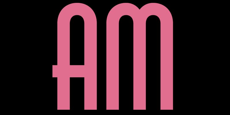
Arzachel is a humanist sanserif with a big x-height and a clear organic look. It’s an all-rounder that works very nicely with texts for publishers and advertisers, conceived to accompany Zenon.
sans-serif
foundry
commercial

0123456789
Brevier, a compact sans, is lean and rhythmical, designed to be used at less than 8 points (Brevier was the old typefounders’ name for 8-pt type), it holds up well under adverse printing conditions.
sans-serif
foundry
commercial
0123456789
Explore Cemer designed by Michele Galluzzo at Adobe Fonts.
sans-serif
foundry
commercial
0123456789
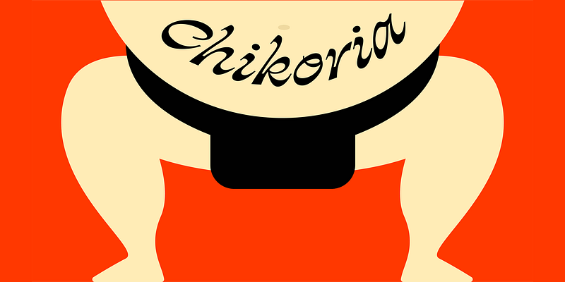
Chikoria has several extraordinary features, the most eye-catching of which is the inverted thick/thin contrast. Unlike the Renaissance Chancery italics, here the imaginary flat nib has various angles with the letters showing thick parts top and bottom instead of left and right. Letters a, g and f (with a descender) cling to the italic tradition, but Chikoria’s slant is much greater than Chancery italics.
script
foundry
commercial
0123456789
Dic Sans is a square sans serif available in many weights. It looks good on screen and in print. Inspiration came from Novarese’s Eurostile, with wide apertures and a less geometric design.
sans-serif
foundry
commercial

0123456789
Divenire is a sans with an organic quality and a highly individual personality. It has squarish letterforms, horizontal terminations, angular junctures, variations of stem widths.
sans-serif
foundry
commercial

0123456789
Explore Divenire Mono available at Adobe Fonts.
mono
foundry
commercial
0123456789
Ernst is an elegant but playful slab serif which harks back to some peculiar early 20th-century types but responds to contemporary demands by offering a wide range of applications. Not properly a revival, Ernst blends type details from avant-garde faces such as Ernst Deutsch/Dryden’s Tango and Georg Belwe’s Belwe Antiqua. Its pronounced and frisky details make it a strong candidate for display work, while the big x-height, its design rigour and consistency of proportions also make it suitable for long texts.
serif
foundry
commercial
0123456789
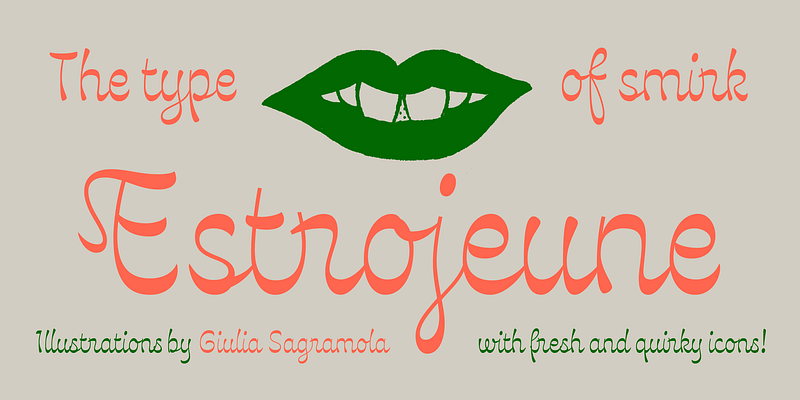
Explore Estrojeune designed by Valentina Casali at Adobe Fonts.
script
foundry
commercial
0123456789
Gil Modern is a distinctive low-contrast display typeface featuring Lombardic capitals and rounded lowercase letters also suitable for small-size typesetting. Inspiration came from a medieval parody developed within the context of the Catalan Art Nouveau movement
serif
foundry
commercial
Scroll to load more