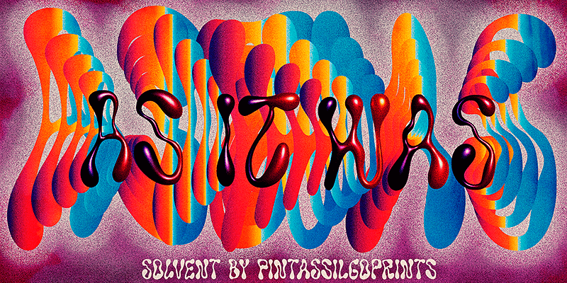
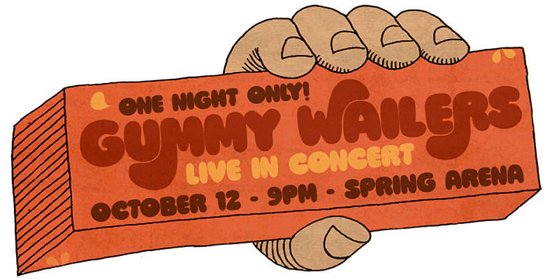
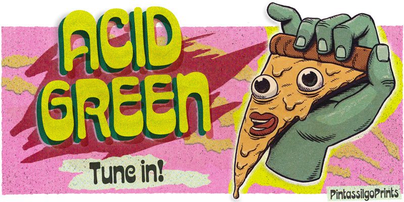
Acid Green is a display typeface with psychedelic flair. Its roots date back to 1914, from an unnamed alphabet by J.M. Bergling, a jewelry engraver and “letterform inventor” whose books on art alphabets and lettering influenced countless artists, including those involved with the genesis of Art Nouveau and Art Deco movements. Perfect for display use when your aim is for retro design or trippy letters. Acid Green has an extensive character set and stylistic alternates for extra grooviness.
PintassilgoPrints
Allotropic is a decorative display face with remarkable Art Nouveau flair. It loosely draws inspiration from a 1914 untitled alphabet from J.M. Bergling’s “Modern Alphabet” and its interpretation by Photo-Lettering from the sixties. It’s a decidedly fab choice not only for vintage and retro designs, but also for creatively contemporary uses in print and on screen. Use it on book covers, packaging, branding, editorial, web, advertising, and apparel! Give Allotropic a go, let the inspiration flow!
Explore Ars Nova designed by Erica Jung, Ricardo Marcin at Adobe Fonts.
Brush Up is the cool handpainted typeface you are looking for. Swiftly painted on paper and carefully translated into a font, it brings 3 glyphs for each letter and 2 for each number, plus variations for some punctuation marks. The font is nicely programmed to cycle these alternate glyphs when Contextual Alternates engines of applications are turned on. Or, you can always pick up your choices manually through a glyphs palette. Either way it will certainly turn out refreshing! Surprisingly versatile, Brush Up is available in two cuts – upright and oblique – and will greatly fit tons of purposes. Is it a headline? A small chunk of text? Maybe not that small? Ok, just Brush'em all!
Freely hand-painted with a flat brush, this font conveys spontaneity both through its typeface design and the numerous alternates it delivers. There are four different glyphs for each lower and uppercase letter and two variations for figures (and yet some punctuation marks). All these alternates are programmed to easily cycle at the click of a button - yes, the absolutely amazing Contextual Alternates one. Brushtones, a bold brush font, nice and handy, just perfect to color your message. Give it a
Chorine is retro and comfy. It’s great for vintage, nostalgic and psychedelic pieces yet also for creative contemporary designs. Chorine sounds sixties, sounds seventies and sounds perfectly now. Play it!
Explore Crayonize designed by Erica Jung, Ricardo Marcin at Adobe Fonts.
Explore Devils Haircut designed by Erica Jung, Ricardo Marcin at Adobe Fonts.
Grante is a uniquely dramatic typeface that breaks the mold of what a sans might be. Rectangular with selectively round corners, it is unapologetically bold. But then you turn on the OpenType features, and suddenly, you have impossibly cool word shapes that would catch the eye of anyone passing by. It is worth mentioning that even without OpenType tricks it is possible to use these ligatures, setting them 'by hand'. Dingbats included!
Lunatique is a highly decorative typeface inspired by the Lucky typeface, designed in 1972 by André Pless for the Mecanorma permanent type contest. The style was later released as Letterpress transfer sheets. These digital versions will be way easier to use. Packaging, posters, book covers, and other applications are endless. Lunatique is available in three widths, with some alternates, too. It has quite a seventies flair, right? Give them a go and make your text shine!
Explore Marker Aid designed by Erica Jung, Ricardo Marcin at Adobe Fonts.
Explore Mudstone Sans designed by Erica Jung, Ricardo Marcin at Adobe Fonts.
Explore Pain de Mie designed by Erica Jung, Ricardo Marcin at Adobe Fonts.
Explore Roadway designed by Erica Jung, Ricardo Marcin at Adobe Fonts.
Explore Salted designed by Erica Jung, Ricardo Marcin at Adobe Fonts.
Explore Solvent designed by Erica Jung, Ricardo Marcin at Adobe Fonts.
Explore Ziclets designed by Erica Jung, Ricardo Marcin at Adobe Fonts.


