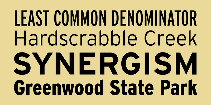
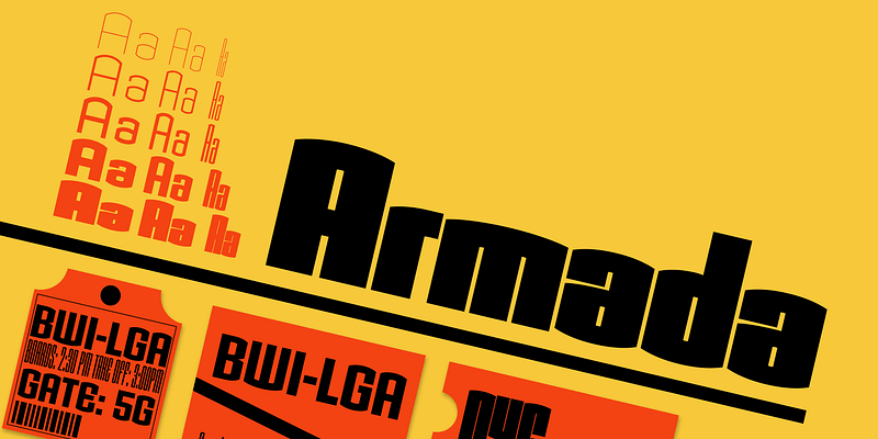
Tobias Frere-Jones began Armada in 1987. An experiment in algorithmic design, Armada follows the verticals and flat arches so often to be found in the architectural geometry of cast iron and brickwork in 19th-century American cityscapes. All of the weights and widths of Armada were drawn by Frere-Jones, offering a full display series of remarkable richness, all variations in a truly architectural theme & discipline.
Frere-Jones Type
Who hasn’t admired the energy of Antique Olive Nord? All other ultrabolds seem sluggish in comparison. Nord exudes Roger Excoffon’s animation and Gallic impatience with the rules. Tobias Frere-Jones cross-bred the weight, proportion, and rhythms of Nord with the casual grace of his own Cafeteria, gaining informality and a dancing vitality on the page. In his words, Asphalt swings with “a lively, if faintly inebriated gyration”.
The irregularities normally found in handwriting can also enliven sans serif letterforms. In Cafeteria, Tobias Frere-Jones took special care to balance activity with legibility, drawing a freeform sans serif that is condensed but in no way stiff.
In the condensed styles of most geometric slab serifs, weak ovals replace the powerful circular forms. In Citadel, Tobias Frere-Jones follows a stronger alternative, substituting straight strokes for the curved sides of round characters. Flat horizontal curves play against the variety of serifs, in counterpoint to the repeating rhythm of verticals. In the Inline style, the stripe adds to that rhythm, creating a typeface that offers a powerful and stylish geometry.
Drawn around 1880 at the Boston Type Foundry, Epitaph combined slow curves with a boxy sure-footed profile. Its noisy theatrics caught Tobias Frere-Jones’ eye, who created this digital revival. Starting with a handful of alternates from the original, he also built a complete second alphabet, offered alongside the default.
Frere-Jones Type is an independent type design practice in New York City, founded and led by Tobias Frere-Jones. With twenty-six years of experience in print and digital environments, we create original typefaces for retail licensing and client commissions. We believe that type exists to solve problems, and beauty is always part of the solution.
In 1998, Tobias Frere-Jones designed Grand Central for 212 Associates from late-’20s capitals hand-painted on the walls of Grand Central Station. The design is a distinguished Beaux Arts descendant of the great French Oldstyle originated by Louis Perrin in Lyons in 1846, known across Europe as Elzevir and in the United States as De Vinne. Lettering from different areas was combined for Light; Bold was designed for more distant signs.
Designed by Chauncey Griffith in 1937 for use in telephone books, Bell Gothic was a proven workhorse for text sizes. Griffith Gothic revives and expands the design for use in headlines as well as text, adding multiple weights, plus an italic and a condensed range. Its dramatic thinning of joints, originally meant to anticipate ink spread, is continued as an expressive characteristic.
Hightower is a soft and inky take on the “Venetian” genre of text faces, which began with Nicholas Jenson’s roman of 1470. Hightower’s wide proportions and deep color were calibrated for small text sizes. Its organic forms and details also work well in headlines, adding complexity and subtlety.
Efficient and gruff, Interstate has become a favorite for branding, packaging, publications, and more. The family is a reinterpretation of Highway Gothic, which has been the official typeface for American highway signage for decades. Its design is ultimately based on signage alphabets developed in the late 1940s by Dr. Theodore Forbes, assisted by J.E. Penton and E.E. Radek.
Efficient and gruff, Interstate has become a favorite for branding, packaging, publications, and more. The family is a reinterpretation of Highway Gothic, which has been the official typeface for American highway signage for decades. Its design is ultimately based on signage alphabets developed in the late 1940s by Dr. Theodore Forbes, assisted by J.E. Penton and E.E. Radek. The family was expanded to include full support for Central and Eastern Europe languages, as well as Cyrillic and Greek.
For additional license options like app and enterprise, visit Interstate Pi on [Type Network](https://store.typenetwork.com/foundry/guyjeffreynelson/fonts/interstate-pi).
While not a revival in the strictest sense of the word, Niagara recalls the crisp, elegant geometry found in some of the best American styles from the 1930s and 1940s. The four condensed weights were designed by Tobias Frere-Jones, who found inspiration in the straight-sided geometric fonts from that era. With its mixture of weights, and Engraved styles, Niagara offers the typographer unusual opportunities.
Nobel offers personal variations on strict Bauhaus geometry. In 1929, only two years after the Futura release, Sjoerd Hendrik de Roos at Amsterdam Typefoundry explored alternative character sets to enliven basic geometric forms and produced a best-selling typeface in Nobel. Font Bureau’s Nobel series was designed by Tobias Frere-Jones, who fondly views Nobel as “Futura cooked in dirty pots and pans.” The Extra Lights were added by Cyrus Highsmith and Dyana Weissman.
Sitting in a Paris cafe with a bottle of beer, Tobias Frere-Jones gave his attention to the label. It was set in a roman design wearing blackletter-like clothes, probably to suggest an origin in Alsace or points to the East. Unable to forget the design, with its blocky, straight line emphasis, Tobias designed Pilsner, an exercise in straight lines in an angle-centered scheme. Pilsner offers a truly adventurous typographic texture.
Loose and angular, this typeface was originally designed by Imre Reiner for the Amsterdam Typefoundry in 1951. Attracted by its free-form structure and unique texture, Tobias Frere-Jones revived the original design from handset proofs in 1993 and designed a new boldface to accompany it. Following Reiner’s personal style of calligraphy, over twenty ligatures were added to each weight for flexibility and variety in headlines.


