DJR

24 fonts
Bradley DJR

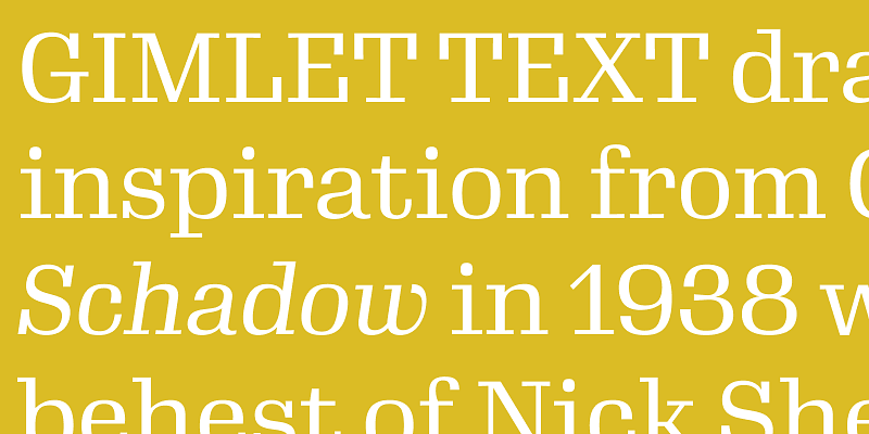
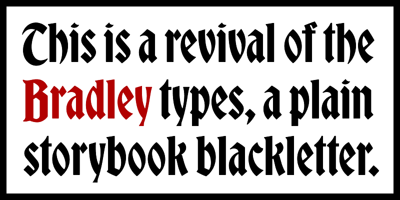
Bradley DJR is a revival of Bradley, a typeface released by American Type Founders in 1895. It is based on Will H. Bradley’s cover for the Christmas edition of The Inland Printer magazine, and most records show that it was Hermann Ihlenburg who completed the typeface design. Its simplified forms make it more accessible to readers who aren’t accustomed to blackletter, and this revival seeks to preserve its softness, descending capital letters, and distinctive storybook character. [DJR's article about Bradley DJR](https://djr.com/notes/bradley-djr-font-of-the-month) For additional license options like app, enterprise, multi-user, and self-hosted web, visit [Bradley on Type Network](https://store.typenetwork.com/foundry/djr/fonts/bradley-djr).

blackletter
foundry
commercial
Condor
0123456789

​​Prompted initially by commercial lettering and landmarks of the ’20s and ’30s, David Jonathan Ross fused a high-contrast style with a rationalized structure of flattened curves and wide-open apertures to devise this glimmering sans-serif family with slight Deco undertones. Condor has an unusually broad wingspan: from taut, compact weights that flaunt their athletic energy to bright, airy styles that radiate luxuriously. For additional license options like app and enterprise, visit Condor on [Type Network](https://store.typenetwork.com/foundry/djr/fonts/condor).

sans-serif
foundry
commercial
Crayonette DJR

Crayonette DJR is a revival of Crayonette, a typeface designed by Henry Brehmer and first issued by Philadelphia’s Keystone Type Foundry. Until now, this typeface has survived without a digital interpretation that does it justice. This delightfully quirky italic features horizontal stress, luxurious curves, and oversize swash capitals. Crayonette DJR retains the key features and proportions of the original but improves its spacing and tames a few of the wilder letterforms. [DJR's article about Crayonette DJR](https://djr.com/notes/crayonette-djr-font-of-the-month) For additional license options like app, enterprise, multi-user, and self-hosted web, visit [Crayonette DJR on Type Network](https://store.typenetwork.com/foundry/djr/fonts/crayonette-djr).

display
foundry
commercial
Fit
0123456789

Fit is a hyper-stylized series of caps designed with one thing in mind: filling up space with maximum impact. With an expansive range of widths, Fit will take just about any text and fit it into just about any space. From the impossibly narrow Skyline to the gargantuan Ultra Extended, you will find a family rich in panache and expressive potential. DJR, 2017. For additional license options like app and enterprise, visit Fit on [Type Network](https://store.typenetwork.com/foundry/djr/fonts/fit).

display
foundry
commercial
Forma DJR Banner

Forma DJR is a revival of Aldo Novarese’s late mid-century neo-grotesque for the Italian Nebiolo foundry. Working together with Roger Black and Indra Kupferschmid, David Jonathan Ross studied the original metal type and interpreted the design as a large family with optical sizes, rounded corners, and tapering stems. The weight range was later pushed to Hairline and Black extremes and reimagined as a variable designspace, with contributions from Ruggero Magrì. [Forma Brochure](https://www.typenetwork.com/brochure/forma) For additional license options like app and enterprise, visit Forma DJR Deck on [Type Network](https://store.typenetwork.com/foundry/djr/fonts/forma-djr-banner).

sans-serif
foundry
commercial
Forma DJR Deck

Forma DJR is a revival of Aldo Novarese’s late mid-century neo-grotesque for the Italian Nebiolo foundry. Working together with Roger Black and Indra Kupferschmid, David Jonathan Ross studied the original metal type and interpreted the design as a large family with optical sizes, rounded corners, and tapering stems. The weight range was later pushed to Hairline and Black extremes and reimagined as a variable designspace, with contributions from Ruggero Magrì. [Forma Brochure](https://www.typenetwork.com/brochure/forma) For additional license options like app and enterprise, visit Forma DJR Deck on [Type Network](https://store.typenetwork.com/foundry/djr/fonts/forma-djr-deck).

sans-serif
foundry
commercial
Forma DJR Display

Forma DJR is a revival of Aldo Novarese’s late mid-century neo-grotesque for the Italian Nebiolo foundry. Working together with Roger Black and Indra Kupferschmid, David Jonathan Ross studied the original metal type and interpreted the design as a large family with optical sizes, rounded corners, and tapering stems. The weight range was later pushed to Hairline and Black extremes and reimagined as a variable designspace, with contributions from Ruggero Magrì. [Forma Brochure](https://www.typenetwork.com/brochure/forma) For additional license options like app and enterprise, visit Forma DJR Display on [Type Network](https://store.typenetwork.com/foundry/djr/fonts/forma-djr-display).

sans-serif
foundry
commercial
Forma DJR Micro

Forma DJR is a revival of Aldo Novarese’s late mid-century neo-grotesque for the Italian Nebiolo foundry. Working together with Roger Black and Indra Kupferschmid, David Jonathan Ross studied the original metal type and interpreted the design as a large family with optical sizes, rounded corners, and tapering stems. The weight range was later pushed to Hairline and Black extremes and reimagined as a variable designspace, with contributions from Ruggero Magrì. [Forma Brochure](https://www.typenetwork.com/brochure/forma) For additional license options like app and enterprise, visit Forma DJR Micro on [Type Network](https://store.typenetwork.com/foundry/djr/fonts/forma-djr-micro).

sans-serif
foundry
commercial
Forma DJR Mono

In Forma DJR Mono, Ruggero Magrì has taken David Jonathan Ross’s revival of the classic neo-grot from Nebiolo and brought it in harmony with the limitations of the monospaced grid. On its own, it excels at conveying technical data with clarity and poise; paired with its proportional cousin, it is the perfect option for charts, graphs, and tabular data. It strikes a distinctive tone, preserving the warmth of Forma DJR with inky, rounded corners, while never making you feel like it was produced by a typewriter. For additional license options like app, enterprise, multi-user, and self-hosted web, visit [Forma DJR Mono on Type Network](https://store.typenetwork.com/foundry/djr/fonts/forma-djr-mono).

mono
foundry
commercial
Forma DJR Text

Forma DJR is a revival of Aldo Novarese’s late mid-century neo-grotesque for the Italian Nebiolo foundry. Working together with Roger Black and Indra Kupferschmid, David Jonathan Ross studied the original metal type and interpreted the design as a large family with optical sizes, rounded corners, and tapering stems. The weight range was later pushed to Hairline and Black extremes and reimagined as a variable designspace, with contributions from Ruggero Magrì. [Forma Brochure](https://www.typenetwork.com/brochure/forma) For additional license options like app and enterprise, visit Forma DJR Text on [Type Network](https://store.typenetwork.com/foundry/djr/fonts/forma-djr-text).

sans-serif
foundry
commercial
Gimlet Display

Gimlet draws its inspiration from Georg Trump’s 1938 typeface, Schadow. At the behest of Nick Sherman, David Jonathan Ross reimagined the oddball serif as an energetic contemporary workhorse, complete with three optical sizes and a flexible set of widths tailored for responsive layouts. A multifaceted series that speaks with a singular voice, Gimlet is a rare find: a typeface that is as funky as it is functional. For additional license options like app and enterprise, visit Gimlet Display on [Type Network](https://store.typenetwork.com/foundry/djr/fonts/gimlet-display).

serif
foundry
commercial
Gimlet Micro

Gimlet draws its inspiration from Georg Trump’s 1938 typeface, Schadow. At the behest of Nick Sherman, David Jonathan Ross reimagined the oddball serif as an energetic contemporary workhorse, complete with three optical sizes and a flexible set of widths tailored for responsive layouts. A multifaceted series that speaks with a singular voice, Gimlet is a rare find: a typeface that is as funky as it is functional. For additional license options like app and enterprise, visit Gimlet Micro on [Type Network](https://store.typenetwork.com/foundry/cartercone/fonts/big-moore).

serif
foundry
commercial
Gimlet Text

Gimlet draws its inspiration from Georg Trump’s 1938 typeface, Schadow. At the behest of Nick Sherman, David Jonathan Ross reimagined the oddball serif as an energetic contemporary workhorse, complete with three optical sizes and a flexible set of widths tailored for responsive layouts. A multifaceted series that speaks with a singular voice, Gimlet is a rare find: a typeface that is as funky as it is functional. For additional license options like app and enterprise, visit Gimlet Text on [Type Network](https://store.typenetwork.com/foundry/djr/fonts/gimlet-text).

serif
foundry
commercial
Glyptic DJR

Glyptic DJR revives Herman Ihlenburg’s Glyptic, a decorative Victorian serif designed in 1878 and issued by MacKellar, Smiths & Jordan. My interpretation leans into the frenzied energy of the design, emphasizing the angularity of the wedges and vertical serifs, and then contrasting them against delicate spirals and curlicues. The spacing is tight—optimized for contemporary use. This revival also adds a Uncial-inspired lowercase, lining figures, and borders, none of which were present in the original design. For additional license options like app, enterprise, multi-user, and self-hosted web, visit [Glyptic DJR on Type Network](https://store.typenetwork.com/foundry/djr/fonts/glyptic-djr).

display
foundry
commercial
Input Mono

Like many programmers, David Jonathan Ross had used monospaced fonts for his code. That was before he questioned the convention and answered with a fresh approach for data and programming aesthetics. Input finds inspiration in early computer consoles but looks towards a typographically rich future, where coding environments overcome technical limitations and allow you to have full control over your display. For additional license options like app and enterprise, visit Input Mono on [Type Network](https://store.typenetwork.com/foundry/djr/fonts/input-mono).

mono
foundry
commercial
Input Sans

Like many programmers, David Jonathan Ross had used monospaced fonts for his code. That was before he questioned the convention and answered with a fresh approach for data and programming aesthetics. Input finds inspiration in early computer consoles but looks towards a typographically rich future, where coding environments overcome technical limitations and allow you to have full control over your display. For additional license options like app and enterprise, visit Input Sans on [Type Network](https://store.typenetwork.com/foundry/djr/fonts/input-sans).

sans-serif
foundry
commercial
Input Serif

Like many programmers, David Jonathan Ross had used monospaced fonts for his code. That was before he questioned the convention and answered with a fresh approach for data and programming aesthetics. Input finds inspiration in early computer consoles but looks towards a typographically rich future, where coding environments overcome technical limitations and allow you to have full control over your display. For additional license options like app and enterprise, visit Input Serif on [Type Network](https://store.typenetwork.com/foundry/djr/fonts/input-serif).

serif
foundry
commercial
Job Clarendon

Job Clarendon is an homage to ‘job printing’ and the Condensed Clarendons used in posters and flyers in the heyday of letterpress printing. A collaboration between David Jonathan Ross and Bethany Heck, this interpretation focuses on the style’s adaptability, taking it both thinner and heavier than most of its nineteenth-century exemplars dared to go. Throughout this expansive range, Job Clarendon maintains its dense charm, with chunky slab serifs, ample ball terminals, and square-terminal alternates. [DJR's article about Job Clarendon](https://djr.com/notes/job-clarendon-font-of-the-month) For additional license options like app, enterprise, multi-user, and self-hosted web, visit [Job Clarendon on Type Network](https://store.typenetwork.com/foundry/djr/fonts/job-clarendon).

slab-serif
foundry
commercial
Manicotti

Inspired by the boisterous wood types of the nineteenth century, Manicotti pushes the reversed-stress French Clarendon style to its decorative extreme. Its thick tops and bottoms and massive slab serifs create an oddly dense typographic texture that is reminiscent of Spaghetti Western films, rugged trails and rowdy saloons. For additional license options like app and enterprise, visit Manicotti on [Type Network](https://store.typenetwork.com/foundry/djr/fonts/manicotti).

display
foundry
commercial
Map Roman

Map Roman is an elegant set of titling capitals based on the lettering of MacDonald “Max” Gill, whose work included a variety of beautifully handlettered maps of London, the United Kingdom, and the world. After stumbling upon his work in a cartography museum, DJR tried his hand at a typographical interpretation of his style that attempts to capture the liveliness and authority of his letterforms. Map Roman distinguishes itself in its flexibility: at its widest, it is broad and luxuriant, while its narrower widths retain their charm even as they cram into the tightest of spaces. [DJR's article about Map Roman](https://djr.com/notes/map-roman-font-of-the-month) For additional license options like app, enterprise, multi-user, and self-hosted web, visit [Map Roman on Type Network](https://store.typenetwork.com/foundry/djr/fonts/map-roman).

serif
foundry
commercial
Megabase

Megabase is a display gothic with strong horizontal stress inspired by the clunkiness of 19th-century gothics like Gothic Bold and the space-age funkiness of 1970s designs such as Aldo Novarese’s Sintex and Bob Newman’s Zipper. Megabase goes beyond its forebears in emphasizing its horizontality; while most typefaces strive for an even typographic color, Megabase embraces its unevenness, allowing topheavy, bottomheavy, and diagonal forms to stick out like sore thumbs. The typeface offers several variants of especially disruptive letters, allowing the designer to calibrate these interruptions. For additional license options like app, enterprise, multi-user, and self-hosted web, visit [Megabase](https://store.typenetwork.com/foundry/djr/fonts/megabase) on Type Network.

sans-serif
foundry
commercial
Megavolt

Megavolt is a broad sans serif with no curves. Instead, it relies on an intricate network of trapezoids and 54° angles to communicate forcefulness, intensity, and motion. After beginning the typeface as a formal geometric exercise, I quickly learned that I needed to lean in to its sci-fi and metal connotations. The result is letterforms so severe and uncompromising that they challenge legibility, not to mention good taste! For additional license options like app, enterprise, multi-user, and self-hosted web, visit [Megavolt](https://store.typenetwork.com/foundry/djr/fonts/megavolt) on Type Network.

sans-serif
foundry
commercial
Megazoid

Megazoid celebrates the awkwardness of raw geometry. With little in the way of fine-tuning or optical compensation, it mashes blocky rectangles together with circular counterforms to create striking abstract shapes. Asymmetrical diagonals punctuate the design, adding a touch of unexpected dynamism. The result is a geometric sans that manages to feel just at home on a retro guitar amp as it would on a futuristic interstellar satellite. For additional license options like app, enterprise, multi-user, and self-hosted web, visit [Megazoid](https://store.typenetwork.com/foundry/djr/fonts/megazoid) on Type Network.

sans-serif
foundry
commercial