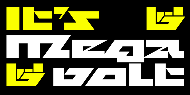
Megavolt is a broad sans serif with no curves. Instead, it relies on an intricate network of trapezoids and 54° angles to communicate forcefulness, intensity, and motion. After beginning the typeface as a formal geometric exercise, I quickly learned that I needed to lean in to its sci-fi and metal connotations. The result is letterforms so severe and uncompromising that they challenge legibility, not to mention good taste! For additional license options like app, enterprise, multi-user, and self-hosted web, visit [Megavolt](https://store.typenetwork.com/foundry/djr/fonts/megavolt) on Type Network.