0123456789
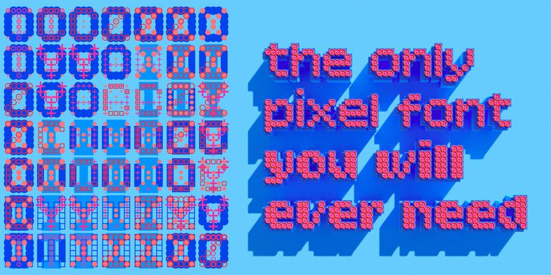
For additional license options like app and enterprise, visit Bitcount on [Type Network](https://store.typenetwork.com/foundry/typetr/fonts/bitcount).
display
foundry
commercial
For additional license options like app and enterprise, visit Bitcount on [Type Network](https://store.typenetwork.com/foundry/typetr/fonts/bitcount).

For additional license options like app and enterprise, visit Bitcount on [Type Network](https://store.typenetwork.com/foundry/typetr/fonts/bitcount).
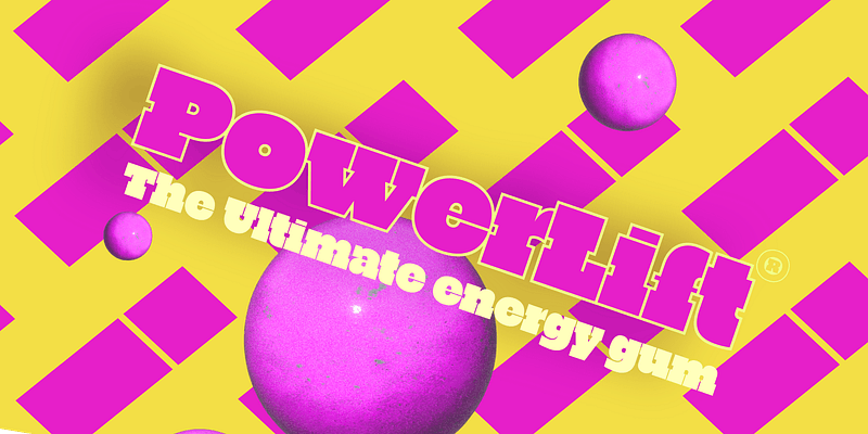
A fun departure from Petr van Blokland’s other types, PowerLift is a chunky, single-weight display slab that comes in two versions: Tight and Tight Outline. PowerLift embraces and rethinks the challenge of combining heavy letterforms with blocky serifs. In some places, apertures close up and the forms fold into themselves, creating surprising new counters where traditionally one would expect openings. The styles fit together seamlessly, but each can also be used as a standalone typeface. TYPETR, 2018. For additional license options like app and enterprise, visit Powerlift on [Type Network](https://store.typenetwork.com/foundry/typetr/fonts/powerlift).
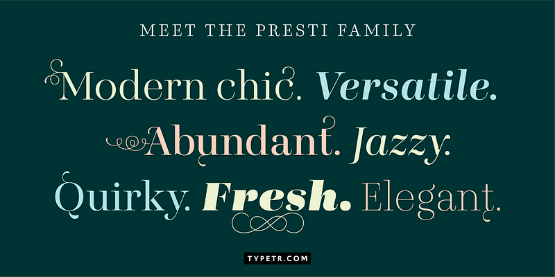
Presti is basically constructed as “expansion contrast," as written with a sharp-nib pencil. The classic appearance is emphasized by the many Open Type features (such as a choice of figures and small caps) and the extensive set of floating flourishes. These can be attached to most letters on eight different positions, two directions, and five sizes. In the Open Type stylistic set a range of predefined flourish settings can be selected, but the user can create any other combination using a simple set of codes. Presti comes in a wide range of weights, classic Roman, and romantic italic. For additional license options like app, enterprise, multi-user, and self-hosted web, visit [Presti on Type Network](https://typenetwork.com/type-foundries/typetr).
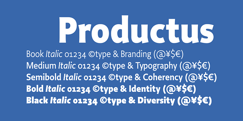
At the turn of the millennium, Petr van Blokland conceived Productus as the humanist sans serif companion to his prizewinning oldstyle Proforma. Van Blokland has shaped the pair of typefaces as an ideal vehicle for distinguished corporate design, capable of styling all imaginable documents. Small text sizes Both offer related distinction for headlines. Each supports the structure of the other. Font Bureau, 2000. For additional license options like app and enterprise, visit Productus on [Type Network](https://store.typenetwork.com/foundry/typetr/fonts/productus).
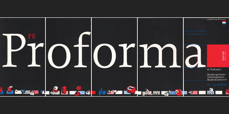
In the mid-1980s, Petr van Blokland designed Proforma for Purup, a leading Danish supplier of form systems. The design, whose oldstyle structure offers essential copyfit and legibility, led ATypI to award Van Blokland the Prix Charles Peignot for distinguished typographic achievement by a designer under the age of thirty-five. In 1995, Proforma was the only typeface nominated for the Rotterdam Design Award. With its matching sans serif companion Productus, Proforma delivers distinction in corporate design. Font Bureau, 1994. For additional license options like app and enterprise, visit Proforma on [Type Network](https://store.typenetwork.com/foundry/typetr/fonts/proforma).

Explore Responder P designed by Petr van Blokland at Adobe Fonts.