0123456789
sans-serif
foundry
commercial
Some of the most original type comes from small, independent foundries and solo designers rather than the big libraries. These are the indie typefaces in the Typedex catalog. Licensing direct usually means more of the work, and more of the money, goes straight to the people who made it.
Fonts flagged as independent releases, newest first · 60 fonts

Built on a single, fixed grid, an uncompromising framework designed to hold an entire typeface, Sector is the product of such an extremely restrictive design process: inspired by the logic of retro LCD displays, where simple segmented systems can express remarkably complex alphabets, this typeface is able to represent 700 glyphs, including diacritics, small caps, alternates, ligatures, fractions and more features with a single grid module, making it the most versatile and adaptable font in its admittedly narrow genre.

Neue Gstaad is a contemporary type family shaped by a distinctly Swiss sense of refinement, calm, confidence, and precision. It moves beyond regional clichés to embrace a broader, more universal expression of Swiss design: one rooted in clarity, discretion, and quiet sophistication. Loosely inspired by typographic giants, Neue Gstaad interprets its references with restraint.

PP Palma is a spritzy sans family of a dual geo-humanist nature. Designed for versatility, the typeface spans across the two genres, combining the best of both worlds. Palma is loosely inspired by the giants like Antique Olive, Johnston and Avenir, but treats the references lightheartedly, going for a different route with a flair.
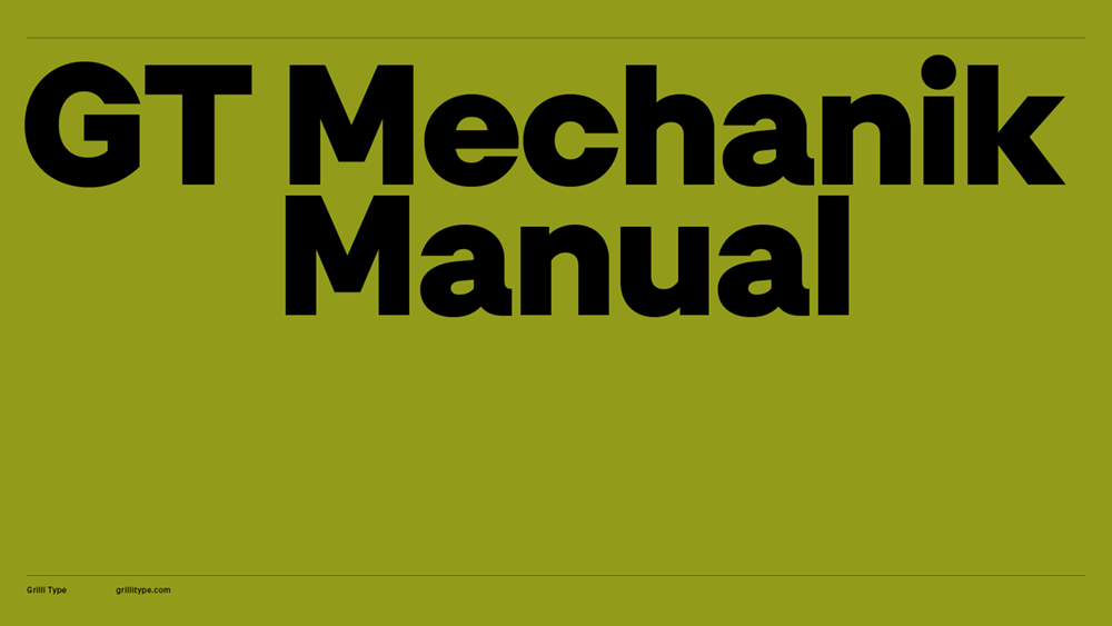
GT Mechanik dials in the appeal of electromechanical text systems by building an inevitable family around its monospace style. Idiosyncratic features that come with the restraints of mechanic typesetting become guiding principles along the tone axis. Mono, Text and Display, each follow that logic at a different scale and intensity.
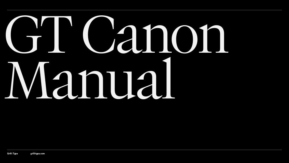
GT Canon’s design is pragmatic but not static: movement and liveliness are embedded in the letterforms. It is our answer to what our digital times require of a serif today. It’s what a contemporary serif should be in both form and function. Like its sans serif sibling, GT Standard, it aims for modern functionality rather than stylistic reinvention.

Gregory Text is your buddy for text and beyond. Down-to-earth and heartfelt, this contemporary bookish typeface is all about charming little quirks:…
Halvar Mono expands the Halvar universe by taking the next logical step: re-engineering Halvar’s constructed forms, raw charm and machine precision into a…

Includes x2 styles (Regular & Italic): A-Z, 0-9 + basic symbols.
Chairman Display is a calm neo-grotesque for tight headlines that let content lead. Rational in construction and economical in form, it reduces letterforms to their essentials without losing human warmth.
Drawing on typewriter faces built for tough printing conditions, Chairman Mono simplifies shapes and opens apertures to aid readability — for editorial use, and code.
Chairman Text is an industrious sans for small sizes. Shaped by strict functional demands, it lets expressive details surface, giving running text a quiet spark.
Chairman Semi-Mono preserves the feel of a typewriter while adjusting character widths for an even reading texture — a middle ground between proportional and mono.
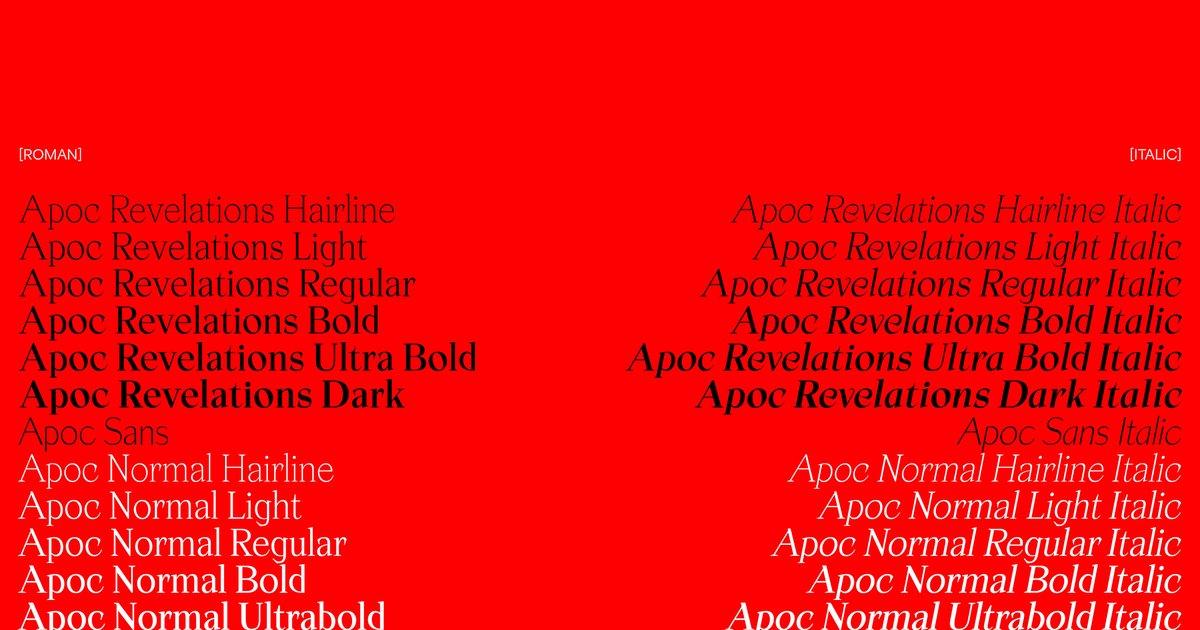
The most influencial standout font family of contemporary era. Apoc is chosen by thousand of designers worldwide to sharply design amazing projects.
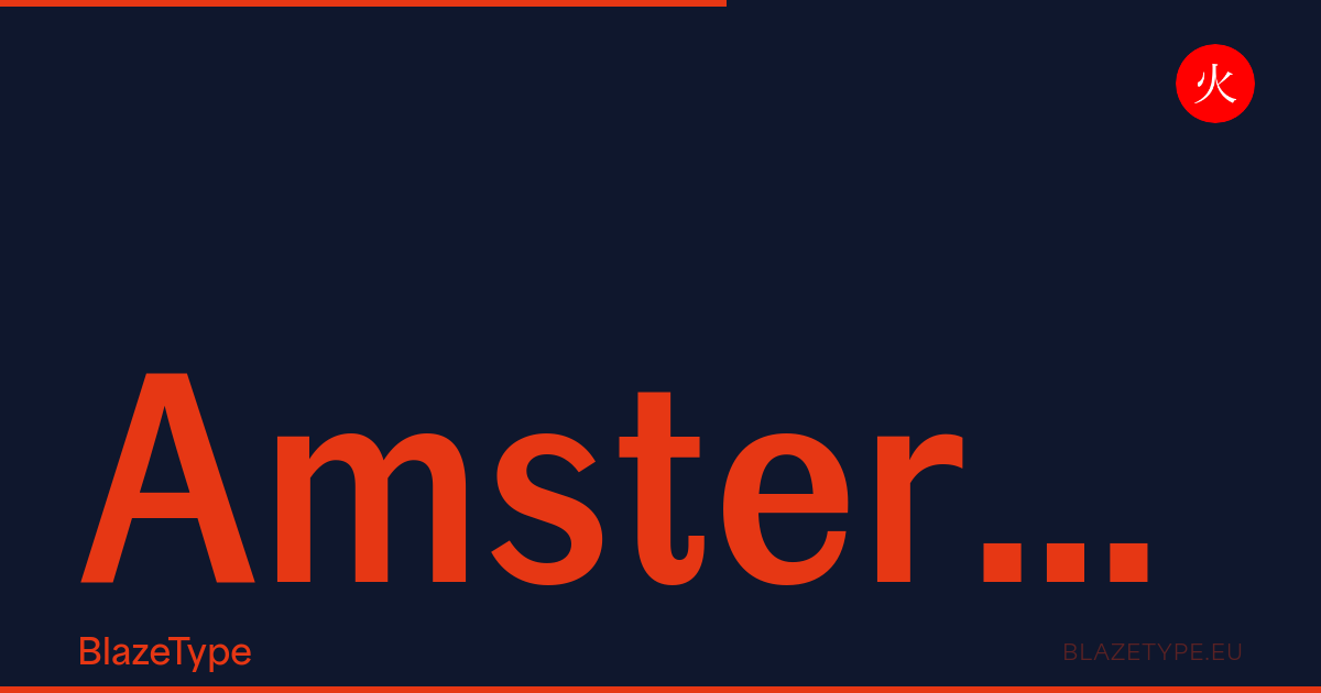
Amsterdam-Grotesk revives a wood type from a Brussels print workshop. Calligraphic grotesque with distinctive terminals, ideal for signage and branding. Free trial, licenses from 40€.
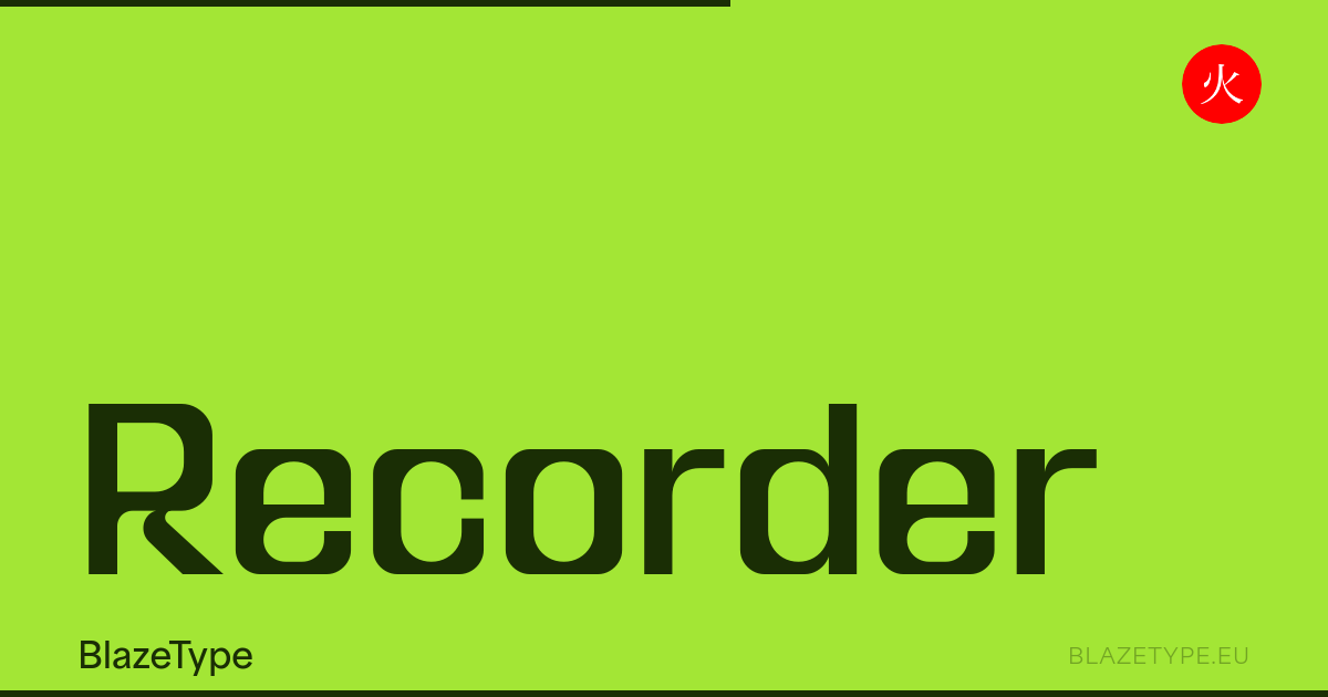
Recorder is a modern experimental variable sans-serif superfamily. Versatile font system for editorial, digital, and display typography. Free trial, licenses from 40€.
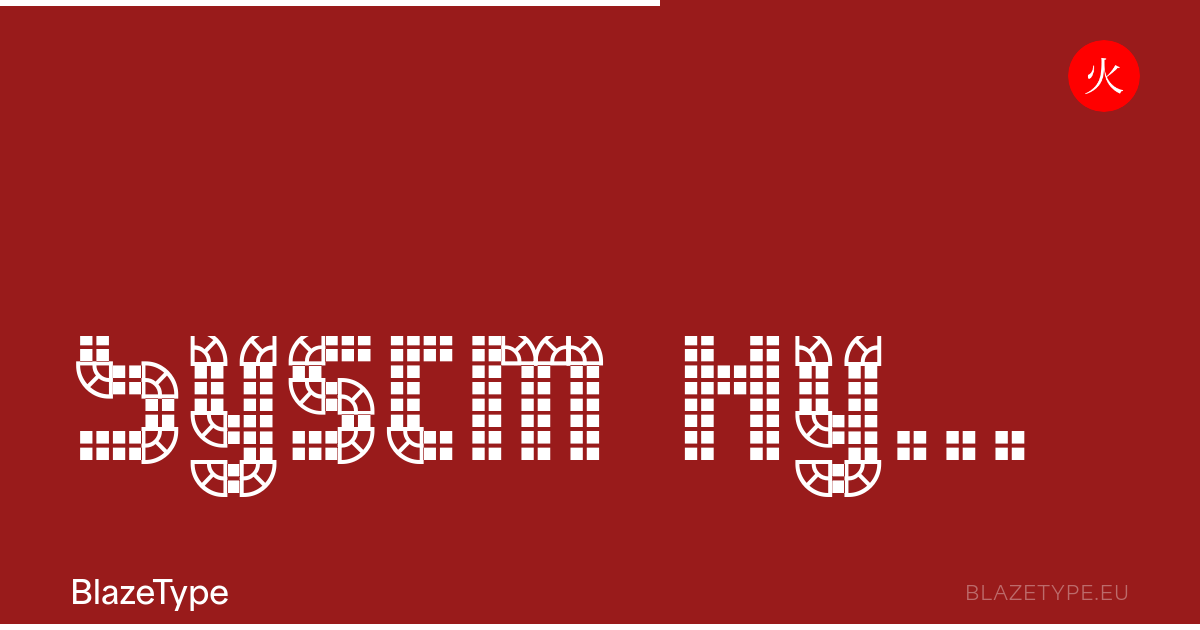
Systm Hybrid Reverse is a modular type family built from quadrants on a grid. Variable outline axis, 1,000+ glyphs, Latin and Cyrillic. Free trial, licenses from 40€.
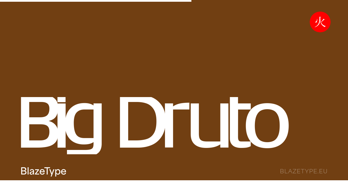
Big Druto is a structured variable sans-serif with timeless proportions. Clean forms, strong presence for headlines, branding, and editorial design. Free trial, licenses from 40€.
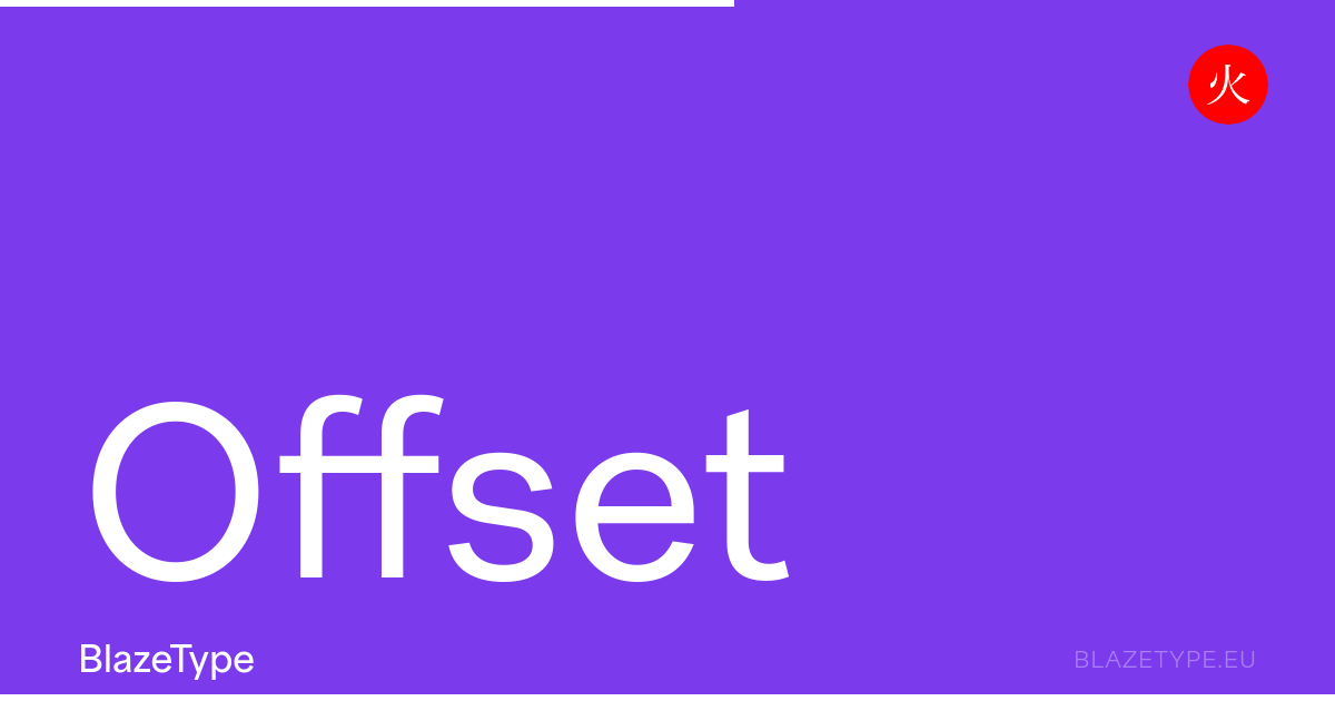
Offset is a variable sans-serif typeface with clean modern lines. Versatile font family for editorial, web, and branding design projects. Free trial, licenses from 40€.
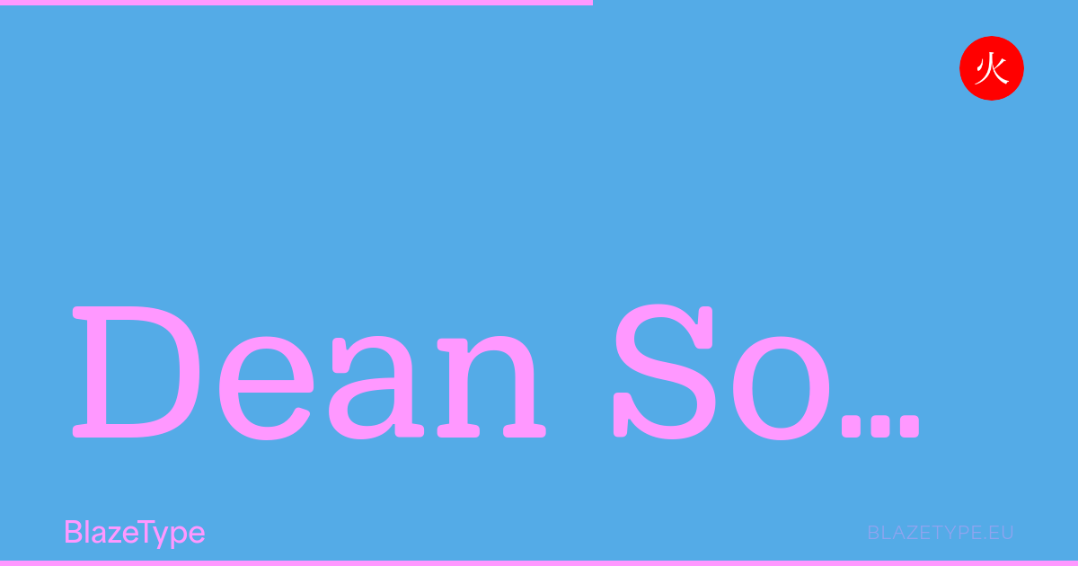
The Dean family is a vibrant tribute to the musical and cinematic culture of mid-20th century America. These typefaces, rooted in the legacy of wood types and period posters, reflect an era of intense creativity when design served as the voice of a culture in full swing. With its four subfamilies, Gothic, Slab, Soft and Soft Slab, and a total of 400 styles, Dean is far more than just a typeface, it’s a creative tool that transcends time and usage, paying homage to the energy and freedom of a pivotal moment in American cultural history. With its rounded structure and sturdy serifs, Dean Soft Slab brings a distinctive balance of warmth and strength to the family. Its softened angles meet confident slab forms, creating a typeface that feels both approachable and grounded. Blending playfulness with a certain typographic solidity, it reinterprets mid-century aesthetics with a gentle yet assertive voice. For a more fluid and relaxed expression, explore Dean Soft, which embraces softness through its smooth, friendly curves.
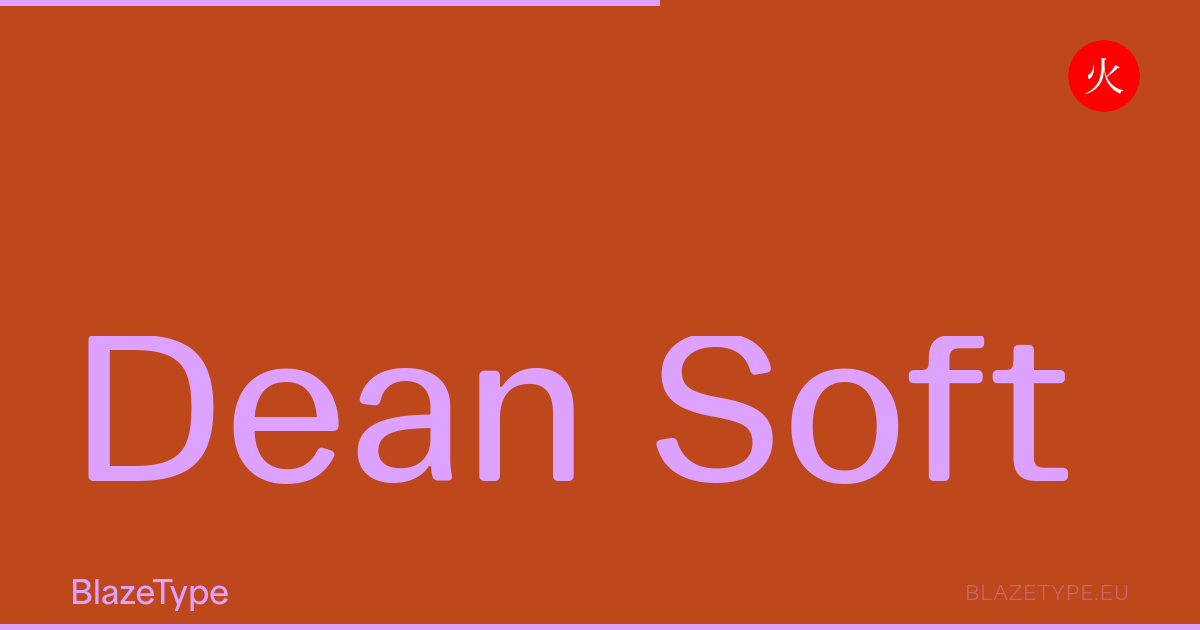
The Dean family is a vibrant tribute to the musical and cinematic culture of mid-20th century America. These typefaces, rooted in the legacy of wood types and period posters, reflect an era of intense creativity when design served as the voice of a culture in full swing. With its four subfamilies, Gothic, Slab, Soft and Soft Slab, and a total of 400 styles, Dean is far more than just a typeface, it’s a creative tool that transcends time and usage, paying homage to the energy and freedom of a pivotal moment in American cultural history. With its smooth, rounded contours, Dean Soft introduces a warmer and more approachable tone to the family. Its softened angles bring a sense of friendliness and ease, while still preserving the distinctive character and structure of Dean. Balancing playfulness with clarity, it offers a more relaxed interpretation of mid-century typographic forms—one that feels both nostalgic and refreshingly contemporary. For a complementary design with a strong visual impact, explore Dean Soft Slab, which combines gentle curves with sturdy serifs for a uniquely expressive voice.
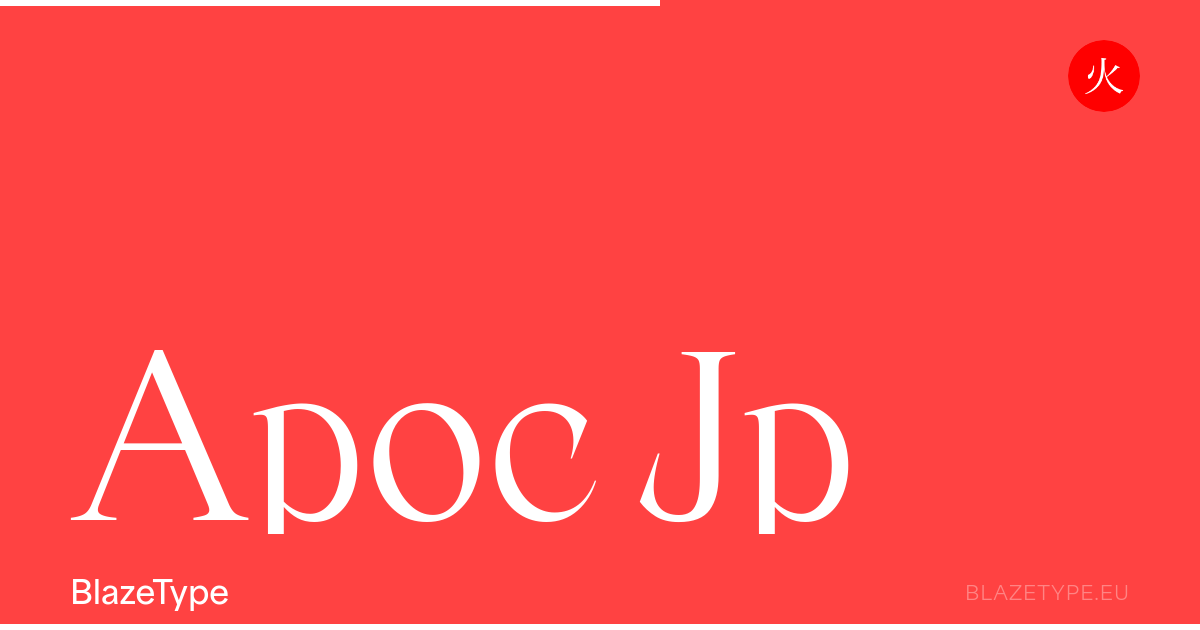
Apoc JP extends the iconic Apoc serif to Japanese Kana. Sharp, expressive variable font supporting Latin, Hiragana and Katakana. Free trial, licenses from 40€.
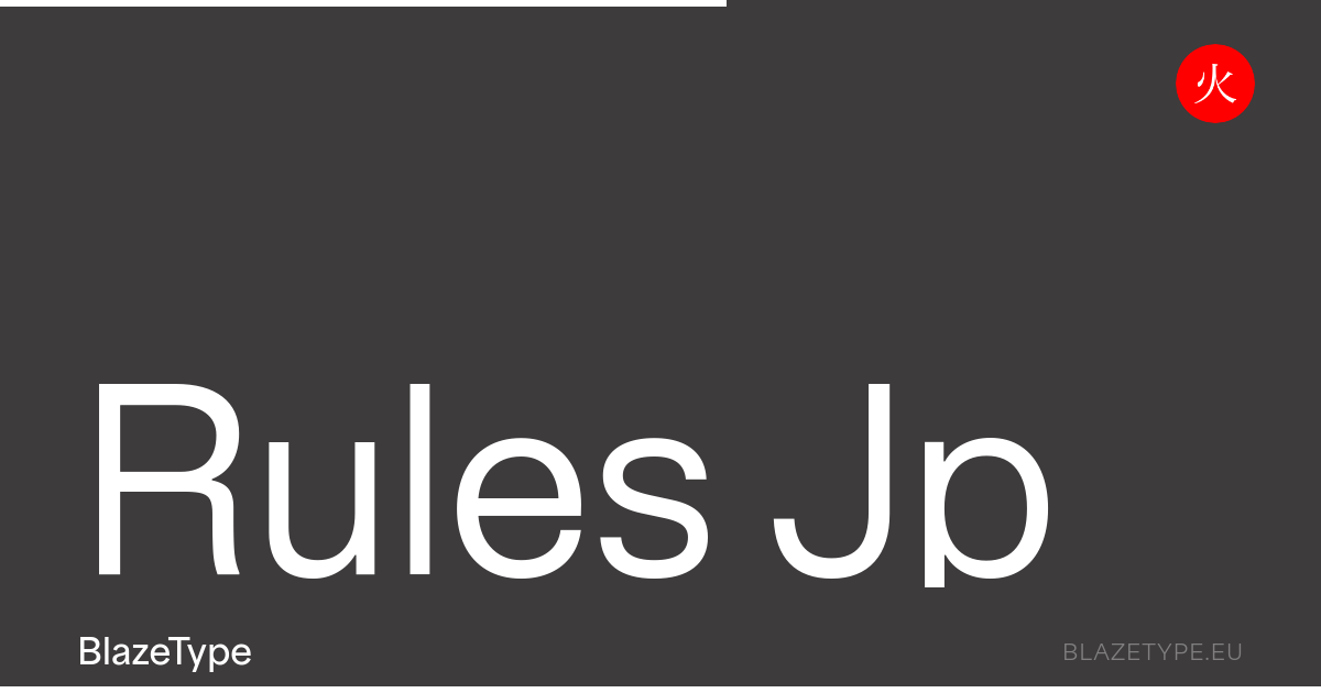
Rules JP is the Latin+Japanese (Kana) support of Apoc Font Family. Supporting both Horizontal and Vertical writing system. Rules font is a contemporary interpretation of the neo grotesque font era, with an edge. Rooted in Swiss Modern type inspiration and built with a strong structure in the respect of type design tradition.
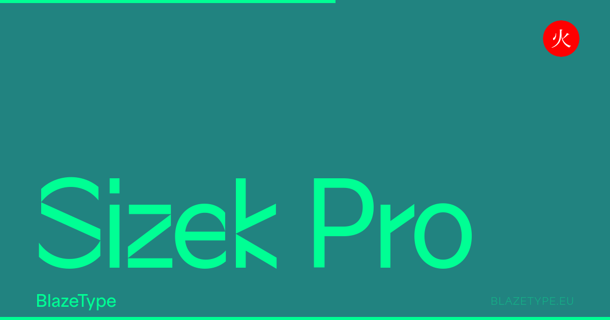
Sizek Pro is an experimental display typeface that reimagines and deconstructs the classical calligraphic structure of letters. It takes inspiration from the digital age's glitches, lags, and damaged or half-loaded files, reflecting the challenges and quirks of working with technology.
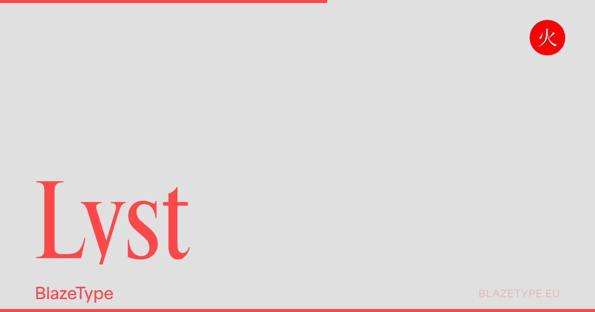
Lyst is a condensed serif shaped by the visual culture of the late 20th century. It captures the broader editorial atmosphere of the period — where corporate clarity met magazine sophistication. The initial spark came from a familiar sight: mechanically condensed Times New Roman in everyday print. Instead of treating that compression as a flaw, Lyst takes it as a subtle point of departure.
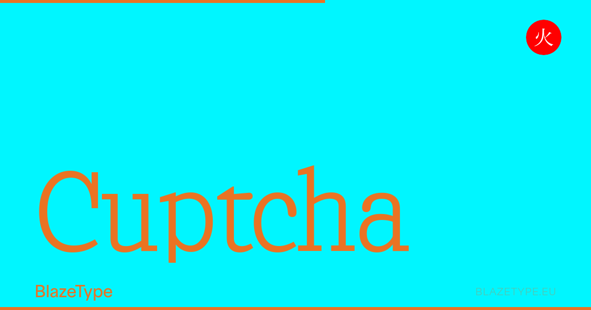
Cuptcha is a slab typeface inspired by the wonky, distorted letters found in website security tests. The name fuses "cup" with captcha, a container holding a collection of letters, much like a typeface itself. Those raw, chaotic letterforms were refined into a consistent typographic system, where the sturdiness of squared slab serifs contrasts with soft, rounded terminals, finding a natural balance in the details.
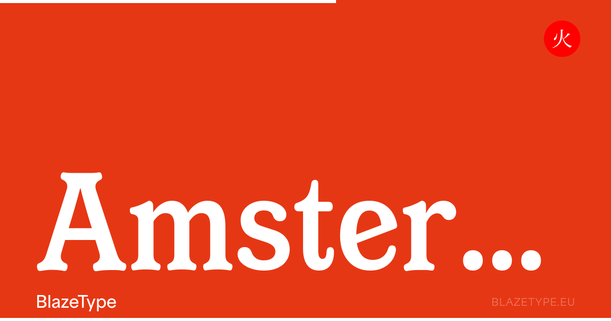
Amsterdam Serif is a revival of a wood type discovered in the type case of an old printing workshop named Unitype in Brussels. The distinctive terminations of the letterforms immediately capture attention—shapes that exude both unexpected charm and singularity. Amsterdam Serif is a generous reinterpretation of the original early 20th-century wood typeface, infused with a distinct calligraphic sensibility.
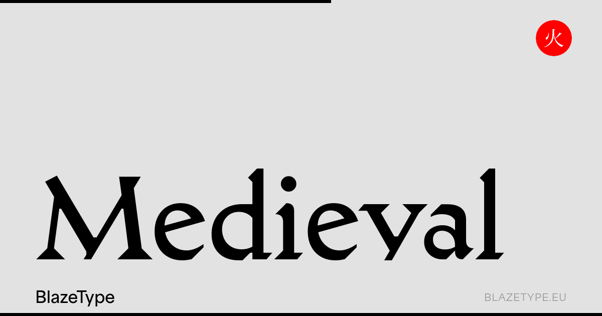
Medieval is a free interpretation of Fritz Helmuth Ehmcke's Mediaeval (Stempel, 1922). The challenge was to remain faithful to the original and its distinctive character — versatile serifs, strikingly tall ascenders, and a pronounced translation contrast — while distilling these qualities into something cleaner and more controlled.
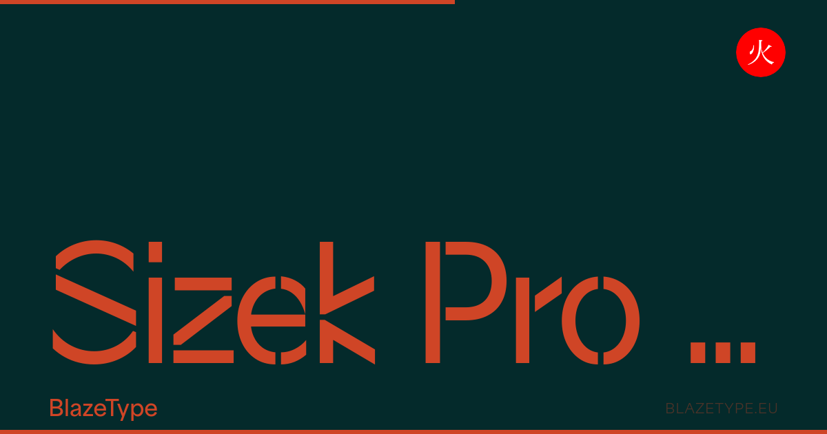
Sizek Pro Stencil is an experimental display typeface that reimagines and deconstructs the classical calligraphic structure of letters. It takes inspiration from the digital age's glitches, lags, and damaged or half-loaded files, while channeling the raw physicality of stencil craft spray-painted surfaces, industrial markings, and urban environments.
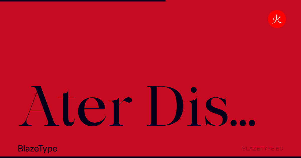
The Display version of Ater font family was inspired by a desire to create greater contrast between bold and thin strokes. It emphasizes the font family contemporary and versatile nature. It can still be used for layout work, such as large or small-scale title designs. An elegant family which borrows from classic serif typefaces as well as more contemporary forms. In a spirit of bringing together as many different mediums as possible with unity in the shapes. It is a variable typeface with a letter blackening approach, to the point of finally appearing in a display-style. A thinner design, but still features those striking weights. From Extra light to Black, it goes to the extreme for optimal legibility in both small and large sizes. Thanks to these variations in tone, the white space is more prominent and highlights the typeface’s attention to detail and refinement. A family designed for creative expression, using ligatures and other glyphs to showcase its potential as a display typeface.
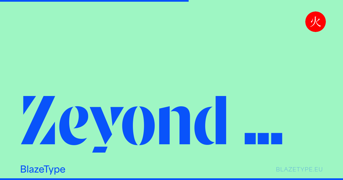
Zeyond Stencil is a display stencil typeface built on a radical modular and geometric approach. Originally developed as a custom single-weight typeface for the contemporary art collective Beyond The Post-Soviet
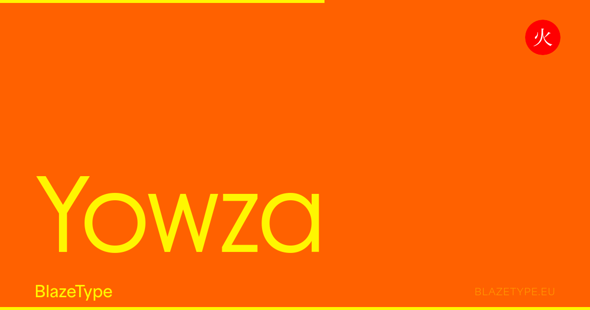
Yowza was developed as a collection of geometric, sans-serif typefaces that served as a personal interpretation of Art Deco elegance. The project originated from a specific design need: I was searching for a display font that could bridge the gap between rigid, architectural construction and soft, organic detailing. What began as a single prototype eventually matured into a comprehensive typographic system. While Yowza sprouted from a fascination with display typography, its expansion into text-focused versions became the project's most rewarding challenge. The final system resulted in three distinct families: Display, Standard, and Text.
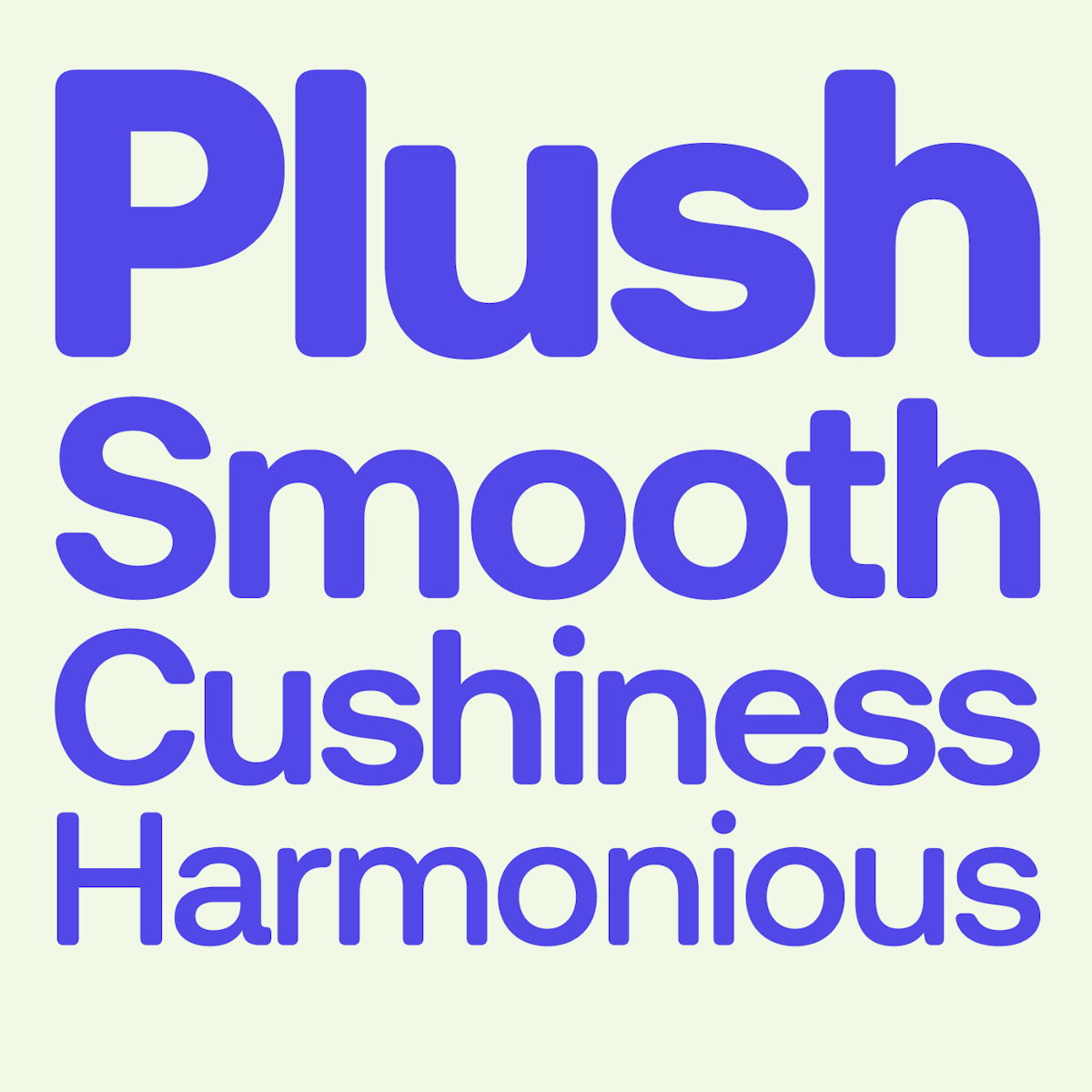
London based type foundry of Mark Bloom and Co.
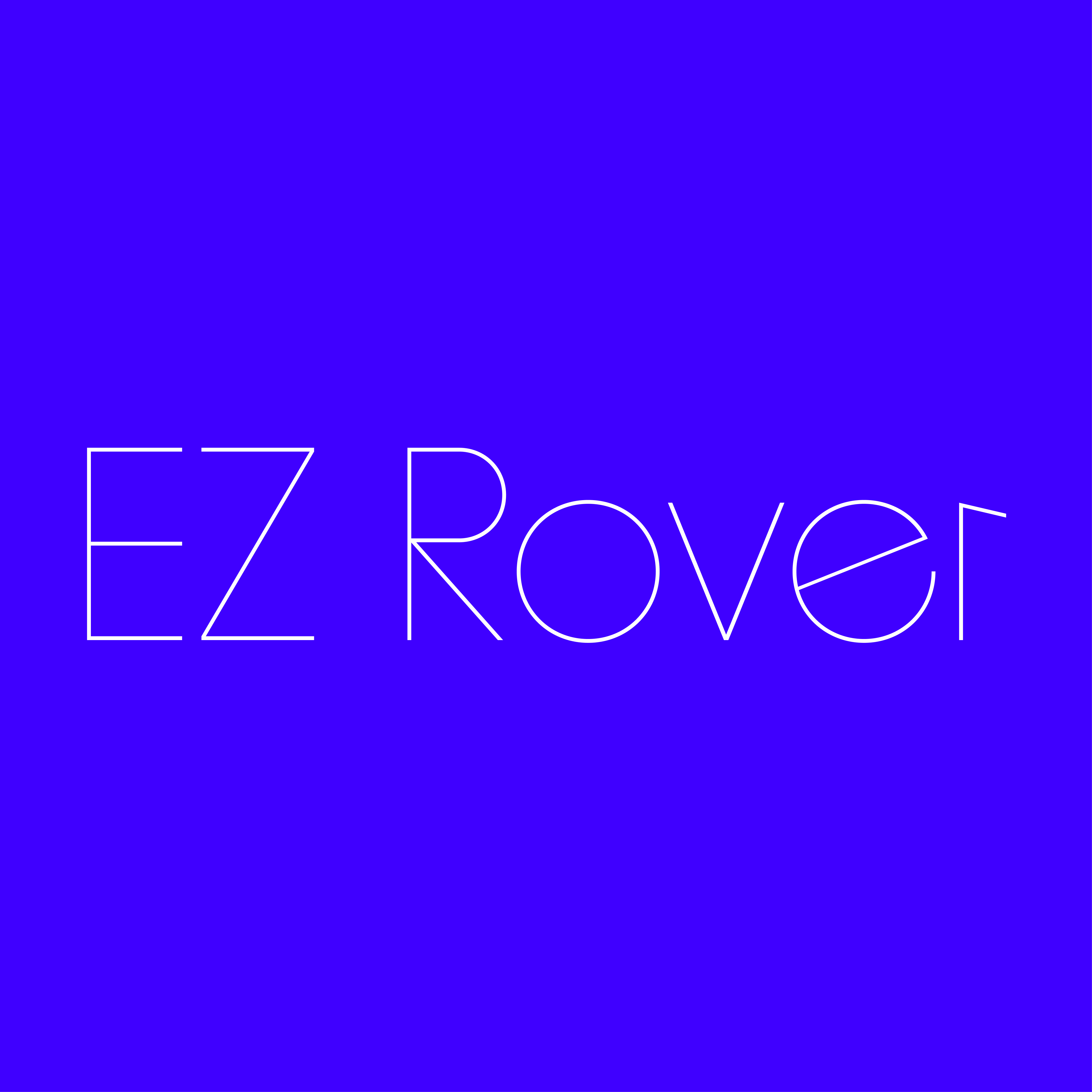
EZ Rover
Eazy Fonts · 2022
EZ Rover is a refined hairline sans-serif inspired by Futura and Avant Garde, blending geometric modernism with contemporary distinctiveness. Inspired by the rational forms that defined twentieth-century typography, EZ Rover draws from a tradition that sought to reduce letterforms to their essential geometry. Yet rather than functioning as a historical revival, it introduces contemporary refinements that bring new character to familiar forms. Its ultra-light construction creates a striking tension between precision and elegance. Every curve, terminal, and counter has been carefully balanced to maintain clarity while embracing a distinctly modern presence. Designed for projects in branding, fashion, editorial, and more. Free trials at eazyfonts.com
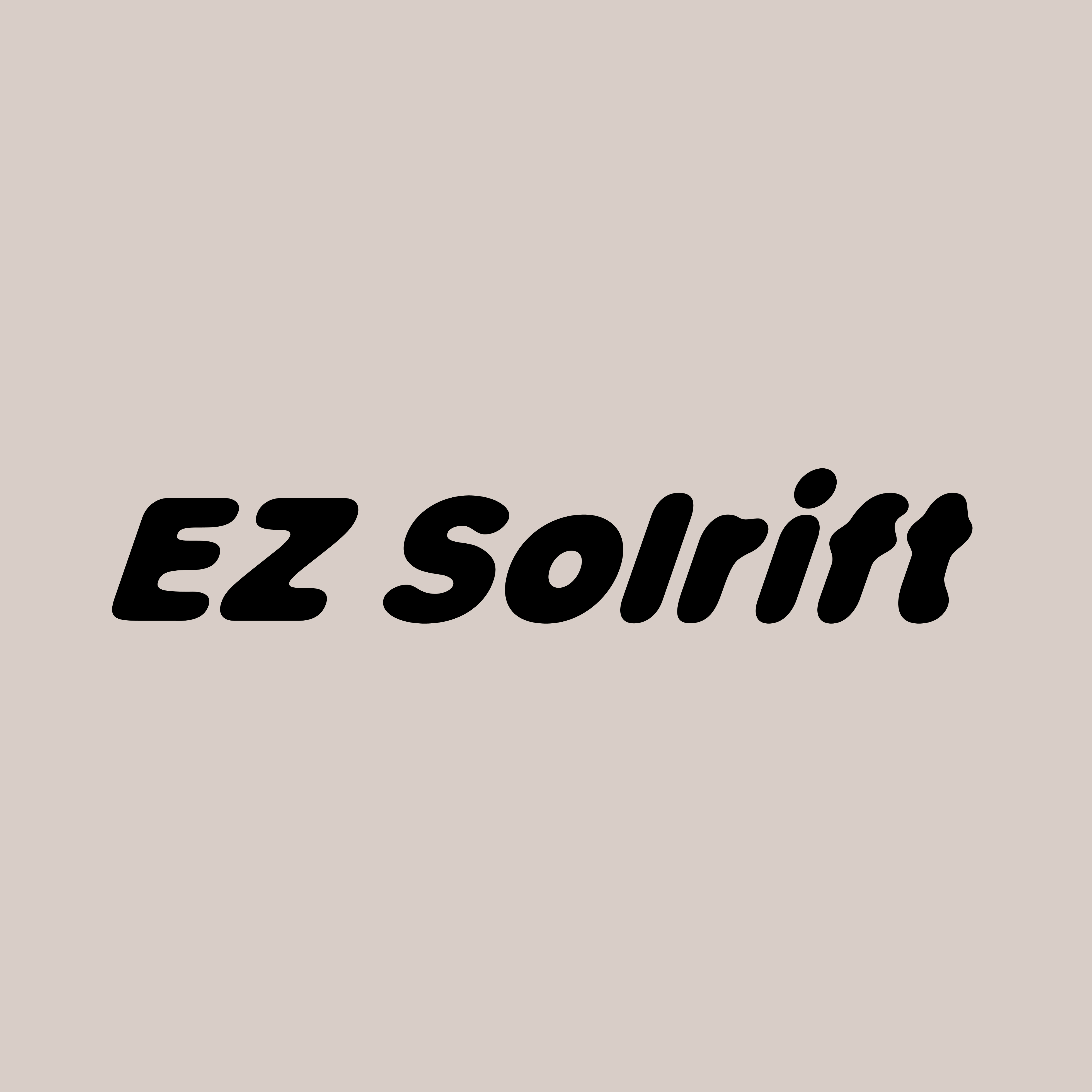
EZ Solrift
Eazy Fonts · 2025
EZ Solrift – A rounded display typeface softened by light, time, and atmosphere. Its softened forms recall vinyl lettering after years of sun exposure, where sharp edges gradually give way to smoother contours and unexpected character. Like materials that evolve under the influence of light, the letterforms embody a quiet transformation—one that feels familiar, tactile, fluid, and deeply human.
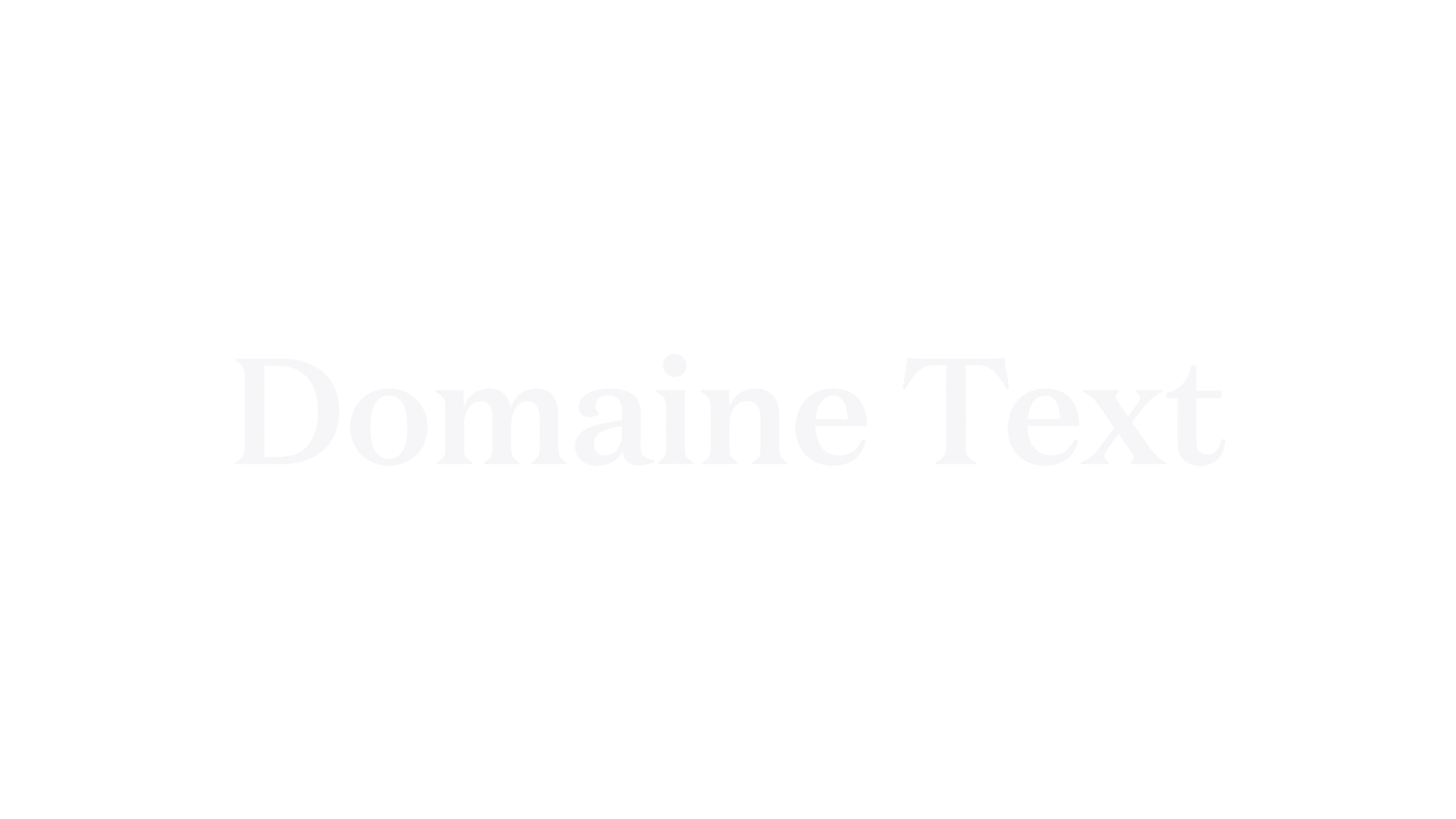
Optimized for body copy, Domaine Text carries the elegance of its display sibling into extended reading. The italics draw from Deberny & Peignot's Labeurs Ordinaires Série. Added to the Cooper Hewitt Collection in 2016. Designed by Kris Sowersby.
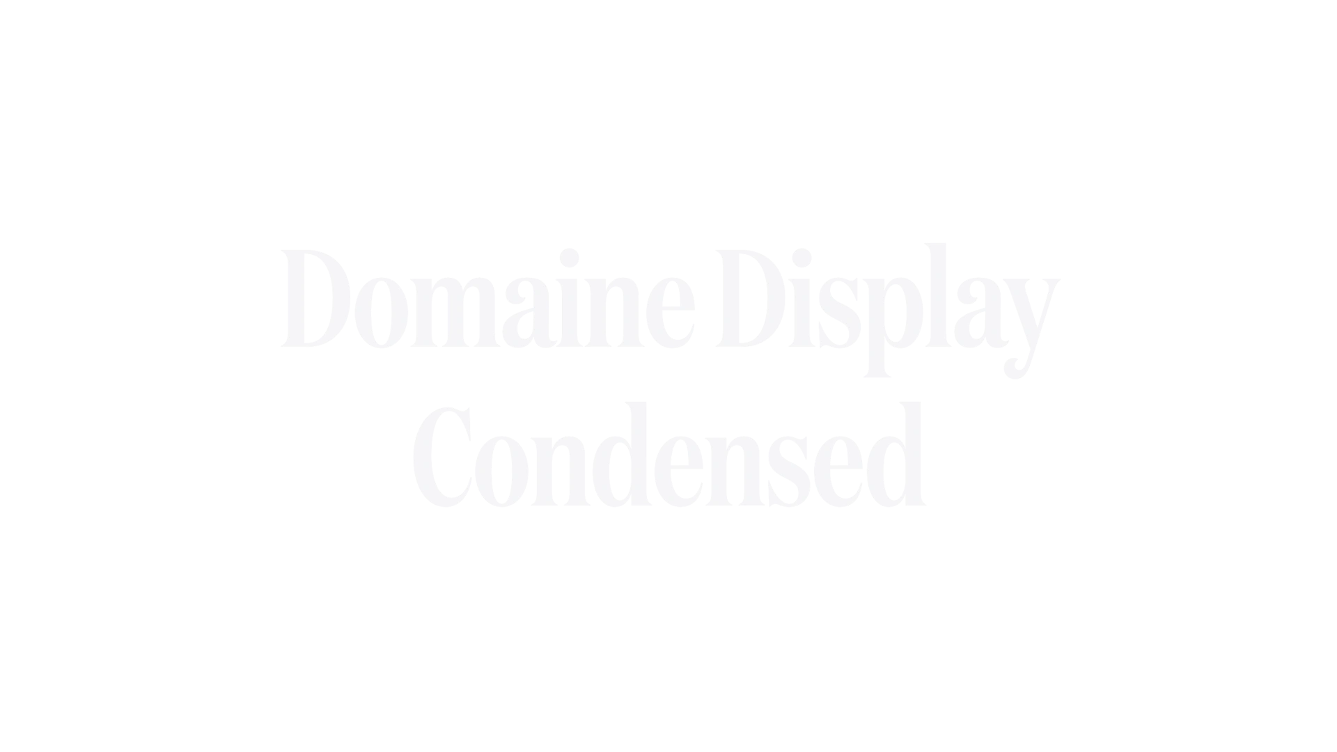
An extremely compressed version of Domaine Display for space-conscious layouts. Retains the characteristic triangular serifs and hooked terminals while maximizing vertical impact. Designed by Kris Sowersby.
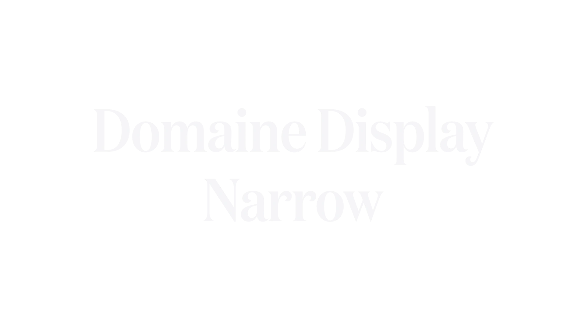
A condensed width variant of Domaine Display, maintaining the sharp elegance and French-British heritage in a space-efficient form. Ideal for headlines where horizontal space is at a premium. Designed by Kris Sowersby.
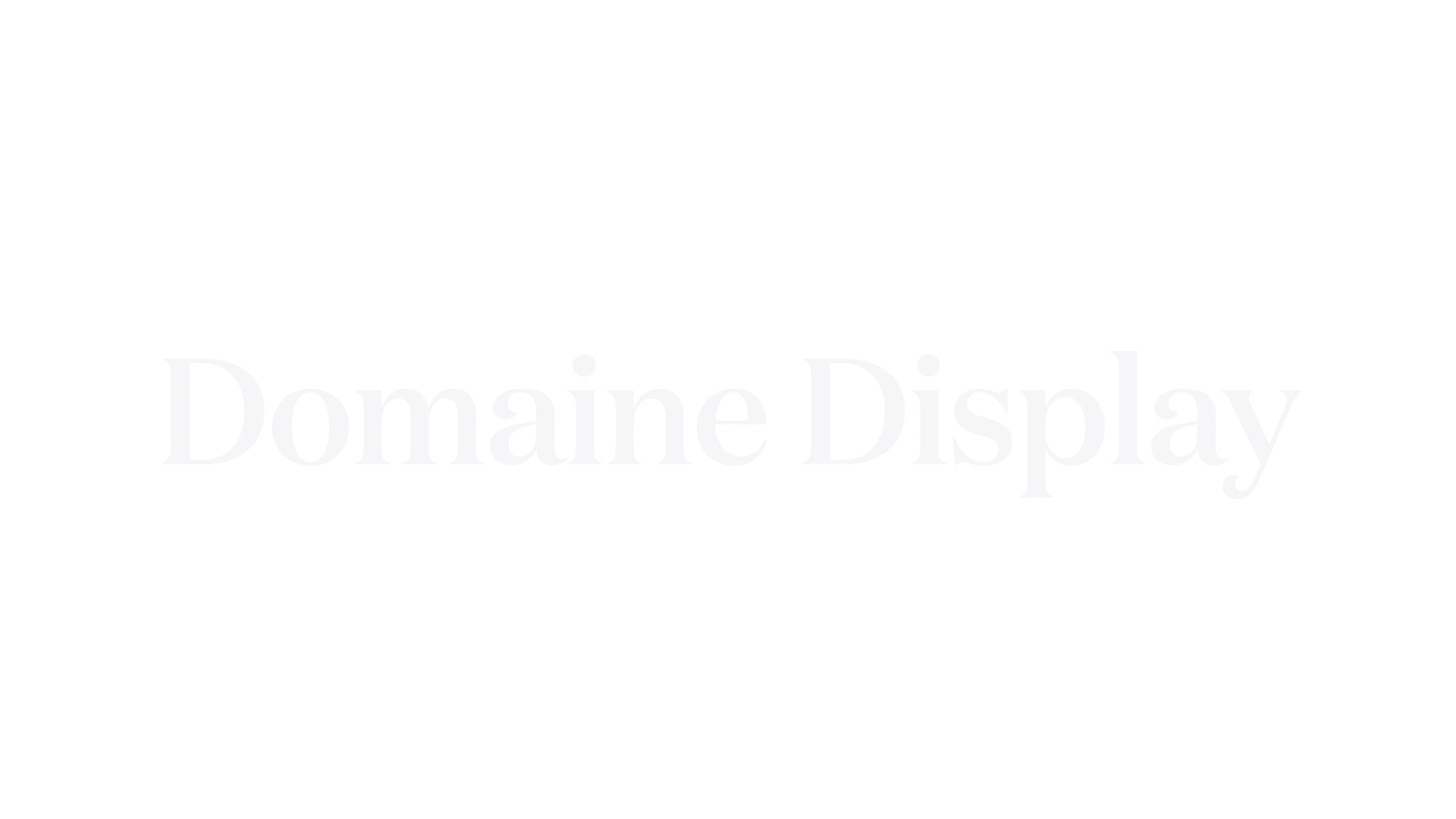
A sharp, elegant serif that blends traditional French and British genres into a contemporary aesthetic. Features gently bracketed triangular serifs and distinctive hooked terminals, with horizontal head serifs providing visual stability. Designed by Kris Sowersby.
Selecta
Maxitype · Giliane Cachin · 2022
Selecta is a contemporary grotesque typeface known for its clean lines and versatility. It was designed to bridge the gap between modern and historical typefaces, making it suitable for a variety of applications from branding to editorial design. The typeface is characterized by its geometric shapes and humanist influences.
Ninna
Margot Lévêque Studio · Margot Lévêque · 2024
Ninna is a display typeface that balances a contemporary aesthetic with a deep respect for classical heritage, drawing inspiration from the French Decorative Arts. Designed between 2019 and 2024, it features a range of weights from Book to Black with matching italics, making it suitable for headlines, branding, and editorial use.
Romie is a calligraphy-inspired display font that draws influences from renowned typefaces such as Lubalin and Bookman. It is designed to support over 300 languages, making it versatile for global use. The font family includes 12 styles, with a recent update in June 2024 adding all italic styles, completing the Romie collection.
Kalice is a revival of the Elzévir Anglais typeface from Turlot Foundry, designed by Margot Lévêque in 2018. The typeface underwent a significant update in 2023, adding new weights and elegant italic styles. Known for its clean lines and modern aesthetic, Kalice is ideal for headlines, logos, and various graphic design projects.
Self Modern
Bretagne · Lucas Le Bihan · 2021
Self Modern is inspired by traditional Japanese serif typefaces known as 'Mincho', which were collected from various magazines and books during a trip to Japan in 2015. The typeface incorporates research on automatic composition systems, particularly 'Self Spacing Types', and is designed to harmonize with Japanese characters at the same size and weight. The Book, Semi-Bold, and Bold versions were developed in collaboration with Roxane Gataud in 2021.
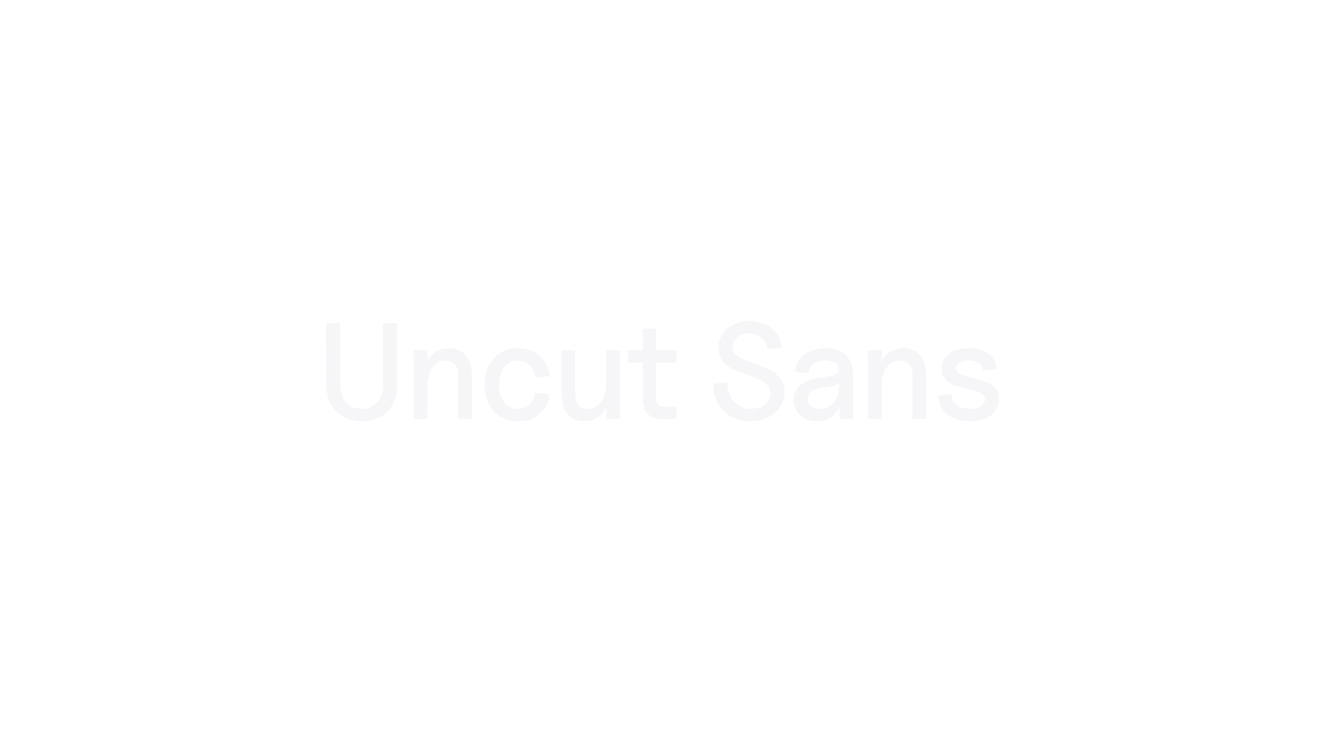
Uncut Sans
UNCUT.wtf · 2022
Uncut Sans is a contemporary sans serif typeface designed for clarity and versatility. Originally created for the UNCUT.wtf website, it offers a range of 12 weights, including variable options, making it suitable for various design applications. The typeface emphasizes legibility and modern aesthetics, reflecting the ethos of open-source typography.
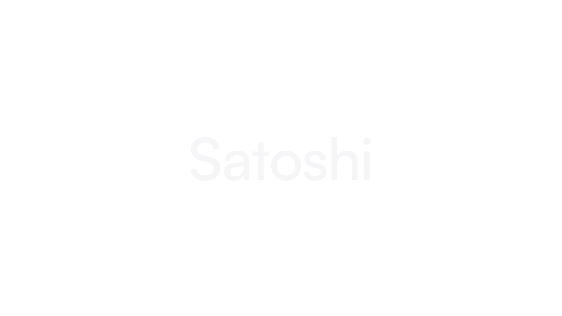
Satoshi
Indian Type Foundry · Deni Anggara · 2021
A modernist sans-serif with elegant rounded shapes and sharp angular details, reflecting Swiss style modernist aesthetics.
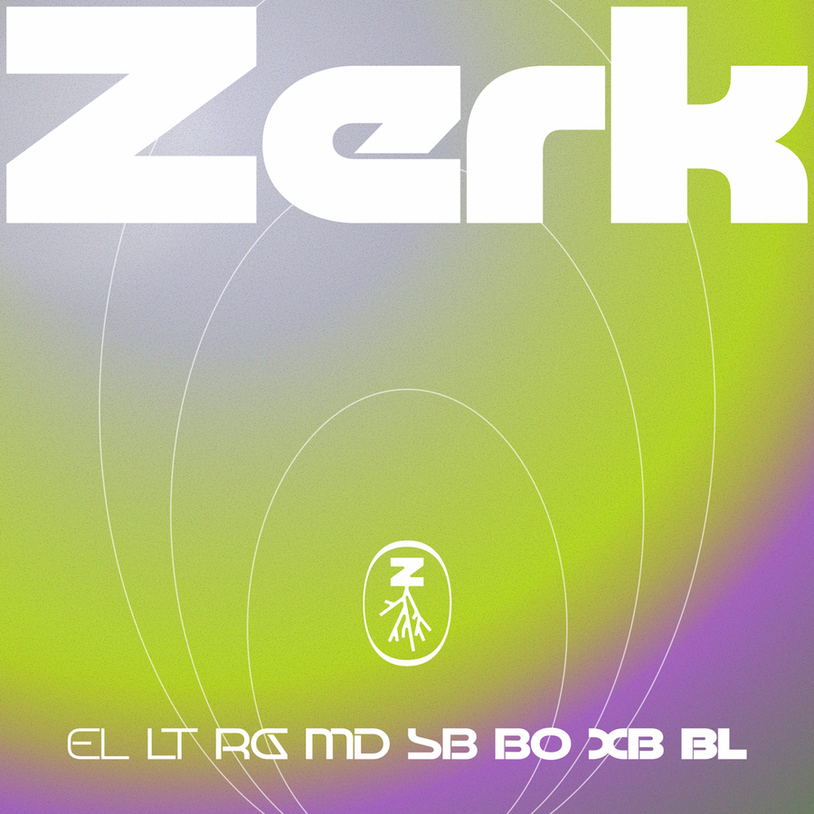
Designed by Element Type. Zerk is a retro futuristic display typeface built on calligraphic roots, exaggerated widths, and a pre-millennial flair. Its structure pairs sculptural curves with a constructed geometry, creating a balance between flow and exaggeration. The typeface frames a future imagined with optimism, joy and mischief rather than ambitious progress. Anything with enough character and guts to be unique from the 70s to the early 2000s was the source of inspiration. These were typographic elements from sc...
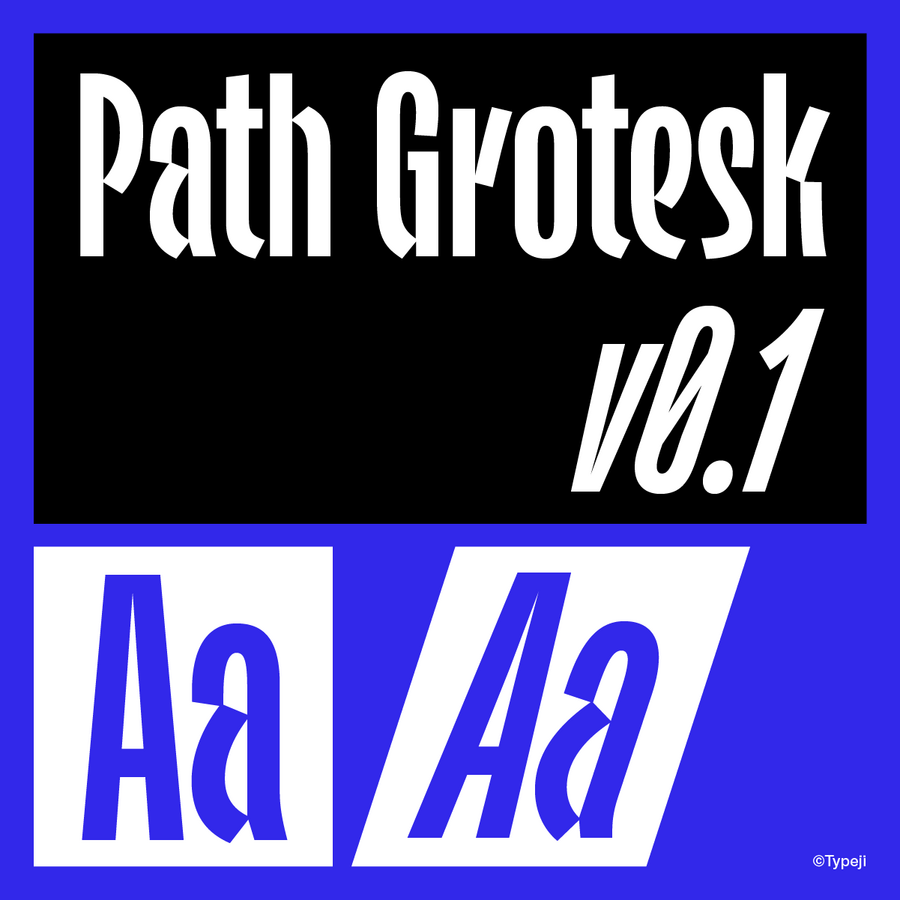
Designed by Typeji. Path Grotesk is a warm, condensed sans-serif that incorporates casual, handwritten cues within a clean, controlled structure. The letterforms draw from the natural motion of a flat marker pen: softly connected strokes and terminals gently angled in the direction of each writing movement. These stroke nuances soften the rigidity typically found in narrow grotesques, giving the typeface a friendly, human quality. Key construction features include lightly connected stroke joins, consistent curve...
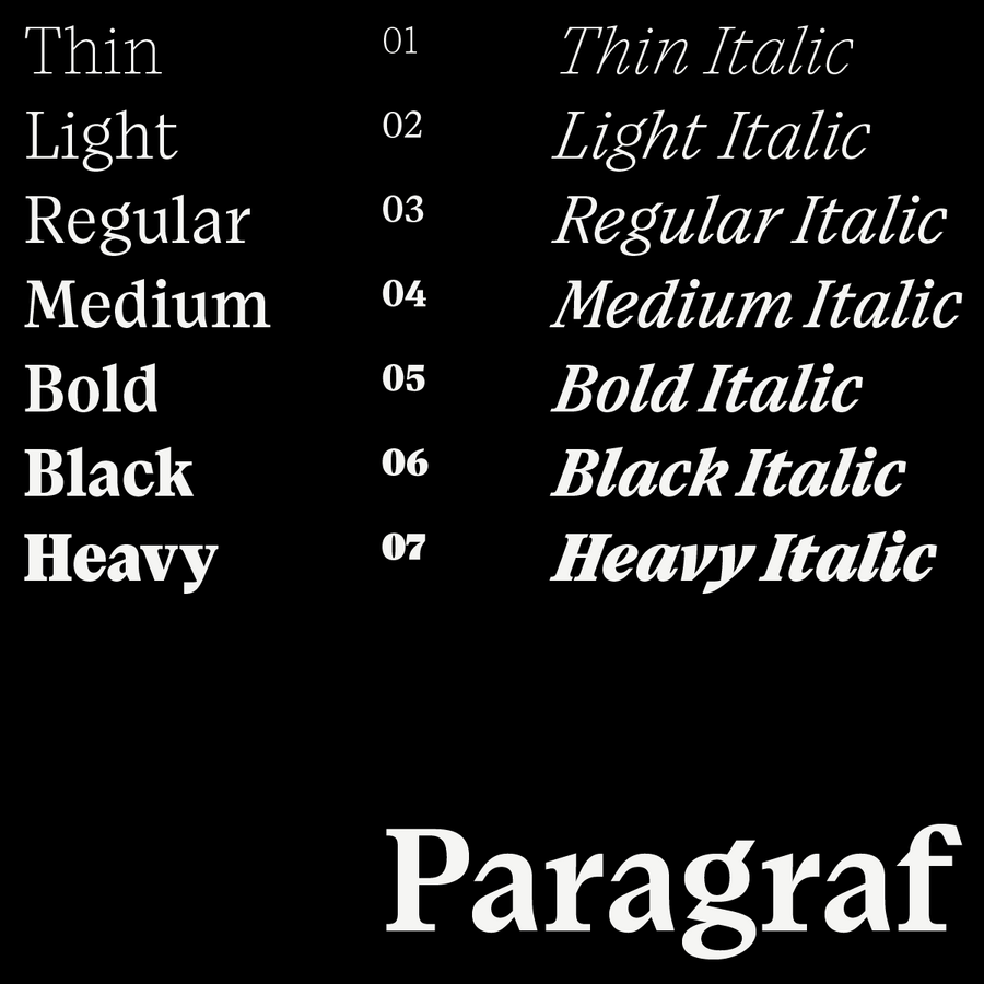
Designed by Typeji. Paragraf is a serif typeface with high-waisted structures, a tall x-height, and slightly narrow proportions. Its clean, straight lines and sharp details establish a clear, rational personality. The design features geometric simplicity, evident in elements like the rectangular and parallelogram-shaped terminals of the ‘r’ and the tails of the ‘y.’ The bottom serifs on letters such as ‘a,’ ‘d,’ and ‘u’ reflect this geometric foundation. Details like the tail of ‘Q,’ the legs of ‘R,’ ‘K,’ and ‘k...
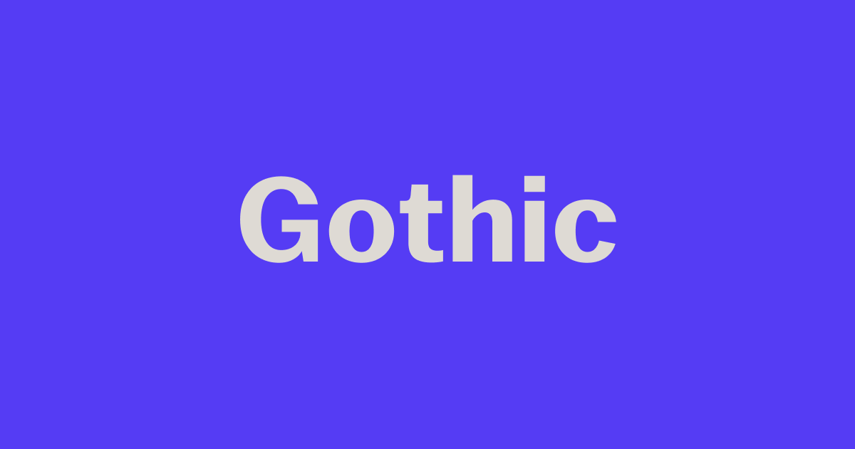
CoFo Gothic is a strong sans font inspired by Franklin Gothic and other 19-20 century grotesques. It's bold character maked it ideal for ads, branding & packaging.

Zed Display Semi-Condensed is a space-saving grotesque typeface for compact and impactful headlines.

The broader proportions of the Zed Display Semi-Wide make it comfortable to
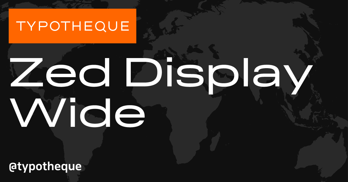
Zed Display Wide is a generously proportioned grotesque typeface that lends a simple and unpretentious sense of abundance to text.
A typeface released by an independent foundry or a solo designer rather than a large corporate library.
You usually get distinctive, carefully made type, and licensing direct sends more of the money to the designer.