Adelia is a flare serif typeface influenced by Nordic arts and culture of the early 1900s. It features romantic and organic characteristics while maintaining a straightforward design, paying homage to the final decades of classicism. The typeface draws inspiration from various sources, including architecture and typographic posters, resulting in an elegant and robust appearance with unique alternates and ligatures.
Letters from Sweden
Letters from Sweden is a Swedish type foundry established in 2011 by Göran Söderström, based in Stockholm. The foundry specializes in designing retail and custom typefaces for various clients.
BAZAAR is a gestural and spirited script typeface characterized by tightly spaced letterforms that vary in height and balance around a center line. Inspired by graffiti and street writing, it embodies a wild rhythm, particularly effective in all-caps settings. The typeface challenges traditional design norms, celebrating disorder and offering extensive language support along with contextual alternates.
Blåkulla is a unique display typeface inspired by the light blue residential buildings of Hagalund, Sweden. Designed by My Longley during her studies at Konstfack, it features all-caps letterforms that blend elements of architecture and typography. The font captures the essence of the patterns created by window curtains, resulting in a striking visual identity.
Capitaine is a good-humoured, chunky slab serif based on the Adtype Series, originally found in the American Specimen Book of Type Styles (1912). It features rounded, slightly irregular characteristics that provide a playful alternative to more rigid display serifs. The typeface captures a contemporary feel while maintaining the quirky attributes of its predecessor, making it suitable for a variety of design contexts.
Eklips is a conceptual typeface inspired by the visual phenomenon of a solar eclipse. Its design features intersecting duplicate outlines that create unique character shapes, resembling a stencil typeface. Known for its playful and ambiguous three-dimensional volumes, Eklips offers a distinctive reading experience and is suitable for various creative applications.
Eksell Display is a unique typeface designed in 1962 by Swedish designer Olle Eksell. It is known for its playful and artistic character, reflecting Eksell's background as a prolific artist. The typeface was created in his small studio in Stockholm and is one of only two complete typefaces he designed. It has been carefully digitized and expanded into a family of four optical styles, including a stencil version.
Eksell Sans is a striking display typeface designed by Swedish designer Olle Eksell in 1973. Known for its unique letterforms that merge straight lines and circular arcs, it reflects a visionary approach to typography. The font draws inspiration from 1970s display faces, creating a distinctive style that is both modern and nostalgic.
Ferry is inspired by the lettering of the Stockholm Ström ferries, which were originally built as steam ferries between 1894 and 1907. This typeface features a sturdy design and is known for its unique character shapes, particularly the letter 'K'. It was created as Erik Moberg's first commercial typeface and supports Latin, Greek, and Cyrillic scripts.
Funkis is a display typeface originally designed in 2016 for a collaborative art project. It features bold lettering and is particularly suited for signage. The design draws inspiration from the letters created by Sigurd Lewerentz for The Stockholm Exhibition in 1930, which marked a significant moment in the development of functionalism in Scandinavian architecture.
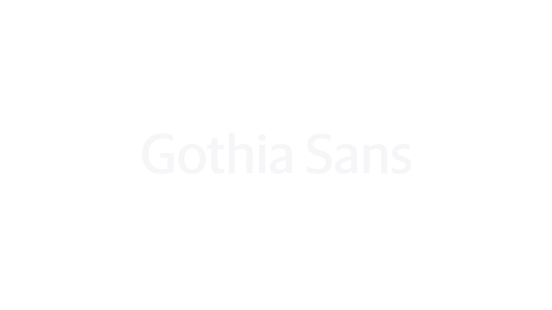
Gothia Sans is a modern sans serif typeface designed for the Swedish newspaper Göteborgs-Posten as part of a rebranding effort. It is known for its refined elegance and crisp details, making it suitable for both text and display settings. The design draws inspiration from historical Dutch typefaces while infusing a contemporary Scandinavian aesthetic.
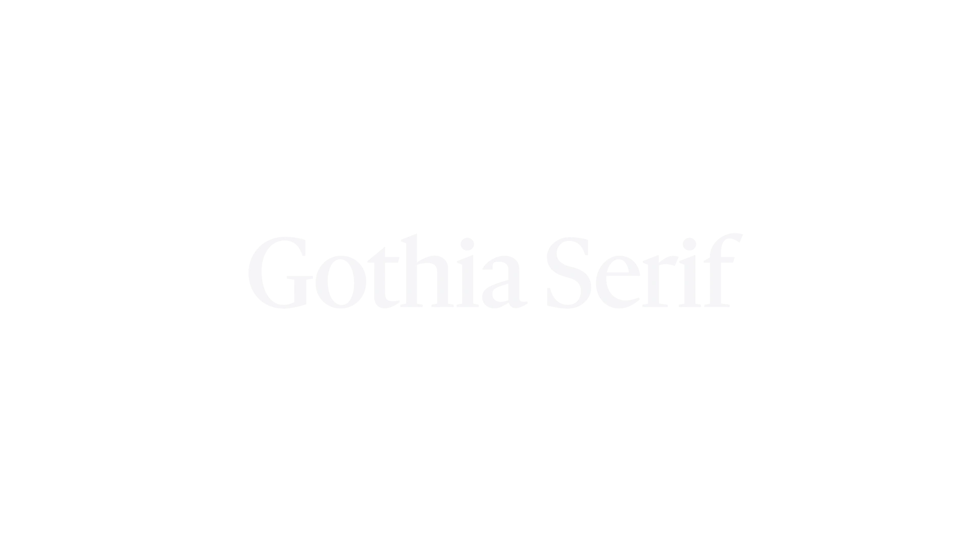
Gothia Serif is a typeface designed for the Swedish newspaper Göteborgs-Posten as part of a rebranding effort. It is known for its versatility in editorial and publication design, offering a refined elegance suitable for both body text and striking headlines. The design draws inspiration from historical Dutch typefaces, infusing them with a modern Scandinavian aesthetic.
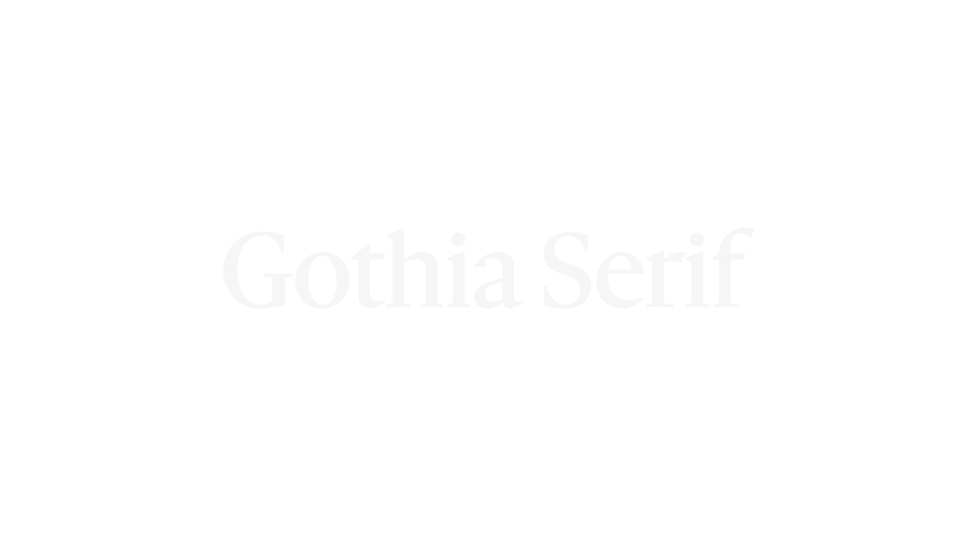
Gothia Serif Text is a small text-optimized adaptation of Gothia Serif, designed for enhanced legibility and readability in smaller text sizes. It was created for a book project and aims to harmonize display and text usage, featuring a wider design, reduced contrast, and an elevated x-height. The typeface draws inspiration from historical Dutch types while infusing a modern Scandinavian flair.
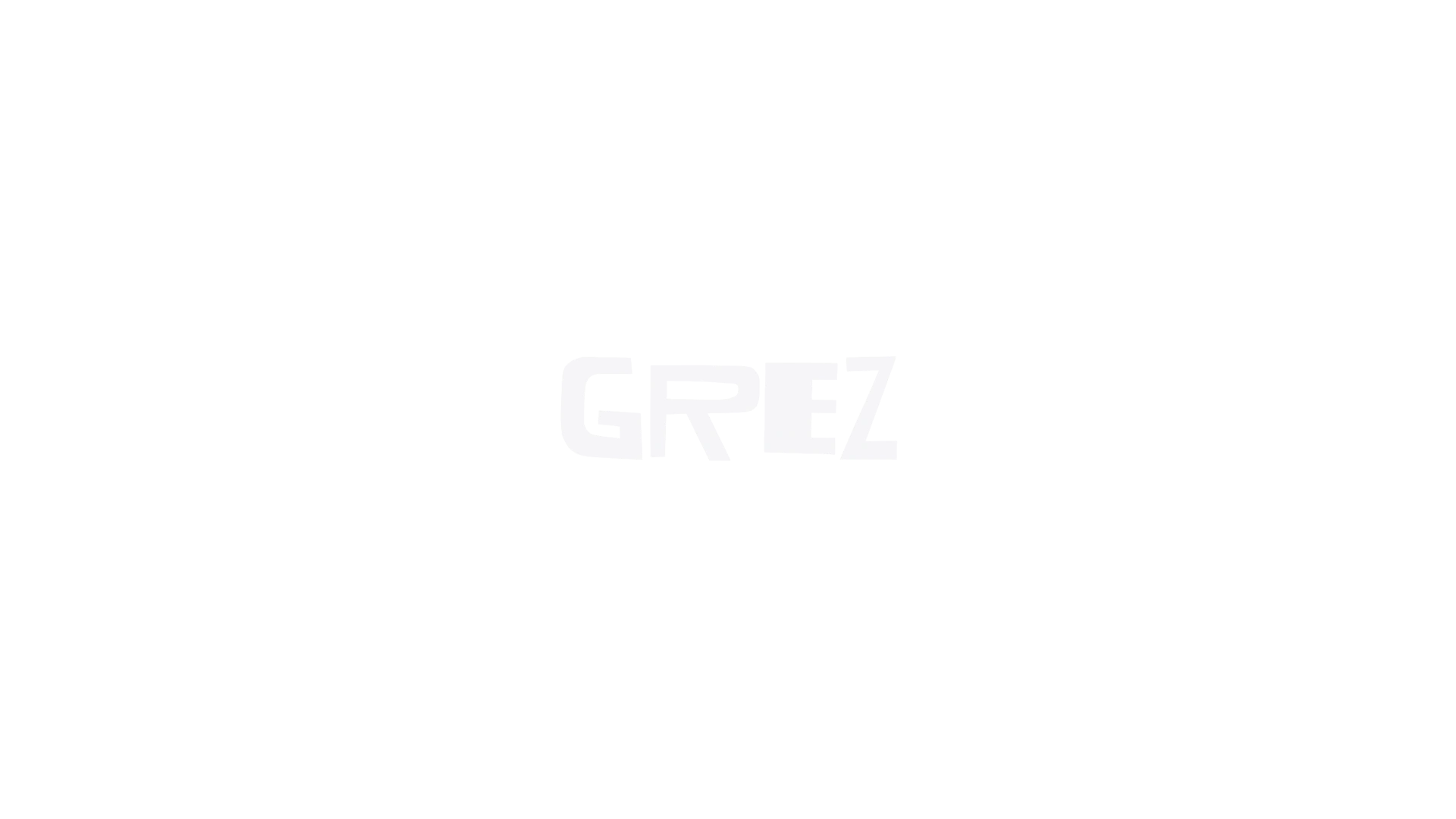
Grez is a new typeface created entirely from shapes cut out of black paper. It was developed during a residency in Grez-sur-Loing, a village near Paris known for its artistic history. The typeface features all-caps characters with four stylistic alternates for each letter, providing a unique and playful typographic experience.
Inline is a typeface designed as a companion to the Line typeface, which was developed for a Swedish fashion magazine. It features a heavy design with counter spaces that correspond to varying stroke weights, creating a unique visual contrast. Released in 2020, Inline is known for its versatility, offering multiple widths and optical sizes, making it suitable for various design applications.
Ivar Display is a modern typeface that began as a serif companion to Siri. It draws inspiration from the sturdy construction of classic text faces from the mid-1900s, while also referencing designs from the 16th and 17th centuries. The typeface is known for its versatility, coming in three optical sizes—Text, Headline, and Display—each with four weights and matching italics, totaling 24 fonts.
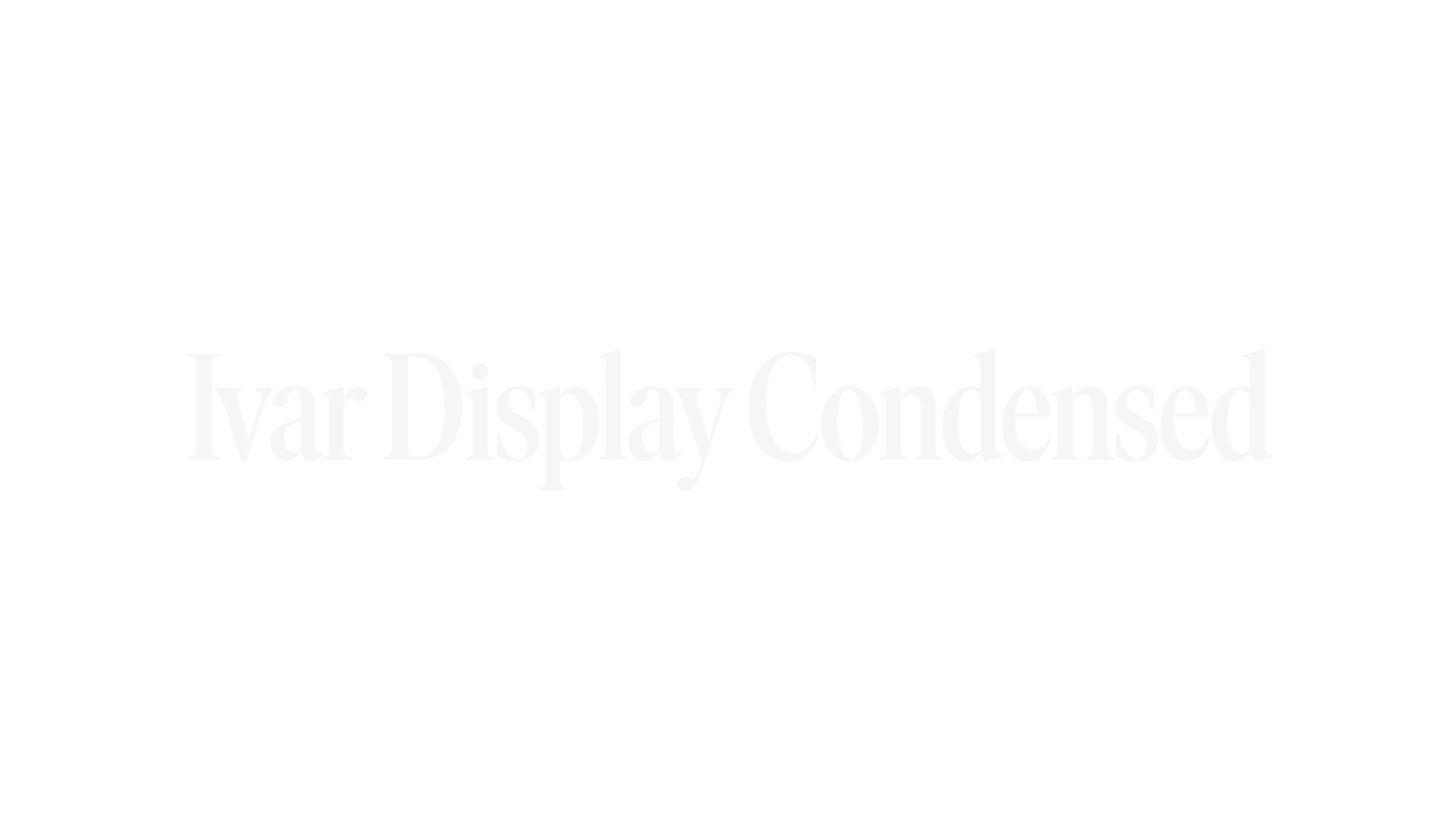
Ivar Display Condensed is a condensed version of Ivar Display, designed for the Swedish magazine Arkitektur. The typeface is influenced by the sturdy construction of classic serif faces, particularly Times, and reflects a blend of modern and traditional typographic elements. It is known for its versatility in editorial design and branding.
Ivar Fine is the fourth optical size in the Ivar family, designed to achieve elegance and sharpness with higher contrast than Ivar Display. It was developed over three years, drawing inspiration from classic text faces of the mid-1900s and the sturdy construction of Times. Ivar Fine is particularly suited for large, elegant headlines.
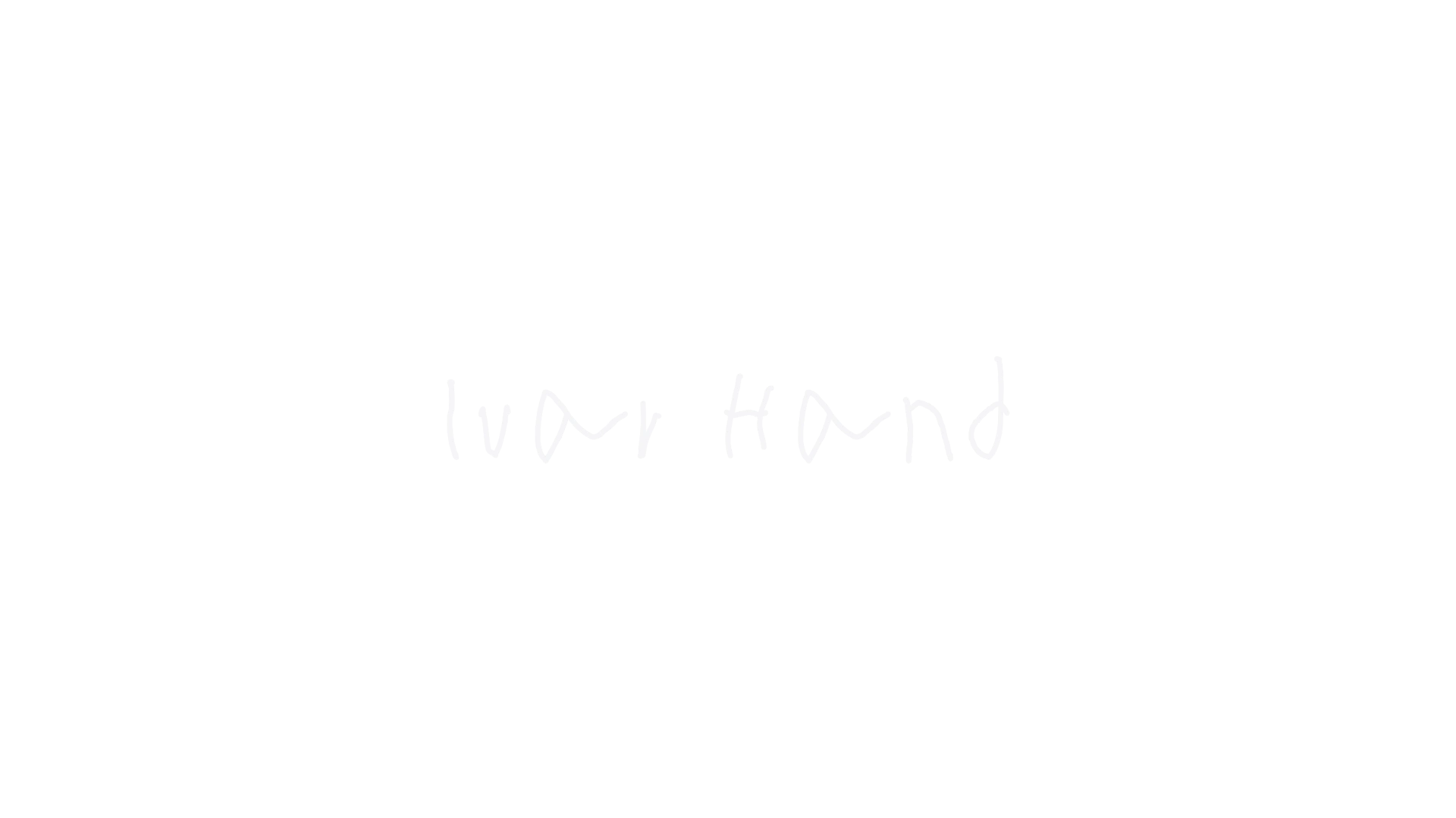
Ivar Hand is a typeface inspired by the handwriting of Ivar at eight years old. Originally drawn on a Remarkable 2 tablet in 2022, it was developed into a font in 2024. The font features a built-in randomizer to replicate the subtle inconsistencies of real handwriting, making it suitable for informal and personal projects.
Ivar Headline is a contemporary typeface that draws inspiration from the sturdy construction of classic serif fonts like Times. It was developed as a companion to the Siri typeface, emphasizing versatility across various applications. The design reflects the typographic styles of the mid-1900s while maintaining a unique character, making it suitable for both display and text use.
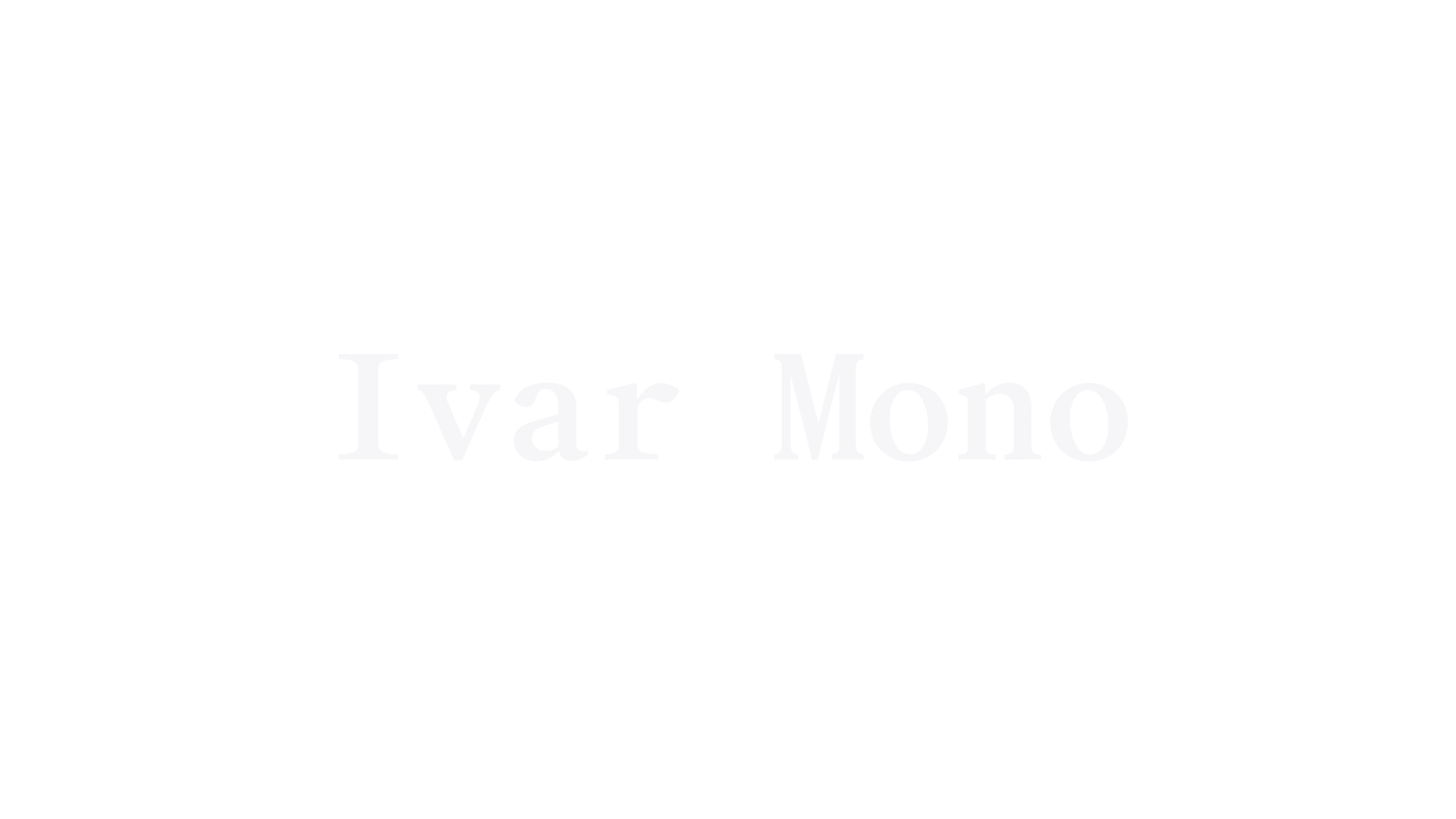
Ivar Mono is a monospaced typeface that serves as a variant of the Ivar family, designed to balance functionality and elegance. It was originally created for GRÖN and features a variable font option in its complete package. The design is characterized by a higher contrast that makes it suitable for both body text and display use.
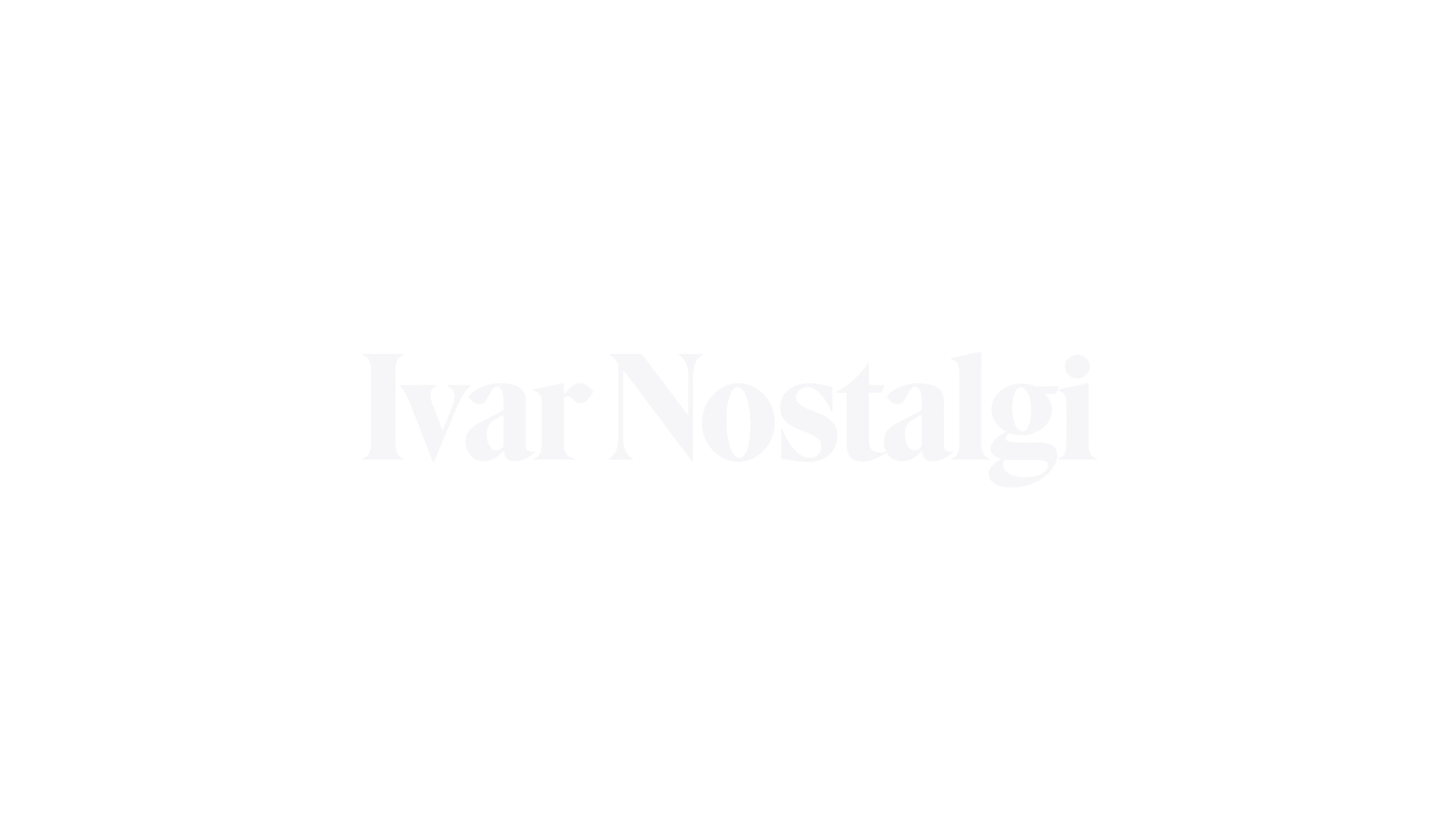
Ivar Nostalgi is a typeface that draws inspiration from the exuberant display typography of the 1970s, characterized by high contrast and tight letter spacing. It is designed for impactful headlines and evokes a sense of nostalgia with its unique aesthetic. The font is available in one bold weight and four optical styles, making it versatile for various design applications.
Ivar Script is a connected extension of the italics in Ivar, blending the elegance of a serif italic with the fluidity of a script. Originally commissioned for Sotheby’s Magazine, it features three optical sizes and advanced OpenType features for enhanced typographic expression.
Ivar Soft is a rounded version of Ivar Headline, designed to convey warmth and friendliness. Originally commissioned by Pentagram, it is now available for retail. The typeface draws inspiration from classic text faces of the mid-20th century, while also being influenced by the sturdy construction of Times. It features three optical sizes and a total of 24 fonts across various weights and styles.
Ivar Text is a serif typeface designed as a companion to the sans-serif font Siri. It draws inspiration from classic text faces of the mid-20th century, particularly influenced by the sturdy construction of Times. The typeface features three optical sizes—Text, Headline, and Display—each with four weights and matching italics, making it versatile for various typographic applications.
