0123456789
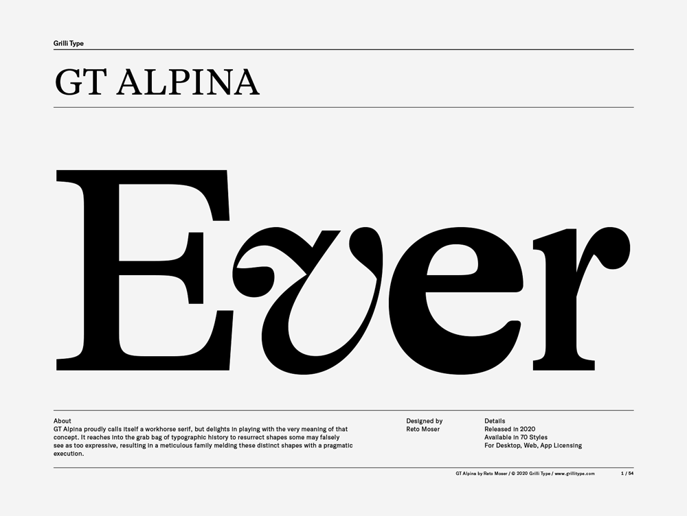
GT Alpina proudly calls itself a workhorse serif, but delights in playing with the very meaning of that concept. It reaches into the grab bag of typographic history to resurrect shapes some may falsely
serif
foundry
commercial
Grilli Type offers original retail and custom typefaces with a contemporary aesthetic in the Swiss tradition.
GT Alpina proudly calls itself a workhorse serif, but delights in playing with the very meaning of that concept. It reaches into the grab bag of typographic history to resurrect shapes some may falsely
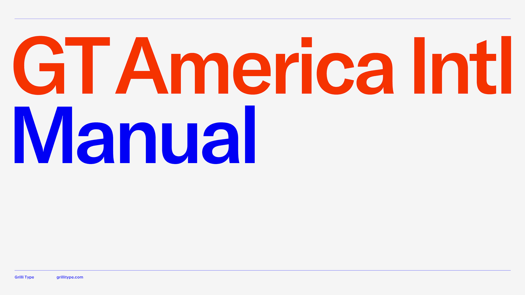
GT America is the missing bridge between 19th century American Gothics and 20th century European Neo-Grotesk typefaces. It uses the best design features from both traditions in the widths and weights where they function optimally.
The GT America Intl collection covers a wide range of writing systems and languages. Each script was designed by expert partners together with Noël Leu and Grilli Type's design team.
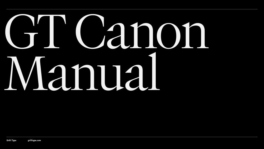
GT Canon’s design is pragmatic but not static: movement and liveliness are embedded in the letterforms. It is our answer to what our digital times require of a serif today. It’s what a contemporary serif should be in both form and function. Like its sans serif sibling, GT Standard, it aims for modern functionality rather than stylistic reinvention.
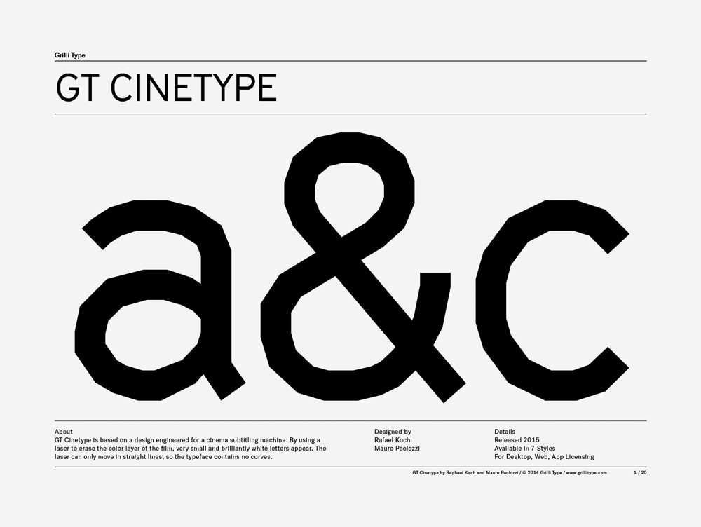
GT Cinetype is based on a design engineered for a cinema subtitling machine. By using a laser to erase the color layer of the film, very small and brilliantly white letters appear. The laser can only move in straight lines, so the typeface contains no curves.
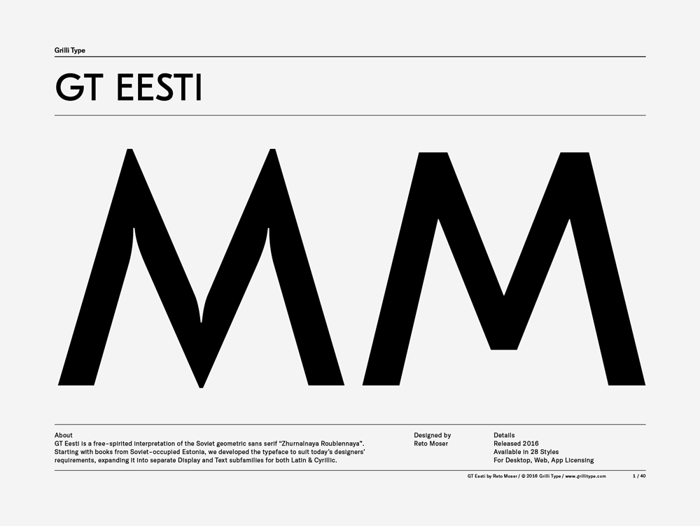
GT Eesti is a free-spirited interpretation of the Soviet geometric sans serif “Zhurnalnaya Roublennaya”. Starting with books from Soviet-occupied Estonia, we developed the typeface to suit today’s designers’ requirements, expanding it into separate Display and Text subfamilies for both Latin & Cyrillic.
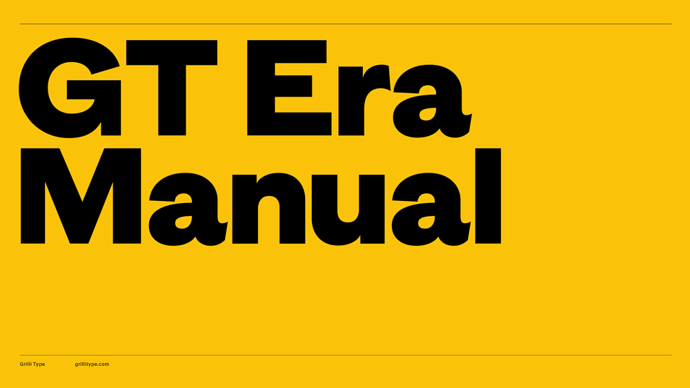
GT Era reimagines the warmth and idiosyncrasies of early grotesk typefaces for our own era. These pre-modernist tools were being pushed to their extremes in the radical designs of the modernist movements—like Bauhaus and De Stijl—of the period. The typeface shuns neutrality and embraces friction, championing recognition over uniformity and flavor over conformity.
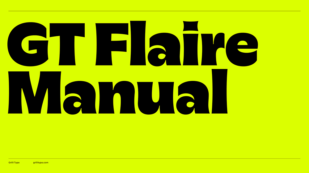
GT Flaire captures the pronounced curves created by calligraphic pens when applying ink to paper under pressure and translates this characteristic into a digital format. This typeface bridges the worlds of business and pleasure, breaking free from corporate rigidity by combining seriousness with playfulness and encouraging users to embrace both.
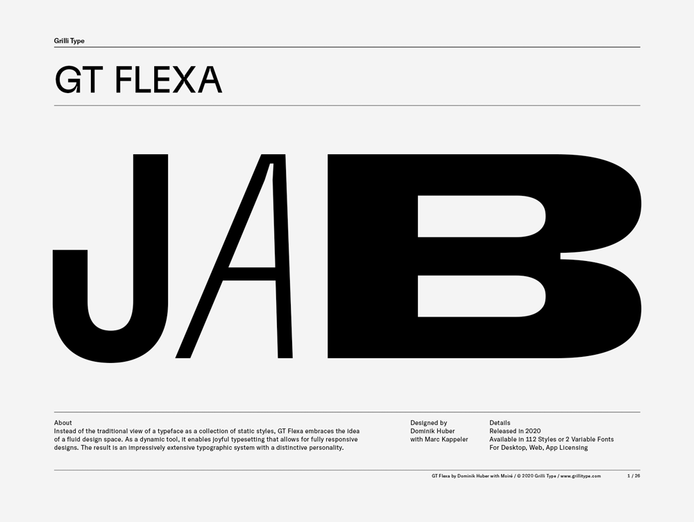
Instead of the traditional view of a typeface as a collection of static styles, GT Flexa embraces the idea of a fluid design space. As a dynamic tool, it enables joyful typesetting that allows for fully responsive designs. The result is an impressively extensive typographic system with a distinctive personality.
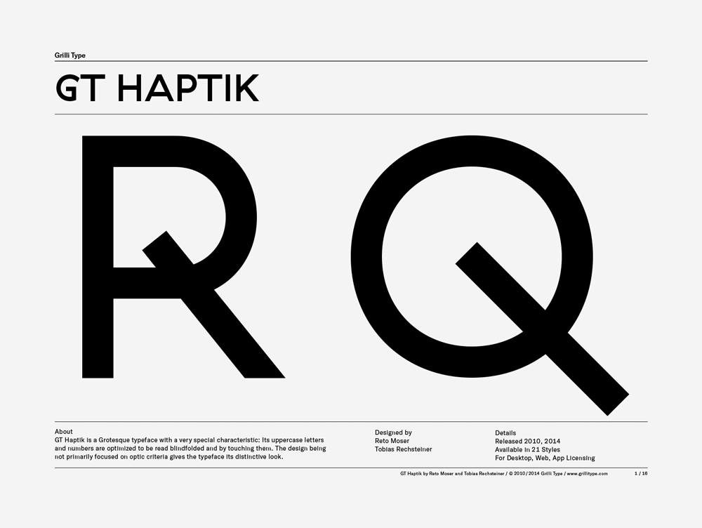
GT Haptik is a monolinear geometric grotesque typeface. Its uppercase letters and numbers were optimized to be It is now available in seven weights with accompanying Oblique and Rotalic styles. Included with each style come alternate characters as well as proportional and tabular figures.
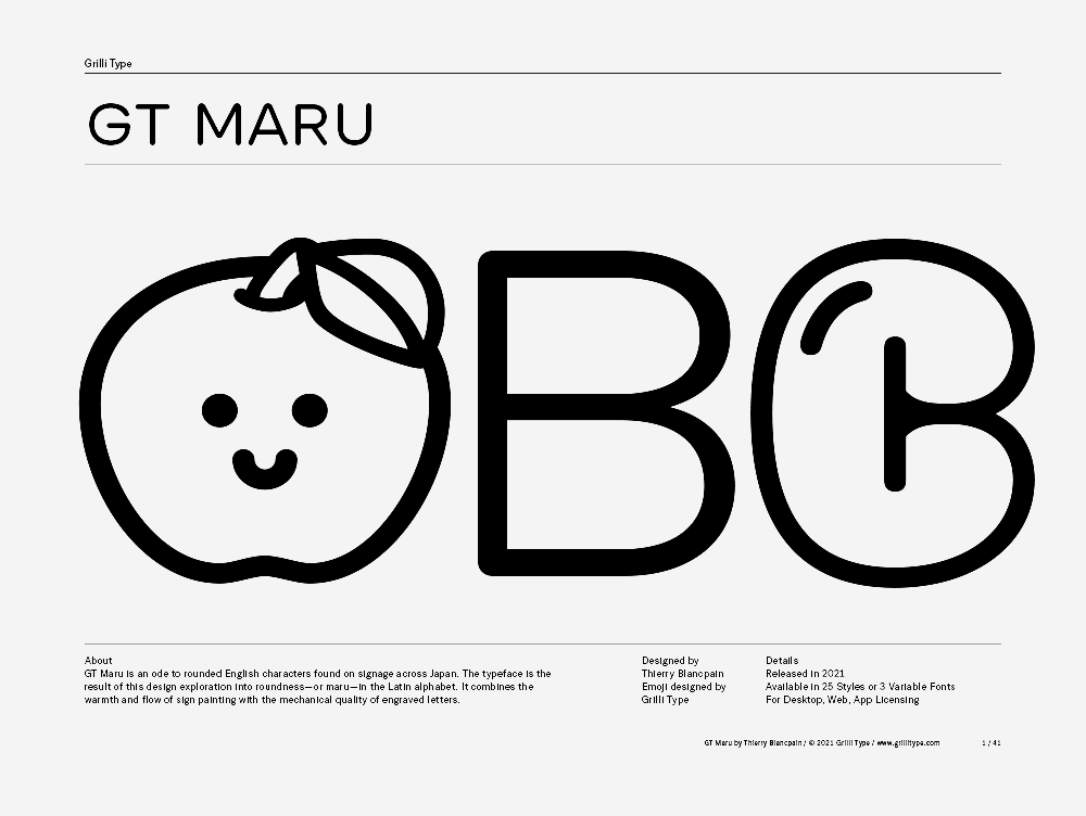
GT Maru is an ode to rounded English characters found on signage across Japan. The typeface is the result of this design exploration into roundness — or maru — in the Latin alphabet. It combines the warmth and flow of sign painting with the mechanical quality of engraved letters.
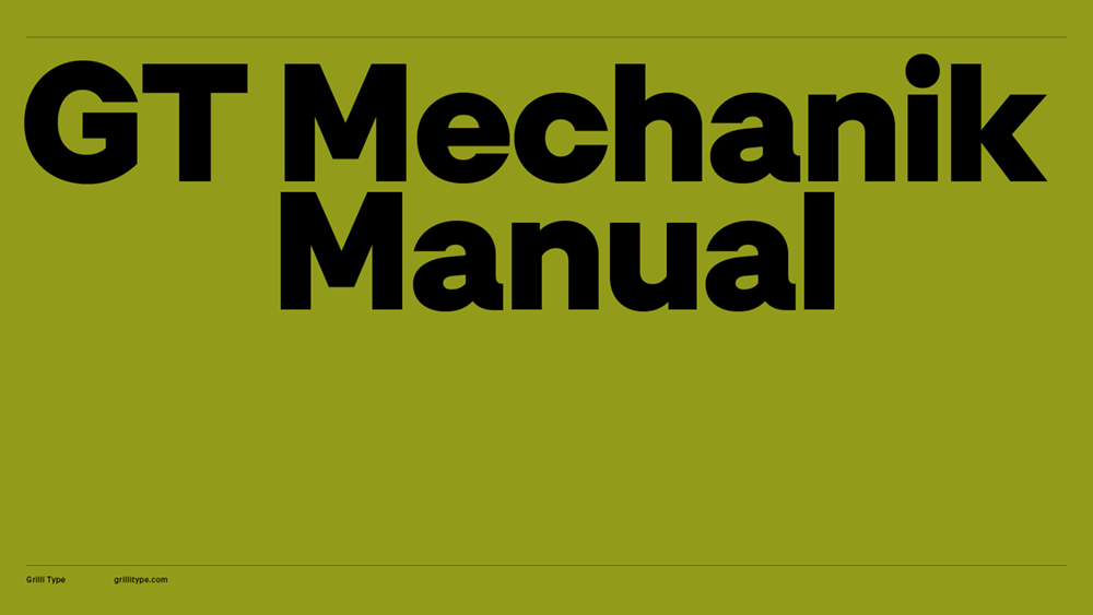
GT Mechanik dials in the appeal of electromechanical text systems by building an inevitable family around its monospace style. Idiosyncratic features that come with the restraints of mechanic typesetting become guiding principles along the tone axis. Mono, Text and Display, each follow that logic at a different scale and intensity.
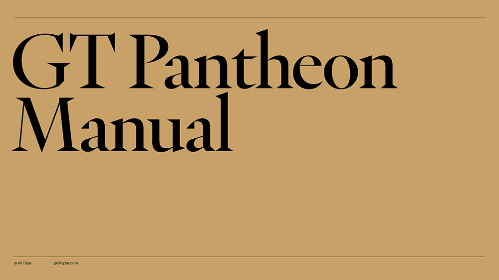
GT Pantheon is an interpretation of historic shapes in a contemporary manner. It exhibits an expressive and dynamic character visible in every stroke. At its core is the conception of three optically-adjusted faces, each designed to best represent the same type at different sizes: Display, Text, and Micro. Within this spectrum, the family moves between elegance, sharpness, warmth and robustness, matching expression with functionality.
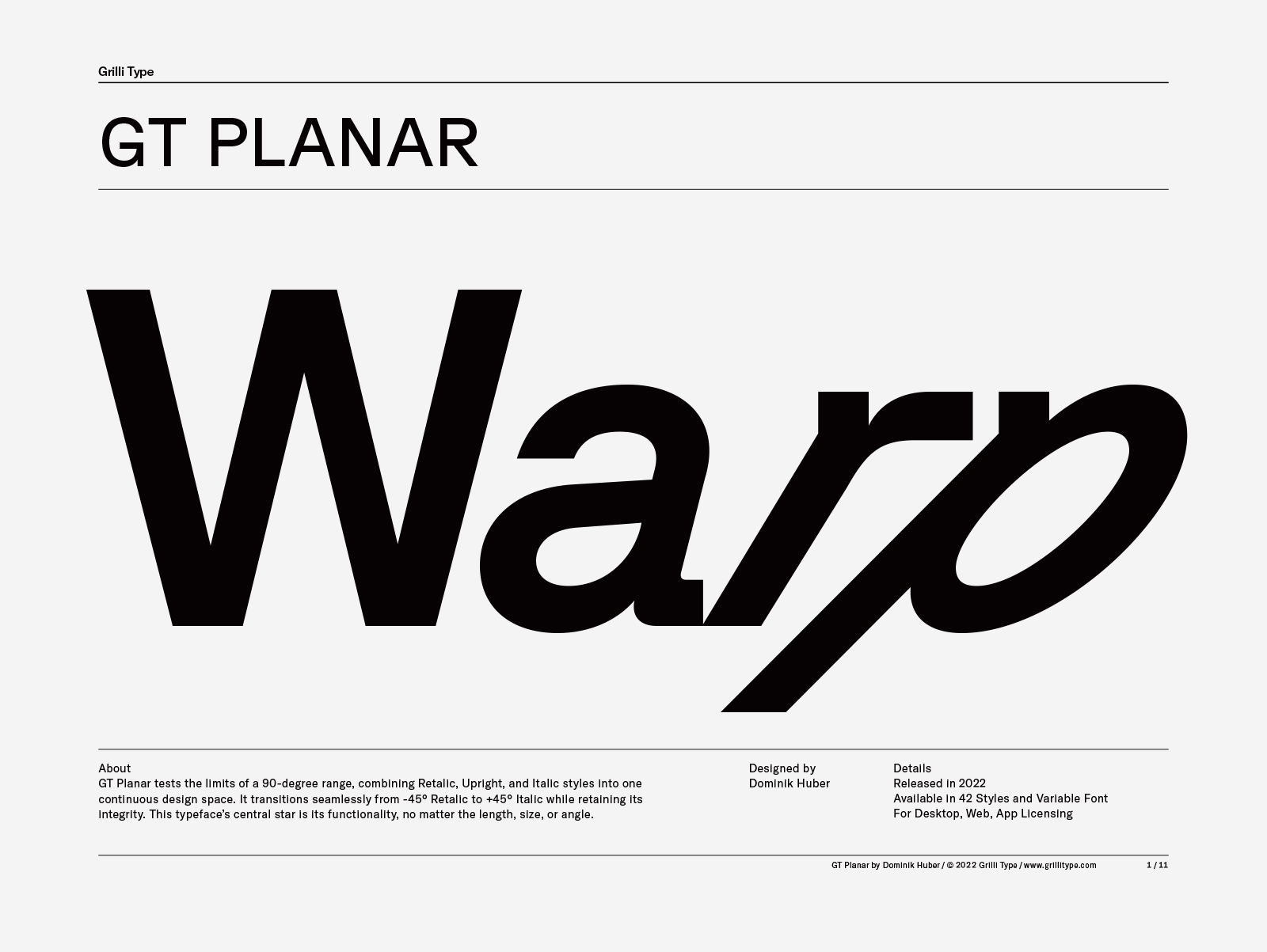
GT Planar tests the limits of a 90-degree range, combining Retalic, Upright, and Italic styles into one continuous design space. It transitions seamlessly from -45° Retalic to +45° Italic while retaining its integrity. This typeface’s central star is its functionality, no matter the length, size, or angle.
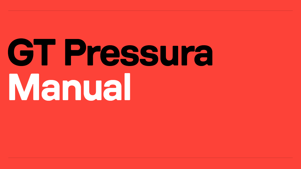
GT Pressura is inspired by metal type printing history as well as engineered letters stamped onto shipping boxes. It uses the visual gesture of ink spreading under pressure as a stylistic device, offering an alternative to more spindly typefaces of the digital age.
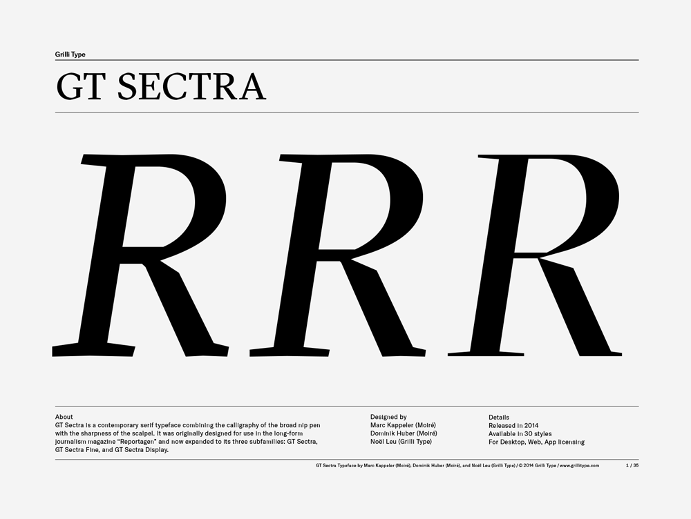
GT Sectra is a contemporary serif typeface combining the calligraphy of the broad nib pen with the sharpness of the scalpel knive. It was originally designed for use in the long-form journalism magazine “Reportagen” and now expanded to its three subfamilies: GT Sectra, GT Sectra Fine, and GT Sectra Display.
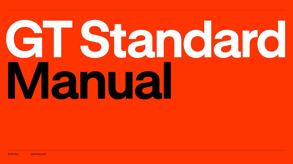
GT Standard is a contemporary response to the modernist pursuit of standardization. It’s rooted in the principles of Swiss Style and expands on this legacy to meet the needs of today’s visual landscape. The typeface is systematic yet expressive, built for clarity, adaptability, and precision across every scale and medium.
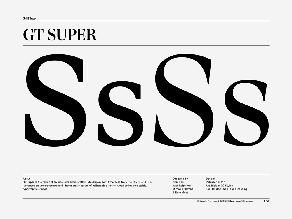
GT Super is the result of an extensive investigation into display serif typefaces from the 1970s and 80s. It focuses on the expressive and idiosyncratic nature of calligraphic motions, compelled into stable, typographic shapes.
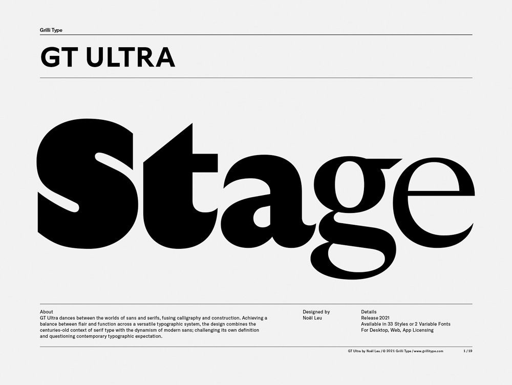
GT Ultra dances between the worlds of sans and serifs, fusing calligraphy and construction. The versatile typographic system combines the centuries-old context of serif type with the dynamism of modern sans; challenging its own definition and questioning contemporary typographic expectation.
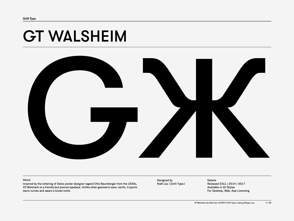
Inspired by the lettering of Swiss poster designer legend Otto Baumberger from the 1930s, GT Walsheim is a friendly but precise typeface. Supports all Cyrillic languages.
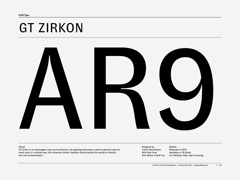
GT Zirkon is an extravagant sans serif workhorse. It blends the worlds of rational tool and ornamentation by applying techniques used to optimize type for small sizes in a refined way.