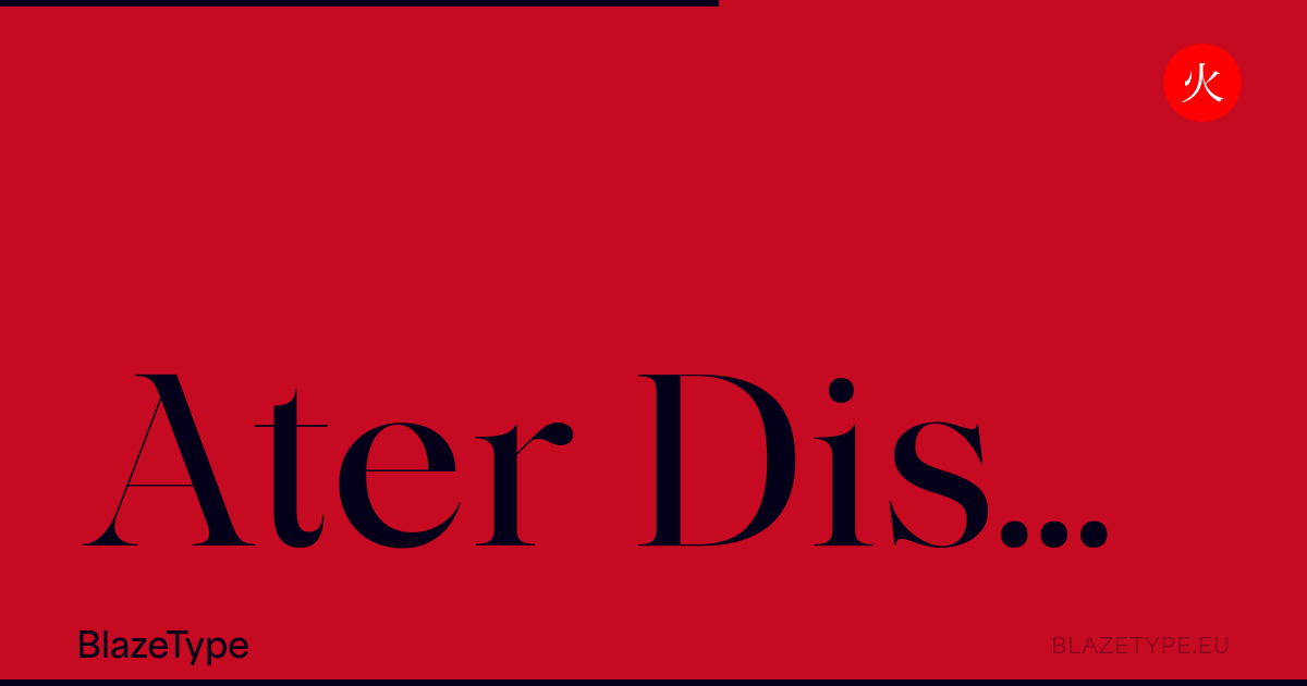
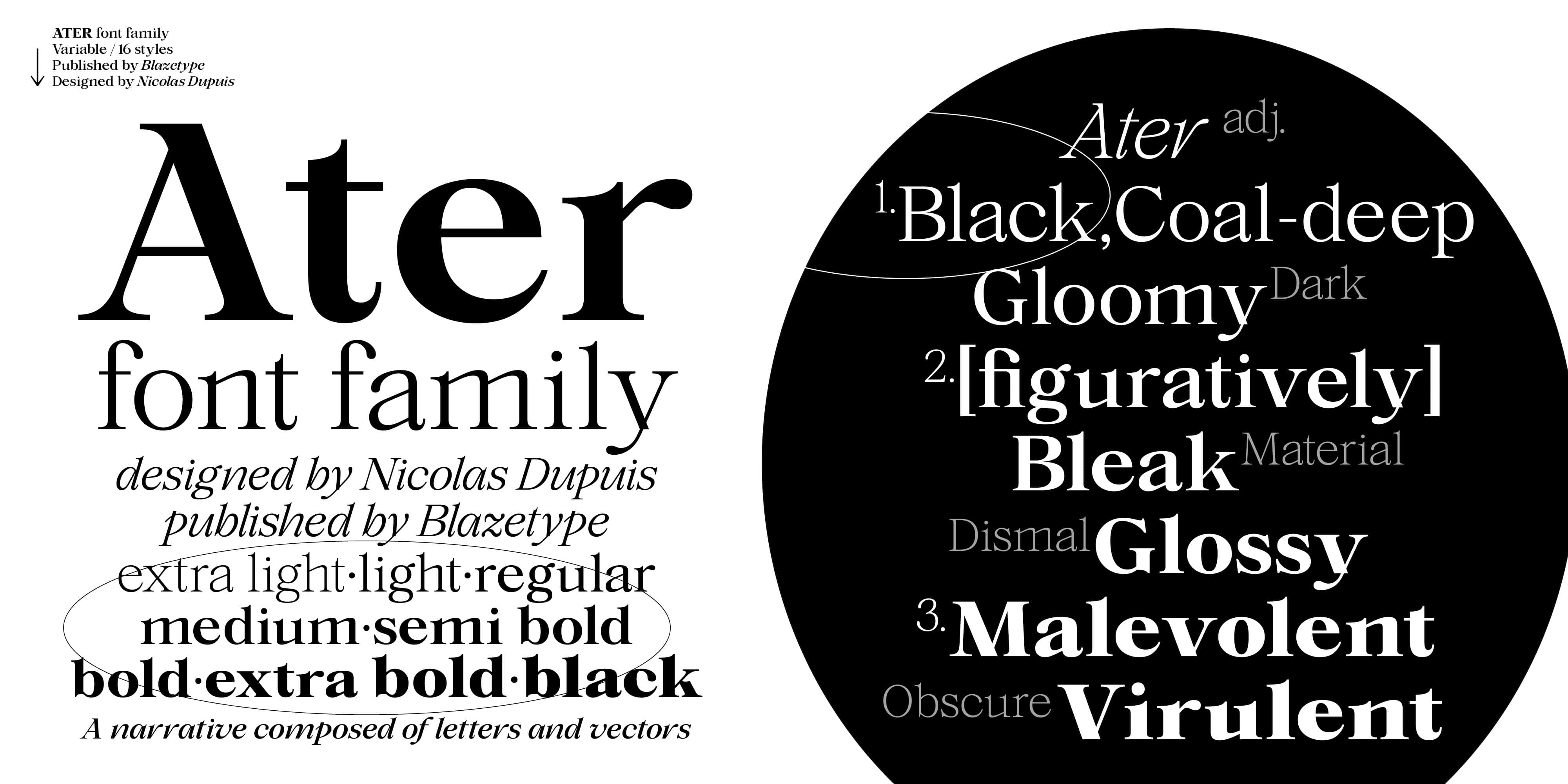
The Display version of Ater font family was inspired by a desire to create greater contrast between bold and thin strokes. It emphasizes the font family contemporary and versatile nature. It can still be used for layout work, such as large or small-scale title designs. An elegant family which borrows from classic serif typefaces as well as more contemporary forms. In a spirit of bringing together as many different mediums as possible with unity in the shapes. It is a variable typeface with a letter blackening approach, to the point of finally appearing in a display-style. A thinner design, but still features those striking weights. From Extra light to Black, it goes to the extreme for optimal legibility in both small and large sizes. Thanks to these variations in tone, the white space is more prominent and highlights the typeface’s attention to detail and refinement. A family designed for creative expression, using ligatures and other glyphs to showcase its potential as a display typeface.