0123456789
CoFo Drifter is a contempopary monospaced sans serif font
mono
contrastfoundry
monospaced
Contrast Foundry is a typeface design studio founded by Maria Doreuli in 2014, focused on creating custom and retail fonts. The studio aims to serve graphic designers with unique typographic solutions for various projects.
CoFo Drifter is a contempopary monospaced sans serif font
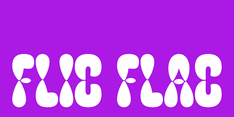
FlicFlac is an organic, soft and rhythmic typeface. It explores the idea of repetition, without following the strict rules of traditional stencil and modular designs. The harmonious shape that words create might deceive you into thinking all letters are made with the same building blocks, but hardly any element is repeated. It’s all about balancing the construction of each letterform with the overall plump and natural character. FlicFlac works perfectly as a statement font, within a word or a phrase that needs to grab the attention. But it’s rhythmic structure also creates extremely ornamental text textures worth experimenting with. On top of that its building blocks are ready to move and invite you to make them dance in animation. The main element of the typeface may remind you of water drops and it performs in the same organic way as water naturally flows. The elements tighten and come together in the middle of each letterform, without touching. In more complex characters these drops merge, creating new forms. Maintaining FlicFlac’s character throughout means pushing the limits of legibility. Maybe sometimes you would have to guess a letter from the context, but that is a sacrifice you can make, right? Because this typeface will always make you notice and make you listen to what it has to say. For additional license options like app, enterprise, multi-user, and self-hosted web, visit [CoFo FlicFlac on Type Network](https://store.typenetwork.com/foundry/contrastfoundry/fonts/cofo-flicflac).
CoFo Glassier is an elegant condensed display font inspired by modernism and architectural lettering

CoFo Gothic is a strong sans font inspired by Franklin Gothic and other 19-20 century grotesques. It's bold character maked it ideal for ads, branding & packaging.

CoFo Hand is a friendly script font with the essence of lively handwriting
Discover versatile and playful CoFo Holz, a modern serif typeface inspired by engravings and wood type
CoFo Kabeltouw is based on marine transportation signs and industrial lettering
Discover CoFo Raffine, an eclectic display serif font with high contrast and elegant forms
CoFo Pixel is… you guessed it, a pixel font. Every letterform is built from small squares placed on a grid. There are no curves, no optical adjustments, no small details. You might say that it makes the work easier. However, simple solutions are not necessarily easy solutions. After some thorough testing of pixel shapes and grid sizes, we chose to work with a simple square building block and a grid that is neither too large, nor too small. We wanted the forms to be as simple and clean as possible, but also recognisable and usable in a range of sizes. Based on the Regular style of CoFo Sans, CoFo Pixel shares many of its characteristics—thickness of the stems, vertical proportions, and overall width of all the characters. The strong foundation of CoFo Sans allowed us to keep Cyrillic alphabet in mind right from the very start and to create an extensive typographic system. The resulting CoFo Pixel is CoFo Sans’s pixel sibling. Its possible applications include large display forms, logos, illustrations. It includes Latin and Cyrillic, localised forms, punctuation marks, math and currency symbols—matching the character set of CoFo Sans, which makes them a great pair and a beautiful addition to your font collection!
Explore the Arabic version of CoFo Sans Pro, a versatile sans-serif font designed for the Arabic script
Try CoFo Sans Semi-Mono — a blended mix of rational monospaced font with elegant sans-serif spacing
CoFo Sona is a geometric sans serif font with humanist features
CoFo Weather is a unique variable font that loves to stretch and slant