Satoshi
Indian Type Foundry · Deni Anggara · 2021
0123456789
A modernist sans-serif with elegant rounded shapes and sharp angular details, reflecting Swiss style modernist aesthetics.
sans-serif
geometric
modernist
A variable font ships a continuous range of styles in a single file, so you get range without the page-weight cost. Below are the variable typefaces in the Typedex catalog, useful when you want flexibility from one family and fewer network requests.
Fonts flagged as variable (one or more registered axes), newest first · 60 fonts
Satoshi
Indian Type Foundry · Deni Anggara · 2021
A modernist sans-serif with elegant rounded shapes and sharp angular details, reflecting Swiss style modernist aesthetics.
Universal Sans
Family Type · Briton Smith · 2020
Universal Sans is an award-winning customizable typeface platform designed to make custom type accessible to a wider audience. Launched in 2020, it features six variable axes and extensive stylistic alternates, allowing for infinite unique outcomes while adhering to fundamental typographic principles. The typeface connects diverse sans serif styles, innovating for the 21st century with unique design features enabled by technology.
Nice is a modern serif typeface that balances clarity, liveliness, and legibility. Designed by Jan Fromm, it features four optical sizes, making it versatile for various applications from small text to large headlines. The typeface draws inspiration from baroque styles while avoiding excessive ornamentation, resulting in a friendly and expressive appearance suitable for editorial design, branding, and packaging.
Neue DIN is a modern reinterpretation of the classic DIN typeface, known for its compactness, elegance, and versatility. Originally developed for technical and transport applications, it has evolved to meet the demands of contemporary design, incorporating variable font technology for enhanced flexibility. The typeface maintains its geometric roots while introducing subtle curves for a more refined appearance.
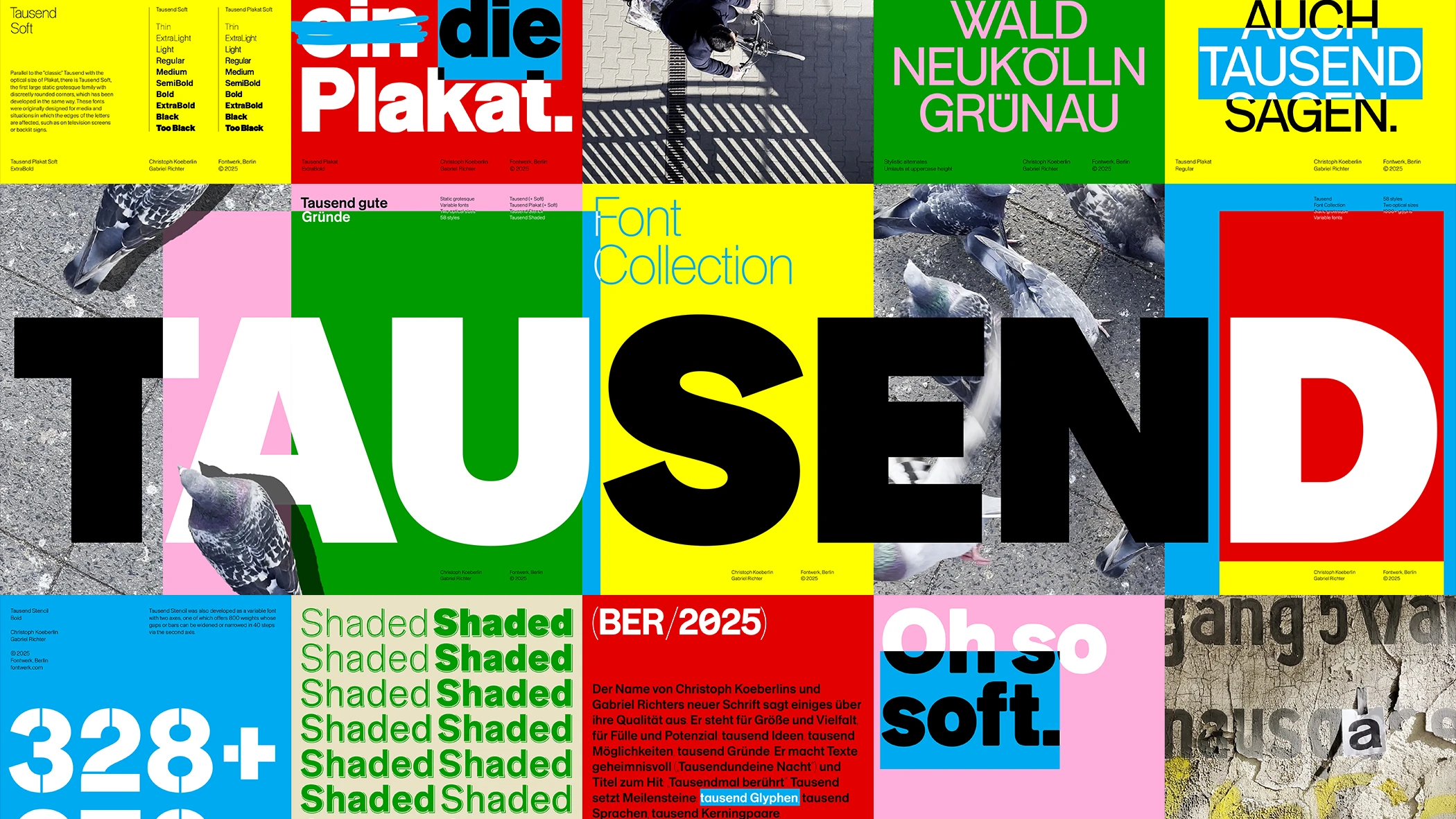
Tausend is a modern sans-serif typeface that draws from the tradition of German grotesque typefaces while incorporating contemporary design elements. It was developed through a collaborative process between Christoph Koeberlin and Gabriel Richter, focusing on roundness and versatility. The typeface is suitable for a wide range of applications, from branding to signage, and conforms to modern typographic standards for accessibility.
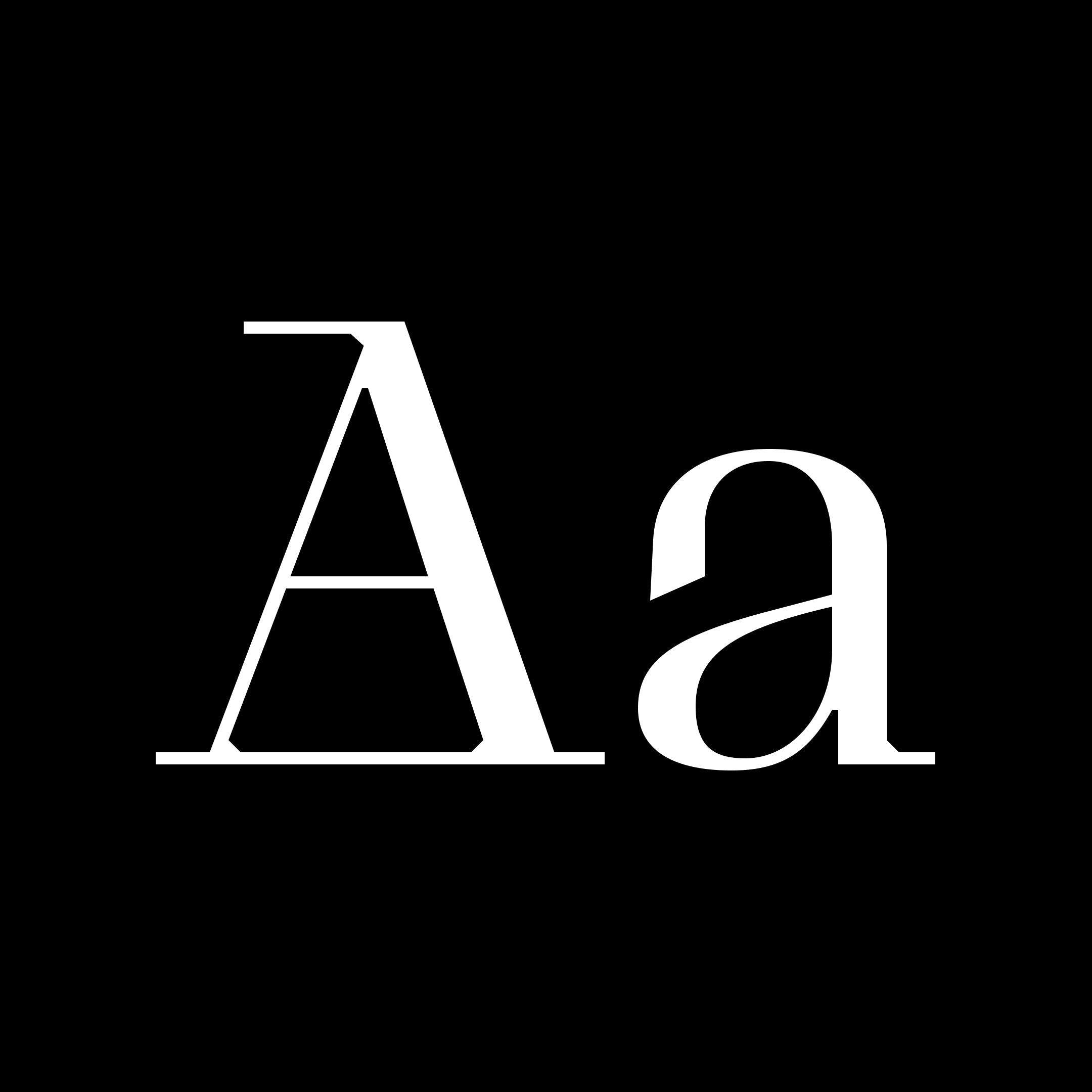
Grafier is a serif typeface that rethinks classic design in the digital era. The original source of inspiration was good old Baskerville, an English typeface from the 18th century. But Grafier went its own way and got some unique new features. The most obvious one is uncompromisingly straight serifs, which join inside the letters. This brutal linearity is also supported by distinctive flag-terminals, chopped shapes and squarish punctuation. The family consists of 10 styles: five weights from Regular to Black in two contrast variations. All the styles are also available as one variable font with two axes. Straight letter shapes makes Grafier a good pair for sans serif fonts. The typeface works perfectly in big and medium sizes; low-contrast styles are suitable for short texts as well. In such cases the readability can be improved by using stylistic alternatives that disconnect serifs.
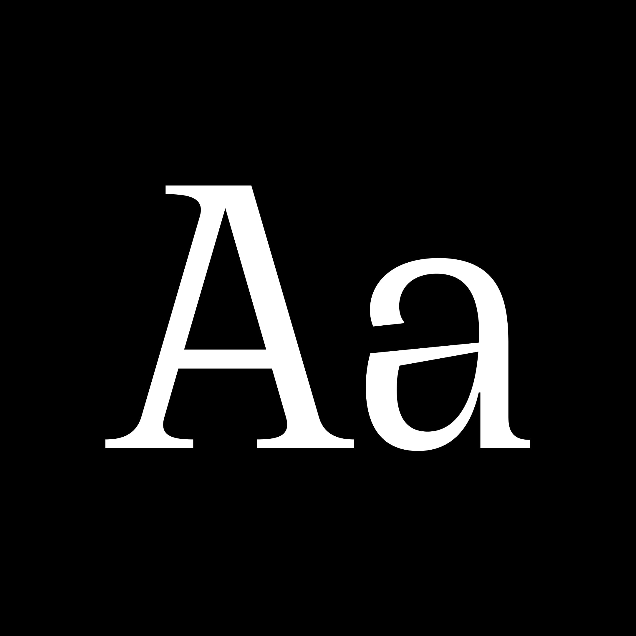
Cirka is an elegant typeface that combines classic forms u0026amp; a vertical axis with sharp, pointy serifs. It works great set large on posters or headers, or small, as body text. Its personality stems from the combination of the subtle details in every curves and the flamboyant, spikey serifs. Reminiscent of the 'Italian Wedge' shape from Lamborghini.
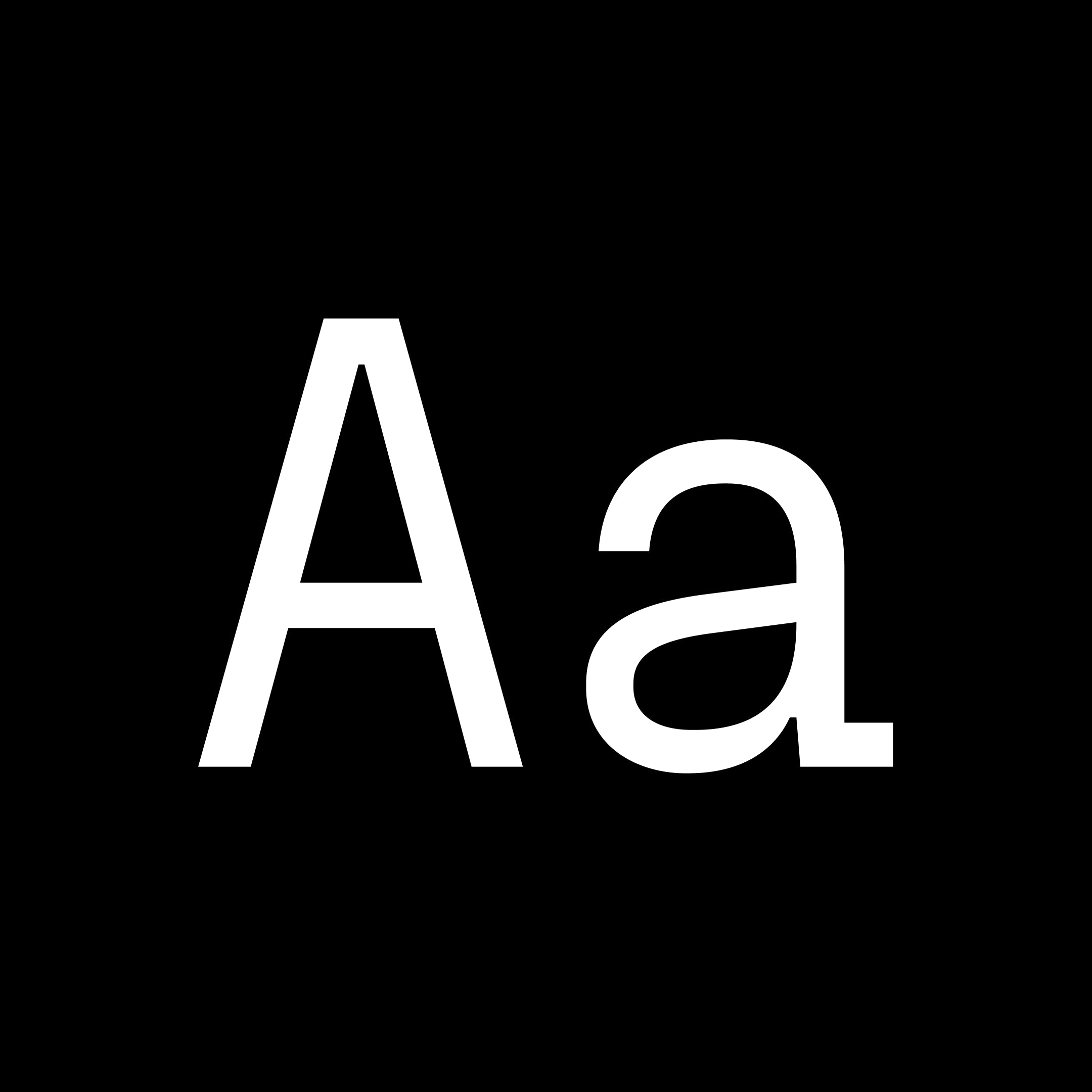
Fraktion Sans is a contemporary grotesque exploring the space between mechanical sturdiness and expressive clarity. While its inspiration stems from vintage signage lettering, the final design is a rather far departure. The square shape and the compact capitals are the only remnants of the original influence and when set in all-caps the industrial spirit is vaguely present. Even so the typeface has been shaped to a modern, versatile allrounder with a slight technical feel that works great in sober applications for screen and in editorial - and still maintains character to be a strong voice in branding. An exaggerated spur on the lowercase 'a' and ink traps are defining visual characteristics just as the squared-off rounds’ true verticals help create a steady cadence. The proportional Sans is complemented by a fixed-width design: Fraktion Mono. The refitted letter shapes of the monospaced design add a surprising playfulness to a genre that generally feels more technical, making Fraktion Mono’s cuts the more informal bunch of the family. Both typefaces offer plenty of typographic solutions through OpenType features like case sensitive punctuation, stylistic alternates, fractions and slashed zero. The 7 upright weights each have an italic counterpart and both sets are available as variable fonts.

Right Grotesk blends the neutrality and functionality of workhorses with a good touch of distinctive personality. Featuring many fine details, smooth curves, moderate contrast and slightly unusual anatomy, the typeface can be a loud and proud hero or a humble supporting actor for all sorts of designs. Not trendy, not timeless either, it was designed to be a versatile and high-quality type family for both serious and fun projects. It was designed to be just Right.

Supply is a solid and versatile typeface inspired by industrial design and architecture. Its precise curves and sharp angles makes this new font one for every designer’s toolbox. It comes in 2 useful cuts: a Sans Serif and a classic Monospace for more structured designs
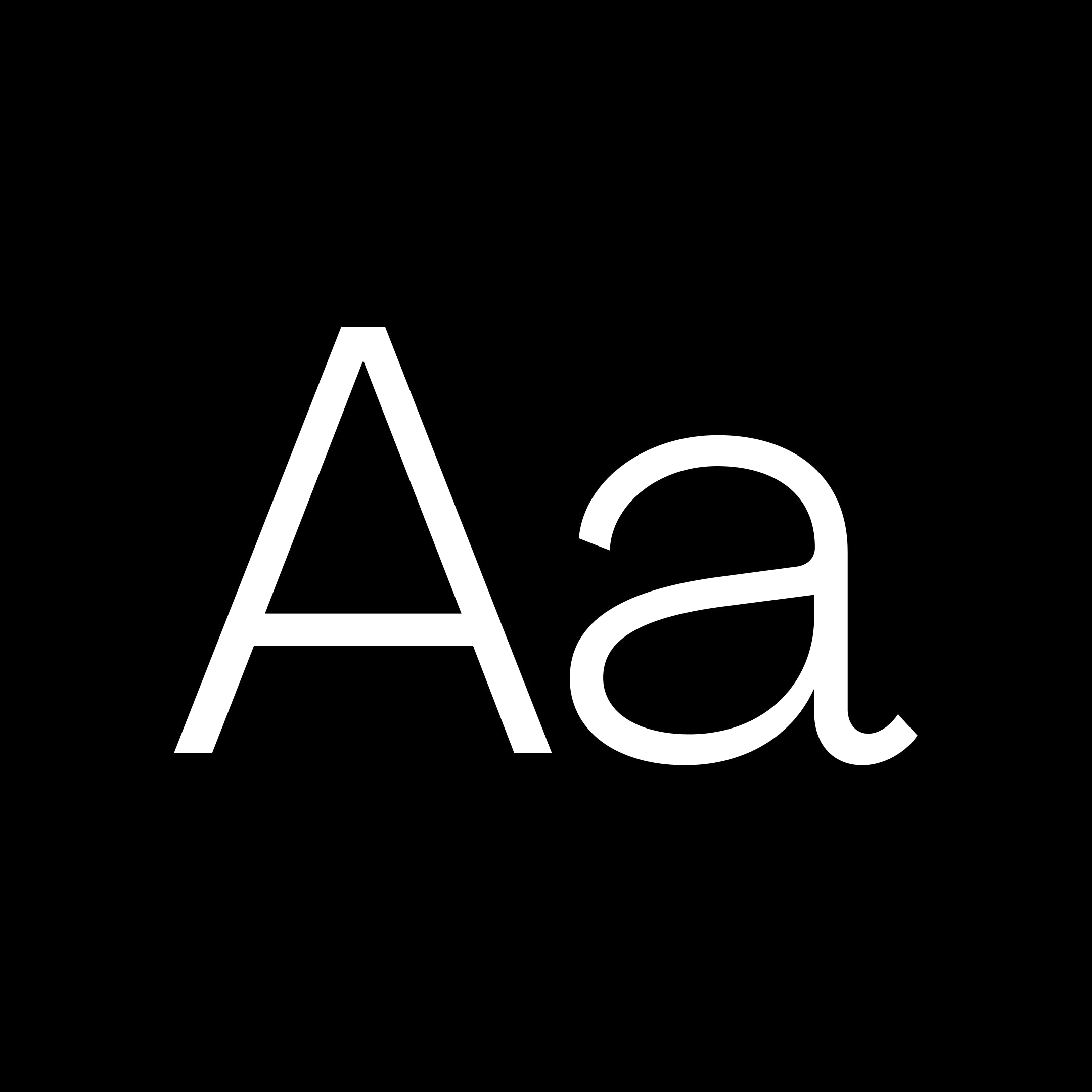
Agrandir is a contemporary serifless type family that celebrates the beauty of being imperfect. It was designed to be a brave antipode to neutral modernist fonts. Agrandir accepts its own shapes as they are – unaligned, quirky and funky. It celebrates humanity, not machines. The type family consist of 74 fonts: 7 weights × 5 widths × Italics + 4 Text styles. Or just one 3-axes variable font. Agrandir features a fairly good number of OpenType stylistic alternatives, which can be turned on for individual letters or as overall presets – Default, Grotesk and Geometric. With its wide variety of flavors and super tight spacing Agrandir is gonna do a good job for big size headlines, websites, logos and posters, and its new text styles are great for body copy.

Pangram Sans Rounded is the more fun and playful sibling of Pangram Sans. It still remains a powerful and extensive geometric workhorse with 144 styles but with a more approachable side. It's in its bolder weights that this typeface truly becomes unique. It also includes support for the Cyrillic Alphabet. Inspired by some of the greatest geometric typefaces, this free to try quality font family will surely be your next “go to” rounded font to uplift your designs.

Pangram Sans is a powerful and extensive geometric workhorse. It was designed to be as bold and intense as it can be subtle and flexibleWe took this free to try geometric sans to a whole new level with a fully variable slanting, from Reclined to Italic. It also includes support for the Cyrillic Alphabet. Inspired by some of the greatest geometric typefaces this complete font family will surely be your next “go to” font to uplift your designs.

Neue World is a free-to-try super-serif font family with 6 widths and 48 cuts. Inspired by vintage display types often manually squeezed to fit the print size, this typeface has all the widths required to accommodate any format. Its soft curves and refined details create a sense of elegance in its thinner weights, while the hard contrast in its heavier weights creates a bold statement. A beautiful, modern serif that pays homage to its forerunners. The stunning details and versatile possibilities for this font make it an essential addition to any type tool kit.
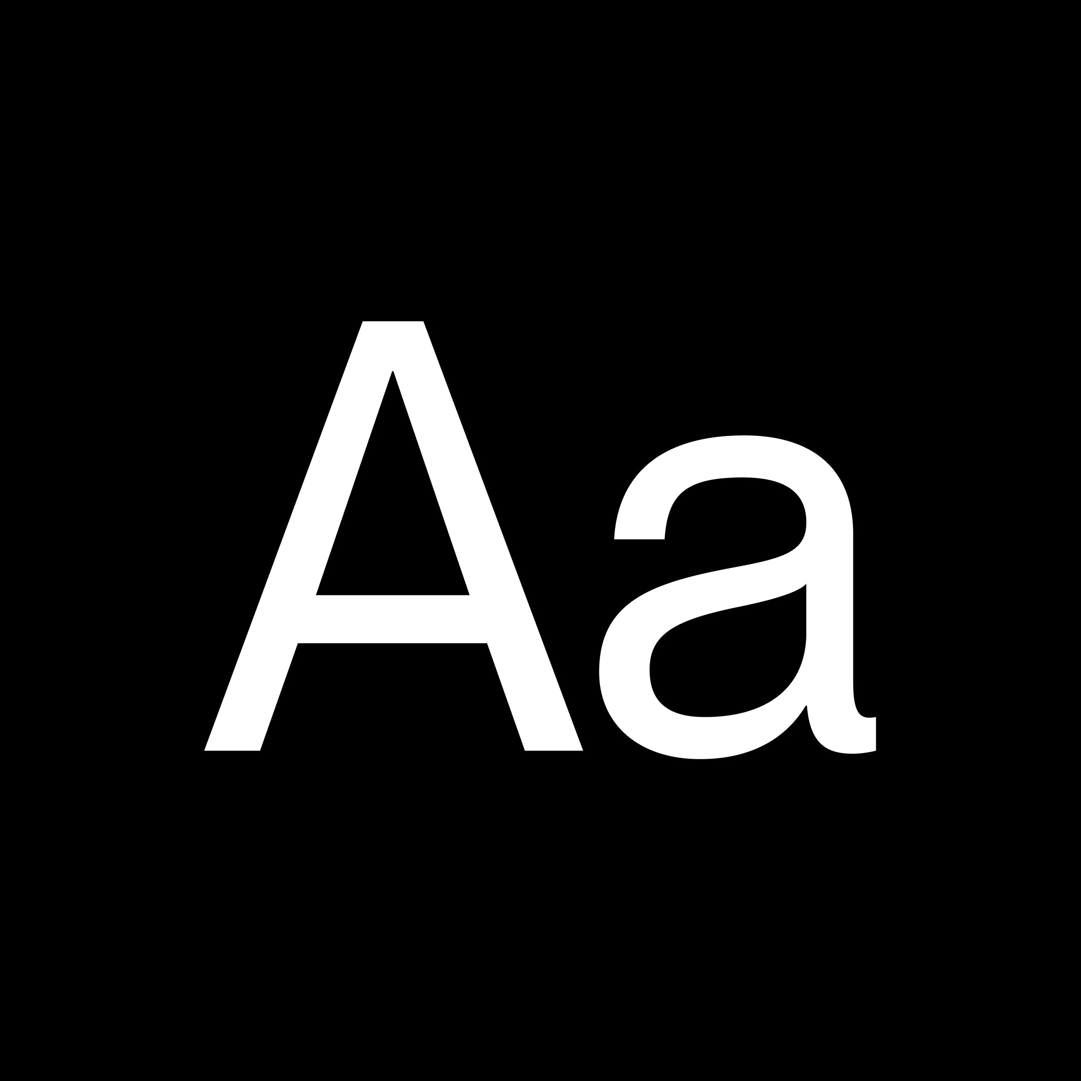
A versatile Grotesque font with the spirit of a display font. Complete with 14 weights (7 Uprights, 7 Italics) and a slightly tighter kerning including Cyrillic support. This typeface was created to be your next champion font. This timeless Sans was inspired by what makes Montreal the great design city it is today, from the Expo 67 to its contemporary effervescent design scene. It has already been used by many local brands notably the most recent rebranding of the city's football club Montreal FC.

Designed to work both as an expressive display typeface and as a readable editorial tool, Räder's range spans across 16 carefully crafted weights: from a stripped down hairline cut to the more exuberant and decorative bold. Road signage is something of which we've learned to assume the neutrality: it's ubiquitous, simple and sends an arguably unmistakable message to the viewer. Has it always be like that, though? Vintage signage systems were in fact the result of a graphic compromise between clarity of message and beauty of appearance, as designers understood the importance of wayfinding in the urban identity: Räder is an attempt to bring the craft back to such times. On one hand immediately recognisable, on the other oddly familiar, it draws from a debut-de-siecle aesthetic to spice up the hyperpopular genre of industrial grotesques. Räder's inner round counters give the feeling of a printed typeface, without compromising its modern look, so you can have the best of both worlds... or should we say the best of both ages?
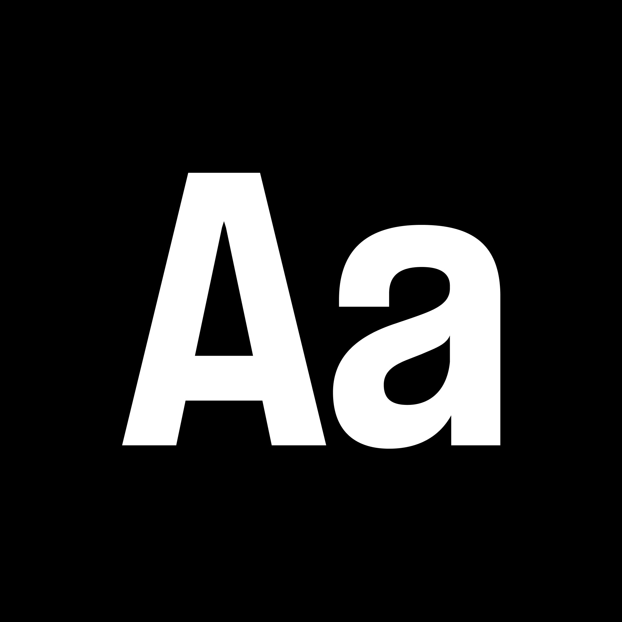
Formula is a complete and versatile typeface that bold racy look with the flexibility of a grotesque. It comes in many styles from Condensed to Extended through a comprehensive set of weights from Thin to black all with their italic counterparts. Formula was designed to make an impactful statement in your designs, wether you are using the Condensed Black Italic style for your race-inspired campaign or the Normal Regular weight just to go along as body text, this typeface has got it all!Download it for free, get set and go!

Right Sans is just a tiny bit fancier than your favorite serif fonts, except it keeps it sans. This huge variable family comes at you in a variety of weights, widths and italic angles, in both classic and variable formats. Right Sans supports the majority of Latin and Cyrillic-based languages. It is a high-contrast sibling of Right Grotesk and Right Gothic. The three of them together give you over 300 fonts perfect for pairing in big and small sizes. Enjoy!

Neue Machina is a powerful and meticulously crafted typeface boasting monospace/geometric type features as well as apparent and deep ink traps in its heavier weights ● It is inspired by the aesthetics of robotics and machines ▲ a font suited for the future of technology ■ It was design to be versatile, to blend in your designs in its lighter weights or to give them a lot of personality in its heavier ones. It comes in a Inktrap cut as well as a Plain cut for your more subtle designs. Each cut comes with their corresponding italics and everything is variable for maximum versatility!

PP Writer is an elegant and dynamic serif drawing inspiration from French Renaissance type. It includes three cuts, text and display styles and a playful italic, and nine weights per cut. Each font includes 744 glyphs with a range of alternates, ornaments and much more. It is intended to provide the user with a legible, traditional text typeface for print and editorial usage. Writer Text is the workhorse of this typeface, its purpose is for text ranging between 6 and 14pt. PP Writer's proportions, contrast, modulation and stress embodies Renaissance type of 16th Century. Although it is inspired by the past, it does not always stick to tradition. PP Writer has plenty of character and personality, pushing the Renaissance style into the 21st Century. It is a variation of the text style with different levels of contrast and sharper strokes. This style embellishes the characteristics of the text style, accentuating and exaggerating each stroke and serif. The Italic is a lively and characterful companion to the upright. It can blend into a piece of text, harmonizing seamlessly with the upright whilst still sufficiently standing out. The Cyrillic follows a similar aesthetic to the Latin, but does not ignore Cyrillic traditions. This is notable in the serifs found on the Tse or Sha, which disregards the Latin motif and prioritise Cyrillic tradition. It’s a beautiful timeless piece bred from renaissance type drawings. You can feel the ink spill in the heavier weights, especially in the italics. It was dreamt to be a workhorse typeface giving you maximum breath of ability with its text, display and italic cuts.

Introducing the premier of - Right ‘American Psycho’ Slab, an original Pangram Pangram production. Slab was giving us major tarantino vibes, those chunky serifs paired with an extended structure. We created a set of imagery that feels like the campaign for a new movie release. How will it all end?Right Slab is that big boi of the family. Massive at first glance, the typeface quickly turns out to be your good old friend. In its heavy styles, Right Slab unapologetically occupies all of the space with its chunky serifs, while light and narrow cuts leave some more air. The typeface is perfect for grabbing attention in a nice and fun way. It feels most comfortable in large display sizes, but styles near Regular can handle some paragraphs for text too. Right Slab is a serif brother of Right Grotesk, from which it has inherited low contrast, large x-height and a ton of variable styles covering 7 weights × 7 widths.

Imagine if Helmut Lang, Maison Margiela and Jil Sander created a collaborative label, what might the imagery look and feel like? This was our starting point for our “campaign” for Right Serif. We created a series of imagery that felt part of a wider fashion campaign, this tied nicely to the unusual and contrasting anatomy of the characters of Right Serif. We explored these characteristics in the form or imagery that played with inversion u0026amp; contrast. Right Serif is a funky multitool, a spiced up workhorse that stretches between being highly functional and having a unique personality. Unlike many other serif typefaces taking roots in history, Right Serif originated as a sans-serif (Right Gothic to be specific) growing serifs. From there, the typeface inherited moderate contrast and features common among grotesks but rare in serifs, notably large x-height and a wide range of variable styles covering 7 weights × 7 widths. Although the family is mostly intended for large and medium sizes, styles close to Regular work really well for paragraphs of smaller-sized text too.

Welcome to the Arabic version of our most popular typeface, Neue Montreal. A versatile Grotesque font with the spirit of a display font. Complete with 7 weights also including Cyrillic support. This typeface was created to be your next champion font. This timeless Sans was inspired by what makes Montreal the great design city it is today, from the Expo 67 to its contemporary effervescent design scene. It has been used by many global and local brands.
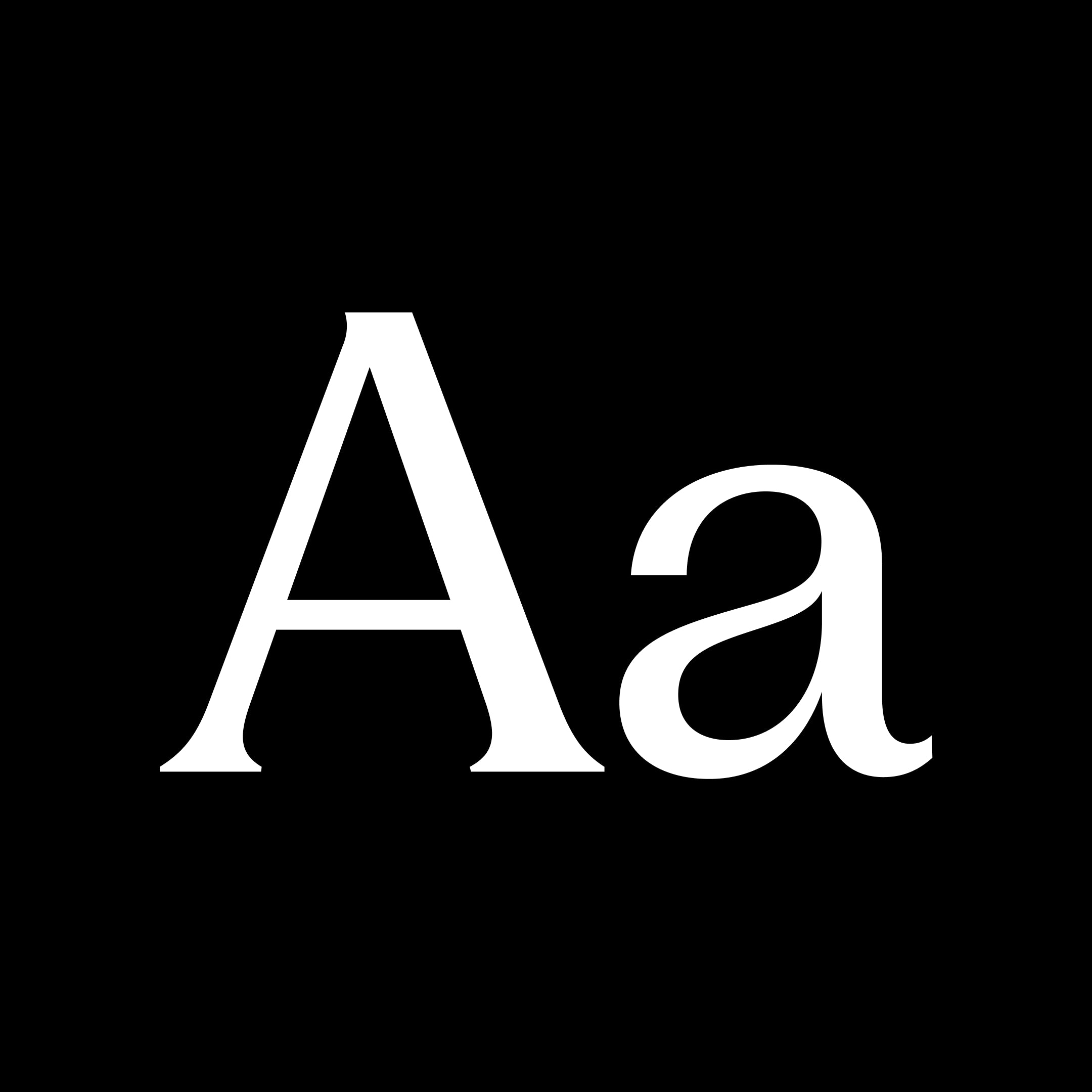
PP Fragment is born from vintage lettering and signs, bridging 19th-century letterforms and contemporary typography. Pangram Pangram’s 35th release uses the latest technology, gracefully oscillating between an elegant, highly contrasted Serif face, a revival mid-serif called Glare, and a strong Sans, each with distinct features yet perfectly complementary. It comes in 4 preset cuts, Sans, Serif, Glare, and Text, each with unique personalities and quirks. Each weight counts 581 glyphs with plenty of alternate symbols to achieve the best-desired result for your next design. Its power and versatility also comes from its 32 very distinct and unique weights plus italics! These weights were carefully crafted and cut for maximum breath of ability, PP Fragment doesn’t disappoint and will surely be one of your best tools in your next design endeavour.
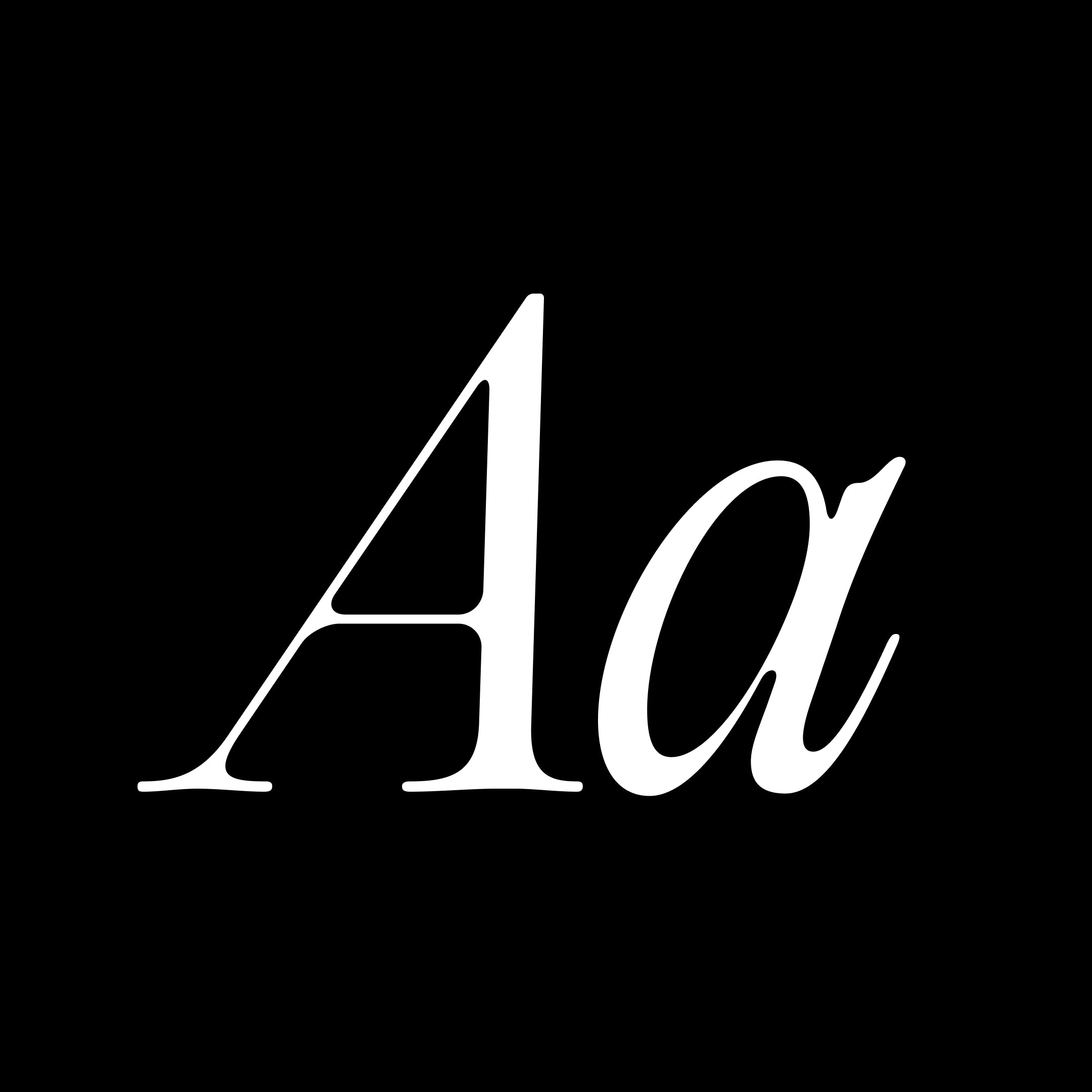
Editorial Old is a 'fresh' take on one of our most popular classics Editorial New. So to understand Editorial Old we need to go back to Editorial New's Concept for a second. The concept of Editorial New was rooted in 70s u0026amp; 80s vintage ads. With its narrower stance and elegant curves, this workhorse serif quickly became one of your favourite. Stemming from that success, we had the idea to push this vintage concept a bit further in this spin-off. What if Editorial New got Old??Its curves would be less tense, its connections a bit more relaxed, its ligature more droopy and more present, its terminals softer. Alongside this idea of the vintage ads, we created a melting, eroded version of our timeless classic with a ton of luscious ligatures. Two Times Elliott led visual campaign embodies this idea of agelessness through refined curves, etched and molded oddities, trinkets and jewelry.

The Harmonious Collision of Brutalism, Minimalism, and Aerospace. A breath of fresh creativity. The newest typeface of pangram pangram, originally designed by Mat Desjardins and expanded by Caio Kondo from Inari Type, embraces the duality between simplicity and experimentation, offering a visually appealing and intriguing aesthetic, a true pangram pangram font. Step into a world where design boundaries are pushed, and artistic influences collide. We're excited to unveil our latest typeface creation, Air. Inspired by a captivating fusion of brutalism and minimalism, with a subtle nod to the sleek lines of aerospace design, Air brings a fresh and distinctive touch to the typographic landscape. Its massive character map includes a variety of alternate characters, allowing for greater customization and creation possibilities. Additionally, abundant ponctuations and a set of arrows are available, adding versatility and functionality to your projects. In addition, Air offers a huge range of weights, 36 in total. From mono style to italic, the typeface even has a variable version that unites these axes in a single file.
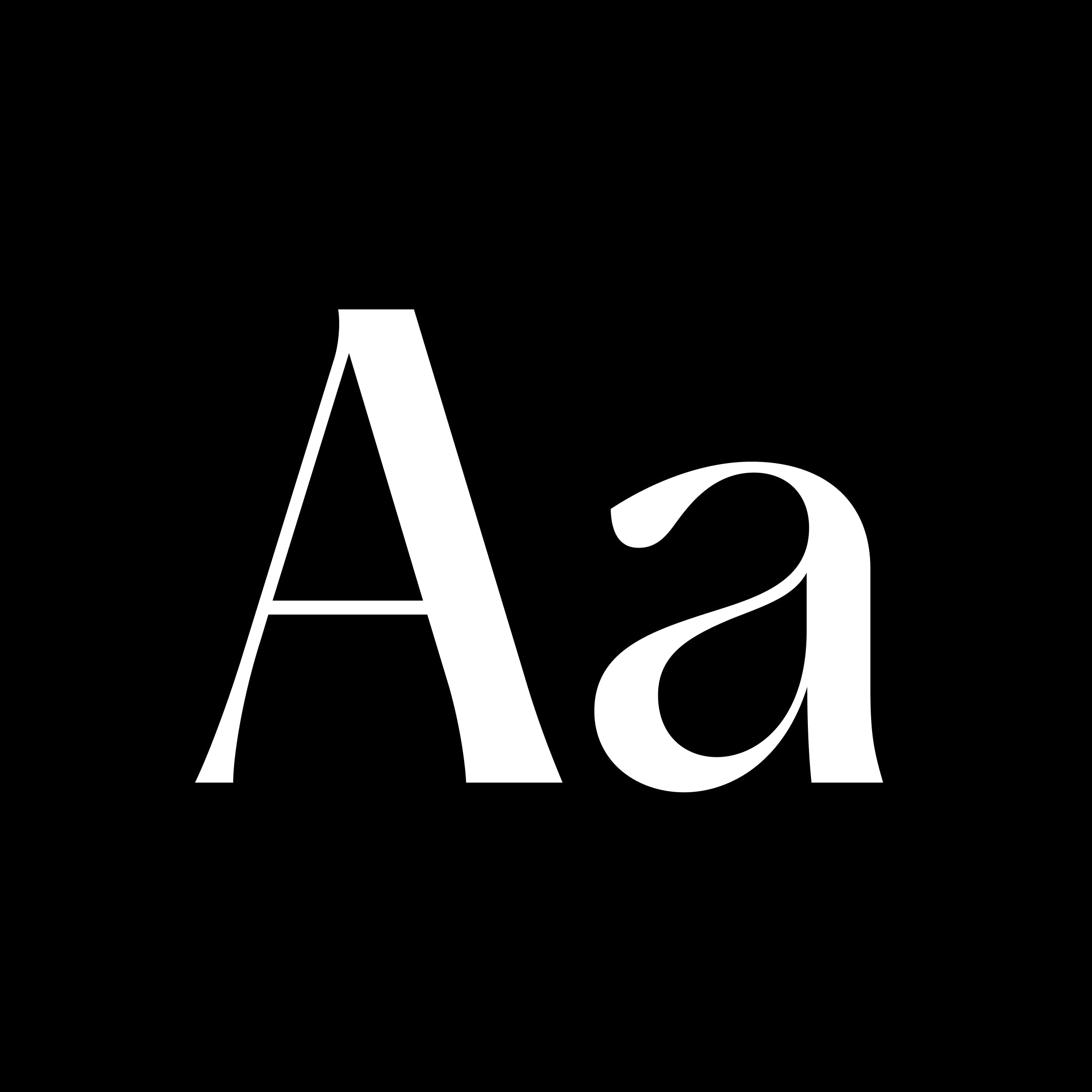
Collaborative at its core, Hatton is a homage to the history of the London district, Hatton Garden, initially designed in partnership with London-based design studio Two Times Elliott. Nestled in London’s jewellery quarter and the design studio’s former home, Clerkenwell, Hatton Garden is the centre of the UK’s diamond trade, famous for both its high-value riches and diamond heists alike. Working together to distil the distinctive character and typographic nuances of the locale’s street signage, shop fronts and landmarks – alongside their beautiful hand-rendered imperfections – the resulting serif is a variable, pearlescent powerhouse, meticulously crafted in eight well-to-do styles. Ranging from Ultralight to Black, Hatton is both refined and robust in its aesthetic. Indicative of the area’s idiosyncrasies and the legacy left behind. Expanding on the ever-growing team of collaborators orchestrating the typographic Hatton heist, Type Designer Morgane Vantorre, alongside Pangram Pangram, has crafted the latest update of the humanist typeface. Now, with even more bang for your buck, Hatton is enviably versatile, befitted with newly crafted true italics, embellishing the serif's expressive, dignified flair alongside its recently refined curves. Its perfected proportions ensure a harmonious balance throughout, especially in the darker weights, with adjusted contrast bringing forth an engaging rhythm, complemented by a sackful of new glyphs – ready raring to adorn whatever design you desire.

Experience the perfect fusion of style and functionality with Neue Montreal Mono. This monospace version of our bestseller, Neue Montreal, introduces coding ligatures and a wealth of features like a special “Button-mode” to elevate your design and coding projects. From its clean, modern aesthetic to its extensive character set, 14 styles including italics and multilingual support, Neue Montreal Mono empowers designers, developers, and creatives with the tools to excel in every project. Upgrade your typography game today and discover the endless possibilities with Neue Montreal Mono.

Introducing PP Pangaia – a typeface seamlessly blending the splendour of traditional serif fonts with the rough, raw, organic beauty of Mother Nature. Drawing directly from the wonder of the Earth and its flora and fauna, Pangaia’s fluid curves inhabit the gentle contours of leaves, riverbanks, and mountain slopes – capturing the joyful, harmonious connection between type, texture and terra firma. Each character in Pangaia is meticulously crafted to evoke imagery of the ground on which we walk – planting itself like the roots of ancient woodland or the rough, rugged foundation of the Earth itself – with serifs blossoming like skyward branches. Its smooth, undulated lines emulate the unprescribed shapes of natural landscapes – the soft, rolling hills and the tranquillity of waters calm. As one, Pangaia inhabits and enlivens our unity with the Earth, both celebrating and making aware of the delicate balance shared between us and the wider world, from its plunging, striking swashes to its powerful italic cuts across 18 total styles. No matter the application, be it brand, book and anything in between, Pangaia is more than just a typeface. Pangaia is a proud, earnest embodiment of nature’s uncorrupted grandeur – offering a sense of connection and respect for our planet through each and every structural form.

Right Serif Mono brings the liveliness of the Right superfamily into the monospaced genre. It embraces the twisted proportions of each character fitted into the same width, while keeping it easy to read in paragraphs and looking distinctive when set big. With its familiar design and a flair of personality, Right Serif Mono is versatile enough to be the primary font or do a secondary work in a combination with something else (Right Serif and matching Right Grotesk Mono are a solid choice).

Right Grotesk Mono spices up the rigid structure of the monospaced genre with playful details and subtle twists. Its friendly technological look makes the font family a good fit for a wide range of projects from branding and posters to websites and books. Having fairly compact proportions, it reads comfortably in paragraphs and remains recognizable in large sizes. When it comes to font pairing, the proportional Right Grotesk and the matching Right Serif Mono make perfect combos, but there are also plenty of other sans and serif counterparts from the extensive Right superfamily.

No matter how much talent we have at our disposal, a great deal of a design project or career is often determined by sheer luck. Talisman is an attempt to harness the mysterious catalyzer and channel it through a hyper-minimalist design: with its casual, stripped-down, almost simplistic structure, it embodies the most prominent quality of luck: effortlessness, both in its manufacturing process and in its use. Created with versatility in mind, Talisman's generous range of weights and widths ensure a great variety of visual expressions, only made more vibrant by its dashing oblique counterpart. It is a typeface ready to become the protagonist of a designer's most successful endeavors, an amulet to keep in one's pocket at all times, both as a first and as a last creative resort.

Gatwick is a wide incise typeface that blends a funky attitude with a refined spirit, resonating with vintage and contemporary aesthetics alike in a unique, memorable way. Unlike many fonts in its genre that rely on uniform proportions and consistent thickness to maintain a “neutral” tone, Gatwick stands out with its tapered stems, sharp terminals, and exuberant details. This distinctive flair gives it an exotic, extravagant character that immediately catches the eye of the reader. With the release of Version 2.0, Gatwick expands its versatility by introducing two new high-contrast families. These additions are ideal for crafting elegant headlines and subtitles, adding an extra layer of sophistication to any project. Designed to fly your creative work to new, unexpected destinations, Gatwick delivers the reliability and comfort of a first-class experience, while ensuring your designs leave a lasting impression.

PP Nikkei is a tribute to Japanese immigration to America through typography, honoring the stories of Japanese immigrants and their descendants. “Nikkei” refers to Japanese individuals and their descendants who live outside Japan. Five typographic systems were made, each expressing unique concepts, yet all interlaced by a common historical narrative. The inspiration came from various sources, including hand-lettered on ships; newspapers of the Nikkei communities; Japanese family crests. Offering versatile title fonts whose proportions and stylistic alternatives allow for playful options for title compositions.

Born from the research that went into the creation of Pangram Playground. PP Playground is a contemporary script, a reinterpretation of the classical copperplate calligraphic style, composed initially with the pointed nib pen. The shapes of Playground font came to life at the intersection of the pen’s logical rhythm, the rich historical calligraphic references, and the precise geometrical construction of the letters. This creative process serves the Playground world, where the seriousness of work is questioned by the necessity of experiment and play to continue to inspire. The elegance of the copperplate script is interrupted by unexpected shapes. We wanted to create surprising tensions from exaggerated contrast and thin horizontal lines. Square forms melted with flourishing curves, and acute cuts and round shoulders were used. The Playground font set includes a semi-connected script, where not all letters are joined. However, the complete cursive connection can be achieved by using the contextual alternates feature. Additionally, two sets of capital letters are available. The first set is closer to italic capitals, while the second set includes swashes for a more calligraphic and expressive variation. The script has 5 weights. Lighter weights are suitable for display sizes, and darker weights are safe for smaller sizes.
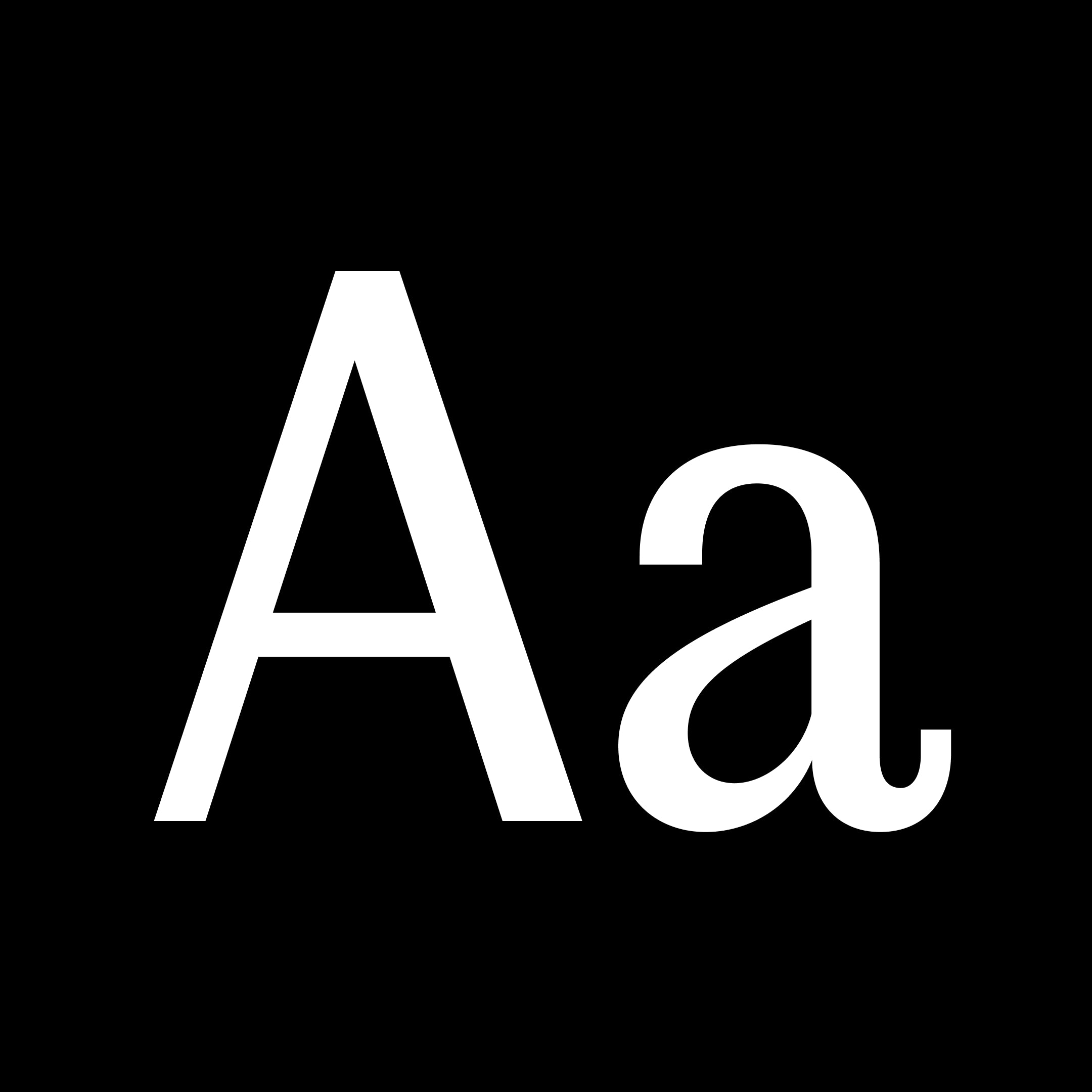
Editorial Sans is a typeface that seamlessly bridges the past and present, embodying a retro-modern aesthetic. Building on the legacy of its serif counterpart, Editorial New, it retains the same proportions and metrics but with a sleek sans-serif design. Editorial Sans offers a clean and contemporary look while honoring its classic roots, making it ideal for a variety of design applications where elegance and modernity intersect. Its versatility shines in both digital and print mediums, from editorial layouts and branding to web design and advertising. Whether you’re crafting a minimalist logo or a sophisticated magazine spread, Editorial Sans provides the perfect balance of timeless charm and modern sophistication. It comes in 16 meticulously crafted styles with true italics — a rare feature in Sans-serifs.
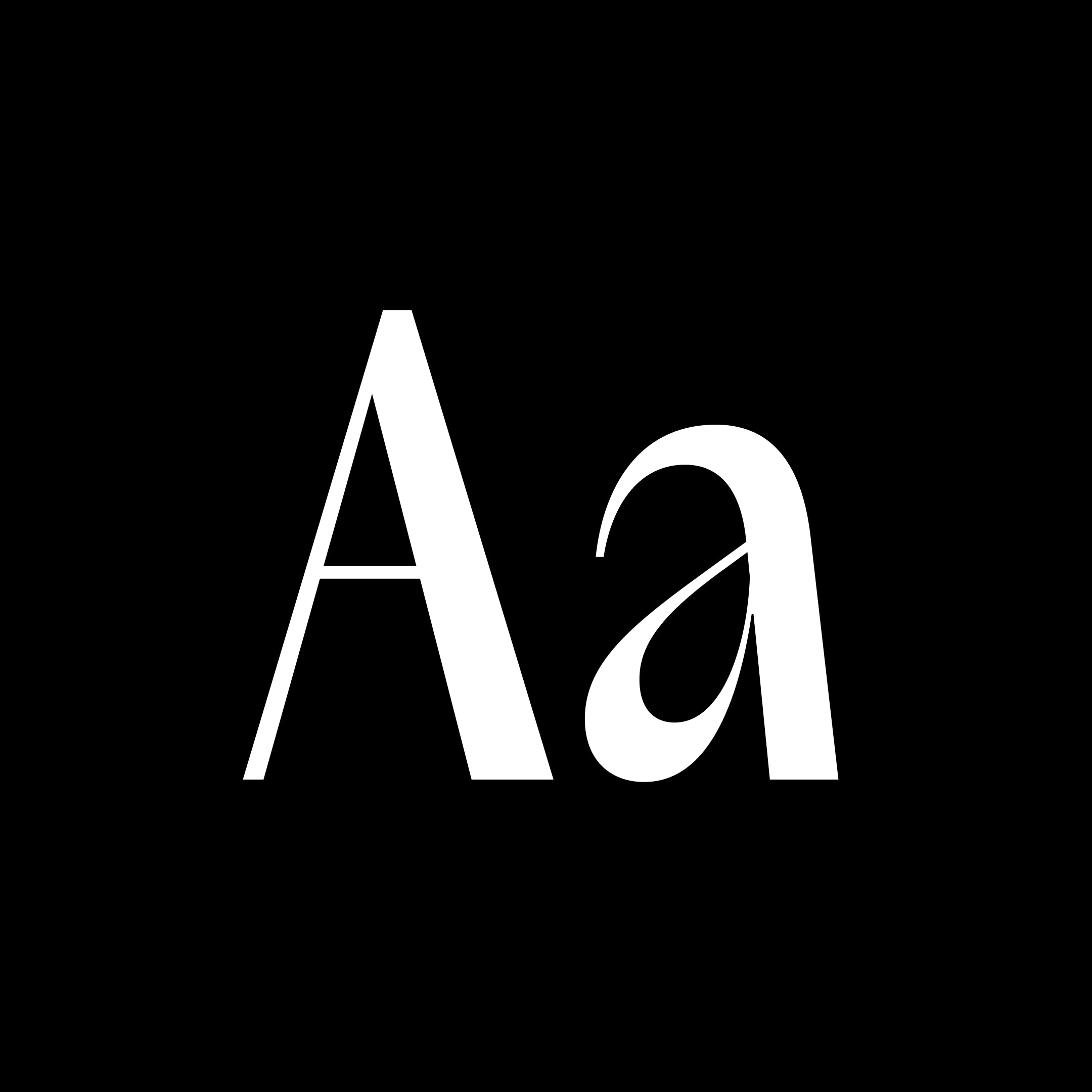
Acma is an irreverent typeface with a powerful elegance. It is ultimately precise and subtle yet it remains flowy and temperamental. The design was inspired by the Japanese modernist aesthetic as well as the fashion world [past, present and future] for its unapologetic nature and opulence through the purity and the tension of its lines yet unconventional forms and rhythms. The design of the lowercase “a”, gave the tone to the whole family, which quickly became Acma. Its luscious curves, wide alternates and deep contrast will embellish any design endeavour it takes on. Guaranteed. It is a highly contrasted, narrow sans serif, ranging from thin to black. Originally intended for editorial headlines, Acma can be use in a variety of purpose starting at 12 point. Acma includes a second set of wide uppercase, and alternative key characters in the lowercase. The use of these characters allows the designer to create a variety of unexpected moments. Acma comes in 10 weights with a variable cut for maximum versatility. It is a celebration of idealistic beauty, express through tension, balance, unorthodox shapes.
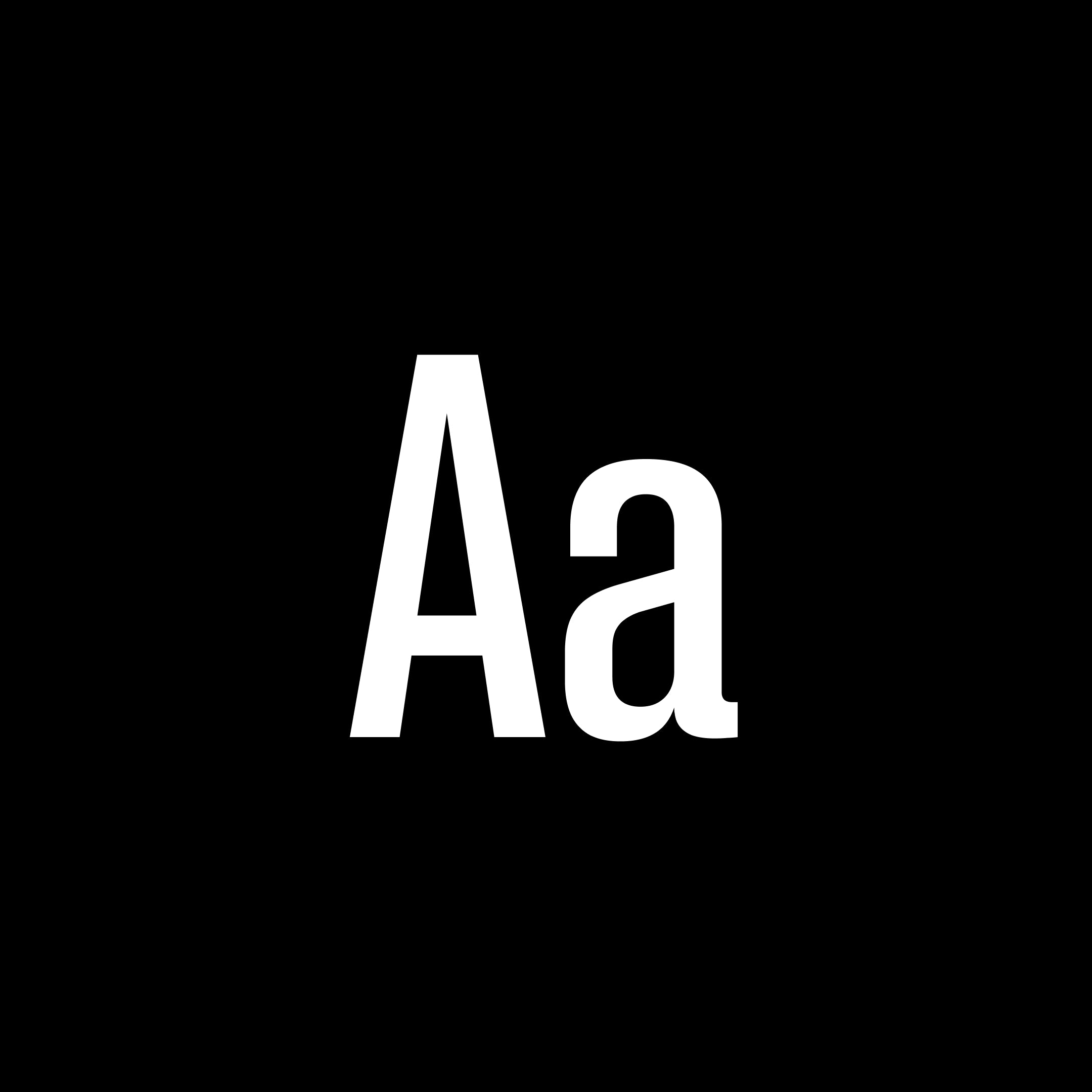
Neue Corp is a versatile typeface, crafted to be the ultimate creative tool for any advertising, marketing, or digital endeavor. Designed with a broad range of widths and weights, it empowers designers and studios to adapt it to any context, from bold headlines to refined body text. Balancing character with neutrality, it combines the eccentricity of old wood type with the precision of neo-grotesques. The Black and Condensed styles are inspired by classic Hamilton Mfg. Co. typefaces, while the wide Bolds are influenced by Helvetica Extended. Regular styles draw from Univers but with softened details for a friendlier tone. Alternate stylistic sets offer even more flexibility: one set makes the typeface more geometric and neutral, while the other brings out a bold, grotesque character with added spurs. With a design spectrum ranging from subtle Thin to powerful Black, and from narrow Compressed to bold Extended, this typeface is ready to elevate any project with style and precision.

Valve is a versatile typeface collection that blends grotesque, geometric, gestural, industrial, monospaced, and cursive sans serif styles into a unified, cohesive ensemble. Defying conventional classifications, Valve provides a wide range of typesetting options through its two distinct families: an ink-trapped workhorse designed for excellent readability at small sizes, and a striking stencil companion that reveals the font’s modular structure and underlying design connections. Valve features three main stylistic sets—a blocky semi-monospaced variant, a familiar humanist style, and a lively cursive option—each showcasing unique contextual ligatures that adapt to tracking for smooth text flow in any combination. With its adaptability and dynamic nature, Valve allows you to control and fine-tune the expressive qualities of your text, making it ideal for a variety of projects, from bold branding and impactful signage to refined editorial design.

Lettra is a monospaced serif typeface that explores the design challenges of modular spacing, with each character individually crafted to ensure consistent weight and proportion across the set. The design draws inspiration from the classic aesthetics of serif typewriter fonts and the detailed classifications seen in botanical drawings. It showcases a strong vertical contrast and distinctive diamond-shaped details, blending nostalgic appeal with mechanical precision. With eight weights in both upright and italic styles, PP Lettra balances structure with character and creativity. It supports a wide range of languages and features, offering a variety of alternated characters. Additionally, the font includes an experimental set of characters, such as unconventional ligatures, ordinal abbreviations, an unusual double-width uppercase and lowercase Oo, and a distinctive sigil.

Monument is a powerful grotesk typeface inspired by the raw beauty and imposing forms of brutalist architecture. Originally designed to make bold statements, it's become a go-to for impactful design, attention-grabbing titles, and refined typographic compositions that demand presence. With its major 2025 update, Monument has grown into one of Pangram Pangram’s most expansive and adaptable font families. It now includes five distinct widths, each available in nine carefully tuned weights, across both upright and italic styles, offering designers an exceptional range of typographic control. Whether you’re crafting branding systems, editorial layouts, or digital experiences, Monument’s versatility and structure make it a workhorse with edge. From ultra-compressed to comfortably wide, it flexes confidently across screens and scales.

Mori is a versatile and sophisticated gothic sans serif inspired by contemporary Japanese design, best suited for editorial, graphic design and branding. From Thin to Black, it has 22 styles, each one includes 804 glyphs with plenty of open type features, including sets with circled and squared numbers, subscript and superscript numbers, symbols and punctuations (some of them Japanese), graphic and mathematical symbols and many alternates. Make sure to check out that geometric 'r' and double-story 'g' !!While keeping all the functionality of a workhorse Grotesk, Mori is far from being boring. You can find some unique and subtle shapes and curves that makes it stand out from the crowd. Notably it's G, number 6 and number 9 just to name a few.
29LT Azahar Text LC is a graceful and reader-friendly typeface designed for both text and display use. It features a balanced design with medium-contrast transitional letterforms, making it suitable for editorial and creative industries. The typeface is inspired by the elegance of the orange tree blossom, reflecting a fusion of cultures and multi-script capabilities.
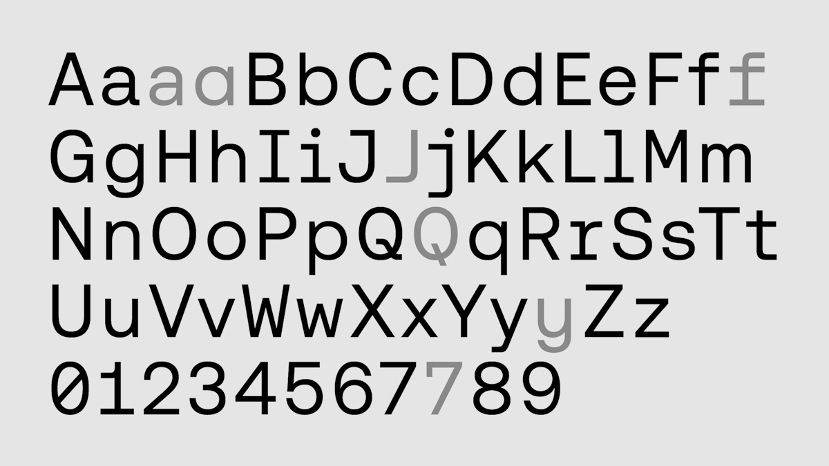
London based type foundry of Mark Bloom and Co.
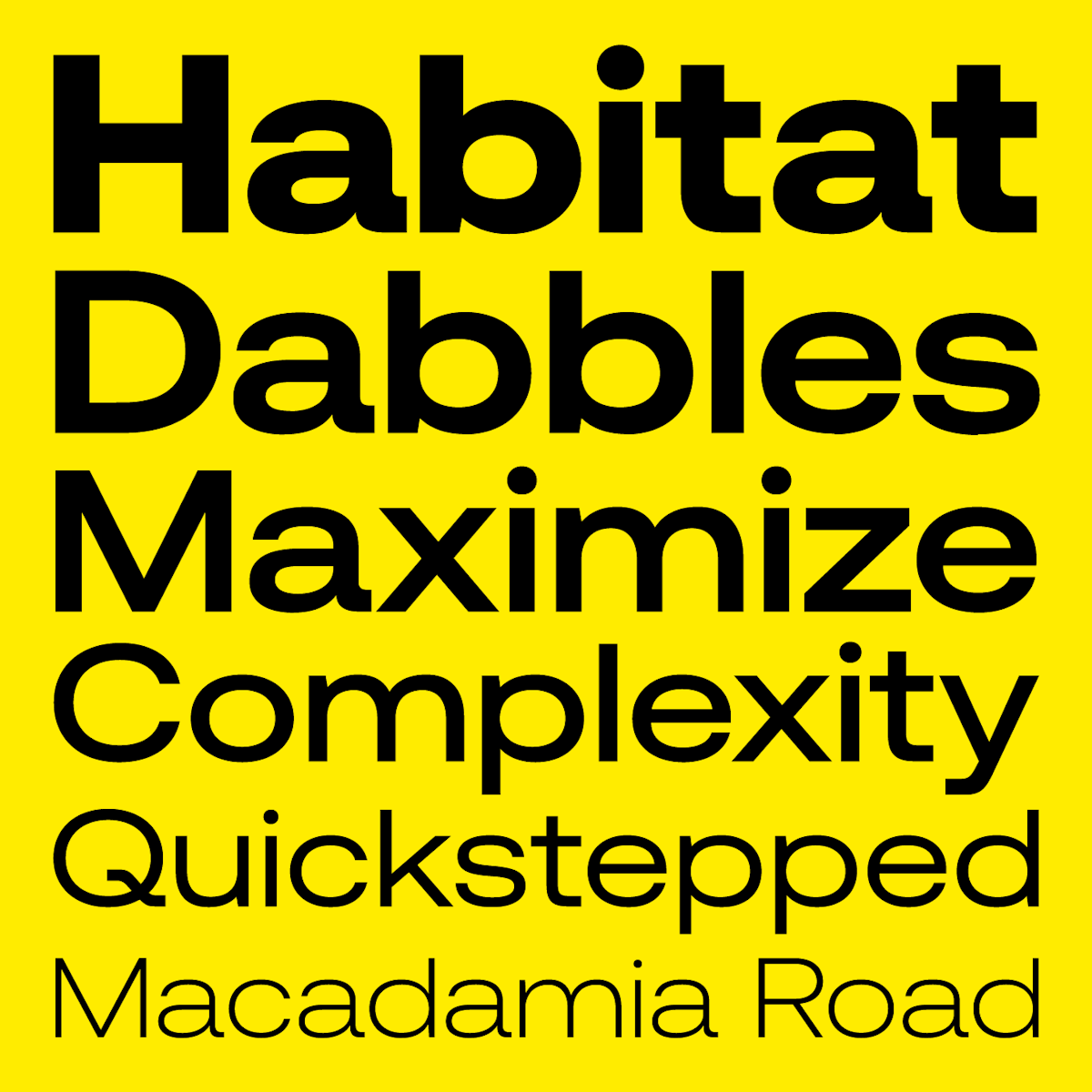
London based type foundry of Mark Bloom and Co.
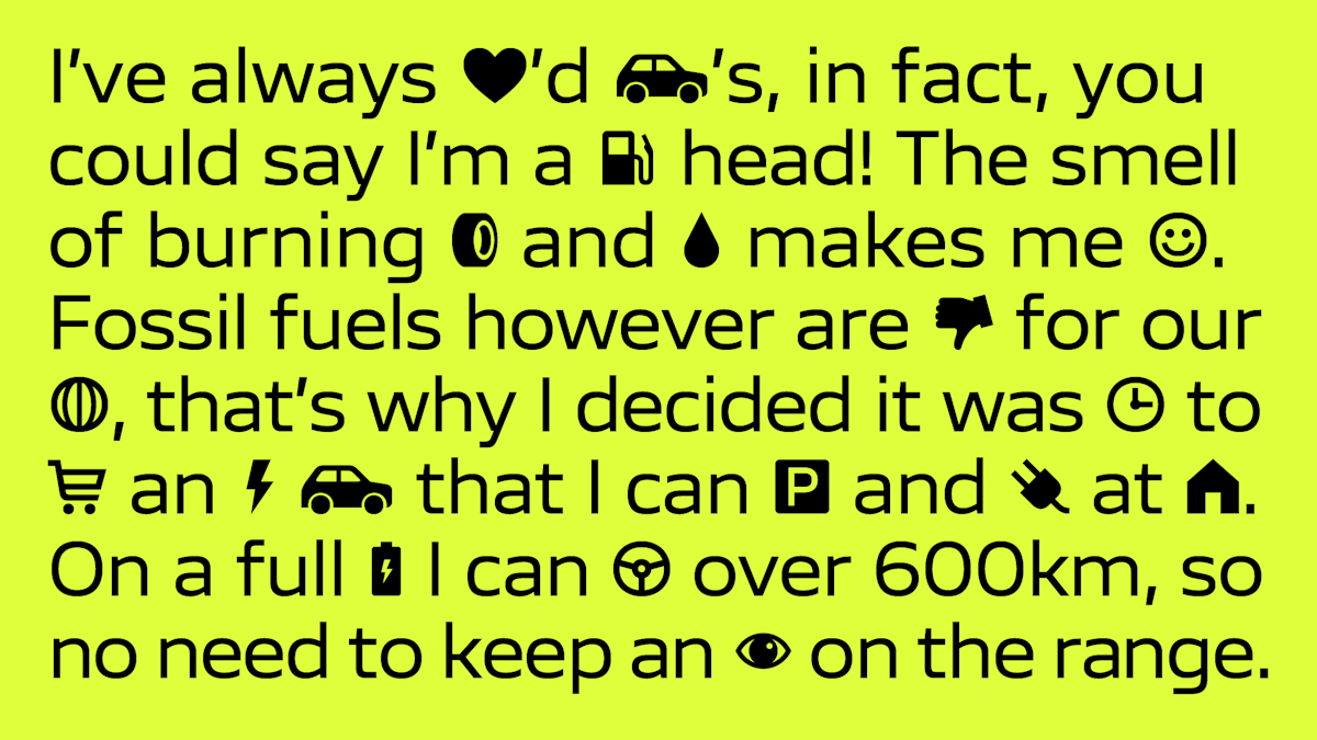
London based type foundry of Mark Bloom and Co.
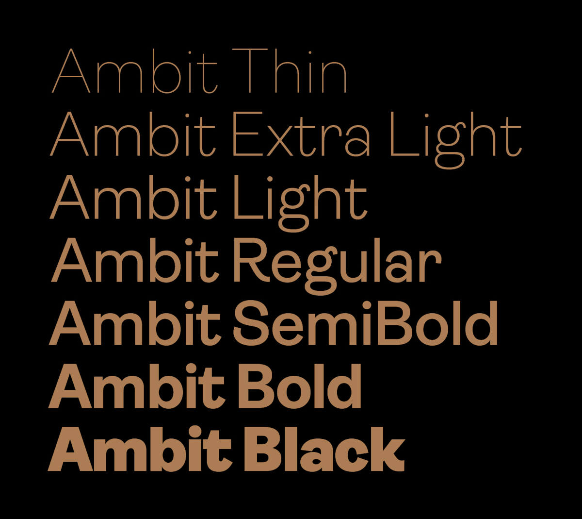
London based type foundry of Mark Bloom and Co.
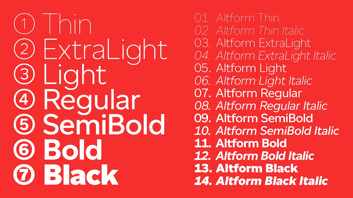
London based type foundry of Mark Bloom and Co.
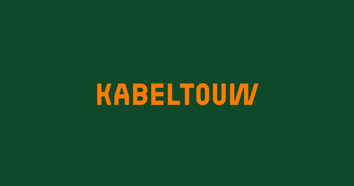
CoFo Kabeltouw is based on marine transportation signs and industrial lettering
CoFo Weather is a unique variable font that loves to stretch and slant
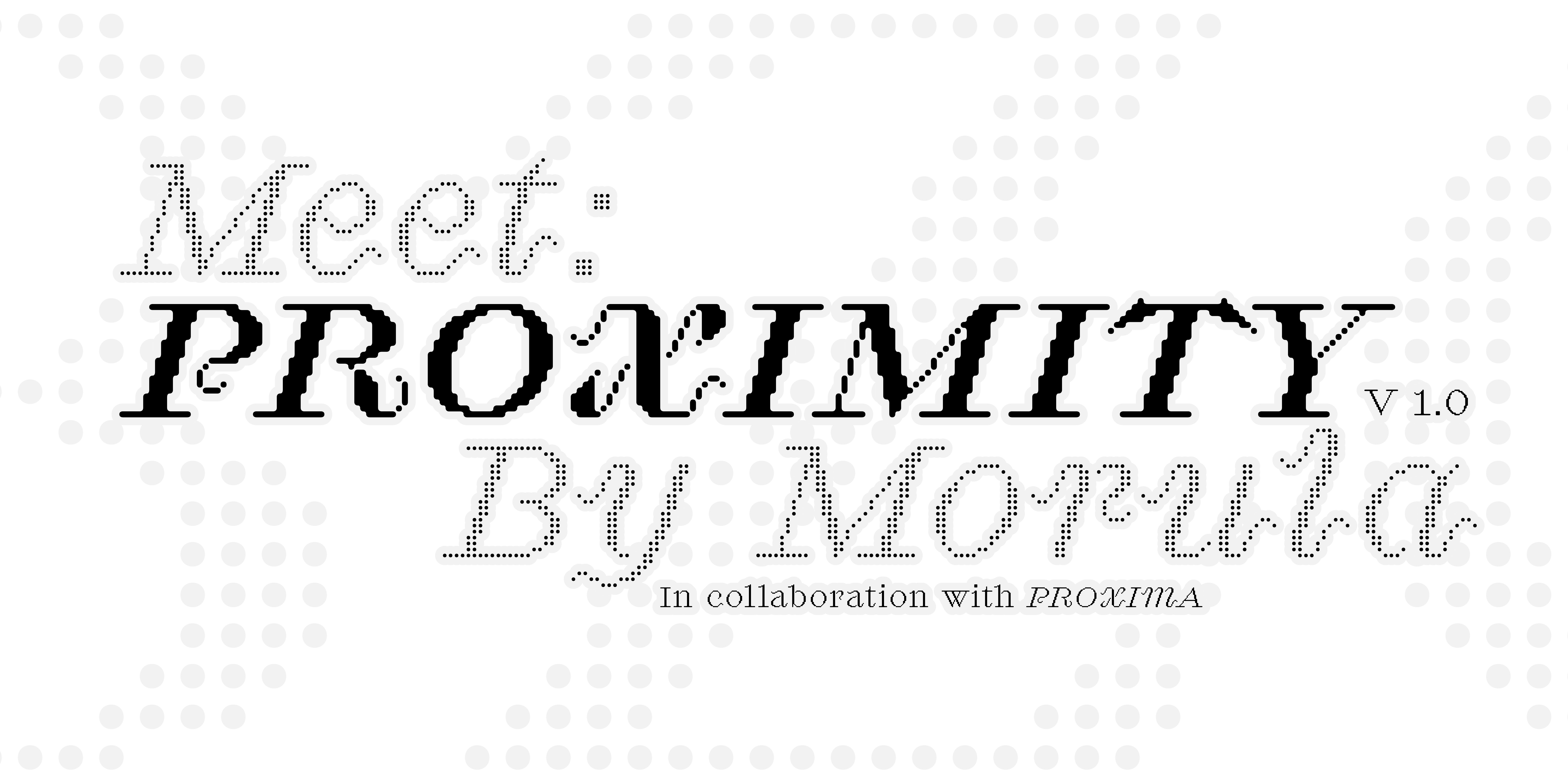
We are a Type Design foundry focused on making Variable Fonts with the easiest Font Licensing around
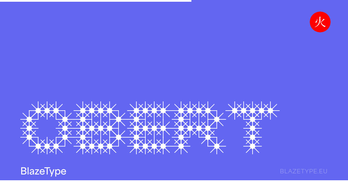
We are a Type Design foundry focused on making Variable Fonts with the easiest Font Licensing around
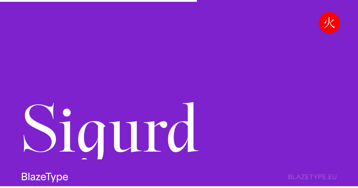
Sigurd is a variable font with strong medieval inspirations
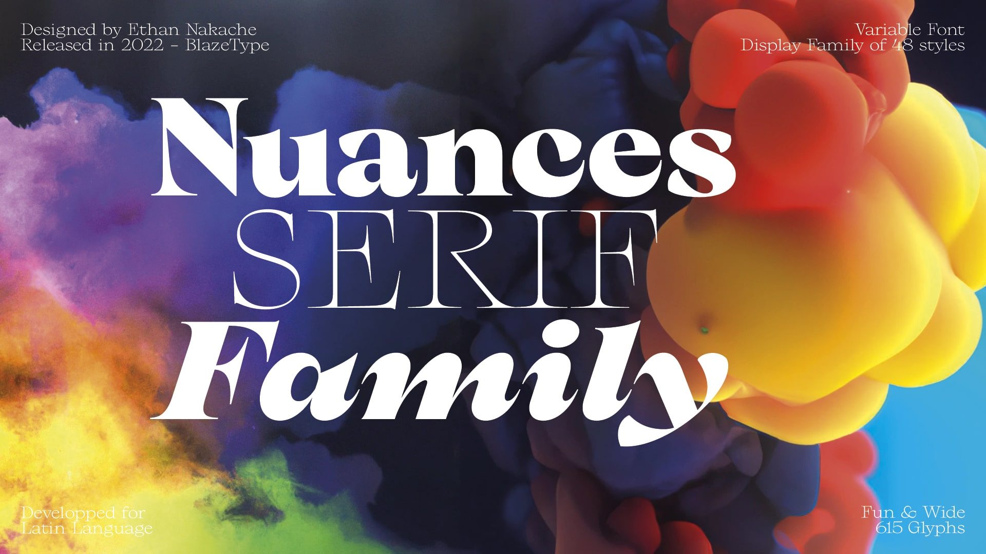
Rich Serif family, highly expressive and resolutely modern

Digital Sans is a flexible font that comes in 7 different weights
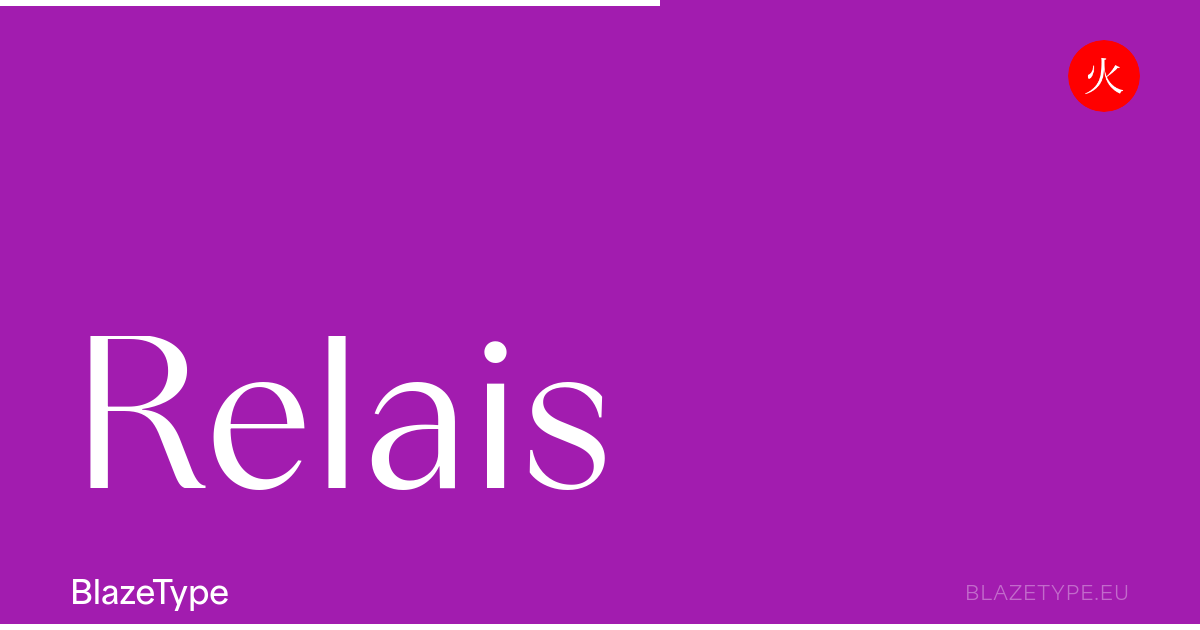
Inspired by 70s and 80s magazines, Relais display is a typeface that will color your strong type layouts (magazines, movie titles…)with its didone like features
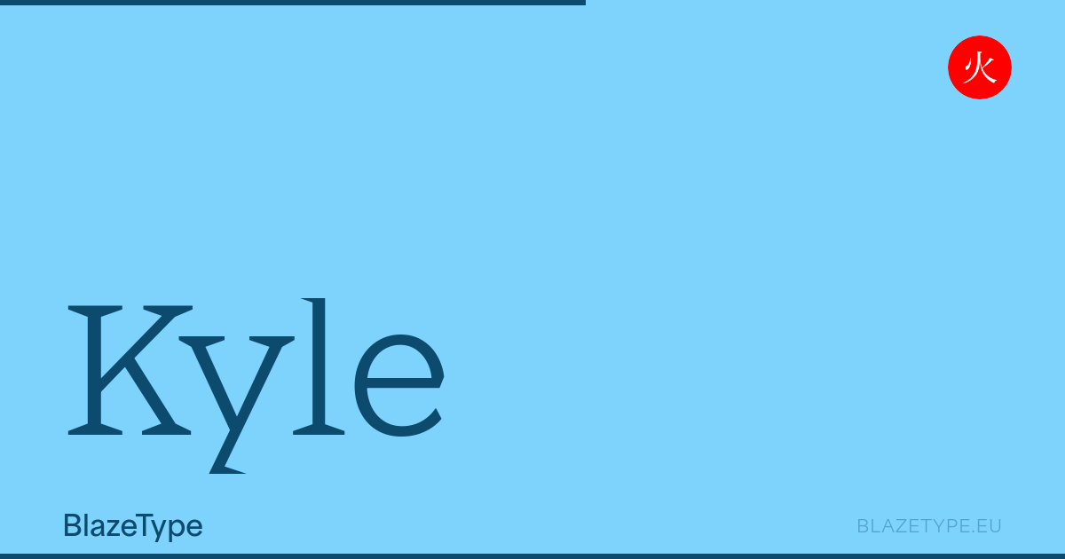
A typeface which changes its character with increasing weight: The fonts have sharp, triangular serifs, that gain momentum as the weight grows
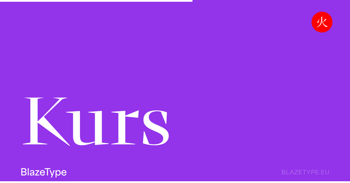
Kurs is a display serif inspired by the concept of the “New Renaissance”, which rethinks the Renaissance as a moment of transition between the Medieval and Modernity
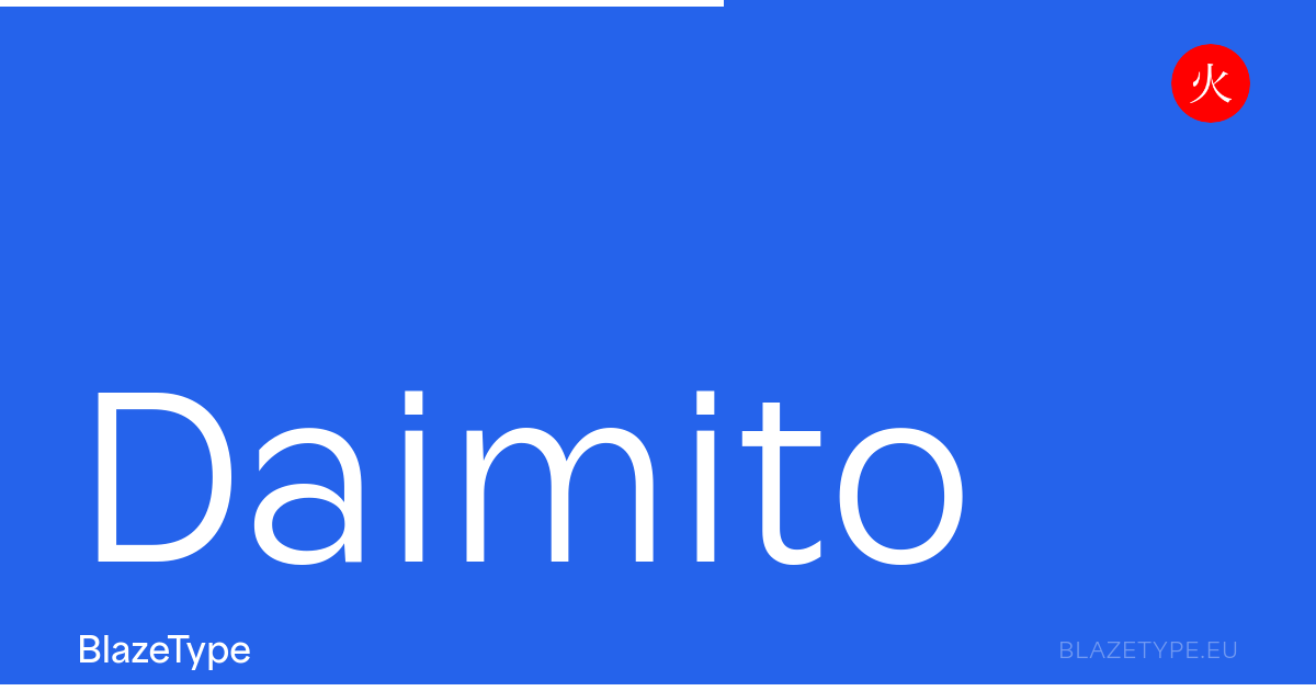
Daimito, used for highlighting and creating new value within the systems, is an uncompromising neo-grotesque and strong stylisation characteristic of humanistic fonts like Gill Sans
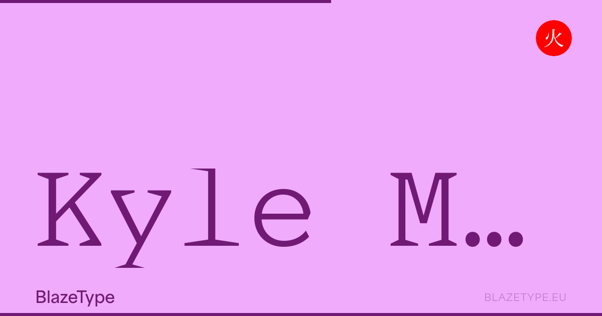
Kyle Mono is a non proportional, monoline serif font family
One font file containing a continuous range of styles along axes like weight (wght), width (wdth), and optical size (opsz), instead of a separate file per weight.
A smaller total payload, finer control over weight and width, and smooth interpolation between styles, all from a single file.