Case is a Neo-Grotesque typeface designed to provide a refreshing alternative to classic sans serifs like Helvetica and Akzidenz Grotesk. It emphasizes horizontal character termination and offers remarkable legibility across various sizes, making it suitable for both branding and extensive text applications. The typeface features real italics and a wide range of styles, enhancing its versatility for modern design needs.
Fontwerk
Fontwerk is a boutique type foundry that offers a curated library of precision-crafted fonts, including various font families. They focus on providing easy licensing options for their fonts.
Change is a typeface family designed as a part of Mateusz Machalski's PhD project, carried out in 2015-2021. The main goal was to create a typeface allowing for the typesetting of complex humanistic texts, containing many historical letterforms. The starting point was the preparation of most of the glyphs provided in unicode for Latin, Cyrillic and Greek. From the formal point of view, the Change family is based on Renaissance proportions with contemporary details. Classic upright version is paired with expressive and calligraphic italics, inspired by the works of Robert Granjon. Each of the styles contains about 4,000 characters, allowing for a broad range of typesetting capabilities – multiscript publications, historical translations, and texts transcription. The crucial aspect was to treat all scripts equally. All OpenType features, such as swashes, final forms, decorative ligatures, can be found in Latin, Cyrillic and also Greek. The name of the typeface refers to the design process in which there are constant changes and corrections. On the other hand, it means to convey how this project influenced my perception of typography and allowed me to embrace it as a medium of artistic expression. Due to its similar proportions, Change works perfectly with the Gaultier typeface .
Hamster is a playful display typeface inspired by the tubular habitats of hamsters and their two-tone fur. Designed as a Variable Color Font, it features rounded ends and bold weights, making it suitable for fun and youthful branding. The typeface includes unique hamster characters and offers a variety of color combinations, reflecting a celebration of joy and delight.
Neue DIN is a modern reinterpretation of the classic DIN typeface, known for its compactness, elegance, and versatility. Originally developed for technical and transport applications, it has evolved to meet the demands of contemporary design, incorporating variable font technology for enhanced flexibility. The typeface maintains its geometric roots while introducing subtle curves for a more refined appearance.
Nice is a modern serif typeface that balances clarity, liveliness, and legibility. Designed by Jan Fromm, it features four optical sizes, making it versatile for various applications from small text to large headlines. The typeface draws inspiration from baroque styles while avoiding excessive ornamentation, resulting in a friendly and expressive appearance suitable for editorial design, branding, and packaging.
Pangea Afrikan is a geometric sans serif typeface that aims to promote typographic diversity by supporting underrepresented languages, particularly those spoken in Africa. It is designed to be inclusive, offering extensive language support and a modern aesthetic suitable for various applications. The typeface reflects a commitment to connecting cultures and continents through typography.
Push is a versatile typeface system that features eight weights across seven widths, inspired by early American Gothics and European Grotesques. Its design reflects a contemporary approach while echoing historical sans serif letterforms. The clever curvature transformation throughout the family creates a unique contrast in shape and counter-shape, making it suitable for a variety of typographic applications.
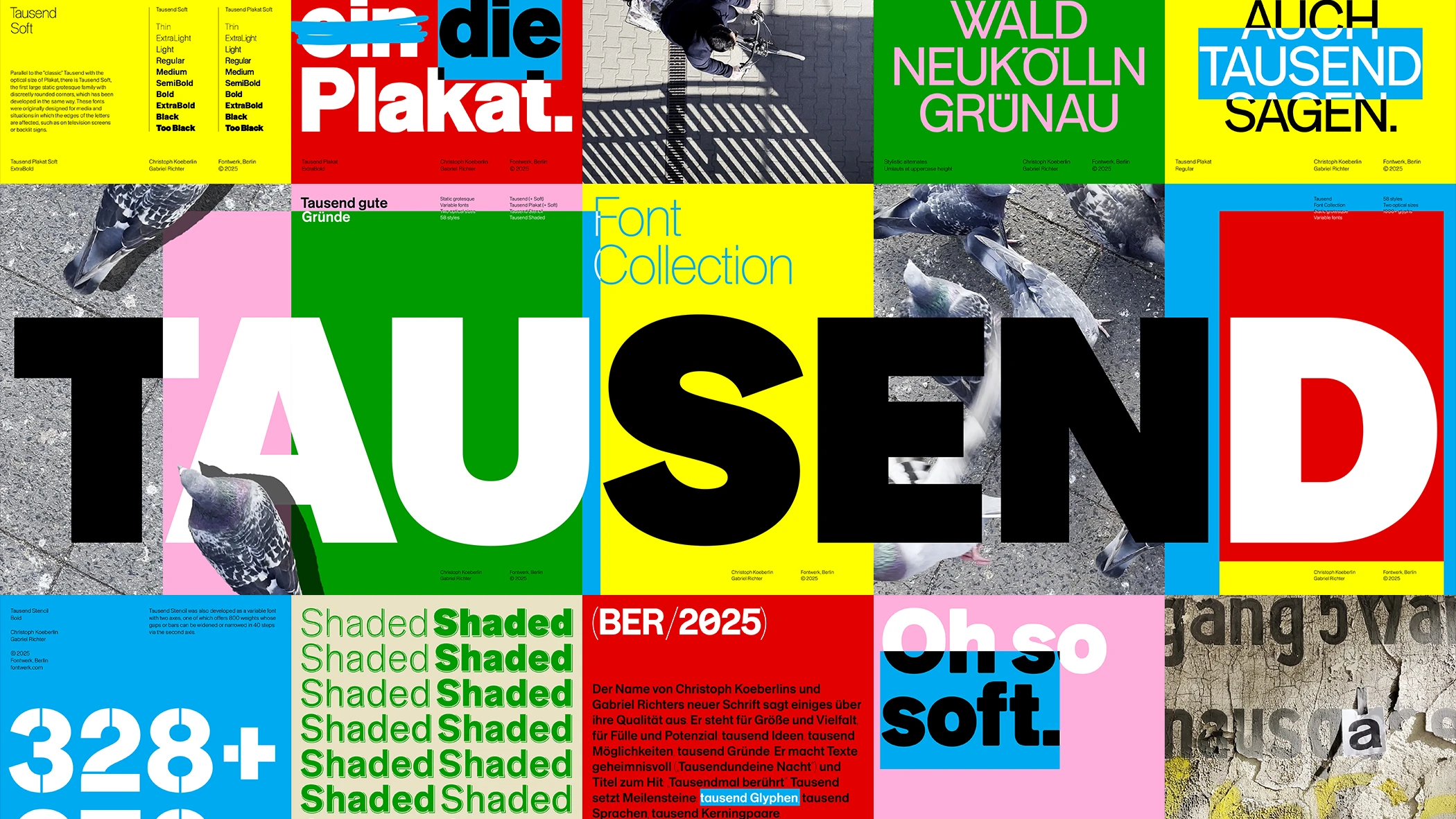
Tausend is a modern sans-serif typeface that draws from the tradition of German grotesque typefaces while incorporating contemporary design elements. It was developed through a collaborative process between Christoph Koeberlin and Gabriel Richter, focusing on roundness and versatility. The typeface is suitable for a wide range of applications, from branding to signage, and conforms to modern typographic standards for accessibility.
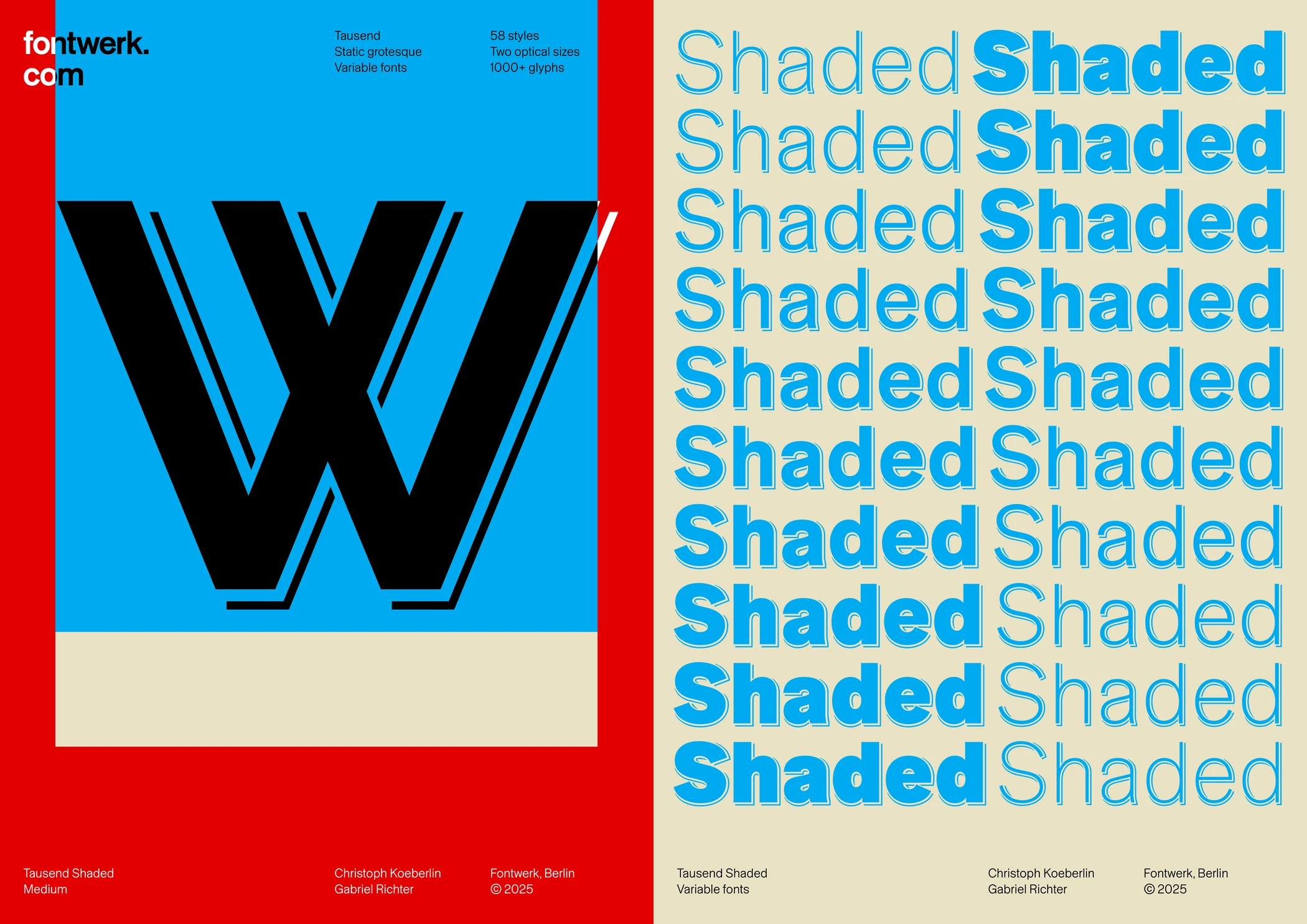
Tausend Shaded is a contemporary reinterpretation of a nearly forgotten style from the early days of sans serif typefaces, specifically inspired by the 1895 Schattierte Grotesk. It combines the essence of classic grotesque forms with a unique shaded variant, showcasing a meticulous design process that emphasizes craftsmanship over algorithmic generation.
West is a geometric sans serif typeface that reinterprets classical geometric forms with a contemporary twist. It combines conciseness and pragmatism, achieving a distinct character through varied letter widths and unique glyphs. This typeface is suitable for both display and smaller text applications, making it versatile for branding and editorial projects.
