Collaborative at its core, Hatton is a homage to the history of the London district, Hatton Garden, initially designed in partnership with London-based design studio Two Times Elliott. Nestled in London’s jewellery quarter and the design studio’s former home, Clerkenwell, Hatton Garden is the centre of the UK’s diamond trade, famous for both its high-value riches and diamond heists alike.
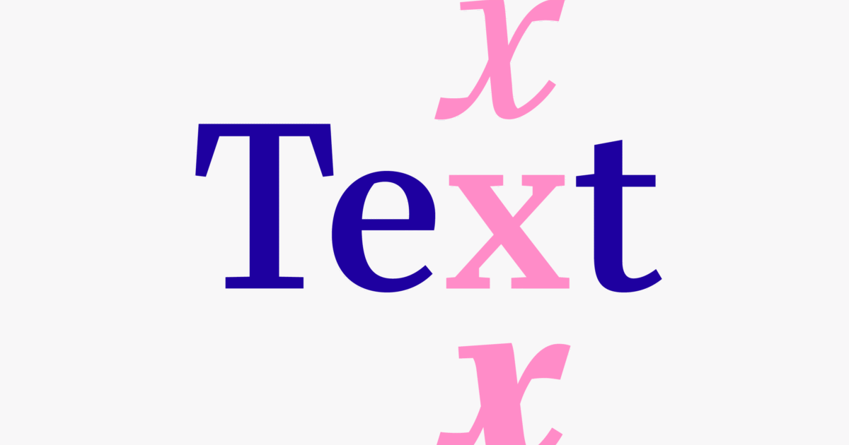
Working together to distil the distinctive character and typographic nuances of the locale’s street signage, shop fronts and landmarks – alongside their beautiful hand-rendered imperfections – the resulting serif is a variable, pearlescent powerhouse, meticulously crafted in eight well-to-do styles. Ranging from Ultralight to Black, Hatton is both refined and robust in its aesthetic. Indicative of the area’s idiosyncrasies and the legacy left behind.
Expanding on the ever-growing team of collaborators orchestrating the typographic Hatton heist, Type Designer Morgane Vantorre, alongside Pangram Pangram, has crafted the latest update of the humanist typeface. Now, with even more bang for your buck, Hatton is enviably versatile, befitted with newly crafted true italics, embellishing the serif's expressive, dignified flair alongside its recently refined curves. Its perfected proportions ensure a harmonious balance throughout, especially in the darker weights, with adjusted contrast bringing forth an engaging rhythm, complemented by a sackful of new glyphs – ready raring to adorn whatever design you desire.