Trending
Trending fonts this week
This is what's actually moving. Typedex ranks fonts by live community signal: votes, saves, and discovery activity across major foundries and indie releases. The list below shifts as the data changes, so it reflects what designers are paying attention to this week, not a static editor's pick.
Ranked by trending score from recent votes and saves, refreshed continuously · 60 fonts
01234567890123456789
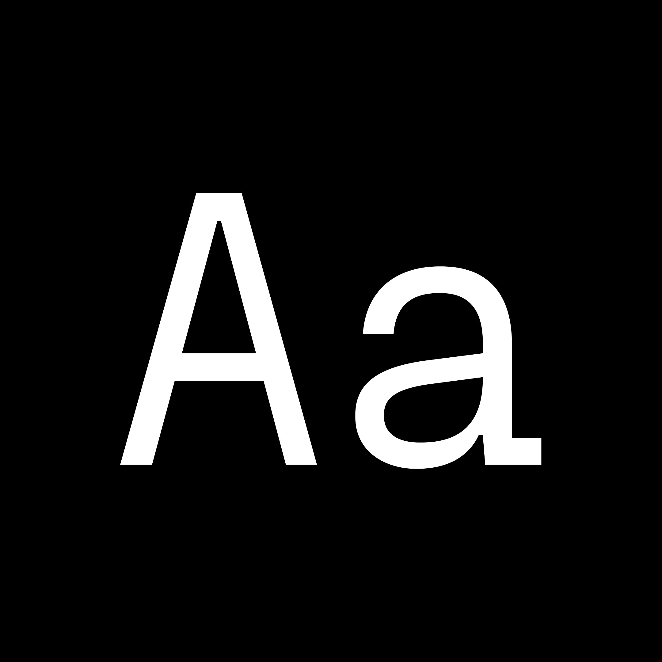
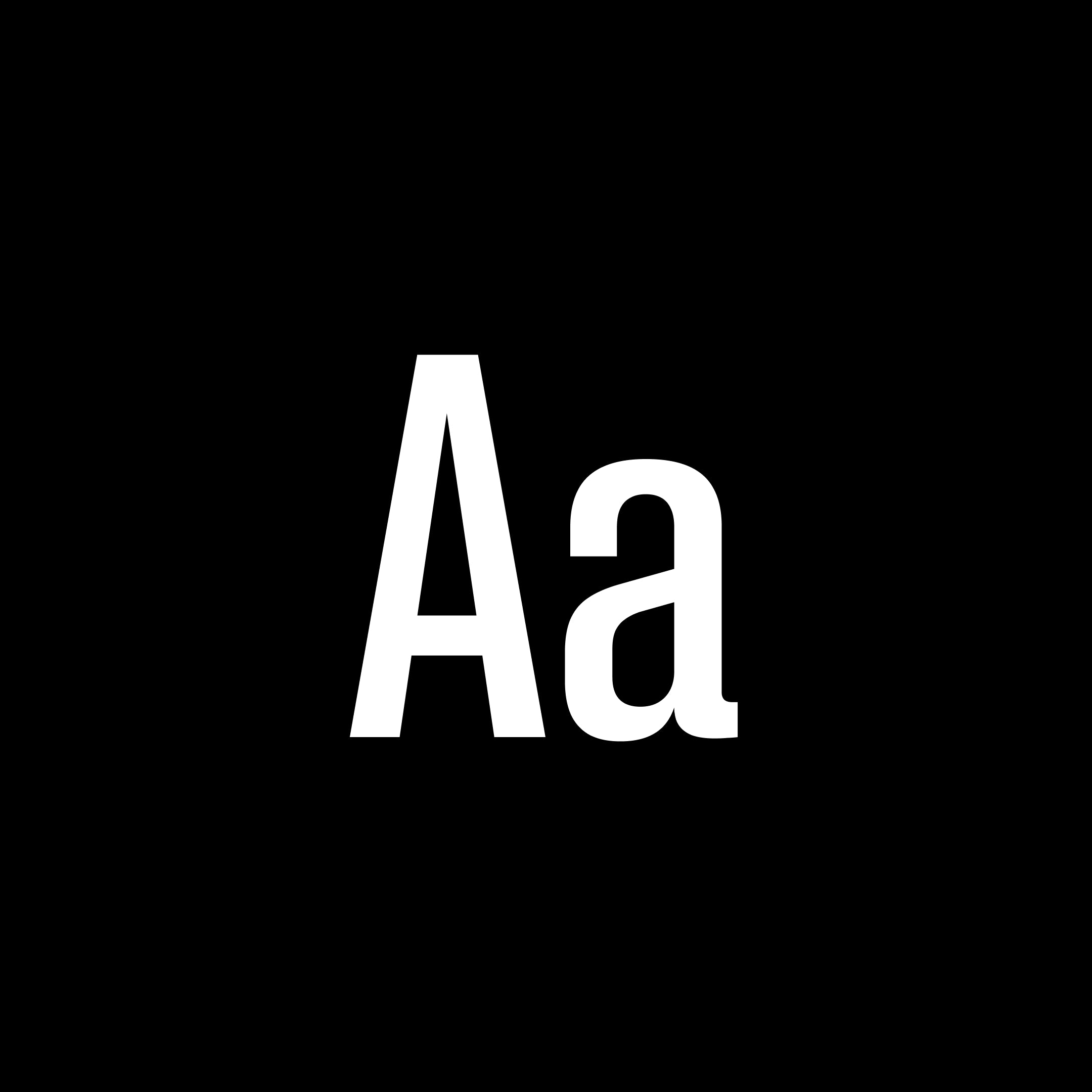
Fraktion Sans is a contemporary grotesque exploring the space between mechanical sturdiness and expressive clarity. While its inspiration stems from vintage signage lettering, the final design is a rather far departure. The square shape and the compact capitals are the only remnants of the original influence and when set in all-caps the industrial spirit is vaguely present. Even so the typeface has been shaped to a modern, versatile allrounder with a slight technical feel that works great in sober applications for screen and in editorial - and still maintains character to be a strong voice in branding. An exaggerated spur on the lowercase 'a' and ink traps are defining visual characteristics just as the squared-off rounds’ true verticals help create a steady cadence. The proportional Sans is complemented by a fixed-width design: Fraktion Mono. The refitted letter shapes of the monospaced design add a surprising playfulness to a genre that generally feels more technical, making Fraktion Mono’s cuts the more informal bunch of the family. Both typefaces offer plenty of typographic solutions through OpenType features like case sensitive punctuation, stylistic alternates, fractions and slashed zero. The 7 upright weights each have an italic counterpart and both sets are available as variable fonts.
mono
pangrampangram
grotesque
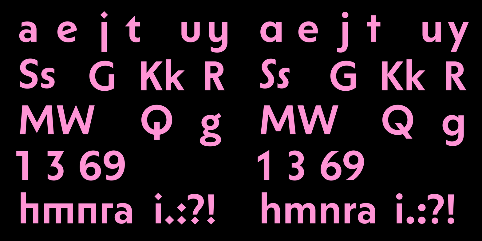
ABC Solar is a highly customizable geometric sans with a large weight spectrum and matching italics. You can change how it looks by selecting from a huge range of alternates — and by choosing between straight or angled cuts. It’s giving Kabel, Vogue, Metro No. 2, Johnston, and Erbar-Grotesque plus Futura, but calling it what it is, Solar lives in that space between Remix and Homage of all the above—with a dash of poetic license thrown in.
sans
dinamo
geometric
01234567890123456789
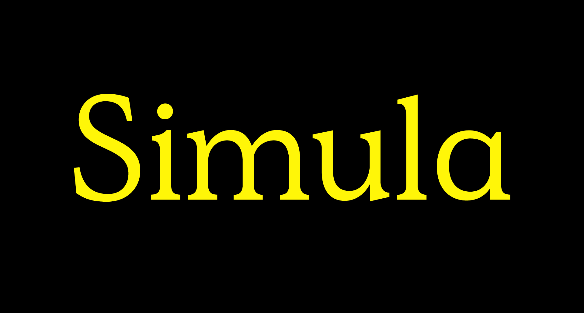
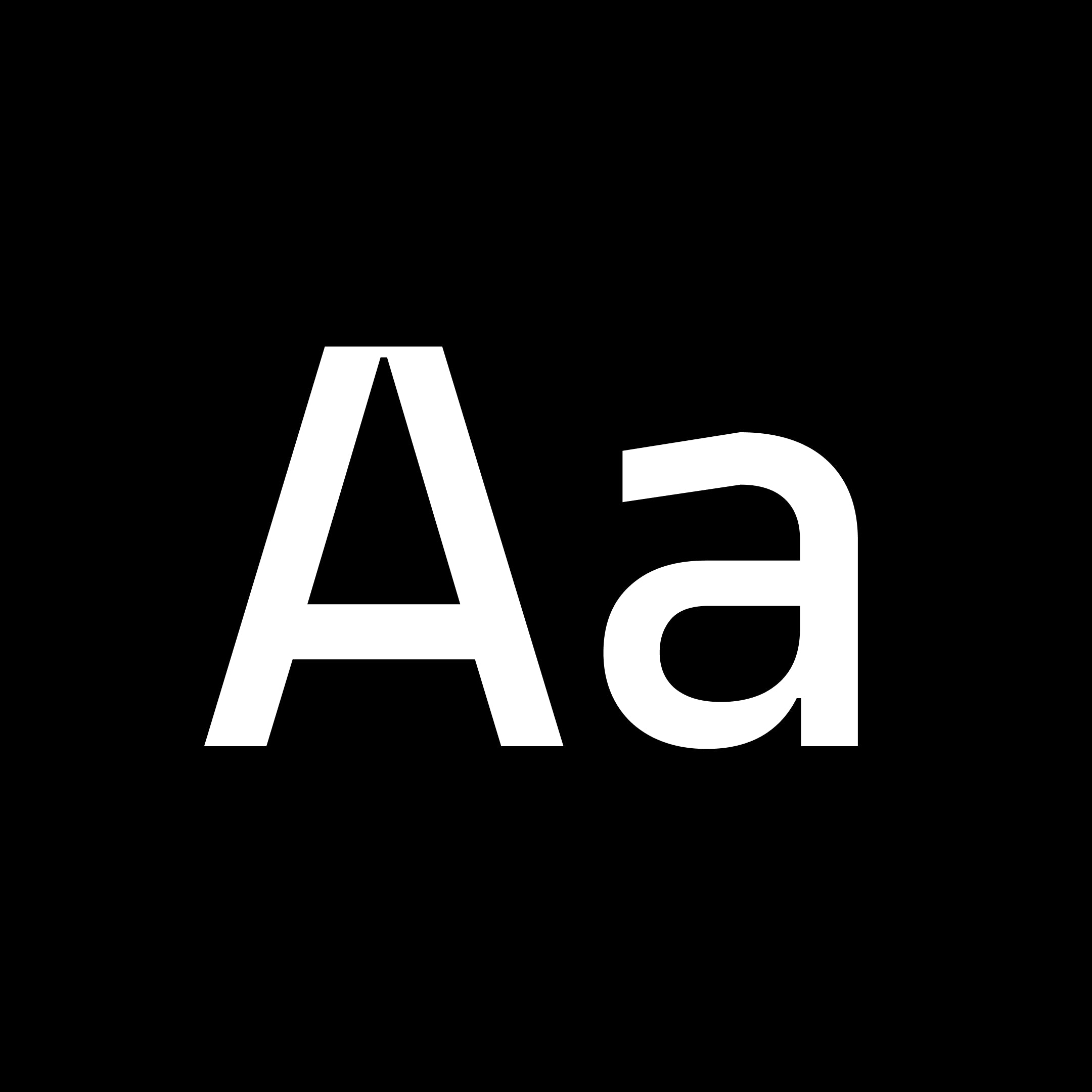
Simula is a contemporary typeface that draws inspiration from the Plantin model, blending traditional Roman proportions with a modern perspective. It is characterized by a unique tension between low-contrast strokes and angular serifs, making it suitable for both display and text applications. The design is known for its rational yet contradictory qualities, particularly evident in its lowercase forms.
serif
sharptype
display
0123456789
Model pays tribute to the world of plastic model kits, drawing inspiration from the iconic Japanese brand Tamiya. Renowned worldwide for its highly detailed and precise assembly kits, Tamiya’s legacy serves as the foundation for this design, celebrating the meticulous art of model-making. The typeface blends nostalgia with modern precision, capturing the essence of the assembly process through its clean, modular forms and mechanical aesthetic. PP Model features a range of four families, from the default Model version to the monospaced variants and experimental Plastic styles. Its design fosters creativity, offering typographic options that embody the concept at varying levels, emulating the connected components of model kits in their forms. In total, the typeface includes 72 fonts, available in both upright and italic styles, featuring extensive Latin support, the Japanese alphabets Hiragana and Katakana, Japanese punctuation, and measurement characters that are rarely found.
sans
pangrampangram
geometric
0123456789
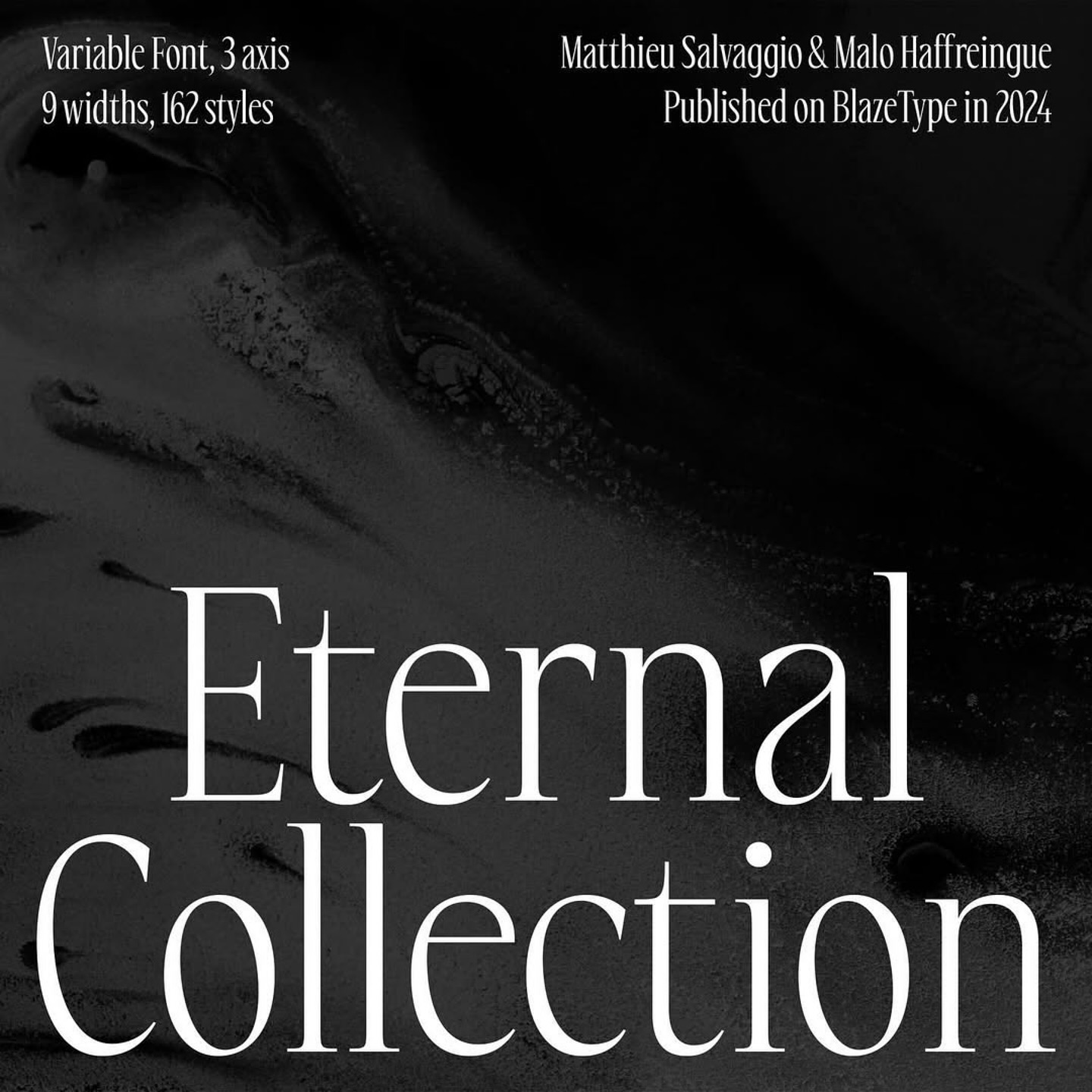
Eternal Collection is a display font family that is designed for high-impact visual communication, this font family features a striking combination of serif detailing and high contrast proportions. With an extensive range of 162 styles, Eternal Collection offers a broad range of creative possibilities. The family includes variations in width, weight, and slant, allowing for nuanced typographic expression across various design contexts. From bold, commanding headlines to delicate, refined subheadings, this font family ensures that every design element can be tailored to the precise mood and tone you wish to convey. Choose from a full spectrum of widths, from compressed to wide, and a variety of weights, from thin to black. The inclusion of slant styles adds an extra dimension of flexibility for dynamic, forward-leaning typography.
serif
blazetype
display
0123456789
29LT Ada Round is a contemporary typeface inspired by the Ruqʿah Arabic calligraphic style. It is part of a larger superfamily that includes Sharp and Flat styles, making it versatile for various typographic needs. Known for its rounded, low-contrast letterforms, it is suitable for both display and body text, providing a smooth and approachable aesthetic.
display
29lt
arabic
0123456789
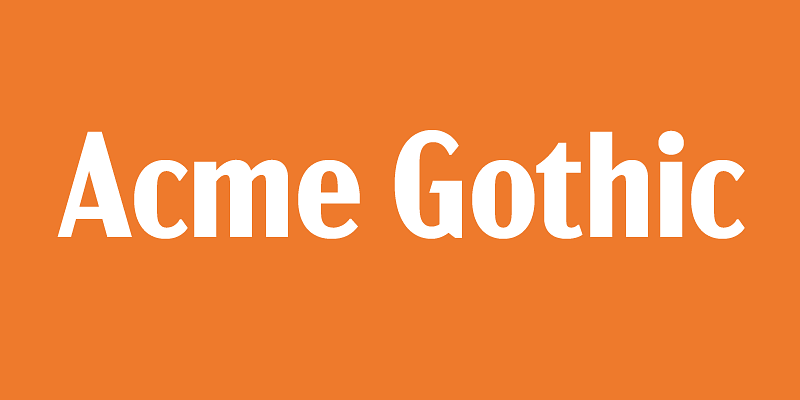
Acme Gothic (2018) is based on the thick-and-thin gothic lettering style popular in the U.S. in the first half of the twentieth century. There have been typefaces in this genre before, but they were either too quirky (Globe Gothic), too English (Britannic), too Art Deco (Koloss), too modern (Radiant), or too Art Nouveau (Panache). None captures the plain, workman-like, vernacular style of Acme Gothic. There are five widths (Compressed, Condensed, normal, Wide, and Extrawide) each with five weights (Light, Regular, Semibold, Bold, and Black) for a total of 25 different styles.
sans-serif
sans
gothic

signifier
Klim Type Foundry · 2020
01234567890123456789
Signifier is a Brutalist response to 17th century typefaces. Designed by Kris Sowersby, Signifier’s digital immateriality draws on a deeply material past. Acknowledging the processes and tools of digital form-making, Sowersby worked consciously with the computer to recast the lead, antimony, and tin of the 17th century Fell Types into ones and zeros. Signifier emerged from this alchemy with Bézier curves and sharp vectors determined by machine logic and a Brutalist ethos.
serif
klim
brutalist
Greenstone
Sharp Type · 2021
-0123456789
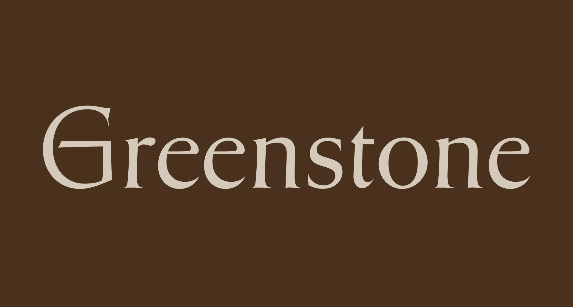
Greenstone interprets Oscar Ogg’s vernacular lettering style through the lens of American and British stone carving, influenced by notable figures like John Howard Benson and David Kindersley. This typeface embodies a typographic expression of an ancient tradition of lettering, showcasing a blend of exquisite vernacular styles developed over centuries. It is particularly suited for use in stone carving and other applications that require a robust, historical aesthetic.
serif
sharptype
display

01234567890123456789
Pier is a modern and structured Grotesk with interesting details that give this font a unique personality. The idea was to create a slightly off geometric font that would look as good big or very small. It was designed to fit your everyday designs and text needs.
sans-serif
pangrampangram
grotesk

01234567890123456789
PP Writer is an elegant and dynamic serif drawing inspiration from French Renaissance type. It includes three cuts, text and display styles and a playful italic, and nine weights per cut. Each font includes 744 glyphs with a range of alternates, ornaments and much more. It is intended to provide the user with a legible, traditional text typeface for print and editorial usage. Writer Text is the workhorse of this typeface, its purpose is for text ranging between 6 and 14pt. PP Writer's proportions, contrast, modulation and stress embodies Renaissance type of 16th Century. Although it is inspired by the past, it does not always stick to tradition. PP Writer has plenty of character and personality, pushing the Renaissance style into the 21st Century. It is a variation of the text style with different levels of contrast and sharper strokes. This style embellishes the characteristics of the text style, accentuating and exaggerating each stroke and serif. The Italic is a lively and characterful companion to the upright. It can blend into a piece of text, harmonizing seamlessly with the upright whilst still sufficiently standing out. The Cyrillic follows a similar aesthetic to the Latin, but does not ignore Cyrillic traditions. This is notable in the serifs found on the Tse or Sha, which disregards the Latin motif and prioritise Cyrillic tradition. It’s a beautiful timeless piece bred from renaissance type drawings. You can feel the ink spill in the heavier weights, especially in the italics. It was dreamt to be a workhorse typeface giving you maximum breath of ability with its text, display and italic cuts.
serif
pangrampangram
elegant

01234567890123456789
Gatwick is a wide incise typeface that blends a funky attitude with a refined spirit, resonating with vintage and contemporary aesthetics alike in a unique, memorable way. Unlike many fonts in its genre that rely on uniform proportions and consistent thickness to maintain a “neutral” tone, Gatwick stands out with its tapered stems, sharp terminals, and exuberant details. This distinctive flair gives it an exotic, extravagant character that immediately catches the eye of the reader. With the release of Version 2.0, Gatwick expands its versatility by introducing two new high-contrast families. These additions are ideal for crafting elegant headlines and subtitles, adding an extra layer of sophistication to any project. Designed to fly your creative work to new, unexpected destinations, Gatwick delivers the reliability and comfort of a first-class experience, while ensuring your designs leave a lasting impression.
sans
pangrampangram
display

01234567890123456789
Beatrice Deck is part of the Beatrice Superfamily, which explores various contrast methodologies in type design. Released in 2018, it combines elements from American Gothic and grotesque styles, featuring a robust set of weights across four optical sizes. Beatrice Deck is particularly suited for caption and sub-headline settings, offering a unique contrast that stands out in display applications.
sans
sharptype
sans-serif

01234567890123456789
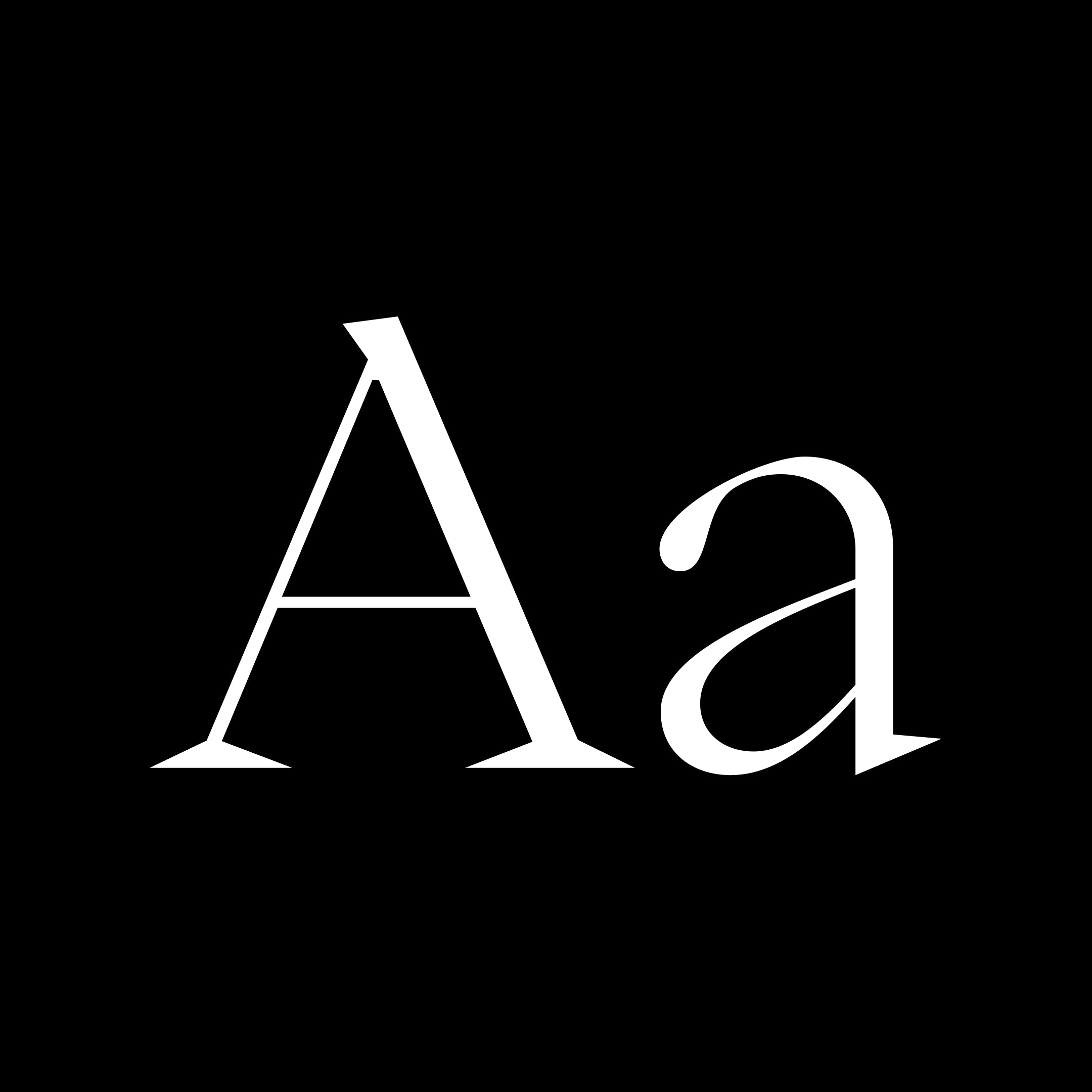
Tiempos Fine is a sharp, modern serif for large sizes
serif
klim
modern
01234567890123456789
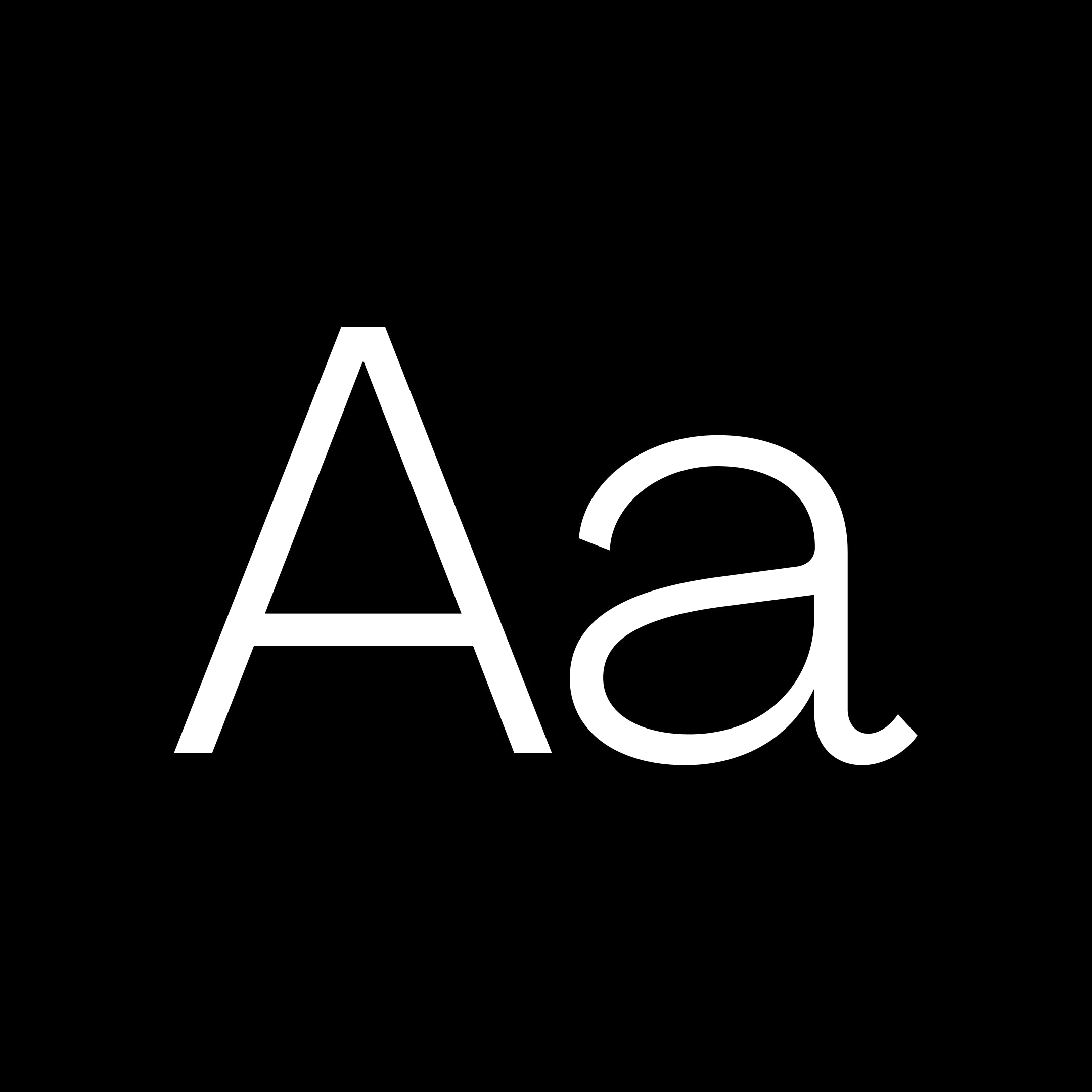
Agrandir is a contemporary serifless type family that celebrates the beauty of being imperfect. It was designed to be a brave antipode to neutral modernist fonts. Agrandir accepts its own shapes as they are – unaligned, quirky and funky. It celebrates humanity, not machines. The type family consist of 74 fonts: 7 weights × 5 widths × Italics + 4 Text styles. Or just one 3-axes variable font. Agrandir features a fairly good number of OpenType stylistic alternatives, which can be turned on for individual letters or as overall presets – Default, Grotesk and Geometric. With its wide variety of flavors and super tight spacing Agrandir is gonna do a good job for big size headlines, websites, logos and posters, and its new text styles are great for body copy.
sans
pangrampangram
sans serif
01234567890123456789
Eiko is an indisputable statement of elegance and refinement. Every curves and bezier points were applied with a sense of purpose. It is inspired by the work of Eiko Ishioka, a multitalented Japanese artist, this typeface seeks to convey the same aspect of her work in these typographic explorations. It is an original serif font with high contrast, including the syllable alphabet kana, hiragana u0026amp; katakana, it is ideal to pair with other kanji fonts of the Japanese mincho style. Its resources include a large repertoire of Japanese punctuations, stylistic sets with circular and square numbers, vertical written, subscript and superscript numbers, mathematical symbols, meteorological symbols, ligatures, arrows and many alternates. And now: a new basic educational set with 81 kanjis and full italics!
serif
foundry
commercial
01234567890123456789
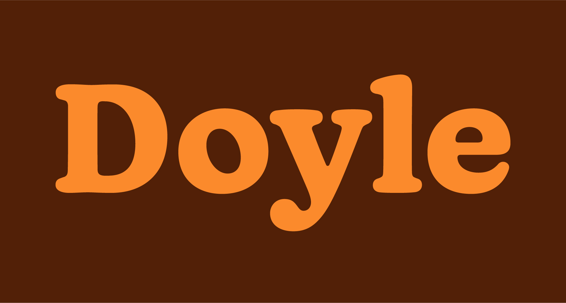
Doyle is a contemporary typeface that blends elements from two iconic styles: Cooper Black and ITC American Typewriter. This unique synthesis results in a type family that is both structured and organic, characterized by its lively, inky forms. Designed in 2019, Doyle is well-suited for a variety of applications, from editorial to branding.
display
sharptype
contemporary
01234567890123456789
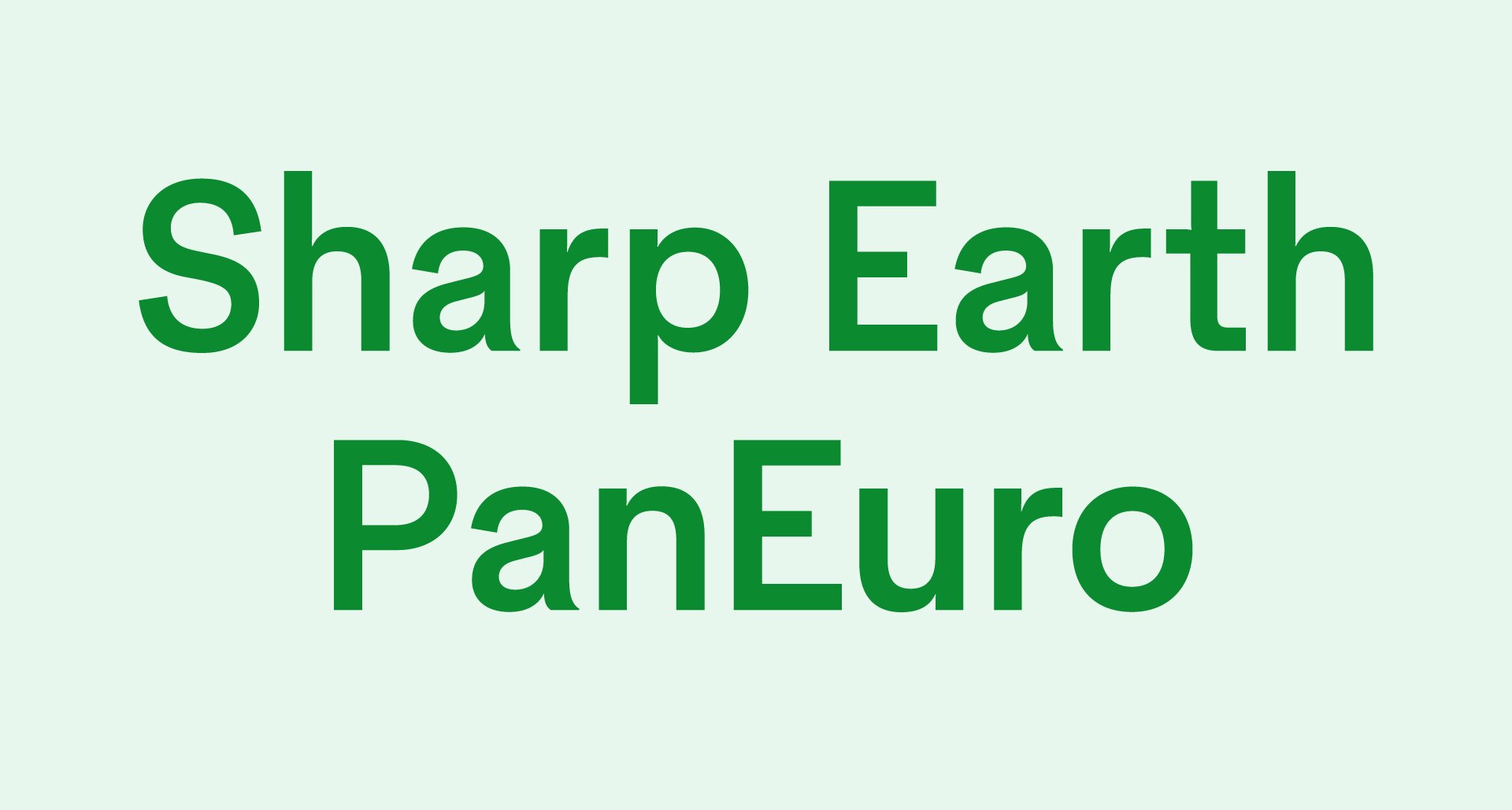
Sharp Earth PanEuro is a contemporary multi-script sans serif typeface designed to accommodate a wide range of languages and scripts, including Latin, Greek, Cyrillic, Arabic, Thai, Devanagari, and Japanese. It embodies a modern interpretation of the international style, focusing on warmth, pragmatism, and utility, making it suitable for diverse design applications across global contexts.
sans
sharptype
multi-script
01234567890123456789
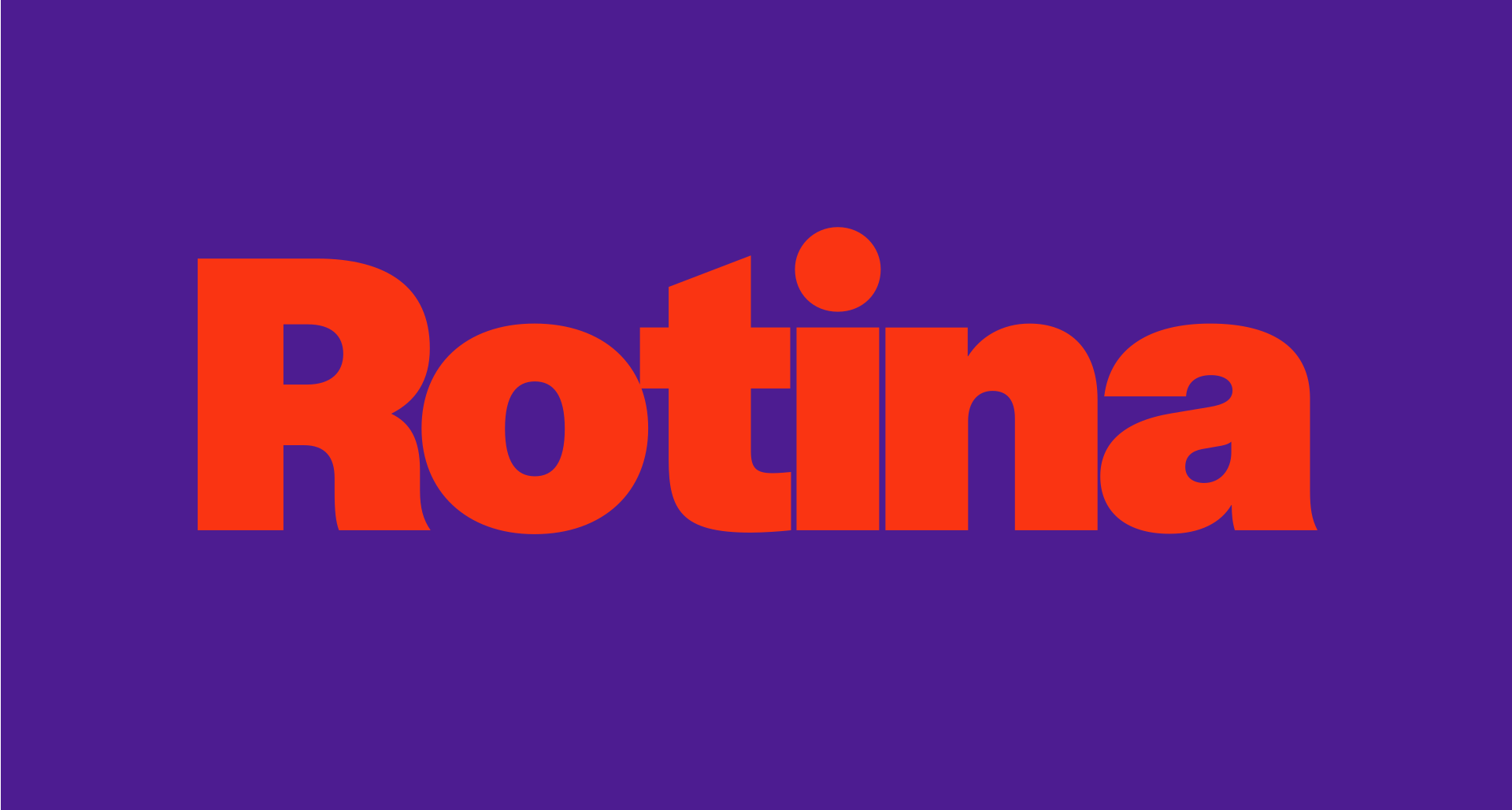
Rotina is a modernist sans typeface that combines utilitarian neo-grotesque elements with a playful character. It is designed for versatility, suitable for branding, editorial, and digital applications, and features extensive OpenType capabilities that enhance its personality. The typeface balances modernist clarity with a touch of charm, making it adaptable for various design contexts.
sans
sharptype
modernist
01234567890123456789
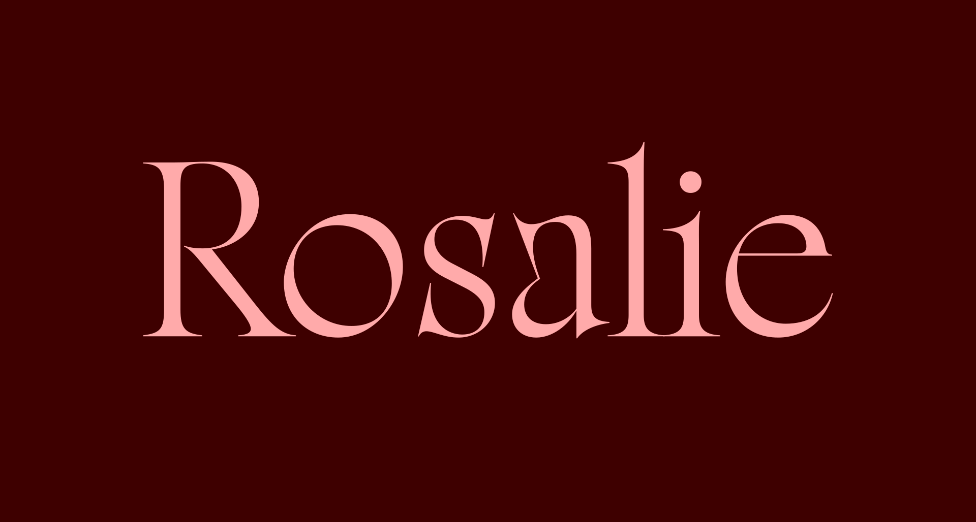
Rosalie is a contemporary display serif inspired by a medieval mural in Guérande, France. It features a unique blend of sharp and round forms, high contrast, and exuberant swashes, making it suitable for both historic and modern contexts. The typeface showcases the evolution of Thuong's design practice over six years, resulting in a versatile duo of Roman and Italic styles with OmniLatin support.
serif
sharptype
display

0123456789
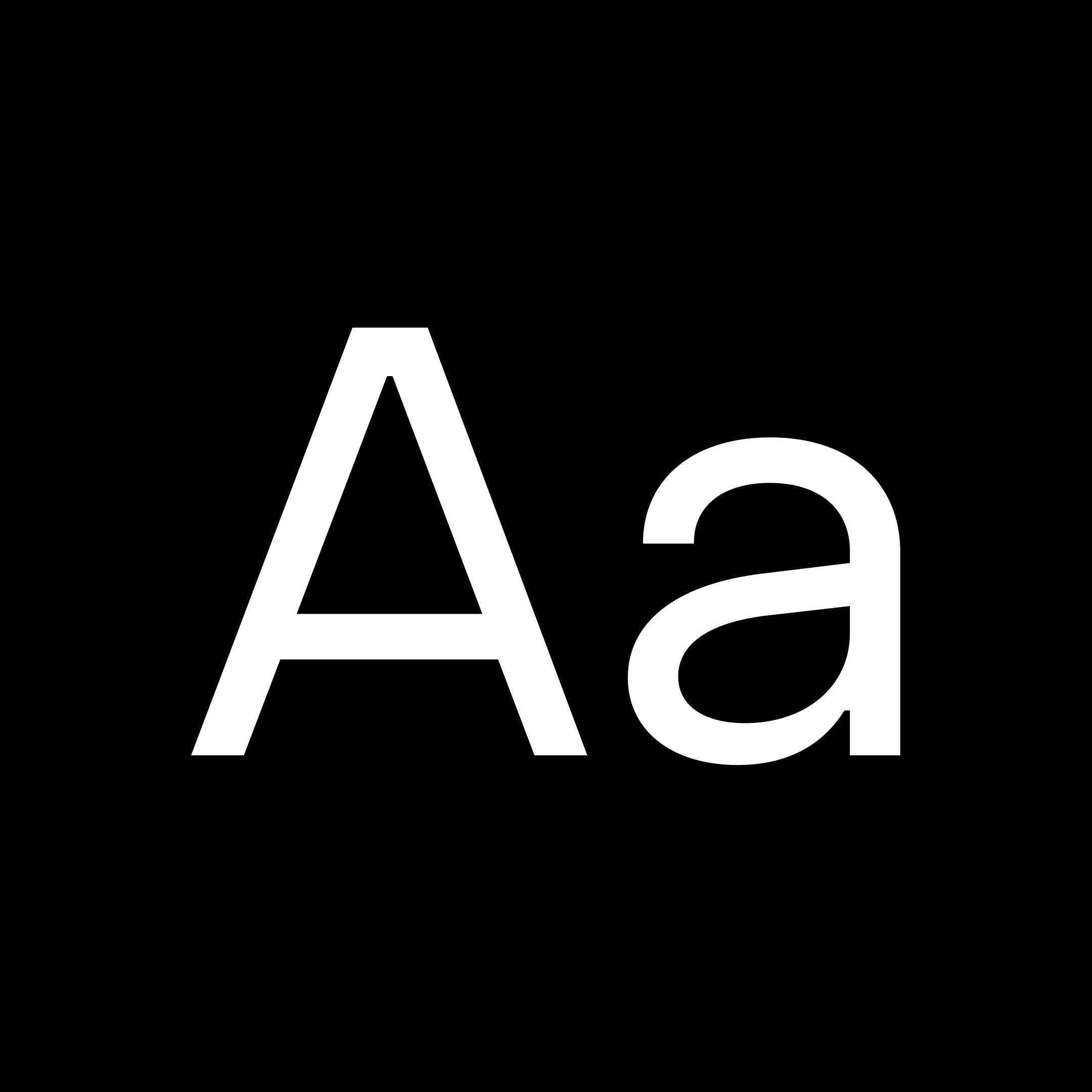
Charlevoix Pro is a beautiful display typeface inspired by one of Quebec's greatest region. It is strong and bold like Charlevoix's hills and mountains and fluid like the water of the Saint-Laurent river. It's slightly rounded corners give this font a human touch when it's used in titles.
sans
pangrampangram
display
0123456789
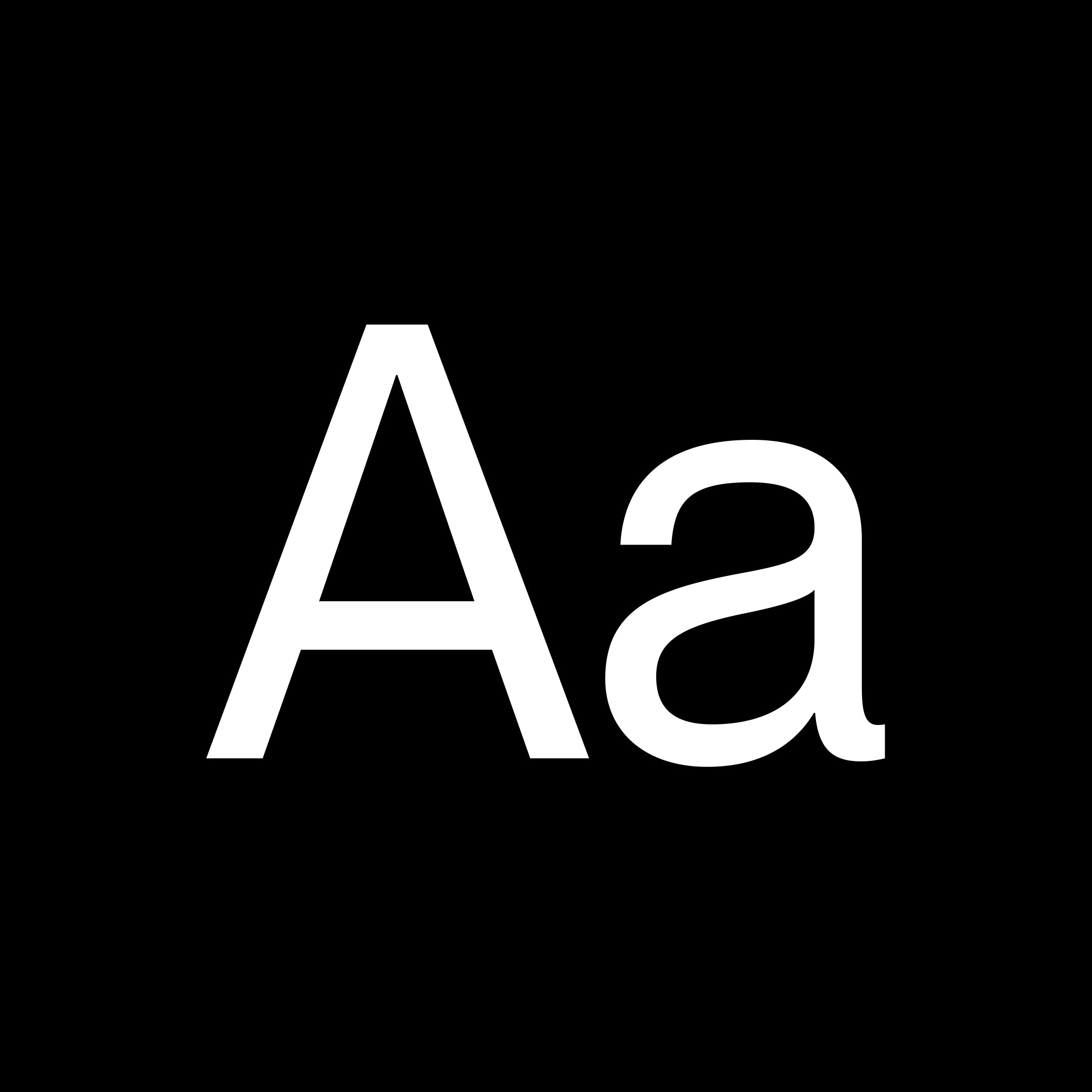
Object Sans is a contemporary type family that puts together the best qualities of Swiss neo-grotesks and geometric fonts. It’s a multifunctional workhorse designed to work best in → any printed and on-screen contexts, including logo design, brand identities, websites, packaging, posters and headlines; regular weight is carefully tuned for small sized body text.
sans-serif
pangrampangram
geometric
01234567890123456789
A versatile Grotesque font with the spirit of a display font. Complete with 14 weights (7 Uprights, 7 Italics) and a slightly tighter kerning including Cyrillic support. This typeface was created to be your next champion font. This timeless Sans was inspired by what makes Montreal the great design city it is today, from the Expo 67 to its contemporary effervescent design scene. It has already been used by many local brands notably the most recent rebranding of the city's football club Montreal FC.
sans-serif
pangrampangram
grotesque

0123456789
The Harmonious Collision of Brutalism, Minimalism, and Aerospace. A breath of fresh creativity. The newest typeface of pangram pangram, originally designed by Mat Desjardins and expanded by Caio Kondo from Inari Type, embraces the duality between simplicity and experimentation, offering a visually appealing and intriguing aesthetic, a true pangram pangram font. Step into a world where design boundaries are pushed, and artistic influences collide. We're excited to unveil our latest typeface creation, Air. Inspired by a captivating fusion of brutalism and minimalism, with a subtle nod to the sleek lines of aerospace design, Air brings a fresh and distinctive touch to the typographic landscape. Its massive character map includes a variety of alternate characters, allowing for greater customization and creation possibilities. Additionally, abundant ponctuations and a set of arrows are available, adding versatility and functionality to your projects. In addition, Air offers a huge range of weights, 36 in total. From mono style to italic, the typeface even has a variable version that unites these axes in a single file.
sans
pangrampangram
sans-serif
0123456789
Neue Corp is a versatile typeface, crafted to be the ultimate creative tool for any advertising, marketing, or digital endeavor. Designed with a broad range of widths and weights, it empowers designers and studios to adapt it to any context, from bold headlines to refined body text. Balancing character with neutrality, it combines the eccentricity of old wood type with the precision of neo-grotesques. The Black and Condensed styles are inspired by classic Hamilton Mfg. Co. typefaces, while the wide Bolds are influenced by Helvetica Extended. Regular styles draw from Univers but with softened details for a friendlier tone. Alternate stylistic sets offer even more flexibility: one set makes the typeface more geometric and neutral, while the other brings out a bold, grotesque character with added spurs. With a design spectrum ranging from subtle Thin to powerful Black, and from narrow Compressed to bold Extended, this typeface is ready to elevate any project with style and precision.
sans
pangrampangram
versatile
0123456789
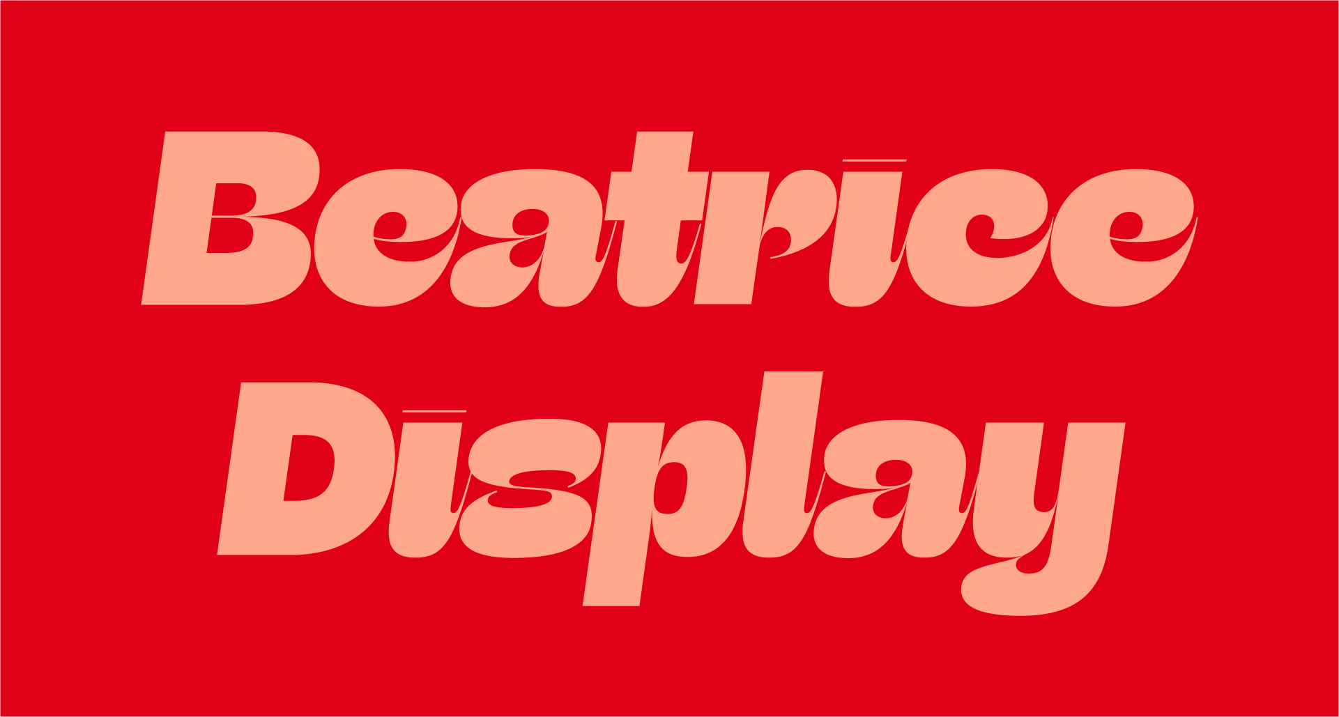
Beatrice Display is a striking typeface that explores a range of contrast methodologies, combining elements from various typographic systems. Released in 2018, it set a new standard in type design with its high contrast and unique spacing. It is particularly suited for large display settings, where its dramatic features can be fully appreciated.
display
sharptype
high contrast

01234567890123456789
PP Museum is a masterfully crafted humanist sans-serif typeface, embodying the perfect blend of elegance and versatility. This remarkable typeface draws inspiration from the meticulous sketches of Optima found on aged banknotes, reinterpreted with a modern sensibility that enhances both readability and sophistication. While technically a sans-serif, Museum’s subtle terminal flares echo a glyphic quality rarely seen in contemporary type design, imbuing it with a distinct personality. Its conceptual foundation is further enriched by extensive research into the typography of vintage tomes, book covers, spines and museum-centric objects — an homage embedded in its very name. The light flares, prominent in the thinner weights, gracefully recede in the heavier styles, ensuring a harmonious balance across applications from refined body text to commanding headlines. This adaptability makes PP Museum an indispensable tool for designers seeking to bridge classic craftsmanship with contemporary aesthetics. The tapered diagonals inject dynamic movement, lending a modern edge to the family’s timeless character. Spanning 9 meticulously engineered weights, each with true italics that feature swashes and decorative terminals—an uncommon feature in sans-serif typefaces—Museum invites exploration and elevates design across every medium.
sans-serif
pangrampangram
humanist

0123456789
Migra is a spiky serif typeface inspired by the features in migratory birds. Its weights span from an austere and elegant light cut to a hawkish and powerful black one. Packed with a set of even more gestural Italics and sundry special ligatures, this typeface is guaranteed to add sparkle and grace to any of your designs.
serif
pangrampangram
display
0123456789
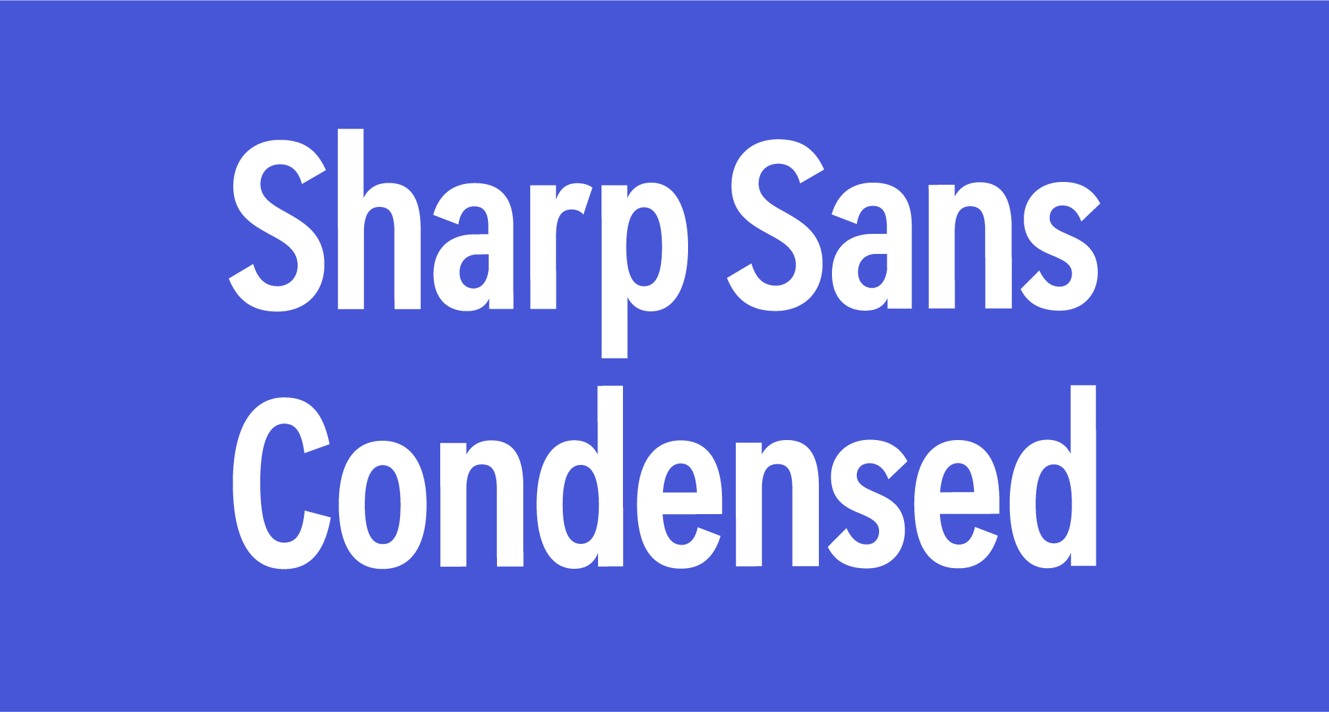
Sharp Sans Condensed is part of the Sharp Sans superfamily, which was developed for editorial design and inspired by Herb Lubalin’s Avante Garde. Initially created for a modern presidential campaign, it has been rigorously tested for various typographic needs, balancing geometric neutrality with clarity and familiarity. This typeface adapts well to both digital and print contexts, making it versatile for contemporary design.
sans
sharptype
editorial
0123456789
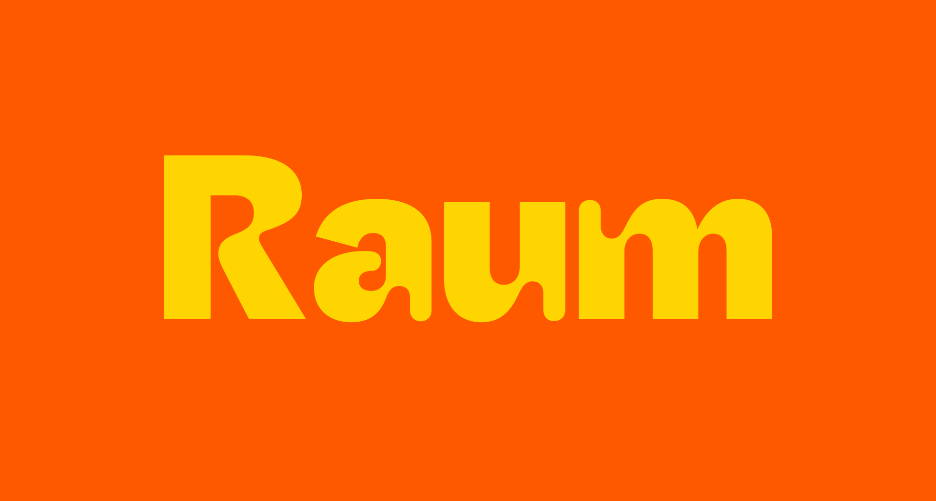
Raum is a sans-serif typeface known for its experimental display qualities and its role as a sturdy design tool. It pushes the boundaries of contemporary design by exploring the 'display inktrap' motif, creating a unique blend of utilitarian and psychedelic retrofuturism. The typeface is part of the Hauss Superfamily, which reflects a meticulous design process aimed at graphic design applications.
sans
sharptype
sans-serif
0123456789
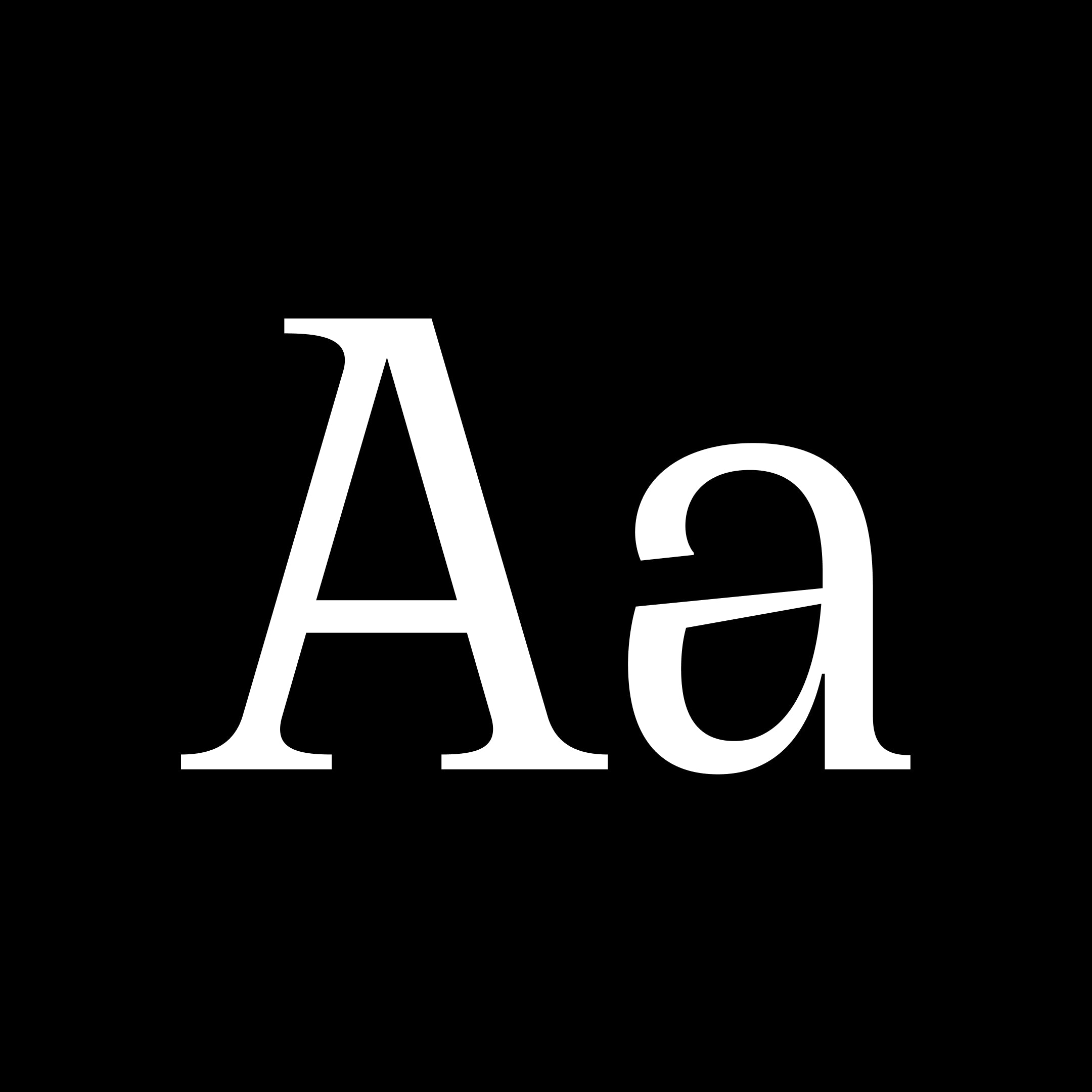
Cirka is an elegant typeface that combines classic forms u0026amp; a vertical axis with sharp, pointy serifs. It works great set large on posters or headers, or small, as body text. Its personality stems from the combination of the subtle details in every curves and the flamboyant, spikey serifs. Reminiscent of the 'Italian Wedge' shape from Lamborghini.
serif
pangrampangram
elegant
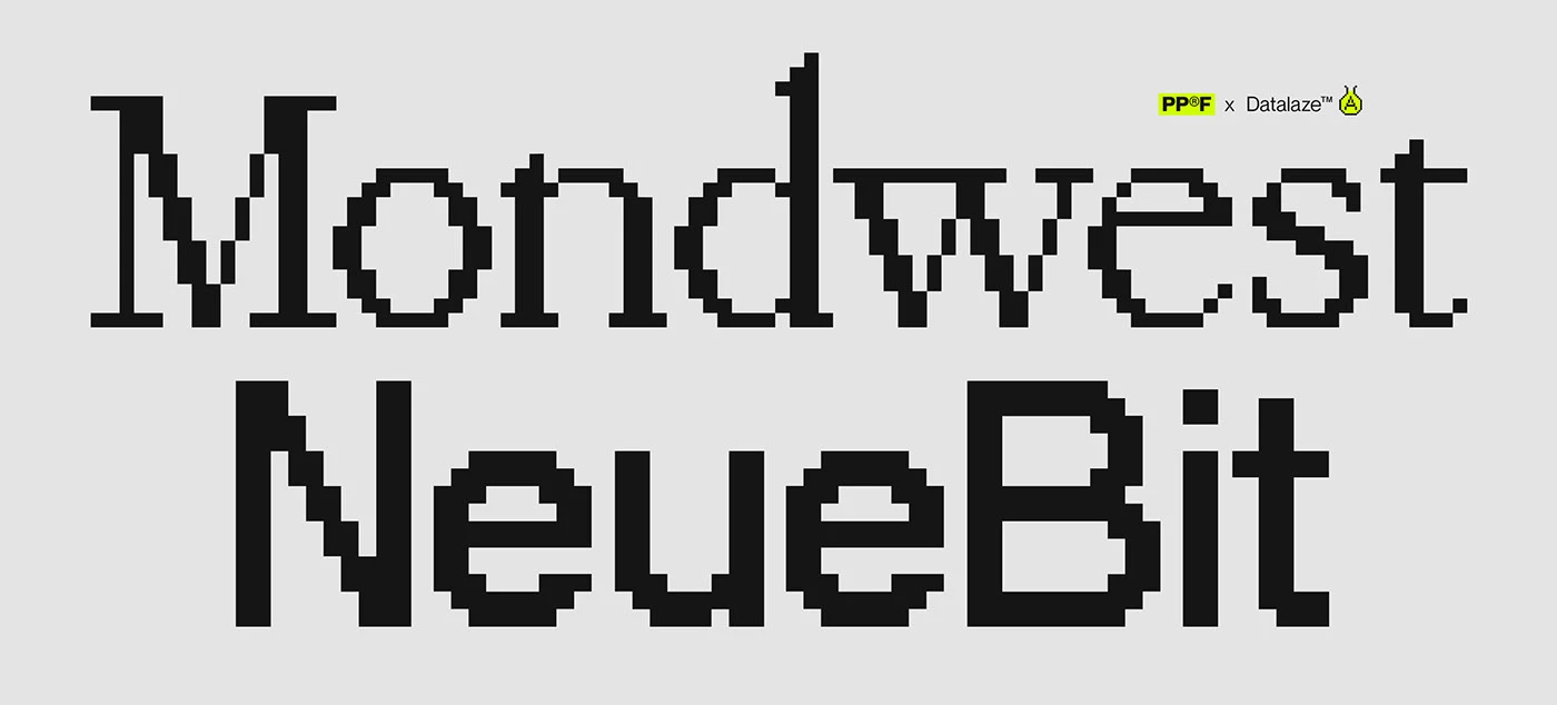
Designed to be your next go to pixel font, these bitmap fonts were inspired by the classic Grotesks and Serifs of our era. With more than 600 characters, symbols and icons these were crafted for maximum legibility, versatility and pairing capacity. The digitalization was pushed further reimagining these timeless classics to a more futuristic/brutalist yet precise aesthetic. The meticulously crafted bitmap typeface pack will definitely uplift your next designs. Those free-to-try typefaces are the perfect option to pair with Neue Montreal or Editorial New to make your designs even more unique and modern.
mono
foundry
commercial

0123456789
Imagine if Helmut Lang, Maison Margiela and Jil Sander created a collaborative label, what might the imagery look and feel like? This was our starting point for our “campaign” for Right Serif. We created a series of imagery that felt part of a wider fashion campaign, this tied nicely to the unusual and contrasting anatomy of the characters of Right Serif. We explored these characteristics in the form or imagery that played with inversion u0026amp; contrast. Right Serif is a funky multitool, a spiced up workhorse that stretches between being highly functional and having a unique personality. Unlike many other serif typefaces taking roots in history, Right Serif originated as a sans-serif (Right Gothic to be specific) growing serifs. From there, the typeface inherited moderate contrast and features common among grotesks but rare in serifs, notably large x-height and a wide range of variable styles covering 7 weights × 7 widths. Although the family is mostly intended for large and medium sizes, styles close to Regular work really well for paragraphs of smaller-sized text too.
serif
pangrampangram
display
0123456789
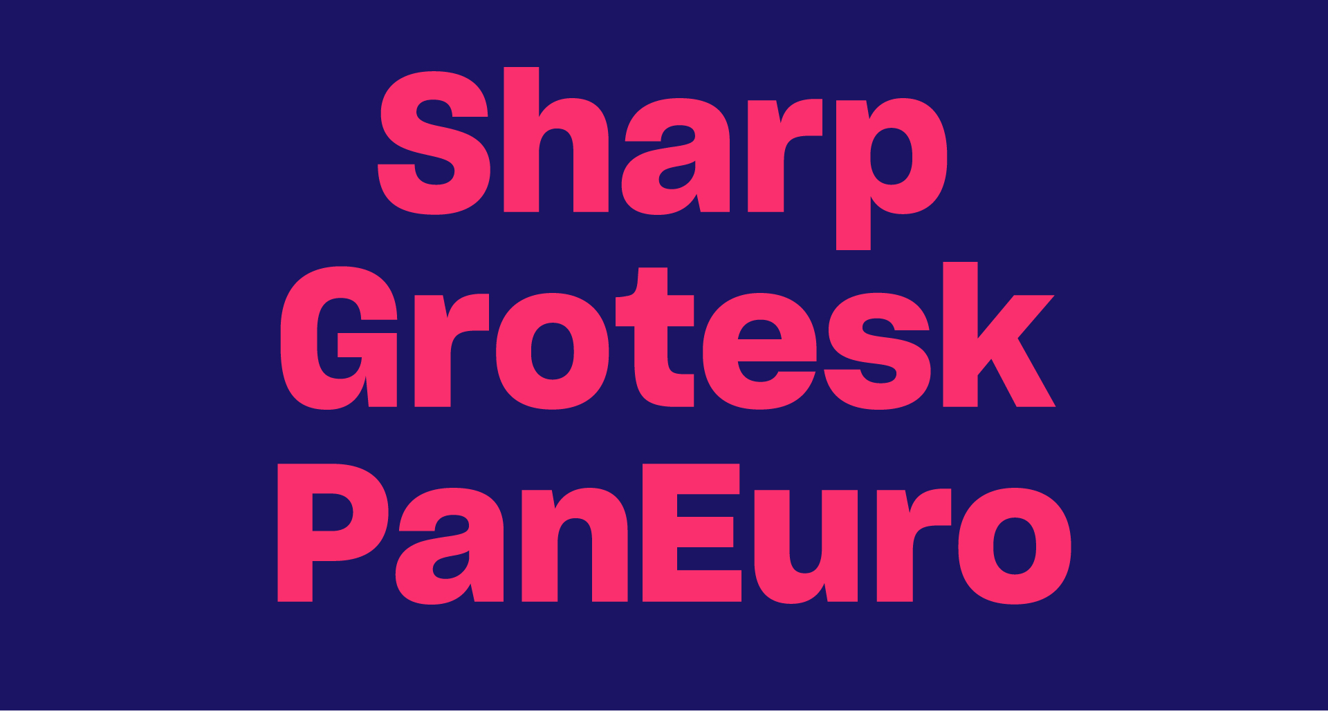
Sharp Grotesk Pan Euro is part of the Sharp Grotesk superfamily, which began as a hand-drawn lettering project in 2011. It has evolved into a versatile typeface known for its extensive Latin character set and multi-script support, including Greek, Cyrillic, Hangul, and Thai. This typeface is designed for a wide range of applications, from editorial to branding, making it a popular choice for modern design.
sans-serif
sharptype
versatile
0123456789
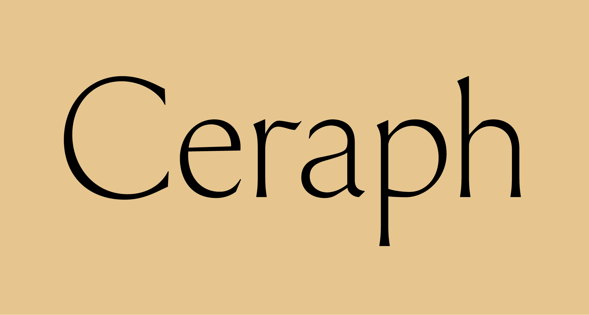
Ceraph is a flared serif typeface that began as an experiment in 2018, evolving into a refined project that embodies grace and strength. Its design features whiplash forms and flared serifs, with uppercase proportions referencing Roman capitals and a calligraphic approach in the lowercase. The typeface is influenced by notable designers such as Hermann Zapf and Giovan Francesco Cresci.
serif
sharptype
flared serif
ABC Gravity is a one weight, 12 width headline typeface. Its many stylistic alternates allow for playful settings and super-compact title arrangements. Its initial skeleton was inspired by heavy grotesque typefaces from the ’60s and ’70s, which we worked to compress and stretch out into extreme widths. As a special addition to the font, we implemented features that allow you to arrange and modify the position of characters. You can make them jump over the baseline or hang from the top. All of Gravity’s 12 styles can be used separately or packaged together as one Variable Font file. That means the output can be modulated seamlessly from XXXX Compressed to Wide.
display
dinamo
variable font

0123456789
Feijoa is a warm, personable serif with ornate embellishments
serif
klim
modern
0123456789
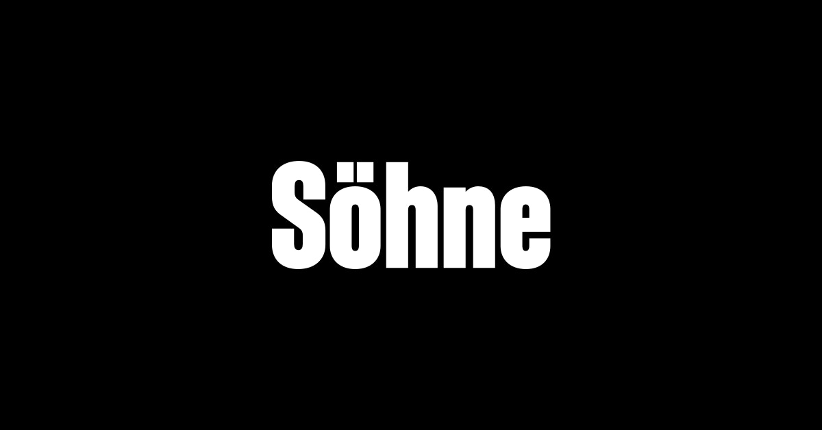
Söhne Schmal is the memory of Akzidenz-Grotesk framed through the reality of Helvetica
sans-serif
klim
neo-grotesque

0123456789
Family is an everyday typeface based on Clearface—originally designed by father and son, Morris Fuller and Linn Boyd Benton. As an extension of its lineage, Family keeps Clearface’s easy-going curves and idiosyncrasies, while updating it for modern use.
serif
klim
oldstyle

0123456789
Die Grotesk was shaped in the long shadow of Helvetica, a typeface both revered and resented in equal measure. Graphic designers love it. Type designers hate it. Endlessly revived and resold, simultaneously banal and sublime, its forms feel inevitable.
sans-serif
klim
grotesque

0123456789
Neue World is a free-to-try super-serif font family with 6 widths and 48 cuts. Inspired by vintage display types often manually squeezed to fit the print size, this typeface has all the widths required to accommodate any format. Its soft curves and refined details create a sense of elegance in its thinner weights, while the hard contrast in its heavier weights creates a bold statement. A beautiful, modern serif that pays homage to its forerunners. The stunning details and versatile possibilities for this font make it an essential addition to any type tool kit.
serif
pangrampangram
display

0123456789
Telegraf combines the forms of mid-century grotesks with rigid angles. As its weight increases, Telegraf’s counters become more rectangular, to help with on-screen viewing at small sizes, and to increase impact at large sizes. It would define itself as a well-planted modern grotesk with a powerful presence and a touch of brutalism. Suitable for both large-scale and indie projects. The Slanted have a comfortable 15° angle for your editorial or long-form content. We also created an extreme 30° Oblique for a more brutalist and graphic approach.
sans
pangrampangram
grotesk

0123456789
Monument is a powerful grotesk typeface inspired by the raw beauty and imposing forms of brutalist architecture. Originally designed to make bold statements, it's become a go-to for impactful design, attention-grabbing titles, and refined typographic compositions that demand presence. With its major 2025 update, Monument has grown into one of Pangram Pangram’s most expansive and adaptable font families. It now includes five distinct widths, each available in nine carefully tuned weights, across both upright and italic styles, offering designers an exceptional range of typographic control. Whether you’re crafting branding systems, editorial layouts, or digital experiences, Monument’s versatility and structure make it a workhorse with edge. From ultra-compressed to comfortably wide, it flexes confidently across screens and scales.
sans-serif
pangrampangram
grotesk
0123456789
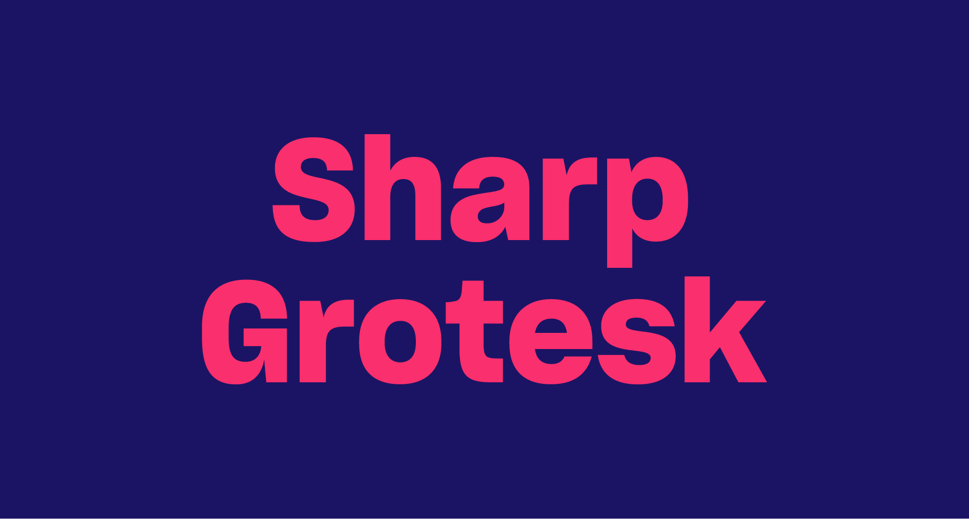
Sharp Grotesk is a versatile neo-grotesque typeface that began as a hand-drawn lettering poster in 2011. It has evolved into a comprehensive superfamily featuring twelve weights and seven widths, along with multi-script support for Greek, Cyrillic, Hangul, and Thai. Known for its adaptability and scalability, it is widely used in various design contexts.
sans-serif
sharptype
neo-grotesque

0123456789
Ghost is a modern interpretation of the Humanist sans genre, drawing inspiration from Roman inscriptional lettering. It aims to redefine normalcy in type design through complex and nuanced decisions, making it suitable for a variety of contemporary applications. The font is characterized by its playful yet respectful approach to traditional forms.
sans
sharptype
humanist

0123456789
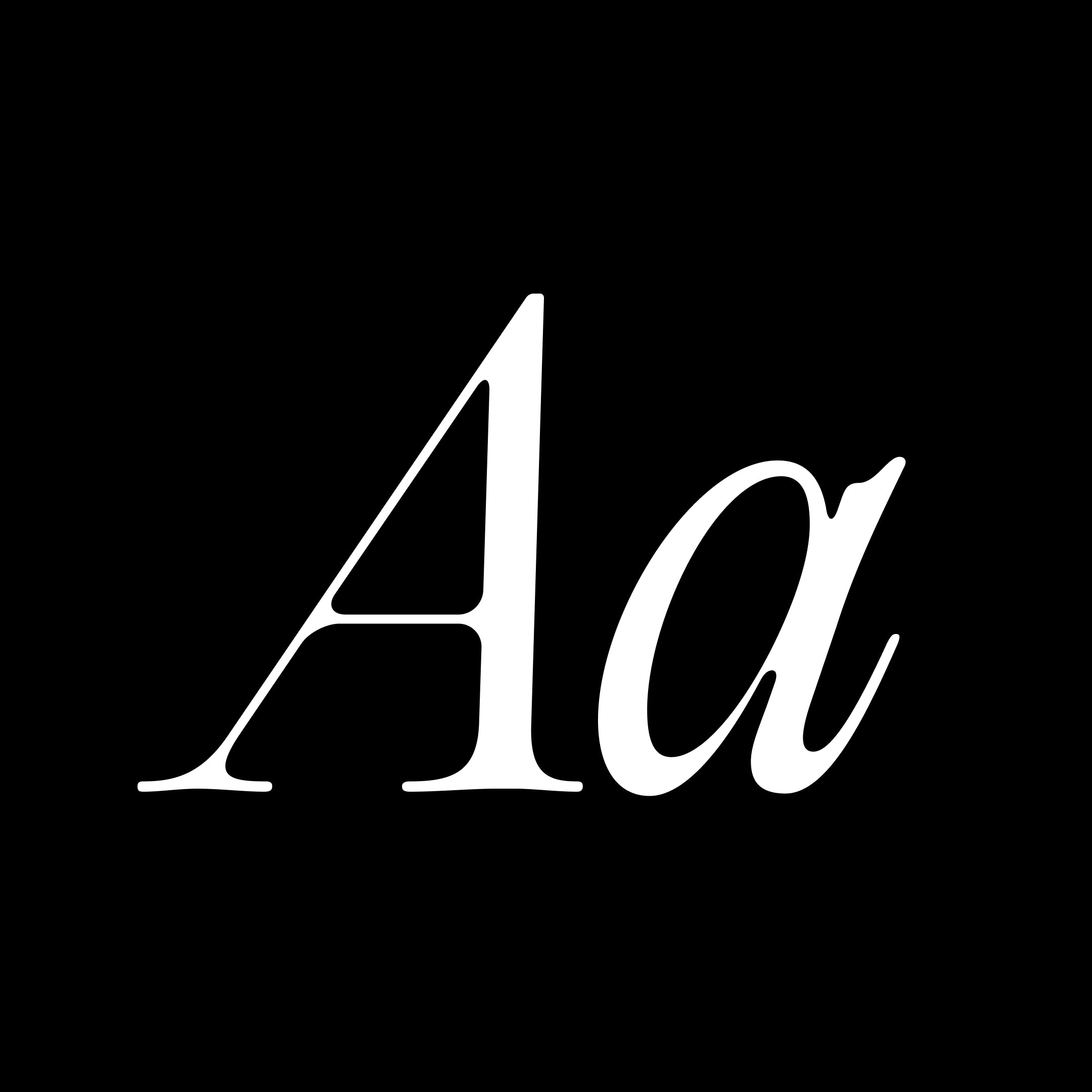
National is a deceptively simple sans with a distinctive personality
sans-serif
klim
sans serif
0123456789
Editorial Old is a 'fresh' take on one of our most popular classics Editorial New. So to understand Editorial Old we need to go back to Editorial New's Concept for a second. The concept of Editorial New was rooted in 70s u0026amp; 80s vintage ads. With its narrower stance and elegant curves, this workhorse serif quickly became one of your favourite. Stemming from that success, we had the idea to push this vintage concept a bit further in this spin-off. What if Editorial New got Old??Its curves would be less tense, its connections a bit more relaxed, its ligature more droopy and more present, its terminals softer. Alongside this idea of the vintage ads, we created a melting, eroded version of our timeless classic with a ton of luscious ligatures. Two Times Elliott led visual campaign embodies this idea of agelessness through refined curves, etched and molded oddities, trinkets and jewelry.
serif
pangrampangram
narrow

0123456789
Mori is a versatile and sophisticated gothic sans serif inspired by contemporary Japanese design, best suited for editorial, graphic design and branding. From Thin to Black, it has 22 styles, each one includes 804 glyphs with plenty of open type features, including sets with circled and squared numbers, subscript and superscript numbers, symbols and punctuations (some of them Japanese), graphic and mathematical symbols and many alternates. Make sure to check out that geometric 'r' and double-story 'g' !!While keeping all the functionality of a workhorse Grotesk, Mori is far from being boring. You can find some unique and subtle shapes and curves that makes it stand out from the crowd. Notably it's G, number 6 and number 9 just to name a few.
sans
pangrampangram
gothic

0123456789
PP Neue York is a sans serif shaped by the city’s layered visual noise: the bodega awnings, the worn American gothics, the mosaic station tiles, the endless rhythm of Avenues and Streets. The goal was to capture all of that and fold it into a contemporary type system that still carries a vintage pulse: clean in structure, functional in spirit, but gently rough around the edges, like something that has lived out in the open. Its three widths (Normal, Narrow and Condensed) shift in density the way the city shifts block by block. Neue York is built as a 48-style family: 8 weights from Thin to Black, each with its own italic, spread across three widths. The widths were drawn with deliberately different x-heights to suit different roles, the Condensed is taller and tighter for headlines, while the Normal has proportions better suited for text and continuous reading. Despite these differences, the family maintains a strong sense of consistency across styles, which allows it to work effectively in both display and text settings.
sans
pangrampangram
sans serif
Frequently asked
How is trending calculated?
By a rolling score built from recent votes, saves, and discovery activity on Typedex, so newer momentum counts for more than all-time popularity.
How often does the list update?
Continuously. The ranking recomputes as votes and saves come in, so the order can shift day to day.