Beatrice Deck is part of the Beatrice Superfamily, which explores various contrast methodologies in type design. Released in 2018, it combines elements from American Gothic and grotesque styles, featuring a robust set of weights across four optical sizes. Beatrice Deck is particularly suited for caption and sub-headline settings, offering a unique contrast that stands out in display applications.
Sharp Type
Sharp Type is a global digital type foundry known for its diverse range of typefaces, including modernist and script styles. The foundry also offers tools like the OmniLatin Tool to assist designers in font production.
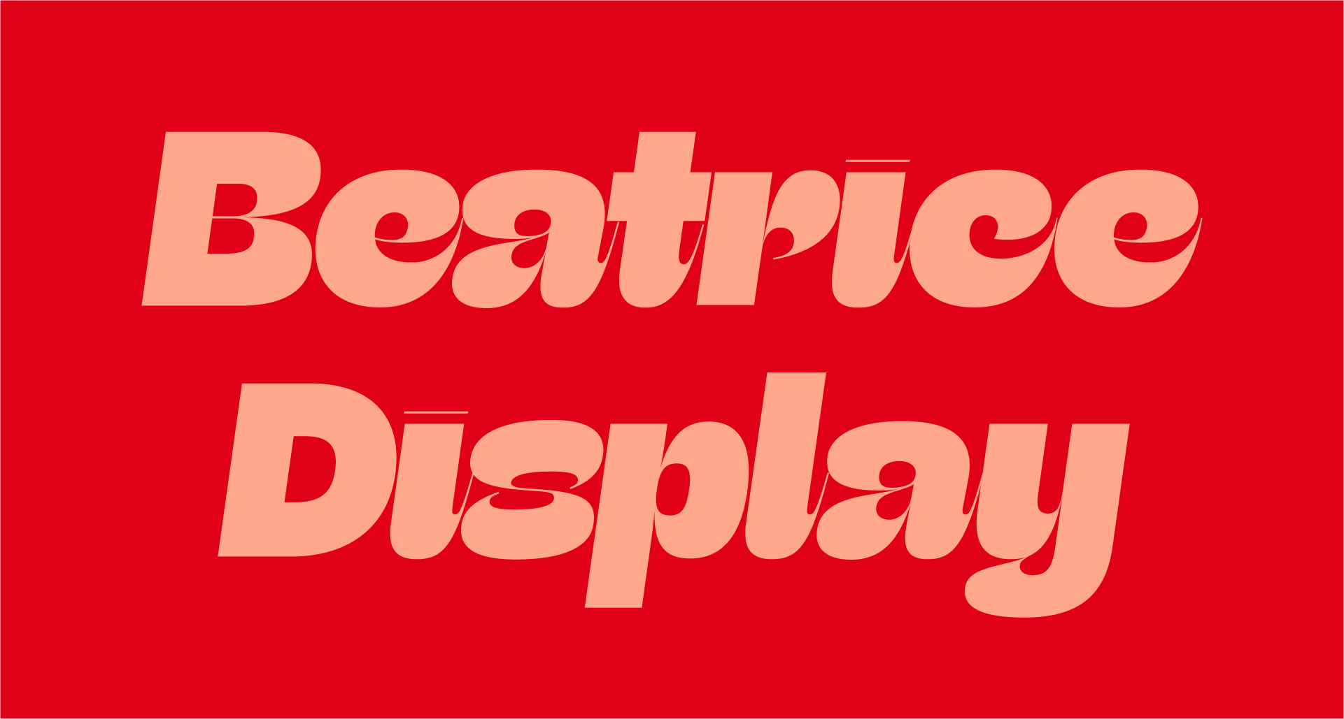
Beatrice Display is a striking typeface that explores a range of contrast methodologies, combining elements from various typographic systems. Released in 2018, it set a new standard in type design with its high contrast and unique spacing. It is particularly suited for large display settings, where its dramatic features can be fully appreciated.
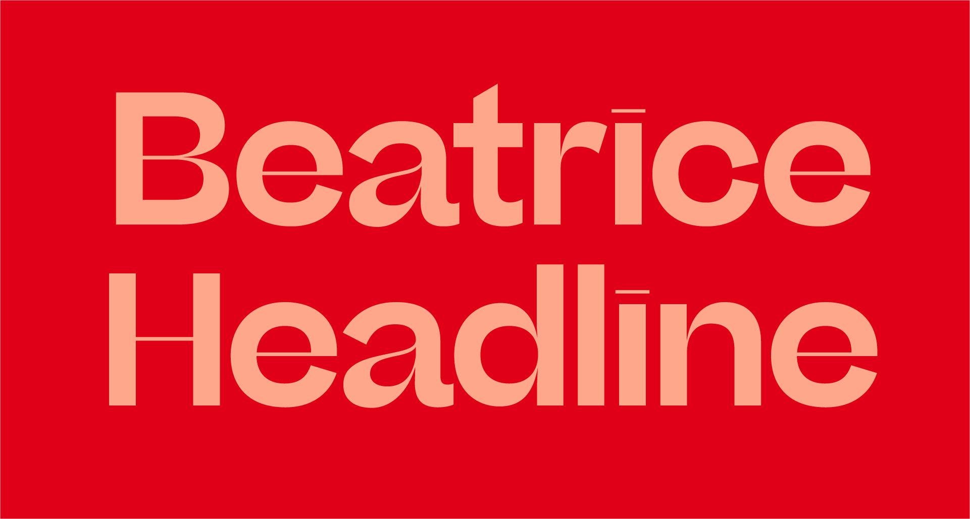
Beatrice Headline is part of the Beatrice Superfamily, which explores various contrast methodologies in type design. Released in 2018, it combines elements from American Gothic with modern design principles, making it suitable for a range of display and headline applications. The Headline cut offers a balance between eye-catching aesthetics and functional readability, ideal for smaller display settings.
Beatrice Standard is a contemporary typeface that explores various contrast methodologies, combining elements from traditional grotesques and modern design principles. Released in 2018, it offers a unique low-contrast aesthetic suitable for a wide range of applications, particularly in smaller text settings. The typeface is part of the Beatrice Superfamily, which includes multiple optical sizes and weights, making it versatile for both display and text use.
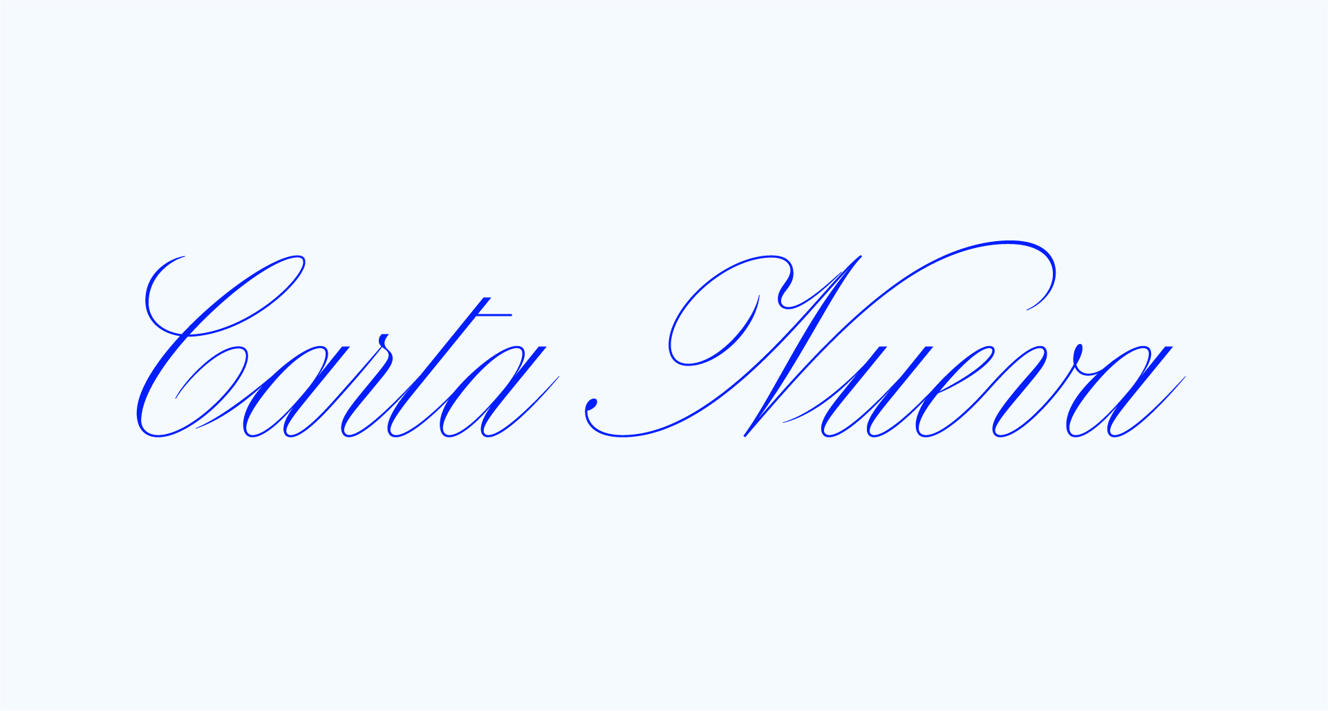
Carta Nueva is a digital reinterpretation of a pointed-nib calligraphy model from 1851, originally crafted in Barcelona, Spain. Designed by My-Lan Thuong in 2019, it captures the spirit of traditional calligraphy while adapting it for contemporary use. The typeface is characterized by its poised and lively letterforms, making it suitable for a variety of applications, including high-profile events like The Cannes Film Festival.
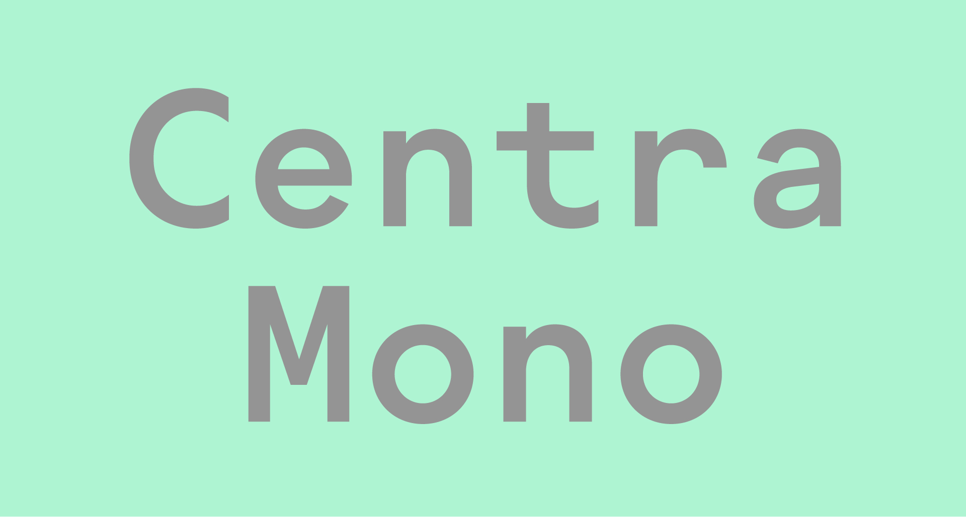
Centra Mono is a contemporary response to monospace typography, designed as part of the Centra superfamily. It emphasizes texture and readability while retaining stylistic details from its humanistic and modernist predecessors, Centra No.1 and No.2. Released in 2021, it offers a unique blend of personality within a fixed-width system, making it suitable for both coding and design applications.
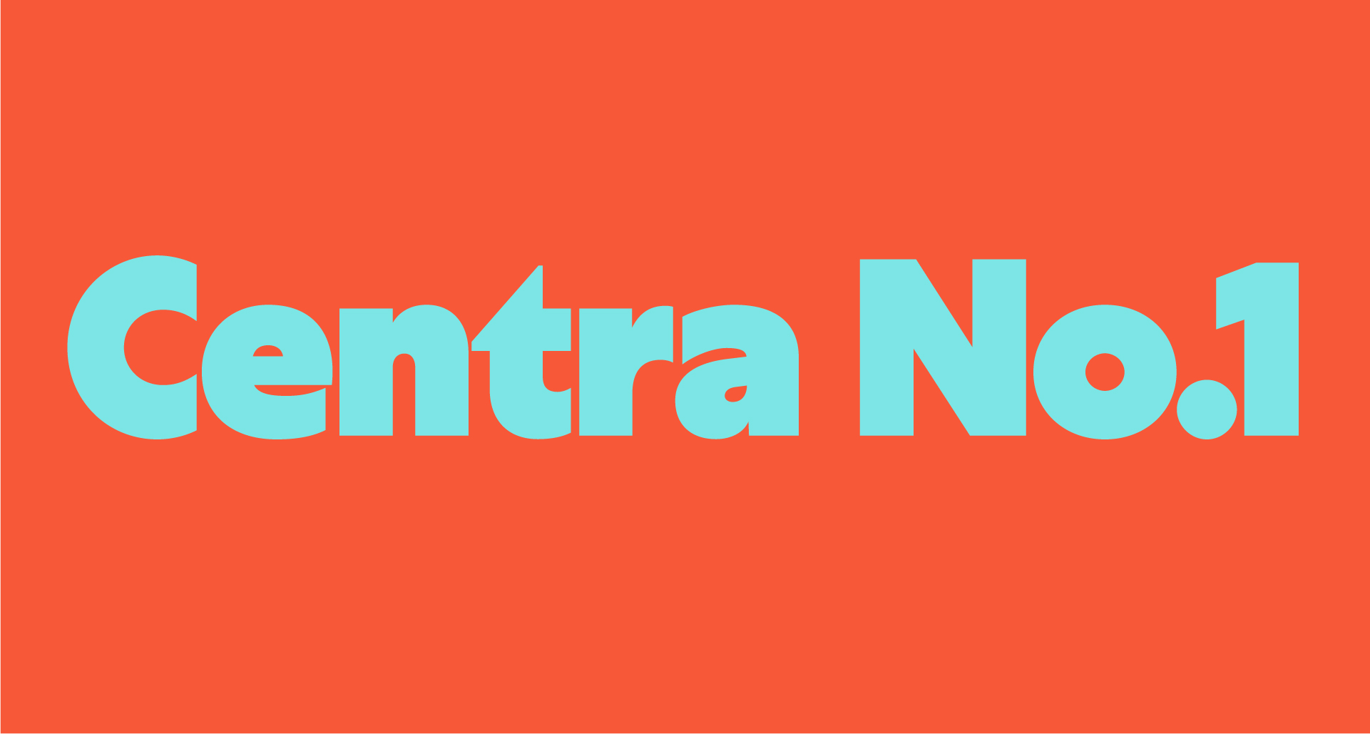
Centra No.1 is the humanist edition of the Centra series, designed to emphasize texture and readability while drawing inspiration from classic British typefaces like Gill Sans. It offers a contemporary take on geometric sans-serif design, incorporating elements reminiscent of ancient Roman capital construction within a modern framework. This typeface is known for its versatility in various design contexts, particularly in branding and editorial use.
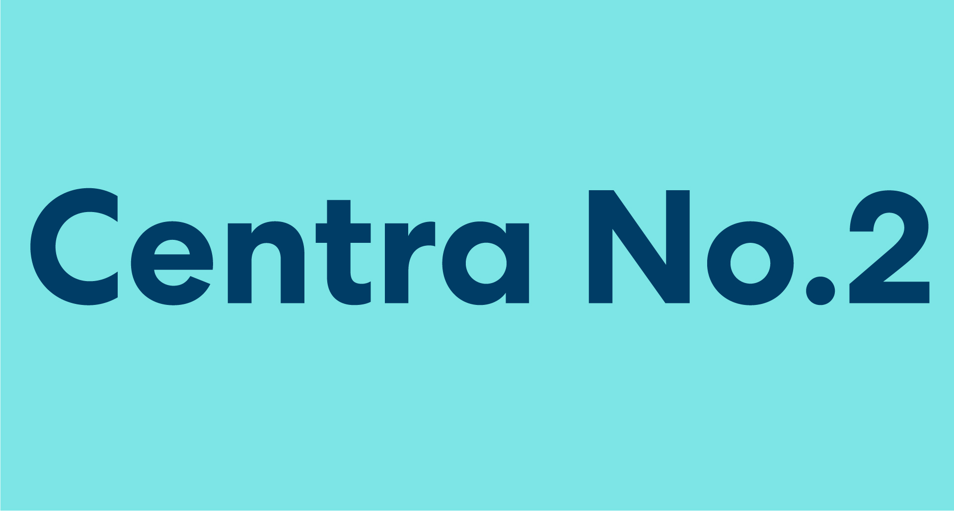
Centra No.2 is a modernist geometric sans typeface that emphasizes texture and readability. It is part of the Centra superfamily, which explores the balance between utility and aesthetic appeal, drawing inspiration from traditional geometric forms while incorporating contemporary design elements. The typeface features diagonal shears in its terminals, setting it apart from more strictly geometric sans-serifs.
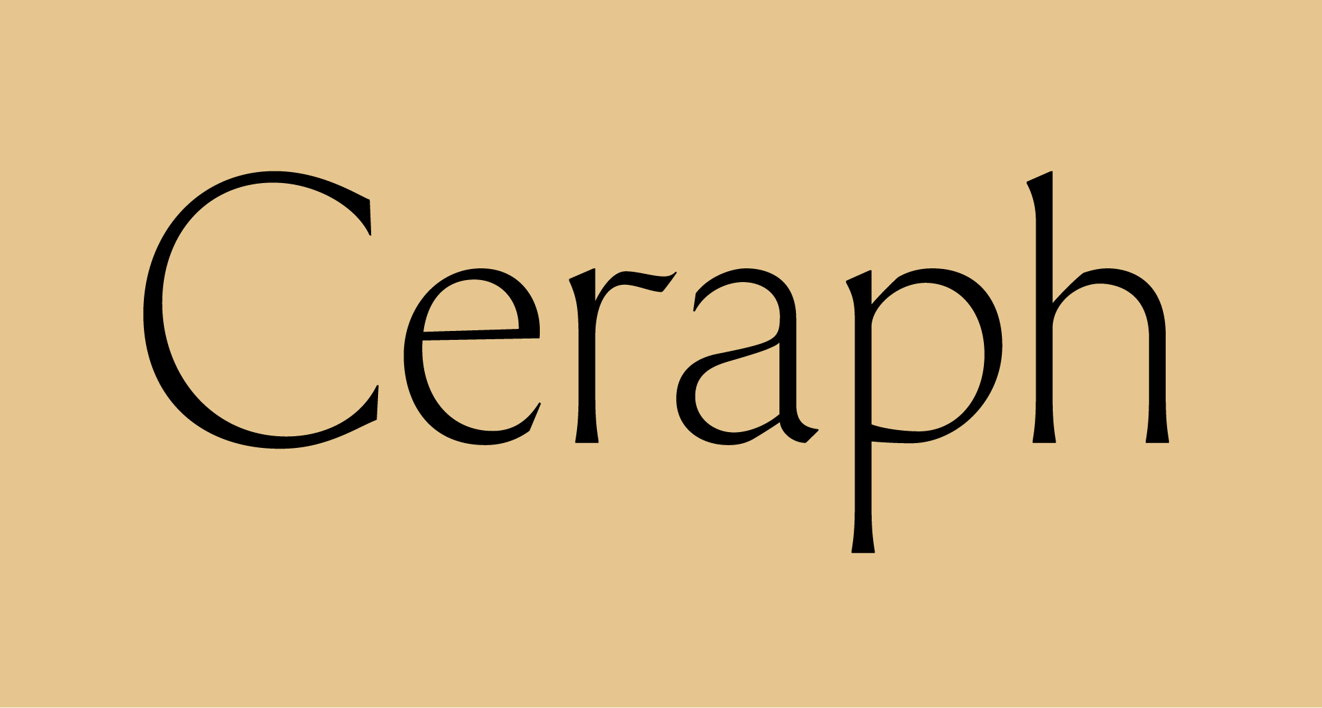
Ceraph is a flared serif typeface that began as an experiment in 2018, evolving into a refined project that embodies grace and strength. Its design features whiplash forms and flared serifs, with uppercase proportions referencing Roman capitals and a calligraphic approach in the lowercase. The typeface is influenced by notable designers such as Hermann Zapf and Giovan Francesco Cresci.
Cordier Script channels the virtuosic calligraphy of Louis Barbedor, a 17th-century French master penman, reimagined as a contemporary script typeface. It draws from the intricate plates of 'Les écritures financière et italienne-bastarde', engraved by Robert Cordier in 1650. This typeface marries historical elegance with modern vitality, featuring inverted thick-and-thin strokes that sweep diagonally upward, showcasing each letter as a study in acrobatic finesse.
The DOSS Collection is inspired by the logotypes of construction and hi-fi audio brands, reflecting the aesthetics of ‘90s rave culture and ‘80s sci-fi. Designed over five years, it features four display-oriented typefaces that showcase exaggerated geometric structures and unicase character sets, making it a versatile choice for graphic designers seeking bold typography.
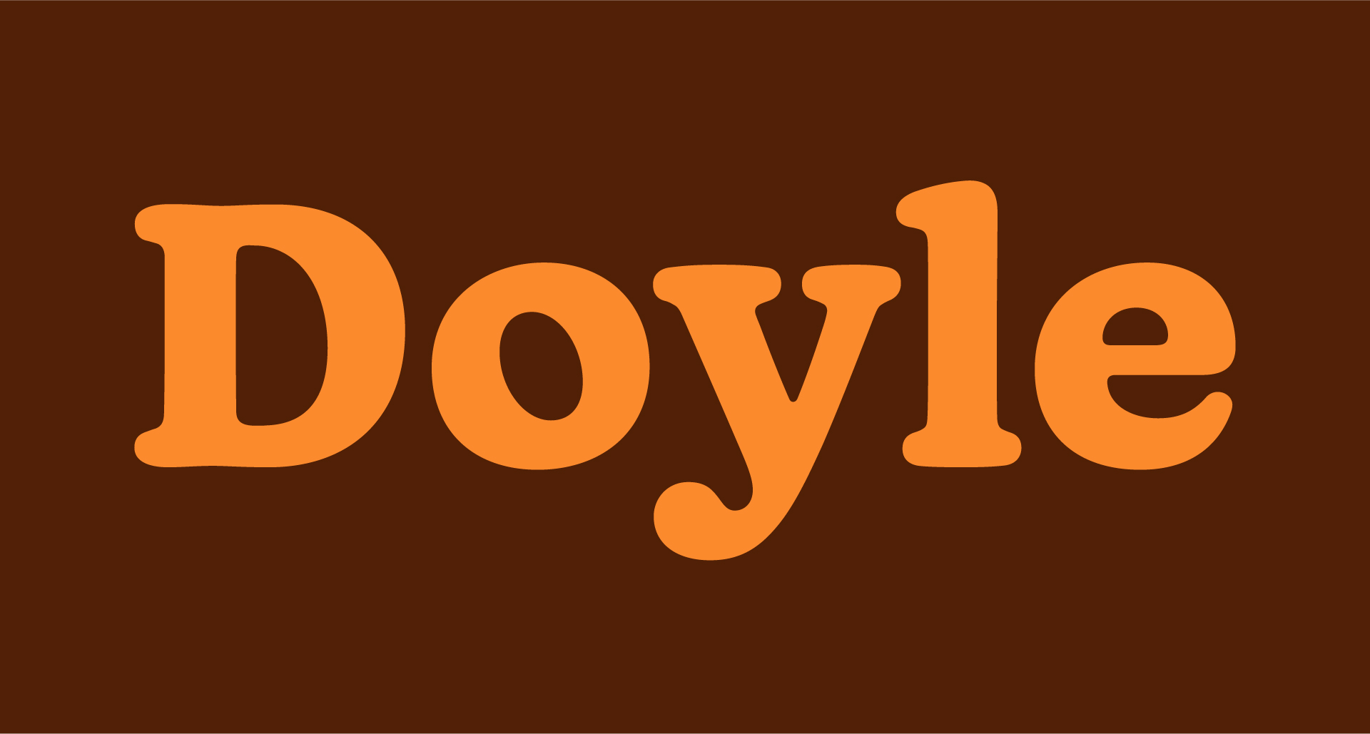
Doyle is a contemporary typeface that blends elements from two iconic styles: Cooper Black and ITC American Typewriter. This unique synthesis results in a type family that is both structured and organic, characterized by its lively, inky forms. Designed in 2019, Doyle is well-suited for a variety of applications, from editorial to branding.
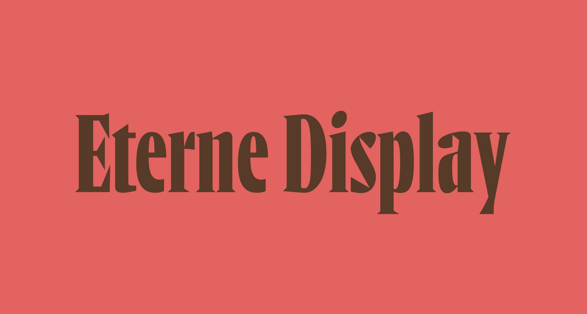
Eterne Display is a compact and dynamic suite of titling fonts that draws inspiration from printed magician’s ephemera and French titling types. Known for its condensed forms and idiosyncratic design, it is particularly suited for editorial contexts where prestige and space efficiency are essential. The font features unique incisions and twists that enhance its visual appeal while maintaining functionality.
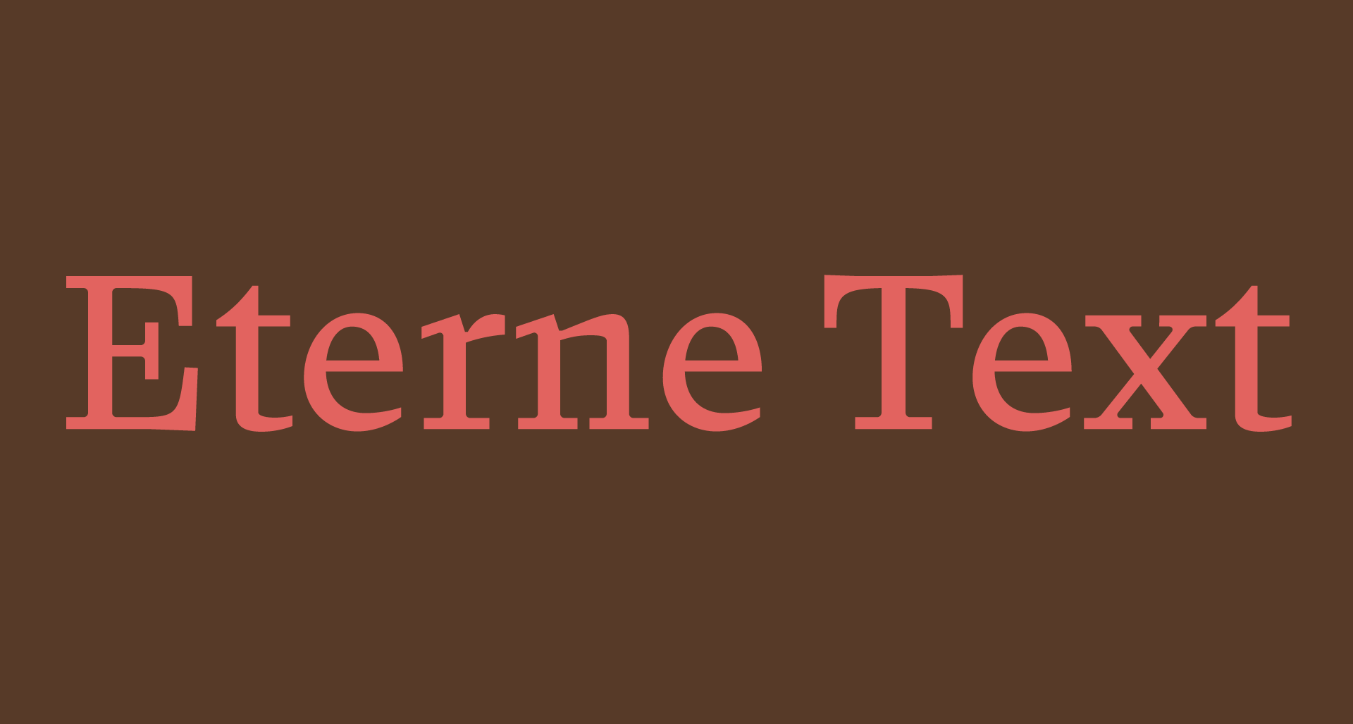
Eterne Text is a refined typeface known for its clarity and readability, designed to balance unconventional forms with utility. It draws inspiration from the Marionette Formula by W. A. Dwiggins, featuring lively letterforms that create a dynamic interplay of space and counter-space. The typeface is characterized by shallow-shouldered arches and low contrast, making it suitable for both display and text applications.
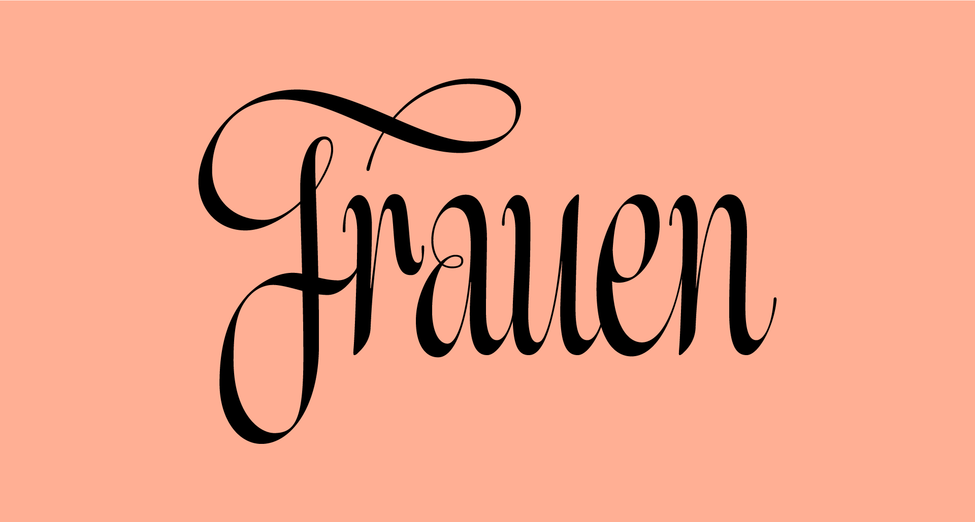
Frauen is inspired by German calligraphy, with its script style based on lettering from a Berlin almanac published in 1945. The roman style draws from the calligraphy of Friedrich Neugebauer, allowing for harmonious use between the two styles. This typeface is known for its elegant and interchangeable uppercase and lowercase forms, making it suitable for both display and text applications.
Ghost is a modern interpretation of the Humanist sans genre, drawing inspiration from Roman inscriptional lettering. It aims to redefine normalcy in type design through complex and nuanced decisions, making it suitable for a variety of contemporary applications. The font is characterized by its playful yet respectful approach to traditional forms.
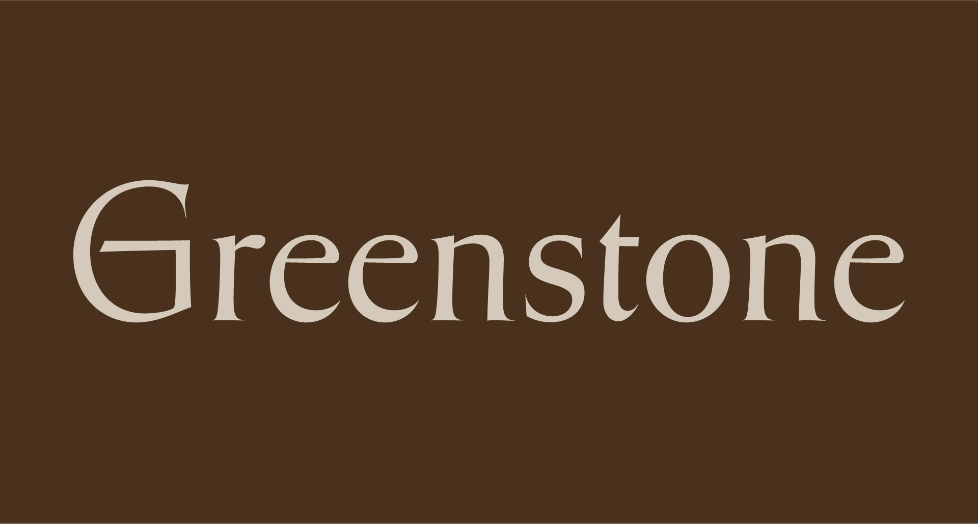
Greenstone
Sharp Type · 2021
Greenstone interprets Oscar Ogg’s vernacular lettering style through the lens of American and British stone carving, influenced by notable figures like John Howard Benson and David Kindersley. This typeface embodies a typographic expression of an ancient tradition of lettering, showcasing a blend of exquisite vernacular styles developed over centuries. It is particularly suited for use in stone carving and other applications that require a robust, historical aesthetic.
Hauss is a sans-serif typeface known for its sturdy design and versatility, crafted meticulously by Justin Sloane over years of refinement for his graphic design practice. It serves as a workhorse typeface while also exploring experimental display forms, particularly through its counterpart Raum, which pushes traditional design boundaries into psychedelic retrofuturism.
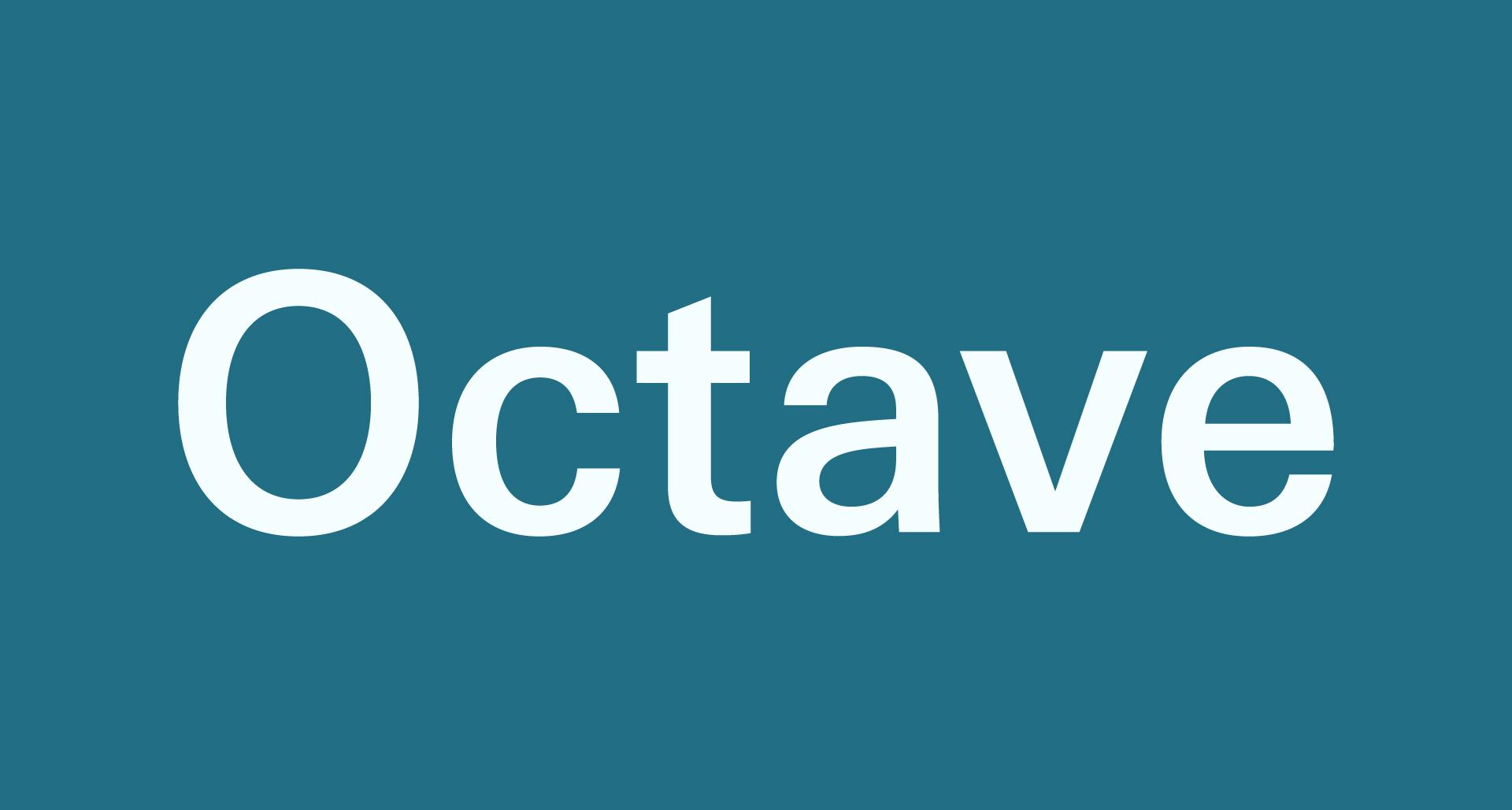
Octave is a modern sans serif typeface that reexamines traditional design structures and aesthetics. It embraces the reliability of mid-20th century design while incorporating contemporary improvements. This typeface is known for its clean lines and functional design, making it suitable for a variety of applications, from branding to editorial use.
Ogg
Sharp Type · 2013
Ogg is inspired by the hand lettering of 20th-century book designer and calligrapher Oscar Ogg. It captures a unique blend of calligraphic and typographic forms, characterized by high contrast and a compact word shape, making it highly legible even at small sizes. The typeface is known for its versatility and has been used in various design contexts, particularly in editorial and branding applications.
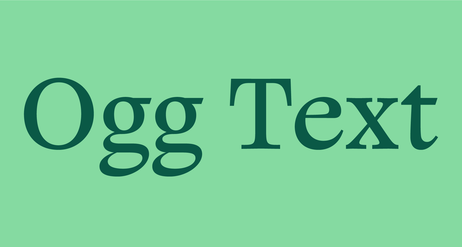
Ogg Text is the complementary text face of Ogg, the seminal display serif by Lucas Sharp inspired by the hand lettering of 20th century book designer and calligrapher Oscar Ogg. Ogg Text infuses the signature calligraphic styling of its predecessor with new and old transitional and oldstyle text face models. Signature moves found throughout Ogg’s calligraphic works were explored, exaggerated, and refined in the high contrast design space of Ogg. The original lettering samples are a combination of calligraphic stroke, contour drawing, and white-out (reduction). This combination of calligraphic and constructed forms became the perfect jumping off point for typographic exploration.
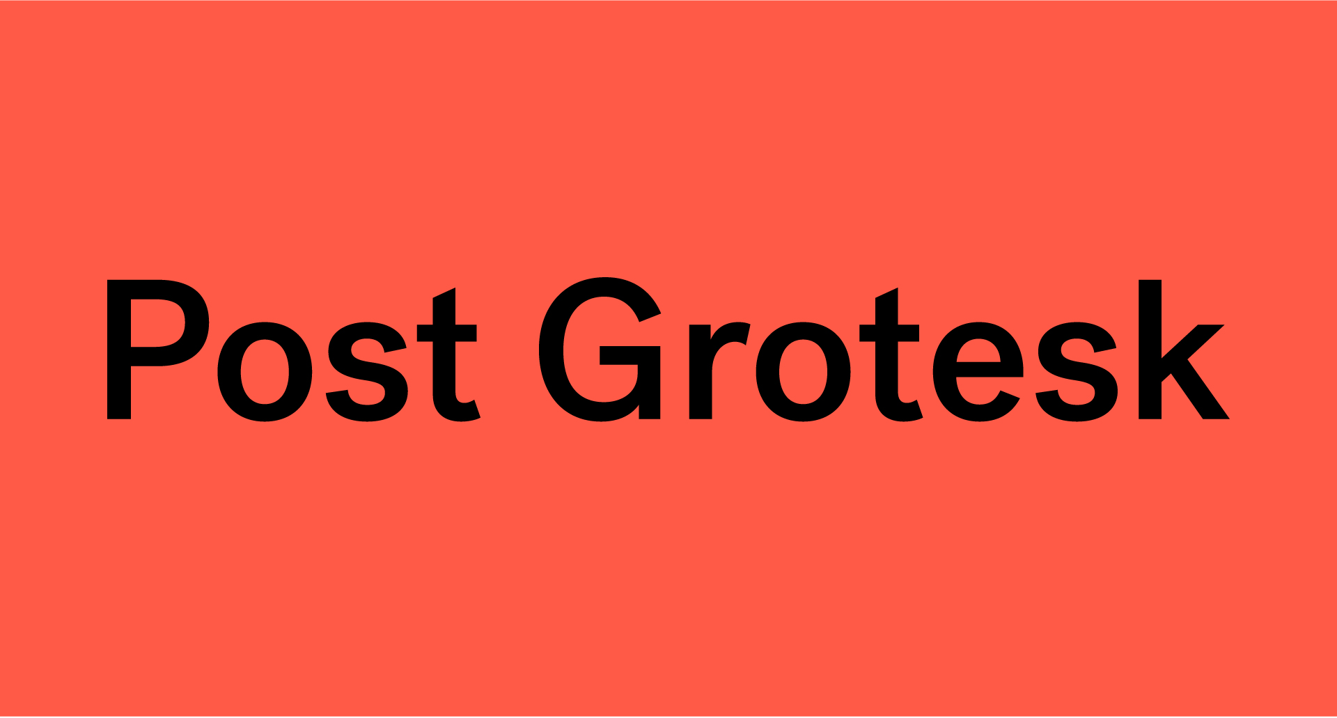
Post Grotesk is a contemporary interpretation of the traditional grotesk sans-serif typeface, designed by Josh Finklea starting in 2011. It aims to provide a friendly and neutral aesthetic, making it highly usable across various applications. The typeface reflects Finklea's design sensibilities and addresses common issues found in standard grotesk and neo-grotesk fonts.
Raum is a sans-serif typeface known for its experimental display qualities and its role as a sturdy design tool. It pushes the boundaries of contemporary design by exploring the 'display inktrap' motif, creating a unique blend of utilitarian and psychedelic retrofuturism. The typeface is part of the Hauss Superfamily, which reflects a meticulous design process aimed at graphic design applications.
Record Disc is a typeface that balances a contemporary update with a nostalgic nod to the retro-futuristic aesthetics of the 1980s. It draws inspiration from historic fonts like Antique Olive Nord and Serpentine, making it suitable for a variety of applications while maintaining a softer, more refined appearance. This typeface is known for its versatility and modern design sensibilities.

