Areal is a revival of the widely used digital typeface Arial, entirely redrawn and rebuilt from the ground up by Dinamo for Are.na. It honors the original design while streamlining stem thicknesses and adding new characters, making it suitable for modern digital use. The typeface reflects a commitment to updating a classic while maintaining its core identity.
Dinamo
Dinamo Typefaces is an independent type design studio based in Berlin. We develop fonts, books, and other physical projects—sometimes on our own, often in collaboration with a global network of contributors. Our work spans both commercial and cultural projects of varying scales.
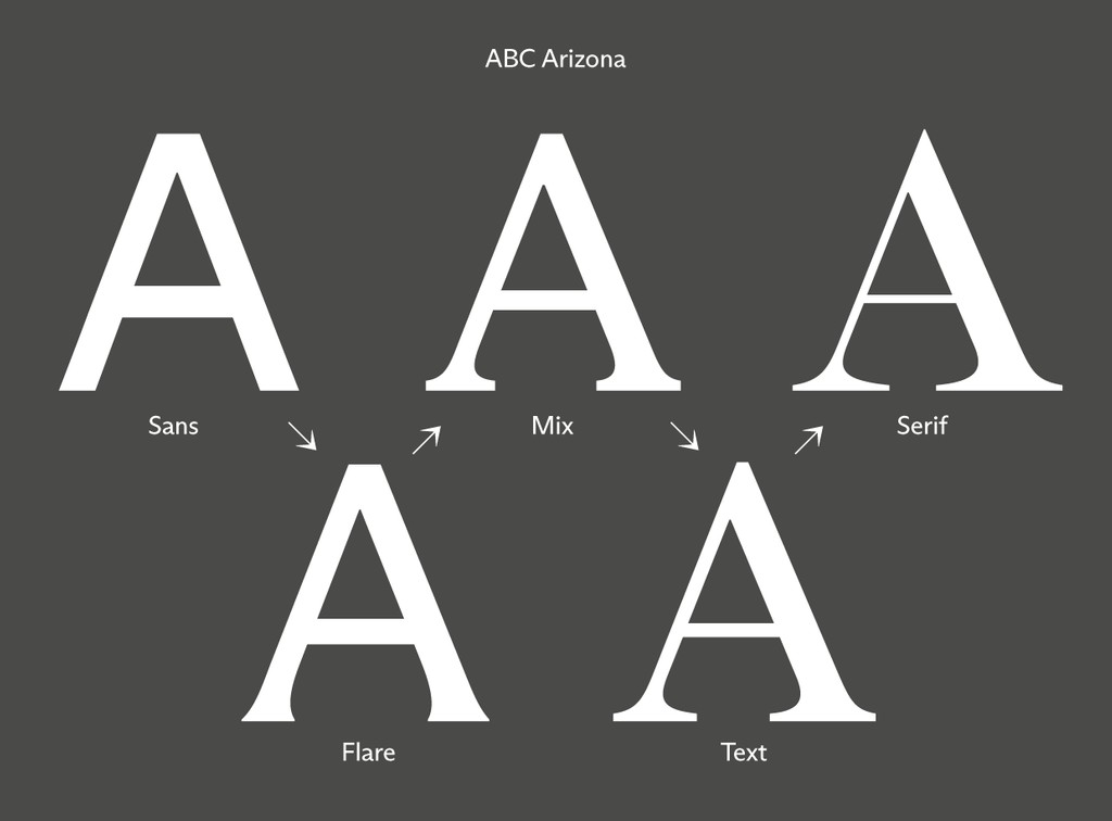
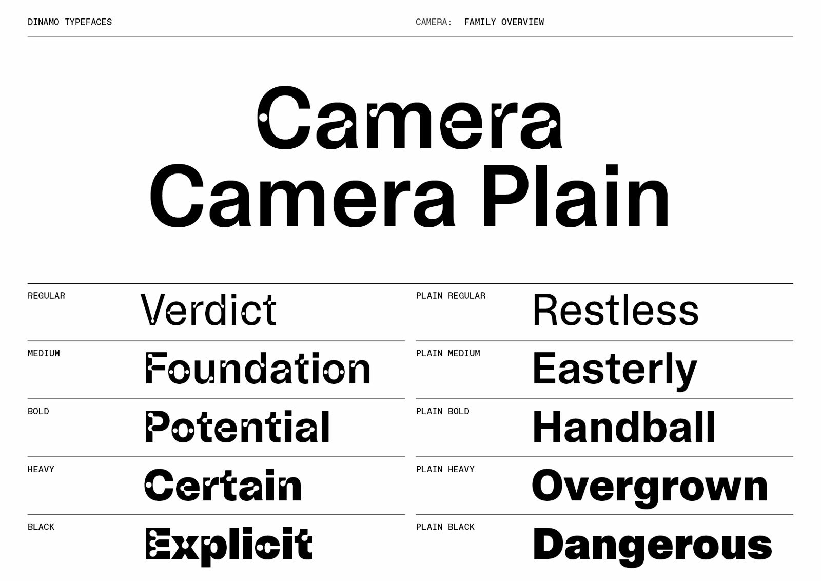
ABC Arizona is the first ever sans to serif “superfamily” that packages its five looks — Serif, Text, Mix, Flare, and Sans — into one single font file. In other words, it’s a slim, all-genres-in-one font happy-meal. Versatile and adjustable for any context. Arizona has five distinctive yet connected subfamilies. Arizona Serif is a high contrast, pointy serif with a modern-meets-Renaissance freshness, and on the other side of the spectrum, Arizona Sans is a straight-forward grotesque with a humanistic touch. In-between lie other species, such as the nearly-but-not sans Arizona Flare. Arizona Mix is chunkier and low-contrast. Lastly, Arizona Text is a classic text serif typeface that’s well-suited for reading. Stretching from its headline to small text possibilities, an entire library can be typeset with just this one typeface. Each subfamily comes with thin, light, regular, medium, bold, and italics as static font files. Or the typeface can be used as a variable font, which includes...
Asfalt’s elongated, tightly-packed forms draw from the design of painted road letters, which are stretched to compensate for the low perspective of an approaching car. From a driver’s seat, words like “STOP” and “GO” read perfectly compact. A stencilled version of road lettering from Niggli’s mid-century Lettera series became the starting point for our design, plus a design manual for road surface signage found by Fabian in thrift store in Rio de Janeiro. Asfalt comes in Compressed, Condensed, Normal, Extended, and Expanded widths stretching elegantly across Light, Regular, Medium, and Bold weights.
Just like the club bouncer that secretly keeps tiny birds as pets, ABC Bingo is rough on the outside and soft on the inside—its edgy exterior contrasts with its sympathetic, rounded inner-contours. The typeface was Johannes Breyer’s first hit in 2011, released while he was still an intern at NORM via a purposefully-developed website. It’s based on a sample published in Rob Roy Kelly’s American Wood Type: 1829–1900, but unlike its source, ABC Bingo’s inner and outer-contours are drawn with polygons, so that it appears smooth at small scale and brutal when large. A second set of monolinear, thin punctuation was added to ABC Bingo in 2012.
Bubblegum is soft and silly but it’s also geometric and highly modular — a sticky clash of two extremes. Small caps have been baked inside, creating a vibe that this type genre has probably not seen before. For anyone brave enough to use it for their invoicing, a monospaced companion is also available.
ABC Camera is a reinterpretation of light traps, which were originally used in the 60s and 70s to make text more readable on TV screens. Similar in logic to ink traps, light traps compensated for low resolution: When the font appeared, the screen’s blur filled in its holes so that each letter looked complete. The design has been orbiting around our cosmos for a long time, and it might be one of the most requested typefaces in our inbox to date. Like many of our fonts, it can be considered an “early work” of our co-founder Fabian Harb, conceptualized around Dinamo’s inception days. Light traps were such an unintentionally bold visual feature, and so we’ve scaled them up for ABC Camera, referring to them as “holes” (as in Swiss Emmental). The font is available without the holes, bringing it back to full functionality and forming an interesting typeface in its own right. Overall, ABC Camera is a neutral, toned-down grotesque similar in style to Helvetica but with freer, less strictly de...
ABC Connect is a digital dot font based on the ABC C-o-n-n-e-c-t-o-r-s grid. The typeface contains monospaced and proportional styles, all with corresponding Italics, making it (probably) the world ’s first Italic dot font (but don’t drill us on that one). It also comes in 5 common screw head styles, including Flat, Torx, Hex, Nail, and Phillips.
ABC Daily is a typeface family made of two siblings: Slab and Scotch. They are like different people who share key DNA features, proportions, skeleton, cap-, and x-height. The idea is simple: both Slab and Scatch can substitute for the other, just like a designer would Roman and Italic styles to create hierarchy and distinction. The visual effect can range from loving harmony to a sense of total destruction (like siblings loving and fighting each other). Each family has four weights and monospace variants. Italics are coming in 2024. ¯_(ツ)_/¯
Dinamo is a Berlin-based type design studio offering retail and bespoke typefaces, design software, research, and consultancy. We operate via a network of…
Diatype Rounded is a warm, curvy sans with friendly shapes informed by the Swiss Neo-grotesque genre and pre-digital typesetting machines. The overall vibe is bold, a little pop, and has an understated sense of humor to it. These rounded forms feel oddly mechanical — as if each character has been engraved with a chunky tool in one continuous line. We buffered the little beauties one by one 💅
We first spotted Estragon’s starting point while scrolling on the Type Foundries Archive Twitter account @typeTFA, noticing a spread later identified as part of Harrild & Sons’ New & Abridged Specimens of Wood-letter, Corners, Borders, &c (circa 1890). Unfortunately, no more characters or information on the design could be found; one librarian at the St Bride Foundation in London suggested it might be an example of the ornamental headline wood types that typographers in the late 19th century would often offer to clients as an additional freebie. We redrew the design for contemporary eyes in 2017, adding three distinctive styles—Wildstyle, Arrow, and Bubble—that can be freely combined at the level of individual characters. Sam de Groot first used the typeface for the identity of Condo New York, describing it aptly as “Schwitters-meets-Wildstyle.” While Matthew Carter once said that “a typeface is a beautiful collection of letters, not a collection of beautiful letters,” Estragon begs to...
ABC Favorit is a straightforward, low-contrast grotesque that combines geometric rigidity with subtle oddities and a humorous touch. It’s available in five weights with corresponding italics, as well as a few special cuts and an underlined version, Favorit Lining. Additionally, there are the sub-families ABC Favorit Extended, ABC Favorit Expanded and the mono-spaced version ABC Favorit Mono. ABC Favorit Lining is the younger yet much smarter brother of ABC Favorit, as it has its own “smart underline” built straight into the font. With this feature, all descending characters can be merged to create unconventional letter shapes. Unleash its Connected mode, and the initial and final characters of individual words are conjoined by an extreme underline. ABC Favorit Lining is available in five weights with corresponding Italics. We have spent the last years extending the typeface to cover additional languages. There are ABC Favorit Greek, ABC Favorit Cyrillic, ABC Favorit Hangul, and ABC F...
Gaisyr is a beautiful typeface with Dinamo house-style Butterfly Serifs. It takes its point de départ from sketches by the early 18th Century royal typographer for King Louis XIV, Jacques Jaugeon. A tension between strict geometry and loopy hand-held gestures lives on in its elegant forms. Just close your eyes and imagine the King sitting in his garden, maybe a bit sunburned, surrounded by butterflies and low hanging citrus fruit, sipping on a (glass bottle) of Coke®. Gaisyr available in proportional, monospaced and semi-monospaced styles.
Just as the Galapagos Islands are home to a vast number of unique species, the ABC Galapagos typeface is made up of a range of unique characters whose forms evolve from one another. The idea for the font stems from the designer Felix Salut’s Galapagos Game, a physical set of building blocks designed as a tool to draw letter shapes. We teamed up with Felix to transform his physical game into a starkly futuristic yet subtly biological font. ABC Galapagos emerges from 42 different cuts of varying styles, including a rounded, straight, and angular style, which can be combined with hybrids such as rounded-straight, rounded-angular, straight-angular, and rounded-straight-angular. Each style then comes in five weights, including grid and no-grid versions. Using the stylistic alternatives built into the typeface, all characters can be moved up and down along a vertical grid, allowing designers to play god with varying chains of the font’s DNA.
ABC Ginto is an exuberant geometric-humanist typeface that delights in tension, especially the tension between circular and rectangular forms. London-based graphic designer Seb McLauchlan developed the font while researching sans-serif typefaces from the twentieth century, focusing on the shift from strict Modernist “purity” to the more baroque, animated styles that emerged during the phototypesetting period of the ’50s and ’60s. These two historic impulses have been remixed to create a dynamic and charismatic set of forms. ABC Ginto consists of the two sister-families, ABC Ginto and ABC Ginto Nord. ABC Ginto is compact and poised, and encompasses a sensible set of weights ranging from Thin to Ultra, allowing the typeface to perform well in a variety of sizes and environments. Nord, on the other hand, takes the tone and timbre of Normal and amps up the volume to 11. It borrows from the former's structure but expands the x-height and character width, and also includes more weights, str...
Ginto Rounded is a geometric-humanist font of soft edges and playful forms. Like its non-rounded older cousins Ginto, Ginto Nord, and Ginto Nord Condensed, the Ginto Rounded subfamilies explore the tension between circular shapes and moments of sharpness. Think of them like field recordings that capture baroque, animated styles from the ’60s and ’70s as they exchange whispers with stricter, “modern” proportion models (like that of Futura). Standard Ginto Rounded comes with a regular x-height and compact lowercase characters, making it good for smaller text sizes. Ginto Nord Rounded has a higher x-height and wider characters – making it a good fit for chunky display contexts. Then there’s also Ginto Rounded Nord Condensed for narrower moments. A Variable Font bridges both Nords, allowing you to fine-tune widths and find solutions for a variety of spatial contexts.
Gramercy is an elegant, contemporary serif that balances slightly painterly and whimsical forms with functionality and sturdiness. With 48 styles in total, its three subfamilies — Standard, Fine, and Display — each come with uppercase swashes. All in all, Gramercy is a font that invites extreme editorial flexibility. A true winner. Designed by our longterm collaborator Robert Janes, a recurring theme is Gramercy’s overhanging, misproportioned details. Where another typeface might have ball terminals, Gramercy has flared strokes. That’s what makes it feel painterly. Hearts beat faster when Gramercy’s swashes appear, a series of uppercase flourishes that cover all weights and subfamilies. The font was initially heavily informed by F.H. Ernst Schneidler’s Amalthea (1956), a typeface that served as the Italic companion to his eponymous Schneidler-Mediäval (1938). Gramercy, Gramercy Fine, and Gramercy Display all cover eight weights with corresponding Italics. The variable font files all...
ABC Gravity is a one weight, 12 width headline typeface. Its many stylistic alternates allow for playful settings and super-compact title arrangements. Its initial skeleton was inspired by heavy grotesque typefaces from the ’60s and ’70s, which we worked to compress and stretch out into extreme widths. As a special addition to the font, we implemented features that allow you to arrange and modify the position of characters. You can make them jump over the baseline or hang from the top. All of Gravity’s 12 styles can be used separately or packaged together as one Variable Font file. That means the output can be modulated seamlessly from XXXX Compressed to Wide.
The idea for ABC Grow first emerged when Fabian Harb discovered a 1970s phototypesetting typeface made from several layers, just like the rings of an onion. We were curious about what would happen if you could dissect these layers and then mix-and-match them to form different combinations. With the help of specifically-developed software, we created our own multi-layered font that allows for six basic outlines to be grouped together to form a total of 63 different combinations. A series of alternative characters are available for those looking for a more economical and less chunky feel—there’s a narrow version of the round O, as well as a tighter M, for instance. The display font is entirely uppercase, and it also includes fractions, roman numerals, arrows, and ligatures. You can purchase each combination individually, or the entire set, if you think you can handle the beast.
When Dinamo was invited to teach a type class in Tallinn, Estonia during the winter months of 2014, Fabian found himself as he often does in a second hand book store, thumbing through a pile of vintage children’s books. One particular title caught his eye, featuring what appeared to be a Soviet-era clone of Helvetia. The typeface’s light traps—i.e. its spiked corners stemming outwards like mutated tails—were designed to help compensate for blurring during the phototypesetting era. The children’s book displays its entire alphabet at the back; all the better for learning the ABCs for some, but in our case, all the better for the task of digitization.
ABC Laica is the result of a cruel methodology: A forced collaboration between the broad nib pen and the pointed nib pen, two common but very different drawing tools. Designer Alessio D’Ellena sketched early versions of the typeface by hand during his spare time as a student at the Royal Academy of Art in The Hague, which usually meant while slouching in uncomfortable armchairs at the airport or on rickety trams winding through the streets of Rome. ABC Laica’s patchwork of shapes are a playful retort to the tradition of calligraphy, reflecting today’s reality of cheap flights, constant hustle, and remote work. ABC Laica features chiseled transitions by default, that generate a pleasing visual rhythm and optical balance for text. And upon activating a Stylistic Set, ABC Laica can sport straight transitions at its joints and evoke a more simplified and elegant tone. Both the monospaced and proportional sub families come in Light, Book, Regular, Medium, and Bold weights with correspondin...


