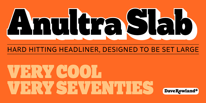
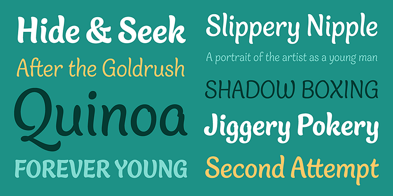
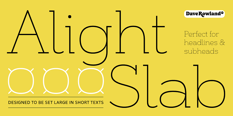
Alight Slab is, wait for it… A light slab! Designed to be set large, in headlines or subheads and (very) short paragraphs of running text. It has slightly super-elliptical forms and crisp details, giving it a contemporary look. Alight Slab features automatic fractions, a discretionary ct ligature, and a capital sharp s. Look no further than Anultra Slab for an ultra-bold accompanying typeface.
Dave Rowland Type
Anultra Slab is, you guessed it… An ultra-bold slab serif! It is a hard-hitting headliner, designed to be set LARGE. Think editorial spreads and event banners. Because it’s a single-weight typeface, no compromises were necessary to get it interpolatable with other weights, so it is as bold and tight as intended. Don’t miss the 3D ‘xtrude’ style that can be layered behind the regular to create two-colour, photo-lettering style text. Very seventies. Very cool. A companion typeface for Alight Slab.
Explore Aziga designed by Dave Rowland at Adobe Fonts.
Explore Backstroke designed by Dave Rowland at Adobe Fonts.
Explore Bali Script designed by Dave Rowland at Adobe Fonts.
Explore Blanket designed by Dave Rowland at Adobe Fonts.
Explore BMX Radical designed by Dave Rowland at Adobe Fonts.
Brag is a squat, bold, soft serif design with a stencil alternative. It is transitional and vintage in a way that feels like it was taken from an old biscuit tin or ephemeral fruit crate label. Understated, friendly, and sturdy without being bland, cloying, or stuffy. Brag is eager to be used on all-natural food packaging, gardening equipment displays, collectible books of poetry, and microbrewery branding. Pairs well with others but can stand on its own; give Brag a
Explore Capsule designed by Dave Rowland at Adobe Fonts.
Explore Chill Script designed by Dave Rowland at Adobe Fonts.
Explore Cinema Script designed by Dave Rowland at Adobe Fonts.
Explore Delfina Script designed by Dave Rowland at Adobe Fonts.
Explore Duckie designed by Dave Rowland at Adobe Fonts.
This is Ekamai, a deliciously plump, tight-but-not-touching script. It is named after a district of Bangkok where Dave once lived. With its lovingly rendered curves and just the right amount of cuteness, Ekamai is perfect for food packaging (of the sweeter variety, probably!), logos, magazine headlines, branding, and the like. The overall feel is friendly and soft without being overtly saccharine. Ekamai pairs well with Quinella, a slightly older sibling, in dramatic and exciting ways, too!
Engria nimbly treads the fine line between sans and serif. Its wedge-like serifs resemble engraved forms created by the splayed shape made by the bristles when clamped together. At the same time, it looks like a stressed, flared sans. This mixed approach lends a unique voice. Thanks to its characteristic details, it is highly legible in text sizes and shines in display sizes. Engria has four weights, with italics, and makes a perfect addition to any designer’s typographic arsenal.
Eroika Slab is a robust display serif intended to be set large. Eroika’s “displayness” stems from its wide stance, tight spacing, equal cap and ascender heights, flared stems, and large x-height. The italics, in particular, are quite unorthodox, with their vertical serif cut-offs and foot serifs where most fear to tread (’scuse the pun). Perfect for book covers, craft beer logos, boxing paraphernalia, and tattoo magazine pull quotes. And probably a whole lot more besides!
Galix Mono is a monospace font patterned after Galix, a technical sans designed to look futuristic without any of the retro appearance. It has a squarish, slightly condensed anatomy characterized by thin joints and deep ink traps that add a sparkle to the otherwise monoline typeface. In the italics, these cuts are accentuated even more, which creates a sense of speed in the letterforms. Galix Mono is perfect for coding, apps, infographics, and other design situations that require structure.
Explore Gelato Luxe designed by Dave Rowland at Adobe Fonts.
Explore Gelica designed by Dave Rowland at Adobe Fonts.
Explore Gigantic designed by Dave Rowland at Adobe Fonts.
Explore Hazel Script designed by Dave Rowland at Adobe Fonts.
Explore Margot designed by Dave Rowland at Adobe Fonts.
Masonic Lodge is a rough, hand-drawn display typeface that appears to be chiseled from stone. Rowland started with a very low scan and traced it until he had almost a whole alphabet. He saw potential, so he created the rest of the letters into a font. There is variety for more authenticity with two versions of each letter and number. Masonic Lodge would be excellent for pub signs and menus, secret society meetings and rosters, food labels and packaging, and monster movie titles and posters!
Explore Megumi designed by Dave Rowland at Adobe Fonts.


