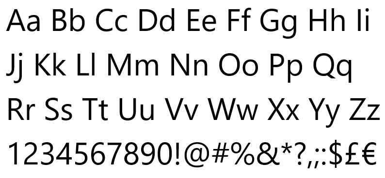
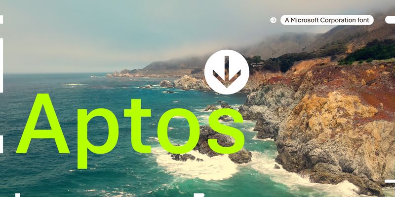
Aptos is a precise, contemporary sans serif typeface inspired by mid-20th-century Swiss typography. Its clear-cut stroke endings emphasize order and restraint; the points where curved strokes meet straight strokes are crisp and well defined, which makes the typeface easily readable and reduces visual crowding. Aptos expresses simplicity and rationality in a highly readable form, with "the austerity that would speak to the huge variety of Office documents created every day," according to designer Steve Matteson. Aptos can be used in both body text and headlines or titles, and its variety of weights are appropriate for different uses: Light, Semibold, and Black weights can help create a hierarchy of information in PowerPoint and Word documents, while the Narrow weights give Excel users a way to fit more information into spreadsheets and tables. The Display weights are slightly narrower and more closely fitted, to give very large text a crisp authority. Type designer Steve Matteson designed Aptos for Microsoft as a new default Office font to replace Calibri. It has six weights, from Light to Black, with complementary oblique styles. In this style of typeface, the italic doesn't typically take on the cursive forms you'd expect in handwriting or a traditional serif typeface; the letter shapes are oblique forms of the upright letters. The italics of Aptos have been individually redrawn, rather than mechanically slanted. Aptos also has two Display weights, with their accompanying italic styles, and two Narrow weights, with italics optimized for Excel. Aptos offers extended support of the Latin, Greek, and Cyrillic alphabets, and for Vietnamese.
Microsoft
Aptos Mono is a monospaced typeface – that is, every letter has exactly the same width. It is the monospaced complement to the contemporary sans serif typeface Aptos. Aptos Mono is essentially sans serif in style, although letters like ‘i’, ‘l’, and ‘r’, which might otherwise be somewhat narrow, feature stubby flat serifs that help to fill the space as well as keeping them easily distinguishable. Aptos Mono has strokes of even thickness, wide letter width, and generous spacing between letters, all of which contributes to its legibility. Like many monospaced fonts, it is most at home in code, but it could also be used in spreadsheets, labels, or small amounts of information signage. Aptos Mono has two weights, Regular and Bold, with italic complements; all versions have identical letter widths. The fonts offer extended support of the Latin, Greek, and Cyrillic alphabets, along with fractions, arrows, and both black and white circled numbers. Aptos Mono is the monospaced companion to Aptos, Aptos Narrow and Aptos Display and was also designed by Steve Matteson.
Aptos Serif is a highly readable contemporary text typeface, a serif complement to the sans serif Aptos. Aptos was inspired by mid-20th-century Swiss typography; Aptos Serif takes its cue from modern, rational 20th-century typefaces with high contrast between thick and thin strokes and a vertical, up-and-down axis of stress within the letters. Its stroke endings, whether flat or serifed, are clear-cut and emphasize order and restraint; the spacing between letters is generous enough to keep them easy to Aptos Serif, like its sans serif counterpart, expresses simplicity and rationality in a highly readable form, with what designer Steve Matteson calls “the austerity that would speak to the huge variety of Office documents created every day.” In Word, PowerPoint, or email, Aptos Serif is appropriate for both body text and headlines or titles. It comes with two weights, Regular and Bold, with complementary italic styles. The italic letters have a restrained cursive swing, within a rational structure. Aptos Serif offers extended support of the Latin, Greek, and Cyrillic alphabets, along with fractions, arrows, and both black and white circled numbers.
Arial gives the illusion of being a very plain typeface. It seems to be basic to a fault, simple lines in simple shapes that anyone can And since it is probably the most ubiquitous sans serif typeface on the web and in print, we are all used to reading it. It has a no-nonsense industrial look, though details like the diagonally cut ends of some strokes soften its effect. It can appear, in a paragraph, a little like a bundle of sticks and round balls that have come together to make up letters. Arial was originally designed in 1982 by Robin Nicholas of Monotype, as a sans serif typeface for low-resolution laser printers; it was later developed, with Patricia Saunders of the Monotype drawing office, into a full typeface family, which Microsoft licensed as one of the core set of fonts for Windows 3.1 in 1992. A lot of attention was put into the hinting of this typeface. Hinting is adding code to the font so that its letter shapes will be clear on screens even at small sizes. The original Arial family includes Arial, Arial Narrow (useful for fitting copy into very narrow columns), Arial Black, and Arial Rounded MT Bold.
Bahnschrift Bahnschrift is a sans serif typeface that looks mechanically drawn and deceptively simple. It is based on the German industrial standard typeface design DIN 1451, which has been used in highway signage and has been widely influential since its introduction in 1931. The font’s clean, no-nonsense style works well on signs or notices and in headlines, and gives an authoritative look to any sort of information design Bahnschrift was Microsoft’s first typeface built using variable font technology, which means that in addition to the typeface’s five pre-built weights and three pre-built widths, it can have potentially infinite variations between the extremes of its weight and width design axes. At any particular width, all the weights take up exactly the same amount of space, so changing the weight doesn’t mean that the text will reflow. Type designer Aaron Bell reworked an earlier Microsoft design used in game titles to turn it into the current variable font, expanding its weights and character set and adding code ("hinting”) to the font so that it will render well on low-resolution screens. Bahnschrift is a purely upright typeface design; it does not have italic styles. Consider Grandview, a related design with italic styles, for body text where italic styling might be required.
Cambria is a text typeface with serifs designed for reading long documents onscreen or in print. The proportions of the letters are even and the spacing between letters is open, giving the typeface an even texture in paragraphs of text. There is very little contrast between thick and thin strokes in the horizontal direction, but a bit more in the vertical direction. Its serifs are short and stubby. The italic is subdued and plays a secondary role to the upright style. Type designer Jelle Bosma designed Cambria to be a potential replacement for Times New Roman. The two typefaces don’t look much alike, but they serve the same function as a workhorse typeface suitable for use in text almost anywhere. Cambria was designed in 2004 as part of the Microsoft ClearType font collection, to make reading onscreen easier and more comfortable. Cambria also has an extensive set of mathematical characters and symbols, making it one of the best typefaces for typesetting math.
Candara is a graceful sans serif typeface that is friendly and readable in text. The texture of a paragraph in Candara is lively but not intrusive, and easy to At large sizes, in headlines or subheads, the subtleties of Candara’s design become apparent. Candara is a very useful typeface for email or web pages as well as for newsletters, booklets, and flyers. There are almost no straight lines in Candara’s letters; instead, what appear to be long, straight strokes actually curve slightly inward in the middle, an effect that architects call “entasis.” In addition, diagonal strokes have a very slight double-S curve. At small sizes – or at a distance when looking at a classical building – these features make the lines look straight, but when you use Candara in a large headline, the subtle curves give it an unexpected elegance. Candara’s italic is less architectural and more calligraphic in style than the upright letters, but they work very well together.
Comic Sans is a fun typeface that embodies the spirit of informality. It looks hand-lettered, with a felt-tip pen. Comic Sans is familiar, used widely all over the world for correspondence, flyers, birthday cards, and labels that are meant to look handmade. It is surprisingly readable in text, whether in print or onscreen. Its imperfect, irregular shapes make it inappropriate for formal documents, although it has often been used in unexpected ways. As its name suggests, Comic Sans looks like the lettering in a comic book. It was created in 1994 by type designer Vincent Connare for a specific purpose: for speech balloons for characters in an animation application. It was included in the Windows 95 Plus! add-on as well as Internet Explorer, and became wildly popular (as well as much reviled by those who dislike its playful sloppiness). Comic Sans came originally in two weights, Regular and Bold; later, true italics were added for each.
Consolas is a “monospaced” typeface, where every letter is exactly the same width. In most typefaces, the widths of the letters vary; an ‘I’ for instance is usually a lot narrower than a ‘w’. Consolas is ideal for computer code, but it’s also useful in personal and business correspondence, and in any situation where numbers or letters need to line up vertically. In both upright and italic styles, Consolas makes a clear distinction between capital ‘I’, lowercase ‘l’, and the numeral ‘1’, which in some typefaces are easy to confuse. Although Consolas works best in text, sometimes its peculiarities can impart what its designer calls “a punkish radiation” to headlines. Consolas was designed to be easy to Type designer Lucas de Groot, who also designed Calibri, wanted to create a “really usable monospaced typeface.” The proportions of Consolas are more comfortably readable than the very wide proportions of an older monospaced typeface like Courier New.
Constantia is a typeface for text. Lots of text. Long text, whether onscreen or on a printed page. It’s thoroughly modern in design, yet it has the proportions and letter shapes of a very traditional text typeface. It is an excellent choice for reports and other long documents, as well as for newsletters and any sort of publication. Its sharp, triangular serifs give it a spiky look, which is especially apparent at large sizes. If you’re creating a document or publication that will have both a printed and a digital form, Constantia is the perfect text typeface. Type designer John Hudson created Constantia in 2004 as one of the two serif typefaces in Microsoft’s ClearType font collection. (The other was Cambria, which has a very different look and feel.) His original goal was to make a typeface for the text in e-journals; he ended up making a typeface that elegantly bridges the gap between print and screen.
Corbel is a clear, modern sans serif typeface that is functional but not bland. It is designed to give an uncluttered and clean appearance onscreen, especially in longer text, and it works equally well in print. It is easily legible at small sizes. The upright letters are look simple and neutral; the italics are more expressive. Corbel is a good choice for business documents, email, and electronic documents that are meant to be Corbel was designed in 2004 as part of the Microsoft ClearType font collection. Type designer Jeremy Tankard aimed to create a typeface that was “less cuddly, more assertive” than some of the other widely used sans serif typefaces. Corbel had to work across a wide range of applications and environments. It has two weights, regular and bold, and italics for both. Corbel’s default numerals are “old style” (lowercase, rather than the same height as the capital letters).
Courier New is a monospaced typeface – that is, every letter is exactly the same width. They look like they were typed on a typewriter, because that’s exactly where the typeface came from: the original Courier was designed for IBM typewriters. Courier New has fairly wide letters, so it tends to sprawl across the page. For many years, it has been the default choice for manuscripts that authors send to publishers, because at 12-point it’s readable and doesn’t cram too many words onto each line. It is very appropriate for correspondence, or for any document that you’d like to look as though it came from a typewriter. Because it is monospaced, all the numbers and letters will line up vertically. The original Courier was designed by Howard “Bud” Kettler in 1955 or 1956 for IBM typewriters and later revised with input from type designer Adrian Frutiger for IBM’s Selectric typewriter series, where it became the most common office typeface. It was adapted as a computer typeface to become one of the core Windows typefaces.
Georgia is a serif typeface designed for clarity and legibility on low-resolution screens. It combines typographic personality with high legibility, making it a popular choice for web content. The design is influenced by Didot and Scotch Roman, featuring characteristics that enhance its readability at small sizes.
Segoe Print and Segoe Script are the two cursive members of the Segoe typeface family. Both are handwriting typefaces, with slightly different styles. Both appear to be written with a felt-tip pen. Segoe Print is more regular, and it works better in all capital letters than Segoe Script does. Segoe Print is legible at smaller sizes that Segoe Script. Both are effective where an informal, handmade look is needed. Use Segoe Print for large text or headlines, with Segoe Script as a fancier accompaniment, for invitations, labels, flyers, brochures, or packaging. Segoe Script is designed by type designer Carl Crossgrove, based on the handwriting of Brian Allen. Segoe Print is an adaptation of Brian Allen’s handwriting by Crossgrove, James Grieshaber, and Karl Leuthold. The letters in Segoe Script connect, like cursive handwriting, while the letters in Segoe Print are independent, though still informal and cursive in form.
Segoe UI is a humanist sans serif typeface designed for clarity and readability on screens. It became the default user interface font for Microsoft with the release of Windows Vista in 2007. Known for its open and neutral appearance, it is suitable for a variety of applications, including user interfaces, labels, and print.
Sitka Sitka is designed for reading, at any size. It has six optical sizes, different versions of the same letters that are subtly adjusted to work best at a particular range of sizes. Sitka Text is ideal for body text, while the larger sizes are, as their names suggest, useful for subheads, headlines, titles, and large banners. Sitka’s letters are wide and open, even in the italics. Use Sitka for long body text and accompanying headings of various sizes, choosing the appropriate optical size for each. When you set a heading all in capital letters, expand the spaces between letters slightly for optimum readability. Sitka was designed to be extremely legible. Type designer Matthew Carter worked with Microsoft’s legibility experts to find the most legible forms for a serif typeface, then developed the range of optical sizes. The process was a successful


