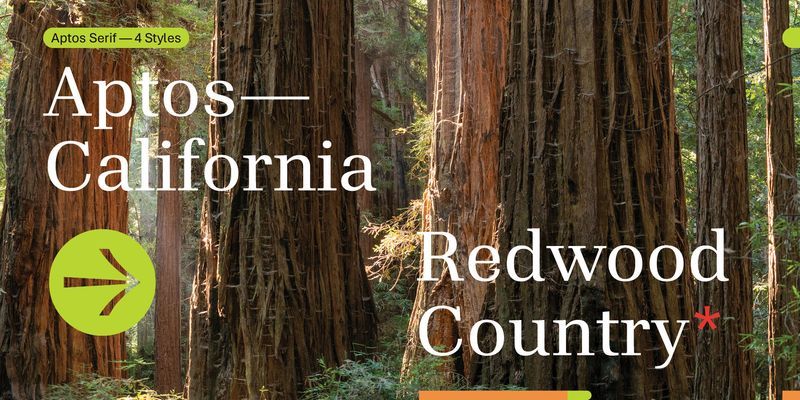
Aptos Serif is a highly readable contemporary text typeface, a serif complement to the sans serif Aptos. Aptos was inspired by mid-20th-century Swiss typography; Aptos Serif takes its cue from modern, rational 20th-century typefaces with high contrast between thick and thin strokes and a vertical, up-and-down axis of stress within the letters. Its stroke endings, whether flat or serifed, are clear-cut and emphasize order and restraint; the spacing between letters is generous enough to keep them easy to Aptos Serif, like its sans serif counterpart, expresses simplicity and rationality in a highly readable form, with what designer Steve Matteson calls “the austerity that would speak to the huge variety of Office documents created every day.” In Word, PowerPoint, or email, Aptos Serif is appropriate for both body text and headlines or titles. It comes with two weights, Regular and Bold, with complementary italic styles. The italic letters have a restrained cursive swing, within a rational structure. Aptos Serif offers extended support of the Latin, Greek, and Cyrillic alphabets, along with fractions, arrows, and both black and white circled numbers.

