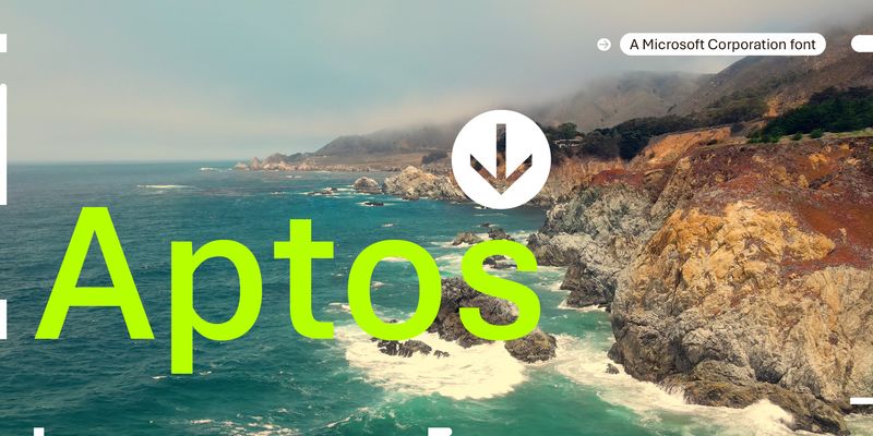
Aptos is a precise, contemporary sans serif typeface inspired by mid-20th-century Swiss typography. Its clear-cut stroke endings emphasize order and restraint; the points where curved strokes meet straight strokes are crisp and well defined, which makes the typeface easily readable and reduces visual crowding. Aptos expresses simplicity and rationality in a highly readable form, with "the austerity that would speak to the huge variety of Office documents created every day," according to designer Steve Matteson. Aptos can be used in both body text and headlines or titles, and its variety of weights are appropriate for different uses: Light, Semibold, and Black weights can help create a hierarchy of information in PowerPoint and Word documents, while the Narrow weights give Excel users a way to fit more information into spreadsheets and tables. The Display weights are slightly narrower and more closely fitted, to give very large text a crisp authority. Type designer Steve Matteson designed Aptos for Microsoft as a new default Office font to replace Calibri. It has six weights, from Light to Black, with complementary oblique styles. In this style of typeface, the italic doesn't typically take on the cursive forms you'd expect in handwriting or a traditional serif typeface; the letter shapes are oblique forms of the upright letters. The italics of Aptos have been individually redrawn, rather than mechanically slanted. Aptos also has two Display weights, with their accompanying italic styles, and two Narrow weights, with italics optimized for Excel. Aptos offers extended support of the Latin, Greek, and Cyrillic alphabets, and for Vietnamese.

