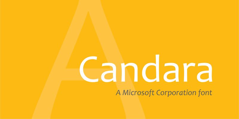
Candara is a graceful sans serif typeface that is friendly and readable in text. The texture of a paragraph in Candara is lively but not intrusive, and easy to At large sizes, in headlines or subheads, the subtleties of Candara’s design become apparent. Candara is a very useful typeface for email or web pages as well as for newsletters, booklets, and flyers. There are almost no straight lines in Candara’s letters; instead, what appear to be long, straight strokes actually curve slightly inward in the middle, an effect that architects call “entasis.” In addition, diagonal strokes have a very slight double-S curve. At small sizes – or at a distance when looking at a classical building – these features make the lines look straight, but when you use Candara in a large headline, the subtle curves give it an unexpected elegance. Candara’s italic is less architectural and more calligraphic in style than the upright letters, but they work very well together.