With Arboria, Josema Urós started from the concept of an archetypal architectural sans. He then introduced grotesque elements into the geometric forms, making the letters warmer. With their generous x-height and open apertures, Arboria’s wide characters look modern, yet bear a refined art deco air, and offer a friendly, outgoing alternative to the more reserved designs of the genre. With six weights in roman and italic, the family works well in editorial settings; Type-Ø-Tones 2013–2017 For additional license options like app and enterprise, visit Arboria on [Type Network](https://store.typenetwork.com/foundry/type-o-tones/fonts/arboria).
Type-Ø-Tones
Arbotek is based on the same skeleton as Arboria, but was built with a more radical approach to pure geometric forms. It is unabashedly tectonic; its outspoken letterforms indicate it is meant solely for display use. The delicate Thin and Light seem to be lifted straight from blueprints, with the rounded variant for the Light suggesting letters drawn by hand with pen and ink. The forceful Ultra references the gorgeous lettering found on vintage art deco posters from the 1920s–30s; Type-Ø-Tones 2013–2017 For additional license options like app, enterprise, multi-user, and self-hosted web, visit [Arbotek on Type Network](https://store.typenetwork.com/foundry/type-o-tones/fonts/arbotek).
Brushland was initially born as custom project, commissioned as a typeface that could give a strong personality to a wine label, for that we agreed that a script font could be the best solution. The goal was to achieve a natural feeling as if it was really written. The project raised some questions, how natural should be this script typeface? How to simulate this writing feeling? For this, four different glyphs were drawn for the same character. This “Feature” or “Behavior”, programmed in the font, combines the variants in the sequence of 1, 2, 3 & 4 and replaces the letters at the time the words are composed, in order to avoid the repetition of glyphs. Through the “Contextual Alternates” OT Feature, the user can decide if they appear or not. For additional license options like app, enterprise, multi-user, and self-hosted web, visit [Brushland on Type Network](https://store.typenetwork.com/foundry/type-o-tones/fonts/brushland).
From a slightly unorthodox perspective, José Manuel Urós’ DINosaur can be considered a revival. The first iteration of DINosaur—which corresponds to the family’s bold weight—was based on a style found in a technical calligraphy manual for industrial lettering. The references used for the system reflect an era where industrial labeling was typically handwritten—either drawn freehand or by ruling with stenciled alphabets. DINosaur’s extreme roundness is not strictly ornamental, but rather an artifact of tracing to generate mechanical forms; Type-Ø-Tones 2016 For additional license options like app and enterprise, visit DINosaur on [Type Network](https://store.typenetwork.com/foundry/type-o-tones/fonts/dinosaur).
Sabina Chipară’s and José Manuel Urós’s Eixample contains three subfamilies—Dip, Glaces, and Villa—inspired by modernist signage found in Barcelona’s Eixample neighborhood. The name of each family is related to the sign’s location or to some specific elements of its design. Dip’s capitals are built with contained decoration to achieve maximum compatibility between letters. The script capitals are the default uppercase, but an alternate slab style is included as OpenType glyphs. Narrow and Inline styles round out this versatile subfamily. Glaces’s three styles slide between monolinear and high contrast and each offers a choice between conventional closed apertures for characters like C, G, and S, and more playful open apertures. These features, as well as small caps, can be accessed using OpenType. The Villa family contains sturdy, industrial letters, free from ornament, and extrapolated from the personality of a single letter “A” from the Villarroel Pharmacy sign. The Eixample families clearly show their origins as display fonts inspired by modernist signage, but they have been engineered for great results at smaller sizes as well. Each of them would be an excellent choice for any number of branding projects, from a hip new bar to a playful children’s clothing brand. For additional license options like app, enterprise, multi-user, and self-hosted web, visit [Eixample](https://store.typenetwork.com/foundry/type-o-tones/fonts/?name=eixample&page=0) on Type Network.
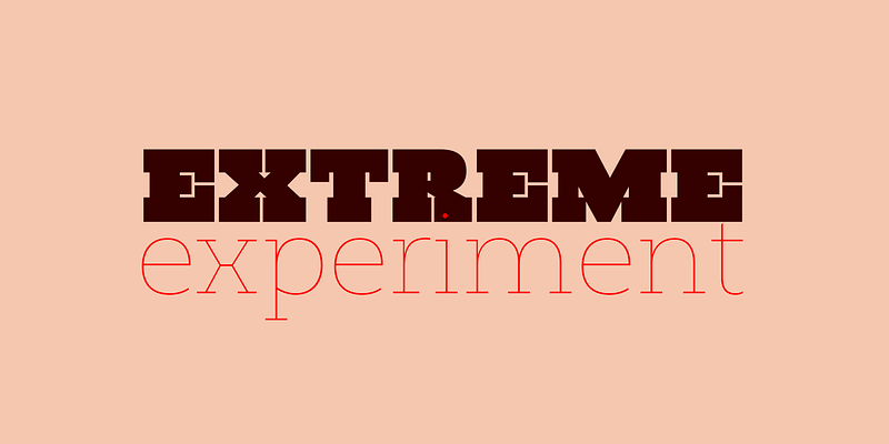
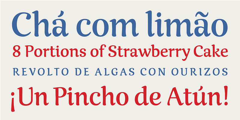
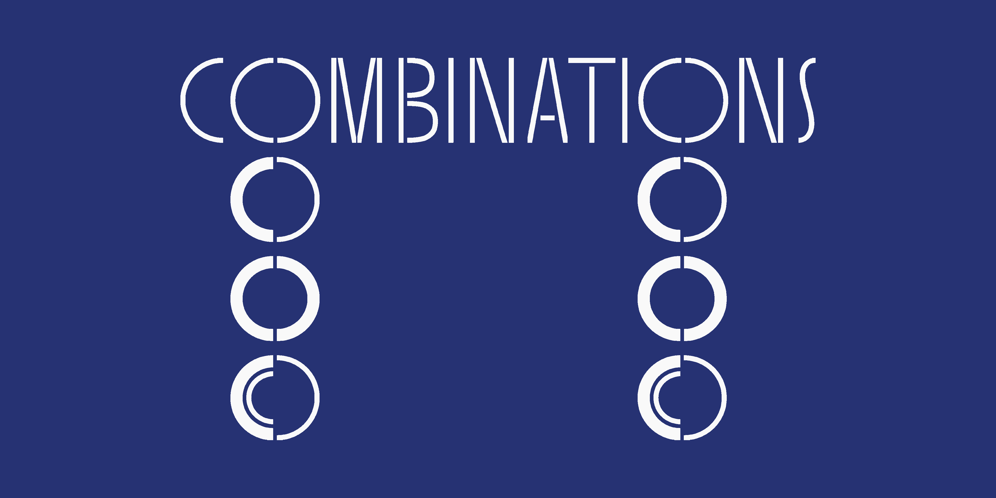
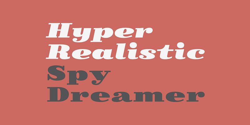
Ella began as a morphological design study: Laura Mesegeur wanted to discover how classic calligraphy models could be adapted to and perform as contemporary, digital, stencil typefaces. Starting at the Hoffmitz Milken Center for Typography’s “Typographers-in-Residence 2021: Mujeres Hispanas y Tipografía”, Mesegeur took the calligraphy models of Oriol Miró (themselves based on historical models) as her origin, pushing them to their typographic limits. Stencil type is defined by the channel of negative space between each part of each letter, allowing it to be cut into material without the counters falling out. Laura synthesized this approach with calligraphy by first determining the minimum number of letterform parts required without losing the strokes’ calligraphic qualities. These calligraphic origins can be seen in Ella’s triangular serifs and pen-nib-esque shapes. The resulting letterforms exude the warmth of handwriting. Ella consists of four families: Roman, Uncial, Rustic, and Brutalist, each in two styles: Regular and Bold. These families have different capital styles, which mirror the historical evolution of the Roman script, yet they share a single lowercase set that unifies their distinct characteristics. The Ella series was designed for posters, book covers, and even brand identities. Wherever personality, expressionism, and sophisticated brutalism are needed, use Ella. For additional license options like app, enterprise, multi-user, and self-hosted web, visit [Ella on Type Network](https://store.typenetwork.com/foundry/type-o-tones/series/ella).
Fabulosa embodies a unique vision, merging historical influences from the ‘fat face’ typography style and the flair of Ed Benguiat’s Caslon Black Swash, designed for Photo Lettering, Inc. in the 1960s. The ‘fat face’ style, with its exaggerated strokes, was pioneered by typefounder Robert Thorne (1753–1820) in the early 19th century. Thorne’s innovation evolved modern type styles with strong contrast and heavy serifs. Caslon Black Swash, a vivid representation of mid-20th-century typographic creativity, features swashes and decorative flourishes that evoke nostalgia. Inspired by these styles and her love for stencils, Laura created Fabulosa. Her vision was to blend the retro with the fantastical, adding a touch of glamour. Fabulosa stands out as a timeless and contemporary statement piece, perfect for projects that evoke stylish nostalgia and make a bold visual impact, from high-fashion magazines to quirky indie film posters.
FinalSix is the typographic adaptation of custom lettering for the 2014 European Water Polo Final. While working on the graphics for that event José Manuel Urós had the idea to create a character set that reflected the idea of the undulating movement of water in a pool. With the word “WATERPOLO” as a visual reference, the FinalSix's characters have rounded tops, bottoms, and diagonals, creating a wavy feeling. Urós defines the process as “form follows meaning.” To preserve its personality as much as possible, the most idiosyncratic characters are found in the Default set, while the more standard variations for editorial use can be found in a Stylistic set. For additional license options like app, enterprise, multi-user, and self-hosted web, visit [FinalSix on Type Network](https://store.typenetwork.com/foundry/type-o-tones/fonts/finalsix).
Guapa was born from a personal experiment: the transformation of a geometric sans serif à la Futura into a charming postmodern deco design. Laura Meseguer began work on Guapa as part of “Pimp the Type,” an exhibition organized by Catalana de Tipos in 2008. For this showcase, 52 designers demonstrated how the tuning of letters can add personality and originality to messages and alphabetical forms. For projects ranging from invitations to book covers, Guapa’s discretionary ligatures, alt characters, and four sets of capitals offer enhanced opportunities for typographical experimentation. The moniker is well-suited to the playfully elegant face—guapa means “pretty” in Spanish. Type-Ø-Tones 2012 For additional license options like app and enterprise, visit Guapa on [Type Network](https://store.typenetwork.com/foundry/type-o-tones/fonts/guapa).
Harri (which means “stone” in Basque) is a display font based on the hallmark letterforms used in signs and building façades all over the Basque Country in Spain. This idiosyncratic lettering style, unique to the culture, evolved from ancient inscriptions carved on gravestones that can still be found in the French part of the Basque Country (Behe Nafarroa, Lapurdi, and Zuberoa). Harri takes some of its more significant features from those engraved letterforms, but also from the current overemphasized shapes derived from them, while remaining mindful of their ancestors: Roman inscriptions and—going even further back—Roman capitals. This evolution is echoed in Harri throughout its weights, from the clean formal Light to the expressive ExtraBold; Type-Ø-Tones 2017 For additional license options like app and enterprise, visit Harri on [Type Network](https://store.typenetwork.com/foundry/type-o-tones/fonts/harri).
Harri Text is more than an extension of Harri. Although the two typefaces shares the same origin, a certain flavor, and a great deal of its idiosyncrasies, Harri is an uppercase-only typeface intended for display uses while Harri Text is a true text family, including a new extra-light weight, italics, small caps, and other additions that make it suitable for editorial purposes. For additional license options like app, enterprise, multi-user, and self-hosted web, visit [Harri Text on Type Network](https://store.typenetwork.com/foundry/type-o-tones/fonts/harri-text).
The first letters of Joc Display typeface were designed to accompany an interactive exhibition that encourages children aged 5 to 9 to craft their own toys by assembling various simple shapes. These shapes inspired the letter designs, which have been converted into symbols for the typeface. The name "Joc" connects the word for "game" in both Catalan and Romanian, reflecting the playful nature of the typeface, the place where its’ design was born and the creator's native roots.
Joost is not just a study on the structure and development of the classic Bauhaus alphabets. It also represents Josema Urós’ drive to transform those shapes into a usable font family. The first version of Joost, published in 1995, stringently adhered to the concept of Herbert Bayer’s Universal Alphabet, which contains only lowercase characters. Urós went above and beyond that in his interpretation, though, with diacritics, punctuation, and a full 256-character ASCII table. The second Joost, released in 2009, incorporated uppercase characters and some serious design improvements. The Joost of 2016 has expanded even further; it now includes a complete character set of Central European and OpenType features, as well as a new system of curves. The Bauhaus continues to evolve; Type-Ø-Tones 1995–2017 For additional license options like app and enterprise, visit Joost on [Type Network](https://store.typenetwork.com/foundry/type-o-tones/fonts/joost).
Inspired by the work of East European type designers, Karol is as a text typeface in a collection of eight styles (four weights and matching italics) with high readability, strength and character. A few days before its publication, Karol was awarded with the Certificate of Typographic Excellence (Judges’ Choice) of the Type Directors Club in 2013. Karol Sans is its natural companion.
Explore Karol Sans designed by Daniel Sabino at Adobe Fonts.
Inspired by pointed pen and copperplate calligraphy, Magasin is a high-contrast display typeface with a retro-chic twist. Laura Meseguer combined script sensibilities with a slightly condensed geometric structure, resulting in the idiosyncratic curves that softly connect the vertical elegance of Magasin’s forms. The typeface boasts a stunning set of capital swashes and a robust suite of OpenType features for better flow, including Ligatures, Stylistic Alternates, Contextual Alternates, and Final Forms. Due to its fine strokes, unique connections, and delicate detailing, Magasin is best suited to display applications such as magazine headlines and poster titles; Type-Ø-Tones 2013 For additional license options like app and enterprise, visit Magasin on [Type Network](https://store.typenetwork.com/foundry/type-o-tones/fonts/magasin).
Memimas is not only an affectionate reminder of primary school days, but also Type-Ø-Tones’ first-ever custom typeface, originally commissioned by Barcelona-based publishing house Barcanova in 1991. José Manuel Urós originally designed the script for use in a series of children’s books; since then, the typeface has evolved into a family of four weights with corresponding italics and a robust feature set that includes alternate caps, ligatures, an extensive set of numerals, and contextual alternates that make typesetting this script a breeze. Type-Ø-Tones, 1991 - 2019 For additional license options like app, enterprise, multi-user, and self-hosted web, visit [Memimas on Type Network](https://store.typenetwork.com/foundry/type-o-tones/fonts/memimas-pro).
Laura Meseguer’s first extensive type family, Multi was originally commissioned in 2011 by a publisher of Dutch regional newspapers. The aim in developing Multi was to match the serif typefaces used for a comprehensive layout overhaul project supervised by editorial art director Luis Mendo. Keywords provided by the client were unequivocal: warm, dynamic, optimistic, friendly, and human. Meseguer initially designed two series: Multi Text, with two weights in roman and italic, and Multi Headline, with six roman styles. Since that commission, Meseguer has considerably expanded the character set and family. Multi Text now comprises three weights (roman and italic), and Multi Headline was renamed Multi Display (seven weights in roman and italic). Like most Meseguer typefaces, Multi is bursting with vitality. Its distinctive phrasing lies between humanist and glyphic, exploring uncharted territory. The design is pragmatic, yet not rigid, and gently graced with tiny incised touches; Type-Ø-Tones 2016 For additional license options like app and enterprise, visit Multi Display on [Type Network](https://store.typenetwork.com/foundry/type-o-tones/fonts/multi-display).
Laura Meseguer’s first extensive type family, Multi was originally commissioned in 2011 by a publisher of Dutch regional newspapers. The aim in developing Multi was to match the serif typefaces used for a comprehensive layout overhaul project supervised by editorial art director Luis Mendo. Keywords provided by the client were unequivocal: warm, dynamic, optimistic, friendly, and human. Meseguer initially designed two series: Multi Text, with two weights in roman and italic, and Multi Headline, with six roman styles. Since that commission, Meseguer has considerably expanded the character set and family. Multi Text now comprises three weights (roman and italic), and Multi Headline was renamed Multi Display (seven weights in roman and italic). Like most Meseguer typefaces, Multi is bursting with vitality. Its distinctive phrasing lies between humanist and glyphic, exploring uncharted territory. The design is pragmatic, yet not rigid, and gently graced with tiny incised touches; Type-Ø-Tones 2016 For additional license options like app and enterprise, visit Multi Text on [Type Network](https://store.typenetwork.com/foundry/type-o-tones/fonts/multi-text).
While teaching an exercise on slab serifs in 2011, designer José Manuel Urós discovered Robert Thorne’s work for Thorowgood. Fascinated by the extraordinary density of the 6-line Egyptian Pica from 1820-21, he wanted to Rothwood Ultra is the result of this experiment. Once the initial style was in place, Josema went to the opposite end of the spectrum to evolve the DNA of the Ultra into a light weight style. Rothwood includes a wide range of weights and two optical sizes. For additional license options like app, enterprise, multi-user, and self-hosted web, visit [Rothwood on Type Network](https://store.typenetwork.com/foundry/type-o-tones/fonts/rothwood).
Laura Meseguer developed Rumba during her time at the KABK’s Type and Media program in The Hague in the early aughts. The family contains three fonts based on the same model, but with varying contrast, construction, and degrees of expressiveness. It comes with several alternate characters, special ligatures, and all of the glyphs required for languages based on the Latin alphabet. This makes Rumba a truly multilingual typeface family, suitable for myriad uses. The family consists of Rumba Small for short texts, Rumba Large for headlines, and Rumba Extra, which imparts a hand-lettered touch; Type-Ø-Tones 2006–2017 For additional license options like app and enterprise, visit Rumba on [Type Network](https://store.typenetwork.com/foundry/type-o-tones/fonts/rumba).
Sisters is a lively set of stencil display typefaces designed by Type-Ø-Tones’ co-founder Laura Meseguer. The family features four fresh fonts that share foundational principles of construction yet complement each other—as sisters do—by celebrating their differences. Variations in contrast, weight, and design characteristics result in four distinct styles dubbed One through Four. This cool quartet contains no lowercase, asserting the family’s rightful place in the titling typography space. Sisters is an homage to all the creative women in this world. For additional license options like app, enterprise, multi-user, and self-hosted web, visit [Sisters on Type Network](https://store.typenetwork.com/foundry/type-o-tones/fonts/sisters).
Skope is an experiment in horizontal stress evoking the extreme lettering style of comic masters Josep Coll and Manuel Urda mixed with contemporary favorites Francesc Capdevila and Joost Swarte. The proportions and fundamental features of Skope are inspired by the masthead of the magazine Triunfo (Valencia, Spain, 1946-1982) and the inspiration for the figures come from a photo in a second-hand shop of kitchen clock from the 1970’s. For additional license options like app, enterprise, multi-user, and self-hosted web, visit [Skope on Type Network](https://store.typenetwork.com/foundry/type-o-tones/fonts/skope).


