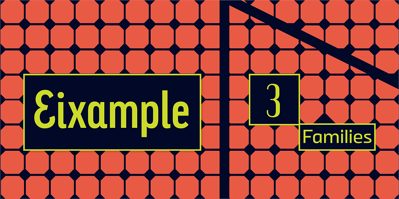
Sabina Chipară’s and José Manuel Urós’s Eixample contains three subfamilies—Dip, Glaces, and Villa—inspired by modernist signage found in Barcelona’s Eixample neighborhood. The name of each family is related to the sign’s location or to some specific elements of its design. Dip’s capitals are built with contained decoration to achieve maximum compatibility between letters. The script capitals are the default uppercase, but an alternate slab style is included as OpenType glyphs. Narrow and Inline styles round out this versatile subfamily. Glaces’s three styles slide between monolinear and high contrast and each offers a choice between conventional closed apertures for characters like C, G, and S, and more playful open apertures. These features, as well as small caps, can be accessed using OpenType. The Villa family contains sturdy, industrial letters, free from ornament, and extrapolated from the personality of a single letter “A” from the Villarroel Pharmacy sign. The Eixample families clearly show their origins as display fonts inspired by modernist signage, but they have been engineered for great results at smaller sizes as well. Each of them would be an excellent choice for any number of branding projects, from a hip new bar to a playful children’s clothing brand. For additional license options like app, enterprise, multi-user, and self-hosted web, visit [Eixample](https://store.typenetwork.com/foundry/type-o-tones/fonts/?name=eixample&page=0) on Type Network.