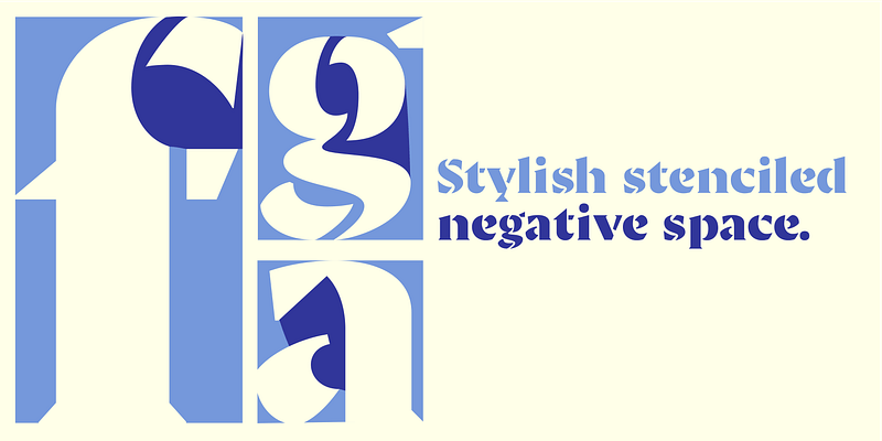
Ella began as a morphological design study: Laura Mesegeur wanted to discover how classic calligraphy models could be adapted to and perform as contemporary, digital, stencil typefaces. Starting at the Hoffmitz Milken Center for Typography’s “Typographers-in-Residence 2021: Mujeres Hispanas y Tipografía”, Mesegeur took the calligraphy models of Oriol Miró (themselves based on historical models) as her origin, pushing them to their typographic limits. Stencil type is defined by the channel of negative space between each part of each letter, allowing it to be cut into material without the counters falling out. Laura synthesized this approach with calligraphy by first determining the minimum number of letterform parts required without losing the strokes’ calligraphic qualities. These calligraphic origins can be seen in Ella’s triangular serifs and pen-nib-esque shapes. The resulting letterforms exude the warmth of handwriting. Ella consists of four families: Roman, Uncial, Rustic, and Brutalist, each in two styles: Regular and Bold. These families have different capital styles, which mirror the historical evolution of the Roman script, yet they share a single lowercase set that unifies their distinct characteristics. The Ella series was designed for posters, book covers, and even brand identities. Wherever personality, expressionism, and sophisticated brutalism are needed, use Ella. For additional license options like app, enterprise, multi-user, and self-hosted web, visit [Ella on Type Network](https://store.typenetwork.com/foundry/type-o-tones/series/ella).

