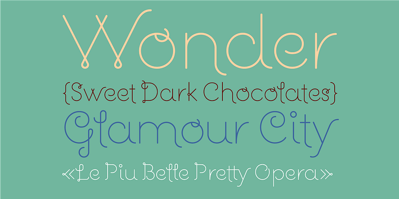
Guapa was born from a personal experiment: the transformation of a geometric sans serif à la Futura into a charming postmodern deco design. Laura Meseguer began work on Guapa as part of “Pimp the Type,” an exhibition organized by Catalana de Tipos in 2008. For this showcase, 52 designers demonstrated how the tuning of letters can add personality and originality to messages and alphabetical forms. For projects ranging from invitations to book covers, Guapa’s discretionary ligatures, alt characters, and four sets of capitals offer enhanced opportunities for typographical experimentation. The moniker is well-suited to the playfully elegant face—guapa means “pretty” in Spanish. Type-Ø-Tones 2012 For additional license options like app and enterprise, visit Guapa on [Type Network](https://store.typenetwork.com/foundry/type-o-tones/fonts/guapa).