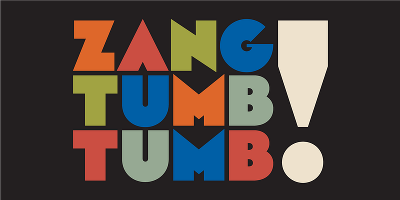
Arbotek is based on the same skeleton as Arboria, but was built with a more radical approach to pure geometric forms. It is unabashedly tectonic; its outspoken letterforms indicate it is meant solely for display use. The delicate Thin and Light seem to be lifted straight from blueprints, with the rounded variant for the Light suggesting letters drawn by hand with pen and ink. The forceful Ultra references the gorgeous lettering found on vintage art deco posters from the 1920s–30s; Type-Ø-Tones 2013–2017 For additional license options like app, enterprise, multi-user, and self-hosted web, visit [Arbotek on Type Network](https://store.typenetwork.com/foundry/type-o-tones/fonts/arbotek).

