
0123456789
Explore Alwyn New designed by Chris Dickinson at Adobe Fonts.
sans-serif
sans
rounded
Explore Alwyn New designed by Chris Dickinson at Adobe Fonts.
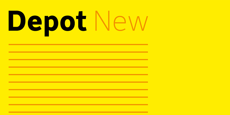
Explore Depot New designed by Chris Dickinson at Adobe Fonts.
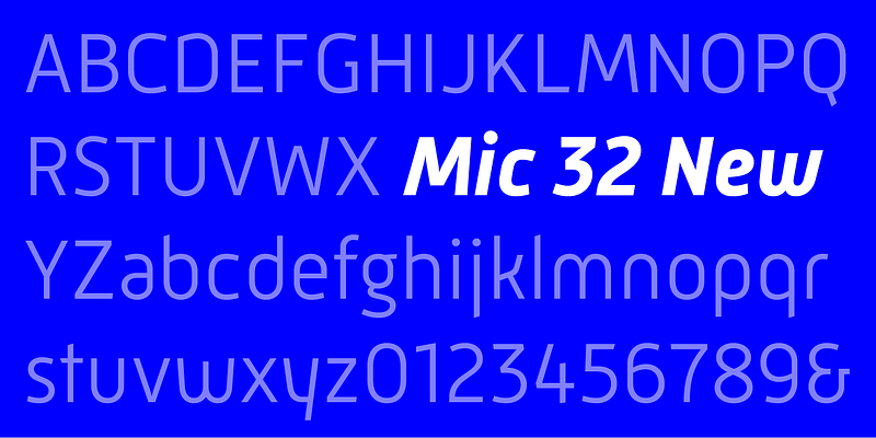
Explore Mic 32 New designed by Chris Dickinson at Adobe Fonts.
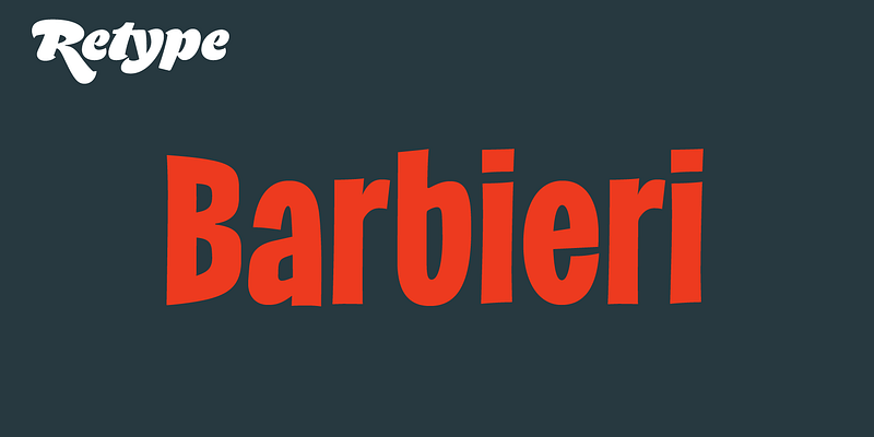
Barbieri is a casual, compressed san-serif family based on German lettering styles from the 1950s and ’60s. The original hand-drawn alphabet appeared on the cover of a German recording.

Bellucci is the redesign of Ramiro Espinoza’s first typeface, Mabella. This experimental alphabet was used for some time as headline font in ‘Jazz’, an e-zine. Being not happy with the original design, he decided to redraw it completely and add 3 new weights. Bellucci is a constructivist, modular, compressed family intended for headlines and posters. The name is an homage to Mabel Bellucci, an Argentinian feminist activist.
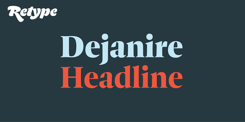
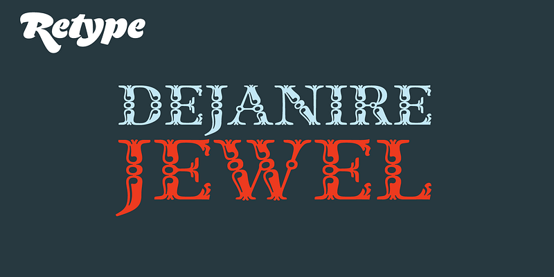
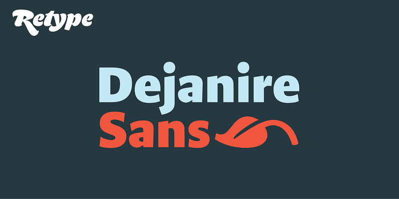
Dejanire is a type family loosely inspired by an anonymous display typeface found in a type specimen by Claude Lamesle, published in Paris in 1742. It takes its name from Deianira, a Calydonian princess in Greek mythology and the wife of Heracles. Dejanire is a transitional roman with a marked contrast and a crisp presence both in print and on screen, making it an ideal choice for robust titles, pull quotes, and decks.
Explore Dejanire Jewel designed by Ramiro Espinoza at Adobe Fonts.
Dejanire is a type family loosely inspired by an anonymous display typeface found in a type specimen by Claude Lamesle, published in Paris in 1742. It takes its name from Deianira, a Calydonian princess in Greek mythology and the wife of Heracles. Dejanire is a transitional roman with a marked contrast and a crisp presence both in print and on screen, making it an ideal choice for robust titles, pull quotes, and decks.
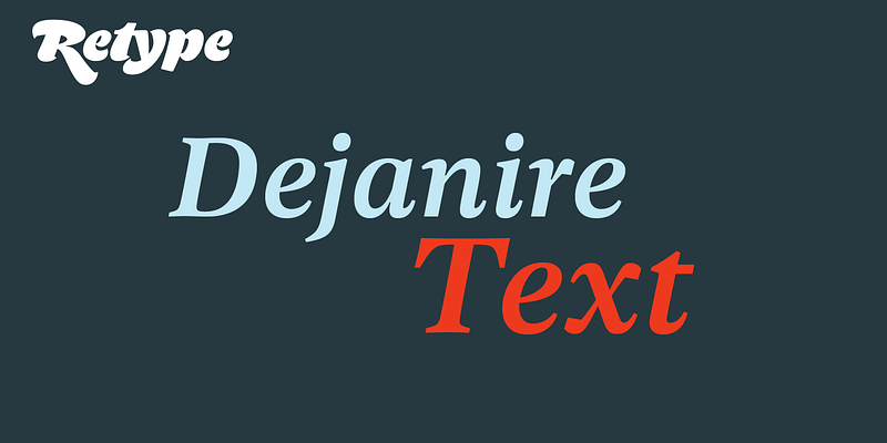
Explore Dejanire Text designed by Ramiro Espinoza at Adobe Fonts.
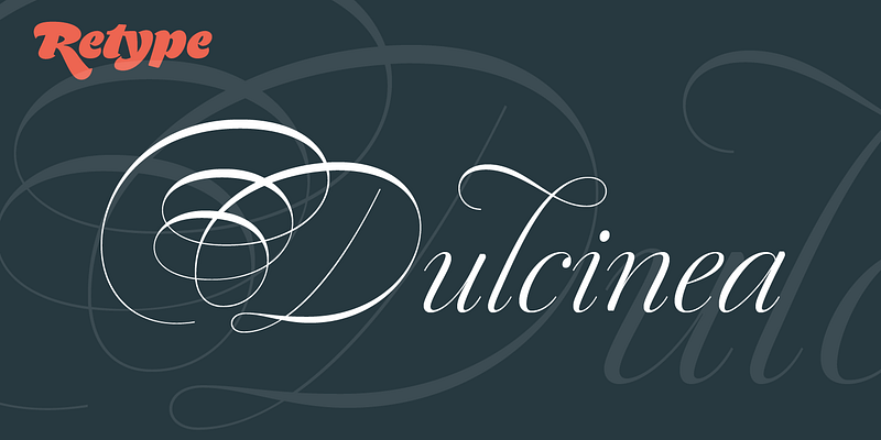
With Dulcinea, Ramiro Espinoza explores Spanish baroque calligraphy’s most extreme tendencies, exemplified in the work of Pedro Díaz Morante and Juan Claudio Aznar de Polanco. With their plentiful calligraphic flourishes, the alphabets of these writing masters represented a marked break with the harmonic, angular Cancellaresca style dominant during the Renaissance. In naming this script, Espinoza pays homage to Dulcinea del Toboso, the fictional heroine of Miguel de Cervantes’s seventeenth-century classic, “Don Quixote.” Far from a mere revival, Dulcinea deftly combines quirks from the period with the playful spirit of the original. An array of delicate ligatures, swashes, and alternate characters enhance opportunities for sophisticated typography. Retype, 2018.
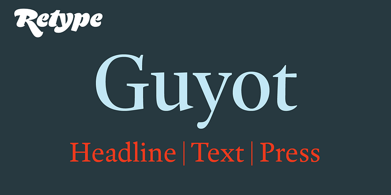
Explore Guyot designed by Ramiro Espinoza at Adobe Fonts.
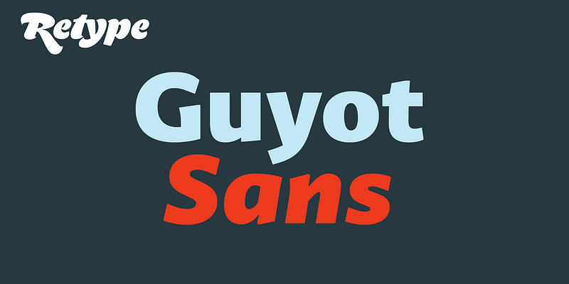
Explore Guyot Sans designed by Ramiro Espinoza at Adobe Fonts.
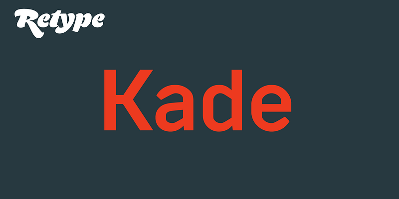
Kade is a display/semi display sans family of fonts based on vernacular lettering photographed over the last ten years in and around the harbours of Amsterdam and Rotterdam.
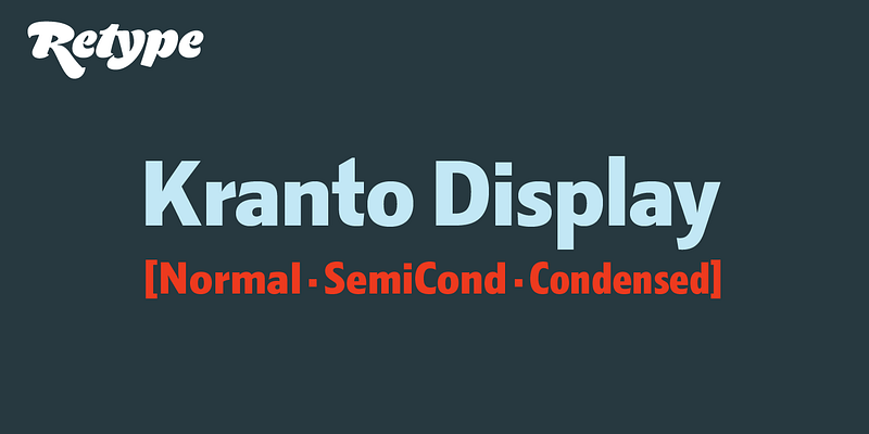
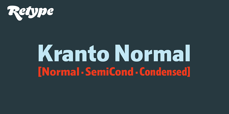
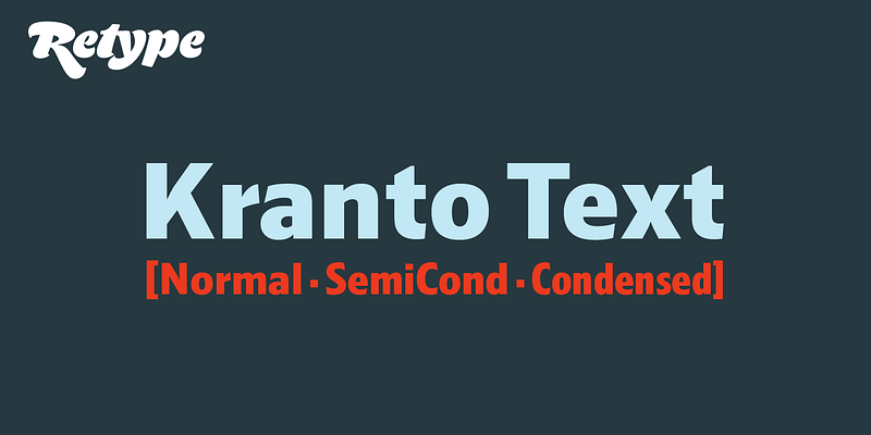
Brimming with subtly original design details, Kranto is a solid, trustworthy, and readable typeface that strives for objectivity and neutrality, making it an ideal choice not only for a broad assortment of corporate, editorial, and digital jobs, but also for environmental uses like signage and wayfinding systems. Kranto is a sans serif superfamily of 144 styles designed by Ramiro Espinoza, drawing inspiration from a group of mainly British and German grotesque typefaces from the first half of the twentieth century. Composed of three widths—Normal, Semi Condensed, and Condensed, each in seven weights from Thin to Black. For maximum typesetting and typographic flexibility, each weight is available in three different x-heights: Text, Normal, and Display. Its extensive character set includes fractions, case-sensitive forms, arrows, ordinals, icons, and tabular figures. In addition to Western European languages, it also supports Central European, Baltic, and Turkic languages.
Brimming with subtly original design details, Kranto is a solid, trustworthy, and readable typeface that strives for objectivity and neutrality, making it an ideal choice not only for a broad assortment of corporate, editorial, and digital jobs, but also for environmental uses like signage and wayfinding systems. Kranto is a sans serif superfamily of 144 styles designed by Ramiro Espinoza, drawing inspiration from a group of mainly British and German grotesque typefaces from the first half of the twentieth century. Composed of three widths—Normal, Semi Condensed, and Condensed, each in seven weights from Thin to Black. For maximum typesetting and typographic flexibility, each weight is available in three different x-heights: Text, Normal, and Display. Its extensive character set includes fractions, case-sensitive forms, arrows, ordinals, icons, and tabular figures. In addition to Western European languages, it also supports Central European, Baltic, and Turkic languages.
Brimming with subtly original design details, Kranto is a solid, trustworthy, and readable typeface that strives for objectivity and neutrality, making it an ideal choice not only for a broad assortment of corporate, editorial, and digital jobs, but also for environmental uses like signage and wayfinding systems. Kranto is a sans serif superfamily of 144 styles designed by Ramiro Espinoza, drawing inspiration from a group of mainly British and German grotesque typefaces from the first half of the twentieth century. Composed of three widths—Normal, Semi Condensed, and Condensed, each in seven weights from Thin to Black. For maximum typesetting and typographic flexibility, each weight is available in three different x-heights: Text, Normal, and Display. Its extensive character set includes fractions, case-sensitive forms, arrows, ordinals, icons, and tabular figures. In addition to Western European languages, it also supports Central European, Baltic, and Turkic languages.
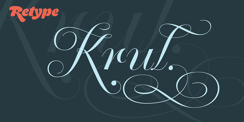
Krul takes its cue from the signature curly letters that appear in the windows of Amsterdam’s traditional “brown” bars. Rather than a literal digitization, Ramiro Espinoza’s take on these forms is an idealized interpretation that incorporates the style’s breathtaking gestural acrobatics and quirks. The character set features an extended set of standard ligatures, plus discretionary ligatures that create surprising connections between letter pairs. The capitals are available in an additional style with increased ornamentation. And standalone ornaments beautifully complement the letters. Krul’s flamboyance sets it apart from more conventional copperplate script faces. Retype, 2012.
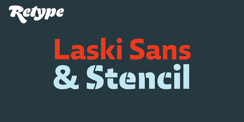
In 2014 Paula Mastrangelo presented her first type family, Laski Slab. Over the last year, Ramiro Espinoza worked to expand the system and the outcome was Laski Sans.
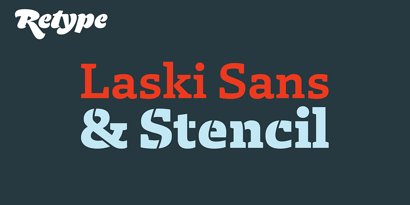
Laski Slab is a comprehensive suite of 20 fonts conceived for editorial purposes. Originally developed for an online children’s magazine, Laski Slab was later expanded into a multipurpose type family.
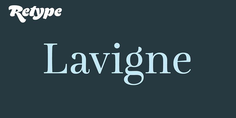
Lavigne is a type-family aimed at publications such as interior design and women magazines – anywhere a touch of distinction is to be desired.
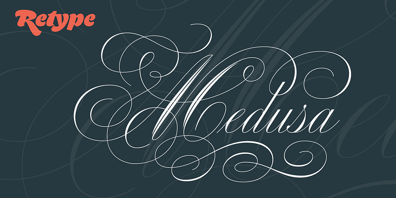
Medusa pays tribute to Ramón Stirling, an acclaimed Spanish calligrapher who worked in Barcelona from the mid-1800s. As a point of departure for this script, Ramiro Espinoza analyzed formal English handwriting and the ways in which it had been (mis)appropriated by the typographic technologies of different eras. Typefaces derived from roundhand scripts tend to be vulgarized and stripped of the beauty inherent in the canon of commercial handwriting. Espinoza decided that, rather than forcing the shape of complex letters to conform to technology, he would push technology to respect the original grace of the letters. Medusa features wildly ornate capitals that depart slightly from Stirling’s originals to hew more closely to the rest of the alphabet. Espinoza also drew several swashes and ligatures from scratch. And, unusually, the script includes a full set of small caps, carefully designed to create an all-caps setting that harmonizes with the classic copperplate script. A separate set of modular swashes can be used to create elaborate decorative headings and cartouches. Medusa won a Type Directors Club Certificate of Excellence in Type Design in 2014. Retype, 2014.
Reiher Headline is a type family inspired by two fonts displayed in the famous Ploos van Amstel specimen, first printed in Amsterdam in 1767. Ramiro Espinoza’s affinity for Baroque types and his desire to study their characteristics in detail were the driving forces behind this new type family. As is typical of his revivals, Reiher Headline does not faithfully follow the forms of historical sources. Espinoza made numerous updates and modifications to the design so that it would better suit the tastes and requirements of contemporary type users.