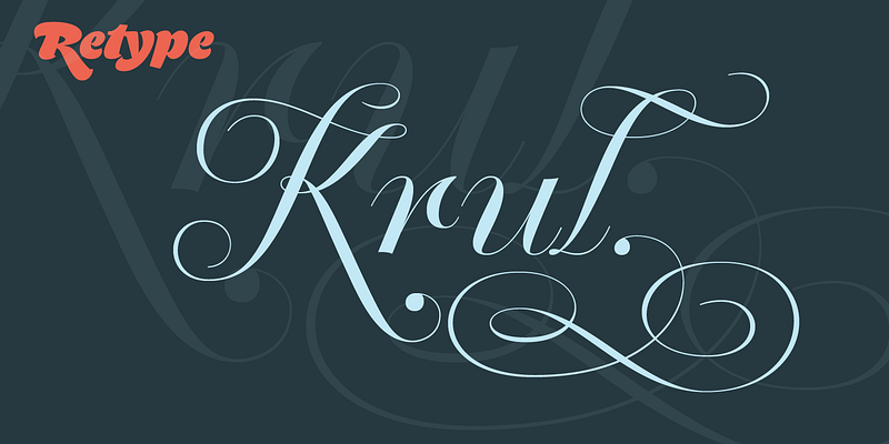
Krul takes its cue from the signature curly letters that appear in the windows of Amsterdam’s traditional “brown” bars. Rather than a literal digitization, Ramiro Espinoza’s take on these forms is an idealized interpretation that incorporates the style’s breathtaking gestural acrobatics and quirks. The character set features an extended set of standard ligatures, plus discretionary ligatures that create surprising connections between letter pairs. The capitals are available in an additional style with increased ornamentation. And standalone ornaments beautifully complement the letters. Krul’s flamboyance sets it apart from more conventional copperplate script faces. Retype, 2012.