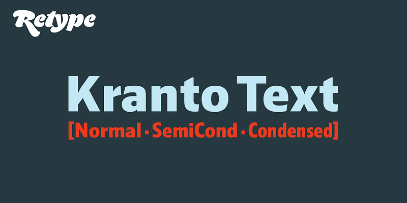
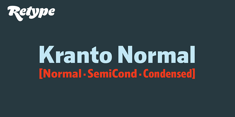
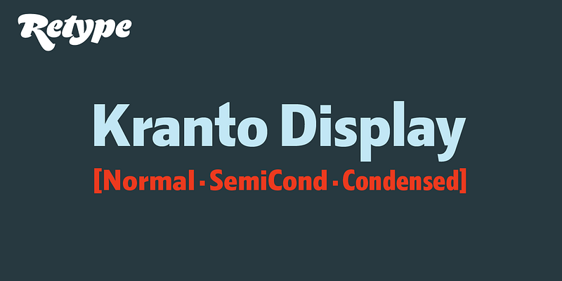
Brimming with subtly original design details, Kranto is a solid, trustworthy, and readable typeface that strives for objectivity and neutrality, making it an ideal choice not only for a broad assortment of corporate, editorial, and digital jobs, but also for environmental uses like signage and wayfinding systems. Kranto is a sans serif superfamily of 144 styles designed by Ramiro Espinoza, drawing inspiration from a group of mainly British and German grotesque typefaces from the first half of the twentieth century. Composed of three widths—Normal, Semi Condensed, and Condensed, each in seven weights from Thin to Black. For maximum typesetting and typographic flexibility, each weight is available in three different x-heights: Text, Normal, and Display. Its extensive character set includes fractions, case-sensitive forms, arrows, ordinals, icons, and tabular figures. In addition to Western European languages, it also supports Central European, Baltic, and Turkic languages.