Darden Studio

7 fonts
Birra

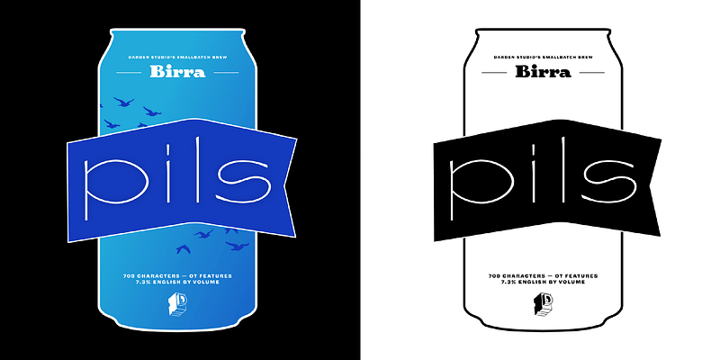
Inspired by the tasting menus offered by craft breweries in North America as “flights”, each style is separately designed by guest designers using a specific type of beer as inspiration. Beer types are arranged so that the color of the beer corresponds to the weight of the style. Upright styles correspond to beers with a dry finish. Stout, designed by [Joshua Darden](https://fonts.adobe.com/designers/joshua-darden) in 2008 as the upright Bold, was the first release of a project always intended to evolve. The result of years of compulsive doodling, Stout was developed with and published to amuse Matteo Bologna (hence the name being the Italian spelling for Beer). Bruin, designed by [Elena Schneider](https://fonts.adobe.com/designers/elena-schneider) in 2019 as Medium Italic, reinterprets the familiar associations with the beer name Oud Bruin (old brown) by adapting the Blackletter font genre. It goes well beyond the familiar by delivering a vibrant and contemporary Blackletter with a passion for straight lines. Adding to the Bruin-like richness, Upper- and lowercase don’t have exactly the same voice but create a nice duet when singing together. Uppercase set on its own offers a contrasting feeling. Saison, designed by [Viktoriya Grabowska](https://fonts.adobe.com/designers/viktoriya-grabowska) in 2020, as Thin Italic doesn’t work — it plays. This TDC award-winning non-traditional “Thin” disrupts weight classifications. Asking, what style takes up more space than Extra Black and has strokes as light as Hairline? Saison is refreshing like the cloudy body and lofty foam of its namesake beer. It is for your best and most exuberant, typographic picnics. Lambic, designed by [Vera Evstafieva](https://fonts.adobe.com/designers/vera-evstafieva) in 2020 is a font that dances all night at the pub and somehow manages to get to work on time the next day. It is an experiment in hybridization between Celtic letterforms and Italics inspired by the workshop of Irish calligrapher Denis Brown. The result is a pan-European character with flavors of Ireland, Germany, Belgium (and many others — all together slightly slanted) with inherent traces of Medieval Europe. Birra Pils (Thin) designed by [Mark De Winne](https://fonts.adobe.com/designers/mark-de-winne) started as a straight up revival of some old "lettrès ornée" found in a French specimen book. In its current form, it's distilled significantly to give you all of the complex flavor and just a touch of lightheadedness. It's skeletal forms reduce the hangover while keeping lots of flair and flavour, with a crisp and tart uppercase, while lowercase brings the funk home. A delightful aftertaste is found in the assortment of emojis to tickle your typographic taste buds.

display
foundry
commercial
Corundum Text

Based on the middle sizes of Fournier’s body of work, Corundum Text’s generous capitals and strong color on the page mark it unequivocally as a text face in the Neoclassic style: when stripped of its letterpress veneer, a quiet, crisp brilliance emerges. Expanding upon the utility of Fournier’s designs for prose and poetry, Corundum Text includes two heavier weights, each with a fully-equipped arsenal of italics and small capitals, suitable for subtle, immersive text settings or robust display with a literary touch.

display
foundry
commercial
Dapifer

Springing forth from the premise of an unbracketed “Old Style”, Dapifer expresses the canonical serif face within the rational framework of a slab serif. Dapifer sources strokes from designers as varied as William Morris and Emil Rudolf Weiss to provide a host of alternate forms with which to define a flexible, precise typographic voice.

display
foundry
commercial
Halyard

Halyard radically extends the typographic utility of the now hyper ubiquitous category: the Grotesque Sans. Halyard’s personality is at once familiar and pleasingly distinctive. The Halyard superfamily is beautifully robust and lively, ready to work at any size. While starkly different in appearance, Halyard’s optical subfamilies perform with consistent personality at their intended sizes — creating the impression of single type design.

sans-serif
foundry
commercial
Jubilat

Jubilat explores the history of the slab serif in six weights, with generous curves and efficient spacing in both dimensions. Its large lowercase and high contrast make it suitable for headlines, decks, and sidebars.

slab-serif
foundry
commercial
Omnes

Omnes takes the curvaceous yet crisp original and turns it up to eleven. Many robust features have been added, making it better than ever for no-nonsense editorial work. Included are a wide range of index characters with eight variations; tabular figures and punctuation for chart work and information design; true numerator and denominator figures with OpenType support for auto fractions; an array of eye-catching arrows; extended language support; and stylistic sets. Originally conceived as the brand typeface for a national retail chain, Omnes meets the need for a rounded typeface which is neither overly mannered nor excessively literal in its approach. Selective rounding adds subtle texture & circumvents the ‘sausage-link’ effect, while non-geometric forms pay homage to 19th-century rounded Grotesques which appeared well before the crisp visual style of the Bauhaus. Omnes's middle range is built for text use, and its weights on either end of the spectrum command a broader range of moods, from its austere, warm Hairlines to its punchy, convivial Blacks. Designed by [Joshua Darden](/designers/joshua-darden), with design and production assistance by Noam Berg, [John Hudson](/designers/john-hudson), [Thomas Jockin](/designers/thomas-jockin), Scott Kellum, [Jesse Ragan](/designers/jesse-ragan), Dan Reynolds, and [Eben Sorkin](/designers/eben-sorkin). Width expansion by Viktoriya Grabowska with art direction from Eben Sorkin and kerning by ikern.

sans-serif
foundry
commercial