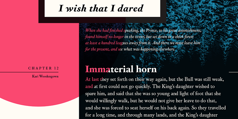
Based on the middle sizes of Fournier’s body of work, Corundum Text’s generous capitals and strong color on the page mark it unequivocally as a text face in the Neoclassic style: when stripped of its letterpress veneer, a quiet, crisp brilliance emerges. Expanding upon the utility of Fournier’s designs for prose and poetry, Corundum Text includes two heavier weights, each with a fully-equipped arsenal of italics and small capitals, suitable for subtle, immersive text settings or robust display with a literary touch.

