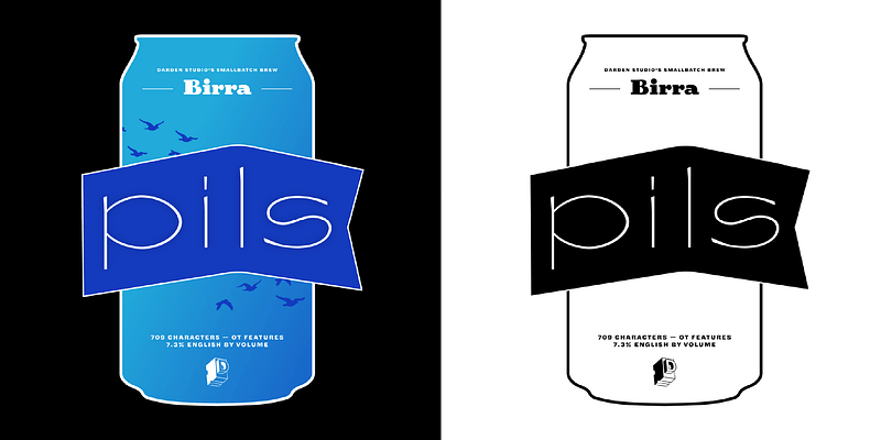
Inspired by the tasting menus offered by craft breweries in North America as “flights”, each style is separately designed by guest designers using a specific type of beer as inspiration. Beer types are arranged so that the color of the beer corresponds to the weight of the style. Upright styles correspond to beers with a dry finish. Stout, designed by [Joshua Darden](https://fonts.adobe.com/designers/joshua-darden) in 2008 as the upright Bold, was the first release of a project always intended to evolve. The result of years of compulsive doodling, Stout was developed with and published to amuse Matteo Bologna (hence the name being the Italian spelling for Beer). Bruin, designed by [Elena Schneider](https://fonts.adobe.com/designers/elena-schneider) in 2019 as Medium Italic, reinterprets the familiar associations with the beer name Oud Bruin (old brown) by adapting the Blackletter font genre. It goes well beyond the familiar by delivering a vibrant and contemporary Blackletter with a passion for straight lines. Adding to the Bruin-like richness, Upper- and lowercase don’t have exactly the same voice but create a nice duet when singing together. Uppercase set on its own offers a contrasting feeling. Saison, designed by [Viktoriya Grabowska](https://fonts.adobe.com/designers/viktoriya-grabowska) in 2020, as Thin Italic doesn’t work — it plays. This TDC award-winning non-traditional “Thin” disrupts weight classifications. Asking, what style takes up more space than Extra Black and has strokes as light as Hairline? Saison is refreshing like the cloudy body and lofty foam of its namesake beer. It is for your best and most exuberant, typographic picnics. Lambic, designed by [Vera Evstafieva](https://fonts.adobe.com/designers/vera-evstafieva) in 2020 is a font that dances all night at the pub and somehow manages to get to work on time the next day. It is an experiment in hybridization between Celtic letterforms and Italics inspired by the workshop of Irish calligrapher Denis Brown. The result is a pan-European character with flavors of Ireland, Germany, Belgium (and many others — all together slightly slanted) with inherent traces of Medieval Europe. Birra Pils (Thin) designed by [Mark De Winne](https://fonts.adobe.com/designers/mark-de-winne) started as a straight up revival of some old "lettrès ornée" found in a French specimen book. In its current form, it's distilled significantly to give you all of the complex flavor and just a touch of lightheadedness. It's skeletal forms reduce the hangover while keeping lots of flair and flavour, with a crisp and tart uppercase, while lowercase brings the funk home. A delightful aftertaste is found in the assortment of emojis to tickle your typographic taste buds.

