HomeListsChatDirectory
Typedex
HomeChatListsDirectory
Guide

Calibri vs Times New Roman: the Marco Rubio font memo and what to use instead

The internet is arguing about two of the most default fonts on earth, which is kind of the tell. This isn't really a fight about typefaces; it's a fight about "default" and what it's supposed to look like.

The immediate spark: news reports said Secretary of State Marco Rubio directed the State Department to switch its default font back to Times New Roman after using Calibri. If you strip away the politics, the interesting part is what each choice signals in official communication: "modern and neutral" versus "traditional and formal."

Calibri doesn't read as modern because it's new. It reads as modern because it's Office-era neutral: a friendly humanist sans optimized for screens. It feels like email, slide decks, and internal documents by design.

Times New Roman, on the other hand, began as a newspaper serif and was later institutionalized as the go-to font for anything that wants to sound serious. That history is why it still reads as formal, even when the content itself isn't.

If you want the same tone without the default baggage, start with the alternatives below.

Context: this page references a widely reported news story; for one mainstream summary see AP News.

Try it in Typedex

Search for “Carlito”, “Tinos”, or any vibe like “text serif”, “humanist sans”, etc.

Calibri-like alternatives

Modern, readable sans-serifs for email, docs, and UI.

Aptos

Aptos

Adobe Fonts · Microsoft

0123456789

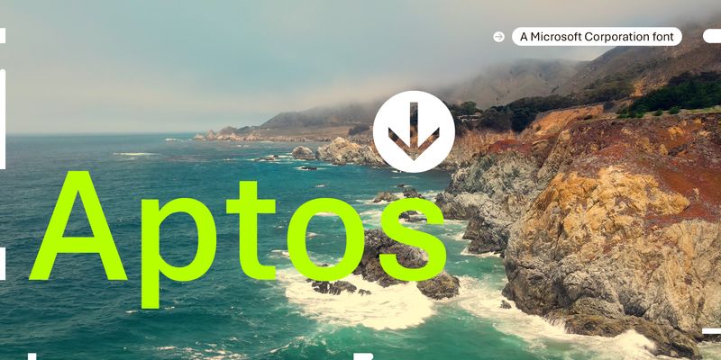
Aptos is a precise, contemporary sans serif typeface inspired by mid-20th-century Swiss typography. Its clear-cut stroke endings emphasize order and restraint; the points where curved strokes meet straight strokes are crisp and well defined, which makes the typeface easily readable and reduces visual crowding. Aptos expresses simplicity and rationality in a highly readable form, with "the austerity that would speak to the huge variety of Office documents created every day," according to designer Steve Matteson. Aptos can be used in both body text and headlines or titles, and its variety of weights are appropriate for different uses: Light, Semibold, and Black weights can help create a hierarchy of information in PowerPoint and Word documents, while the Narrow weights give Excel users a way to fit more information into spreadsheets and tables. The Display weights are slightly narrower and more closely fitted, to give very large text a crisp authority. Type designer Steve Matteson designed Aptos for Microsoft as a new default Office font to replace Calibri. It has six weights, from Light to Black, with complementary oblique styles. In this style of typeface, the italic doesn't typically take on the cursive forms you'd expect in handwriting or a traditional serif typeface; the letter shapes are oblique forms of the upright letters. The italics of Aptos have been individually redrawn, rather than mechanically slanted. Aptos also has two Display weights, with their accompanying italic styles, and two Narrow weights, with italics optimized for Excel. Aptos offers extended support of the Latin, Greek, and Cyrillic alphabets, and for Vietnamese.
sans
sans-serif
modern
No preview yet

Carlito

Google Fonts

0123456789

Carlito is a humanist sans-serif typeface that was designed as a metric-compatible alternative to Calibri. It is known for its clean lines and modern appearance, making it suitable for both digital and print applications. The font supports both Latin and Cyrillic scripts, enhancing its versatility across different languages.

sans-serif
humanist
modern
No preview yet

Inter

Google · Google Fonts · 2017

01234567890123456789

Inter is a sans-serif typeface designed for computer screens, featuring a tall x-height that enhances readability, especially in mixed-case and lowercase text. It was created to improve legibility in user interfaces and has become popular in web and app design. The font family includes a wide range of weights and styles, making it versatile for various applications.

sans-serif
readability
digital
No preview yet

Lato

Adobe Fonts · Google Fonts

0123456789

Explore Lato designed by Adam Twardoch, Botio Nikoltchev, Łukasz Dziedzic at Adobe Fonts.

sans-serif
variable
foundry
No preview yet

Source Sans 3

Google Fonts

0123456789

Source Sans 3 is a humanist sans-serif typeface designed for legibility and versatility in user interfaces. It is an evolution of the original Source Sans Pro, which was Adobe's first open-source typeface family. Known for its clean lines and modern aesthetic, it is widely used in digital applications and print.

sans-serif
humanist
modern
No preview yet

IBM Plex Sans

Adobe Fonts · Google Fonts

0123456789

Explore IBM Plex Sans designed by Mike Abbink, Paul van der Laan, Pieter van Rosmalen at Adobe Fonts.

sans-serif
variable
foundry
No preview yet

Open Sans

Adobe Fonts · Google Fonts

0123456789

Explore Open Sans available at Adobe Fonts.

sans-serif
variable
foundry
Adelle Sans

Adelle Sans

TypeTogether · Veronika Burian & José Scaglione · 2012

0123456789

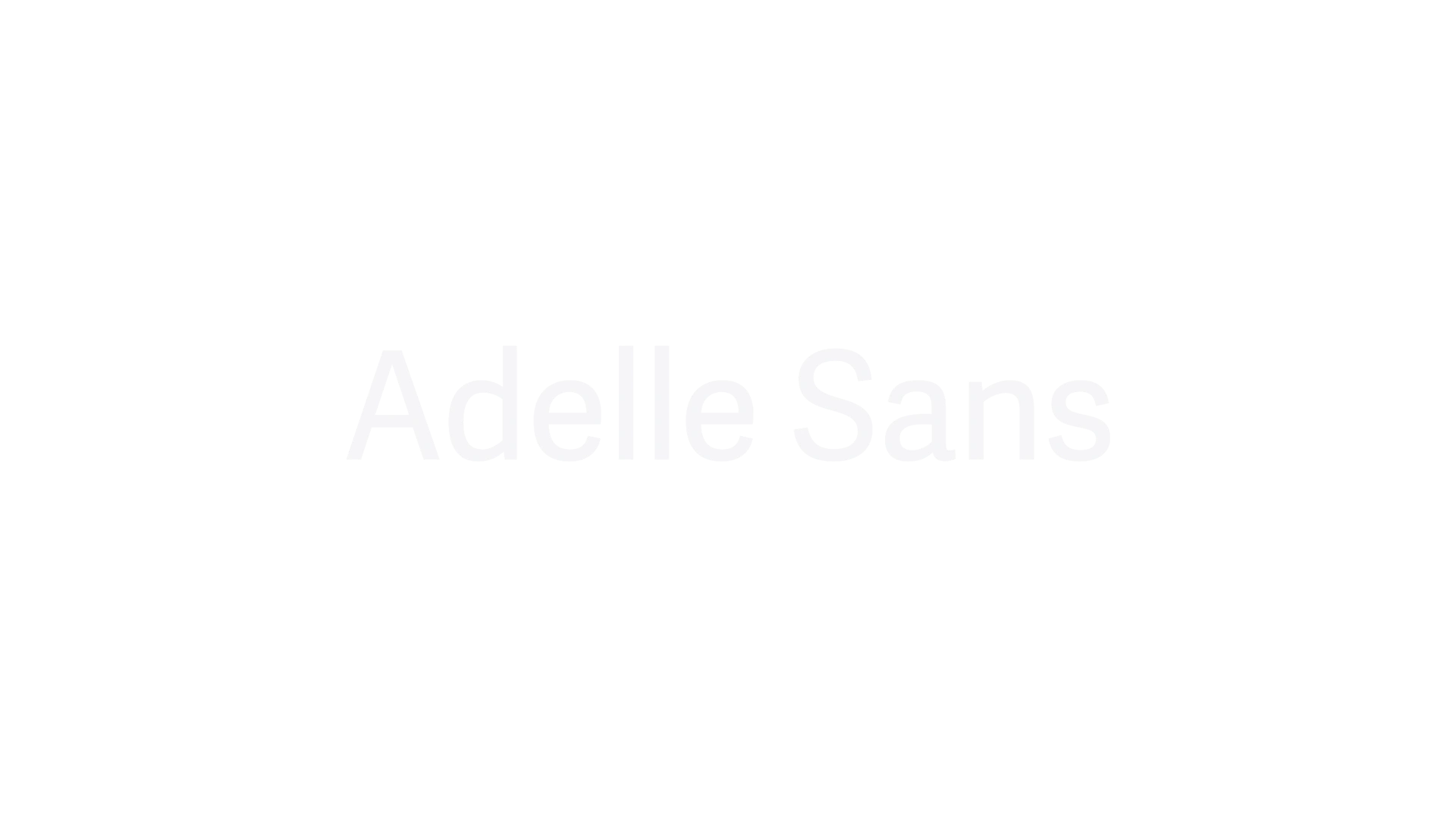
Adelle Sans is a clean and flexible sans serif typeface that offers a modern take on traditional grotesque designs. Released in 2012, it is known for its versatility across branding, signage, and editorial design, providing extensive language support and a harmonious fit with its slab serif counterpart, Adelle. The typeface is characterized by its lively yet unobtrusive appearance, making it suitable for a wide range of applications.

sans-serif
sans serif
branding

Times New Roman-like alternatives

Traditional text serifs that keep the “official document” tone without feeling like a default template.

No preview yet

Tinos

Google Fonts

0123456789

Tinos is a serif typeface designed by Steve Matteson, known for its innovative and refreshing design. It is metrically compatible with Times New Roman™, making it a suitable alternative for various applications. Tinos is often used in digital and print media, providing clarity and readability.

serif
readable
digital
No preview yet

Source Serif 4

Google Fonts

0123456789

Source Serif 4 is a serif typeface in the transitional style, designed to complement the Source Sans Pro family. It is known for its readability and versatility, making it suitable for both print and digital applications. The design aims to provide a harmonious pairing with sans-serif typefaces, enhancing typographic aesthetics.

serif
transitional
readable
No preview yet

Libre Baskerville

Google Fonts

0123456789

Libre Baskerville is a web font optimized for body text, designed to be highly legible at smaller sizes. It is based on the American Type Founder's Baskerville from 1941, featuring a taller x-height and a more modern feel. This typeface is often used in digital publishing and is known for its classic elegance and readability.

serif
web
body text
Tiempos Text

Tiempos Text

Klim Type Foundry

0123456789

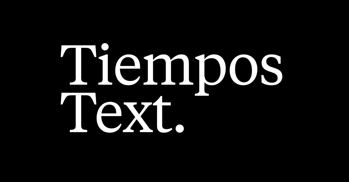
Tiempos Text is a modern serif for economic and legible typesetting

serif
klim
modern
No preview yet

Merriweather

Adobe Fonts · Google Fonts

0123456789

Explore Merriweather designed by Eben Sorkin at Adobe Fonts.

serif
variable
foundry
No preview yet

PT Serif

Adobe Fonts · Google Fonts

0123456789

Explore PT Serif designed by Alexandra Korolkova, Olga Umpeleva, Vladimir Yefimov at Adobe Fonts.

serif
cyrillic
modern
No preview yet

Noto Serif

Adobe Fonts · Google Fonts

0123456789

Explore Noto Serif designed by Monotype Design Studio at Adobe Fonts.

serif
readability
multilingual
No preview yet

Crimson Pro

Google Fonts

0123456789

Crimson Pro is a contemporary serif typeface designed for readability in print and digital media. It is known for its classic and elegant appearance, making it suitable for editorial use, academic publications, and books. The typeface is a revival of the original Crimson typeface, which was designed to be a versatile and legible option for long texts.

serif
readability
editorial