0123456789
A credible, contemporary interpretation of a classic newsface.
serif
editorial
modern
TypeTogether is an independent type foundry established in 2006, focusing on text typography for intensive digital and print editorial use. The foundry also creates custom type designs tailored to the specific needs of clients worldwide.
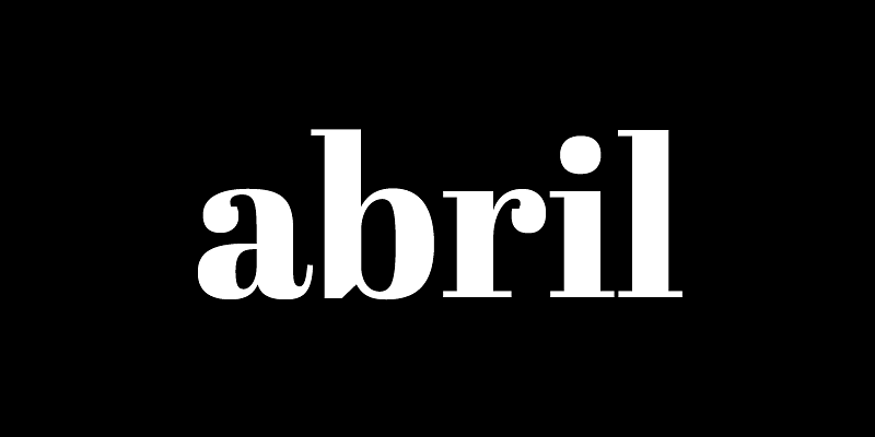
A credible, contemporary interpretation of a classic newsface.
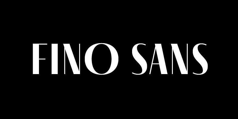
A low contrast font family for trustworthy, impactful headlines.
A versatile and authoritative slab serif font family with no shortage of personality.
A flexible two-width family: monospace for developer’s code writing and proportional width for reading.
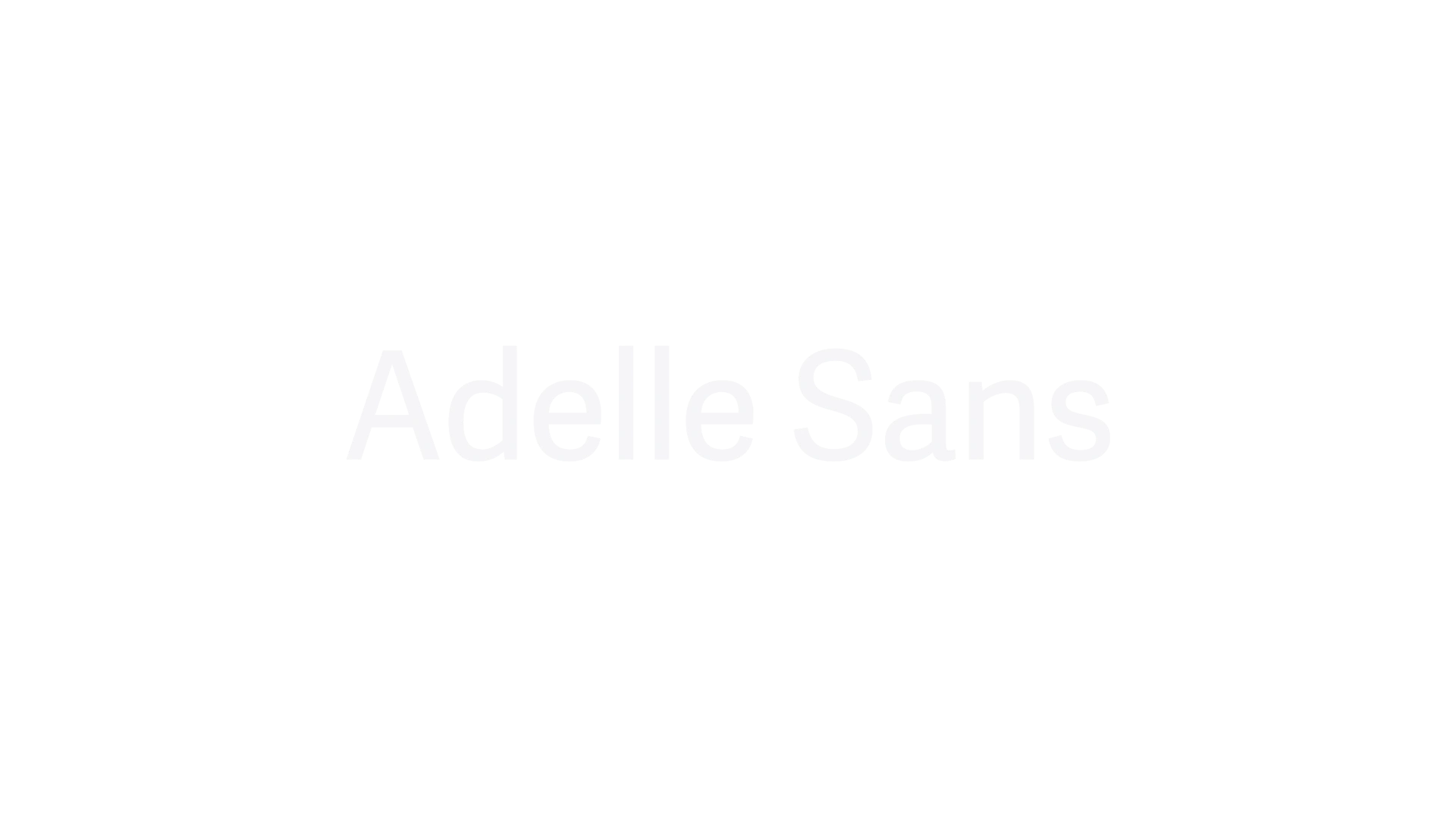
Adelle Sans is a clean and flexible sans serif typeface that offers a modern take on traditional grotesque designs. Released in 2012, it is known for its versatility across branding, signage, and editorial design, providing extensive language support and a harmonious fit with its slab serif counterpart, Adelle. The typeface is characterized by its lively yet unobtrusive appearance, making it suitable for a wide range of applications.
A three-weight font family inspired by sweeping 16th century chancery italics.
A contemporary, eclectic font family drawn from roots in Romanesque Europe.
A Latin category-expanding sans serif font that’s part experiment and part modern update.
An elegant font family for books, successfully used both on screen and in print.
A 90-font family that shifts from sans to slab serif, from condensed to expanded widths, and includes every possibility in between.
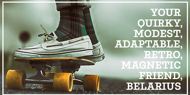
A classy throwback text font family with a fearless and venturesome display.
A spirited and rhythmic upright italic, ideal for display use.
A modern and indestructible serif font family with strong links to tradition.
Explore Catalpa designed by José Scaglione, Veronika Burian at Adobe Fonts.
A versatile and highly legible sans serif font family with some contrast.

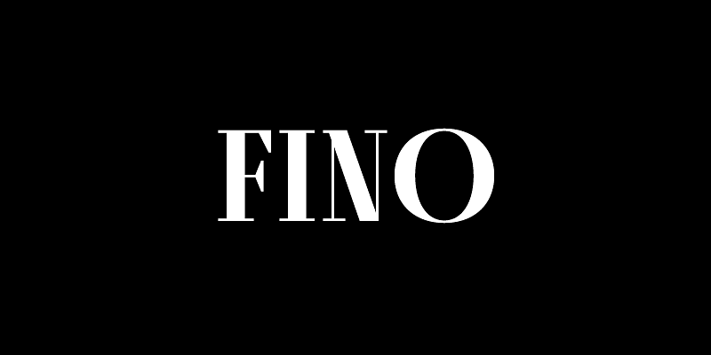
A refined serif newsface with distinctive character and clarity.
A surprising and unconventional slab serif font, great for headlines or short texts.
A high velocity sans serif with a bold voice and daring curves.
A contemporary book and magazine font family with a soft and warm voice.
Creating new common ground between a nimble oldstyle serif and an experimental Fraktur.
An elegant serif font with a broad palette of typographic goodies.
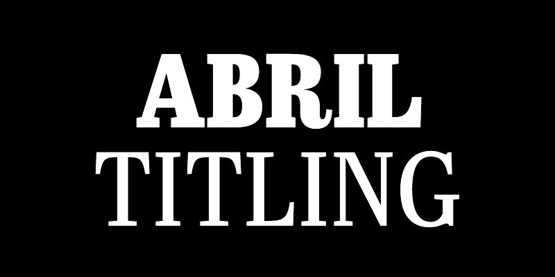
Dramatic, contemporary serif titling font family that scales beyond the world of looks by tapping into archetypes.
A sans titling family, dramatic and contemporary in tone, that scales beyond the world of looks by tapping into archetypes.
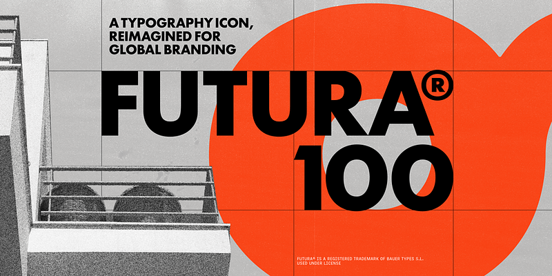
[Futura®100](https://fonts.adobe.com/collections/futura100-multiscript) — the iconic geometric family for branding, surety, and standout presence — is now one of the few truly global type families. It communicates in 12 scripts and more languages than ever before. With upcoming language support for more than 90% of the world’s population, the revitalised warmth of Futura®100 is historically introspective, globally applicable, and stylistically comprehensive. Futura®100 was created by TypeTogether and a global team of experts over a period of several years, and released in partnership with Bauer Types, the owner of Renner’s original design and trademarks, and the heir to this typographic legacy. It offers a complete set of OpenType capabilities, while a fully featured variable font provides infinite flexibility for setting type in dynamic environments, both online and offline. Futura® is a registered trademark of Bauer Types and used under license.