
0123456789
Aria Text is a free interpretation of the historical Transitional style, but with a more moderate contrast between thick and thin strokes, and a less formal look.
serif
foundry
commercial
Aria Text is a free interpretation of the historical Transitional style, but with a more moderate contrast between thick and thin strokes, and a less formal look.
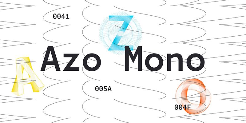
Azo Mono is the monospaced version of Azo Sans. It respects the original concept of geometric construction with humanistic nuances, but was designed for situations where a more “dehumanized” feeling is desired, for example, when presenting data or writing code.
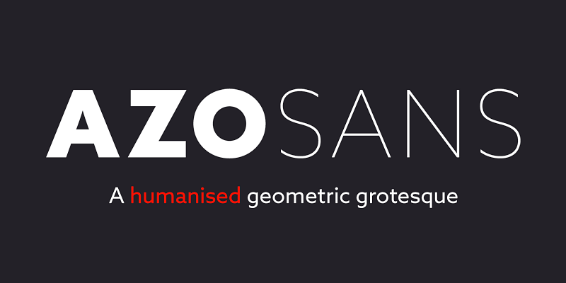
Azo Sans is a geometric sans, inspired by the constructivist typefaces of the 1920’s. It’s nuances soften the strictness of pure geometry, and makes it more human and pleasant to
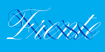
Canora Frente is a robust interpretation of the English round hand, a calligraphic style that, while fluid and graceful, is surprisingly robust in structure. It’s design aims to push the calligraphic model to a modernized and mechanical look, using straight lines, abrupt cuts and stylised loops and dots. In turn, Canora Verso further tests the English round hand’s ability to withstand arbitrary design decisions, with its unusual left leaning angle. Canora’s pair of fonts features lowercase letters that are simple and condensed, while the moderately opulent majuscules, with their swashes and ample curves, are naturally more decorative.
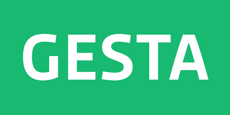
Gesta is a versatile sans serif suitable for both corporate and editorial purposes. With its generous x-height and subtly curved strokes, Gesta combines a modern look with a warm feel.
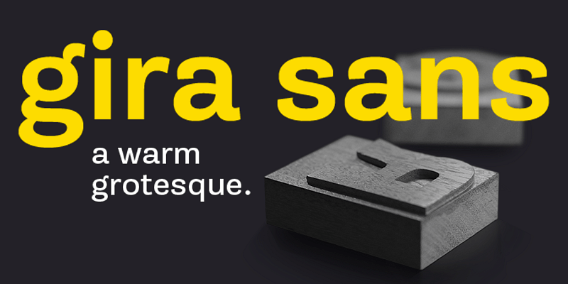
Gira Sans is a grotesque typeface, inspired by the 19th century sans serifs. It's a modern, human and joyful take on that model.
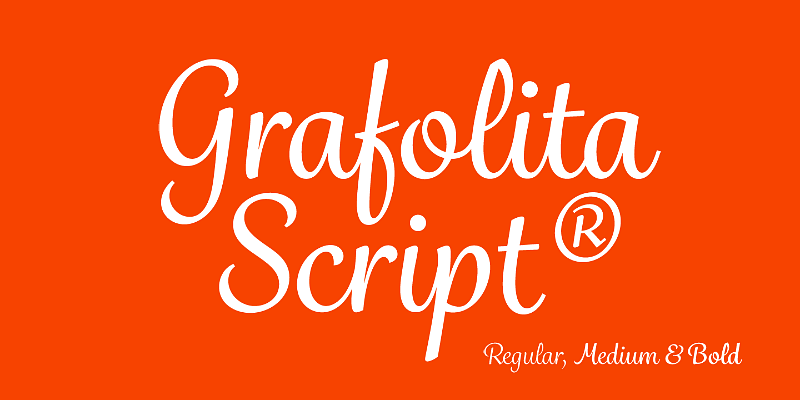
Grafolita is a versatile casual script family of three fonts. The three weights allow designers to balance stroke thickness between different body sizes.
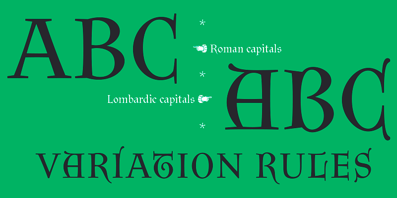
Litania was inspired by a transitional form of Carolingian minuscules. It has two mixable and interchangeable sets of uppercase letters, Roman and Lombardic Capitals.
Orbe is a typographic interpretation of the Lombardic majuscules, the chosen form for versals in mediaeval manuscripts, which were an amalgamation of uncials and of roman capitals.
Signo is a dynamic sans serif with reverse contrast, designed for editorial and branding. Signo’s tall x-height and open counters allow it to perform well both in headlines and small sizes.