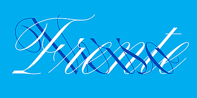
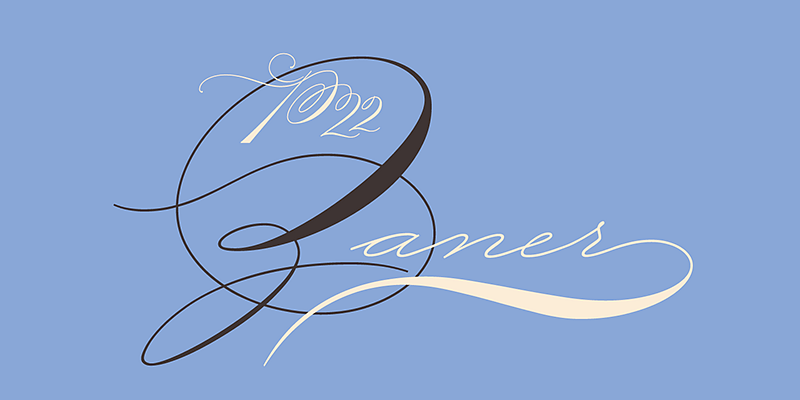
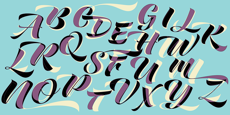
Canora Frente is a robust interpretation of the English round hand, a calligraphic style that, while fluid and graceful, is surprisingly robust in structure. It’s design aims to push the calligraphic model to a modernized and mechanical look, using straight lines, abrupt cuts and stylised loops and dots. In turn, Canora Verso further tests the English round hand’s ability to withstand arbitrary design decisions, with its unusual left leaning angle. Canora’s pair of fonts features lowercase letters that are simple and condensed, while the moderately opulent majuscules, with their swashes and ample curves, are naturally more decorative.