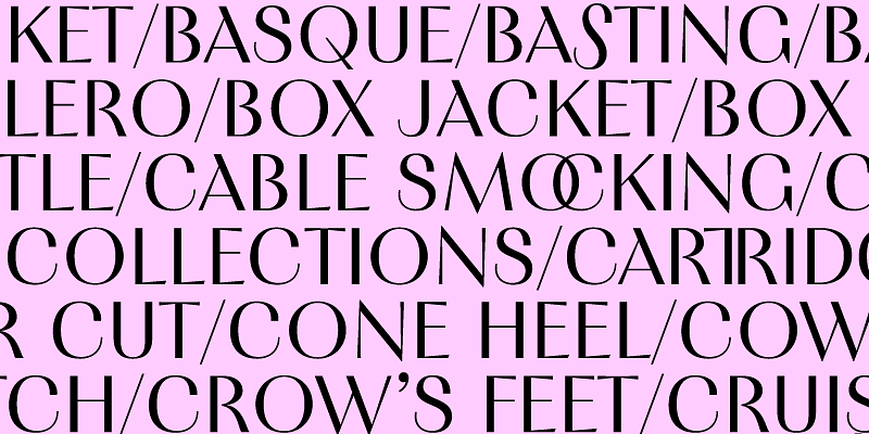
Eschewing ornamentation, PF Expo's design is nobly rooted in simple, rational, and absolutely functional Roman forms. Circa 17th century the contrast between the thick and thin strokes of letters increased, oblique stressing transformed into upright stressing, round letterforms were compressed and bracketed serifs grew edgy and delicate. During that period and throughout the late 19th century, wood type manufacturers marketed design variations more quickly than type founders did, by devising a system to condense or expand type and creating secondary styles to bracketed serifs such as triangular shapes. Expo takes its cues from several condensed typefaces of that period particularly Latin Condensed as well as mid-20th century designs such as Vendome Condensed, and conveys a sharp elegance that creates a cohesive family with solid and provocative quality. The typeface’s abundance of thoughtful details excels at display sizes bringing its extravagant nature into the limelight. In particular, PF Expo’s carefully modeled serifs follow an artful logic of triangular symmetry, whilst at x-height, the slanted one-sided serifs in letters such as (n), (p), (r) blend effortlessly into the stems to foster a distinct identity. The abrupt cut at the joints -a visual trick that adds a certain flair to its type design, especially when used at large sizes- provides a unique functionality as it compensates for over-inking in lowercase. The type family’s narrow proportions offer an economy of space - a critical issue for headline use. In addition, the italic version alters dramatically the texture and rhythm with razor-sharp terminals that transform from dual-sided serifs to triangular upstrokes. Expo provides advanced typographic features including alternate glyphs with its character set extended for pan-European Latin support as well as Greek and Cyrillic. Exuding a strong, contemporary, and energetic personality, PF Expo’s modernized novelty is Parachute’s latest typographic installment to ensure an exemplary visual outcome. It received a TDC Certificate of Typographic Excellence in 2023.
Parachute Typefoundry
Explore PF Fuel designed by Panos Vassiliou at Adobe Fonts.
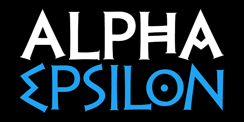
The Golden Age of the Greek Civilization. The world’s history carved on stone. PF Hellenica was created based on numerous photos from archaeological sites and several other historical references dating back to 1100 B.C. This is a more recent interpretation of the original with subtle serifs at stroke endings. In order to capture the essence of this writing, there are a few alternate forms used at lowercase, uppercase and/or accented positions. These alternates come from different regions in Greece.For instance, uppercase Theta was used by the Cretans and the Korinthians, whereas uppercase Delta by the Ionians. PF Hellenica comes in three styles: Light, regular and bold. This version has been expanded to include 3 major scripts: Latin, Greek and Cyrillic.
Marlet is a beautiful and inspiring set of typographic elements based on a minimal and simplistic approach to elegance. Originally designed as a single-style font for a Mexican cosmetics institute and its exclusive make-up and skincare line aimed at upper-middle income bracket women, Marlet has progressively bloomed. Parachute Typefoundry’s type system is made for timeless elegance through numerous combinations diverting from passing trends in type design. Inspiration came from the roaring 20s and 30s, decades that embraced women’s independence both socially and politically. Taking intricate hints from the era whilst maintaining approachability, the contemporary dynamic version of this humanist typeface evolved with modulated strokes. Its thick-thin, serif-less strokes express the modernity of the fashion industry, breaking away from the monotone sans serif. A type system with contrast progressing from low (Text version) through medium (Display) to high (Finesse), with differentiated letter widths (Titling), extravagant letterforms (Swash) and finally 64 eclectic patterns (Motifs), Marlet evolved from a single typeface into a comprehensive type system in various weights which support Latin, Greek and Cyrillic. Contrary to other Marlet families, the sophisticated capitals of the Display version come with slightly tapered strokes in order to embody the contemporary qualities of a sans serif typeface into the dynamic virtue of a serif. Simple and elegant at the same time and in contrast to Didot and Bodoni, Marlet is typeface that is nonconformist, multifaceted, fashionable and romantic, strong and chic, casual yet provocative. It has received awards from TDC, Red Dot, Tokyo TDC and German Design Awards.
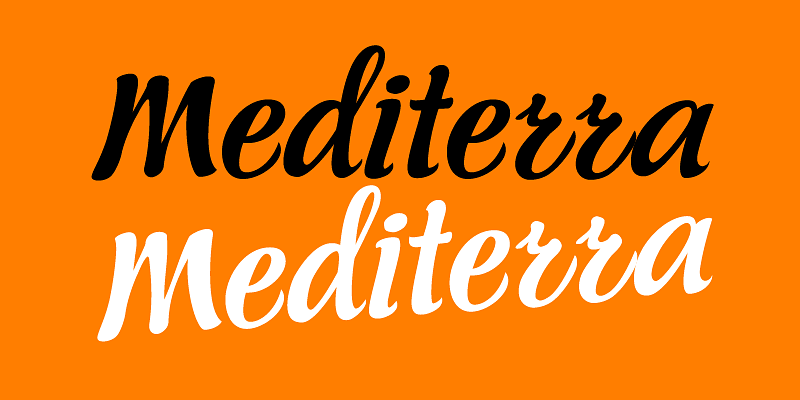
Sitting inside our offline vault and print catalogs for several years but still available for purchase, PF Mediterra is part of a valuable triad of typographic gems which are finally re-released, fully updated and upgraded. Designed by Vladimir Radibratović, a foremost calligrapher, type designer and illustrator, this trilogy of script typefaces was recently revamped by our design team with full support for Latin, Greek and Cyrillic. Initially released in 2003 this typeface manifests a human, hand-crafted feel. Designed to excel particularly within casual and natural contexts, the organic Mediterranean essence of PF Mediterra has attracted attention to this popular typeface for brands on the supermarket shelves, wine labels, packaging, quotes, stationery and vintage lettering.
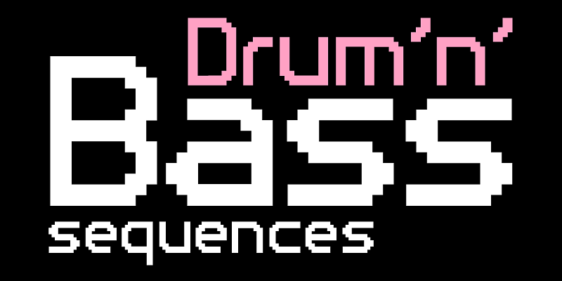
Pixelscript is a unique script pixel font which was carefully designed to be quite legible in web applications. Based on an earlier Parachute typeface, this is the only script pixel font that covers a wide range of languages and scripts like Latin, Greek and Cyrillic. Its large size (10x7 pixels) makes it suitable for titles. You may even use it for long legible text. Alternately use Photoshop to create gif icons for titles and/or web buttons. Finally you may use it in print applications at various sizes to create that extra digital aesthetic.
Use PF Reminder to add a homey and personal touch to your notes and messages. Whether it is a note to your loved ones or a colleague at the office, this is the typeface to use. But don't take our word for it. The applications of this typeface are endless. Since its 1st release back in 2003, we have seen it being used for anything from banking to automobiles. And now, with this new version you can communicate with a big part of this world in a way you always wanted. PF Reminder comes loaded with 555 glyphs which support all European languages including Greek and Cyrillic.
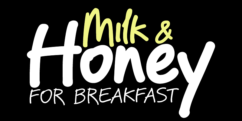
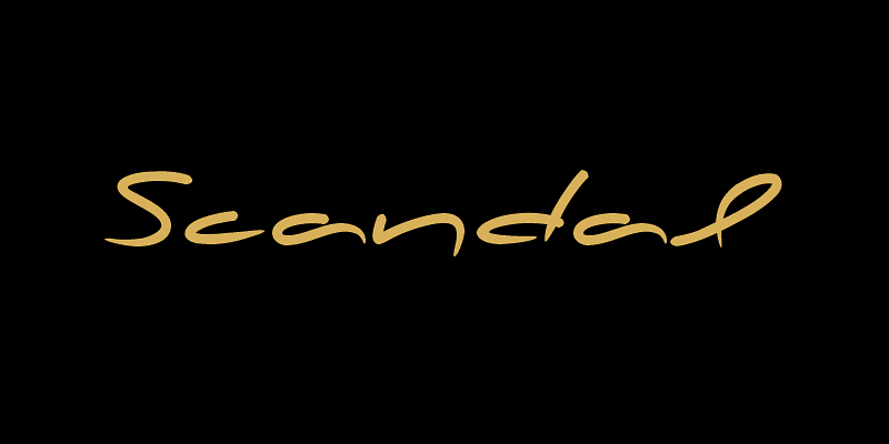
In the designer's own words “a couple of years ago, when I was designing a package for a marmelade range, I started having a go at creating a typeface that would suit the package I had in mind. The whole process was intensely appealing to me: from merely using typefaces as an intricate part of my work as an art director, I started exploring the function of each and every element that a typeface consists of. The two things on my mind in designing a typeface for a marmelade brand were firstly, that I wanted it to have a hand-written feel, so as to exude that old-fashioned, home-made quality, and secondly, that it ought to have a certain sweetness and gentleness that would match the product. However, PF Scandal managed to outgrow its original inspiration. As I continued working on it, I toned down some of its elements to make it more versatile. And so, PF Scandal evolved into a typeface that has a contemporary, and yet hand-written look, which makes it suitable for a wide range of uses. It comes with the full array of European characters including Latin, Greek and Cyrillic as well as 120 matching pictograms”.
Sitting inside our offline vault and print catalogs for several years but still available for purchase, PF Signskript is part of a valuable triad of typographic gems which are finally re-released, fully updated and upgraded. Designed by Vladimir Radibratović, a foremost calligrapher, type designer and illustrator, this trilogy of script typefaces was recently revamped by our design team with full support for Latin, Greek and Cyrillic. Initially released IN 2002, this typeface manifests a human, hand-crafted feel. Designed to excel particularly within casual and natural contexts, the nostalgic charm of PF Signskript, has attracted attention to this popular typeface for brands on the supermarket shelves, wine labels, packaging, quotes, stationery and vintage lettering.
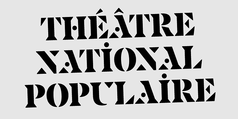
This sharp but approachable family takes its cues from the brutal simplicity of Josef Albers’ reductive lettering and the informal stencils made by graphic designer Jacno for the French Théâtre National Populaire in the 1950s. The use of stencil technique predates movable type and goes back to the 17th century. It started picking up momentum in the 19th century and at the beginning of the 20th century it caught the attention of designers and architects such as Le Corbusier who adopted Didot-like stencils for labelling architectural drawings. It is used frequently for signage in industrial and urban environments but it has also become quite popular among graffiti artists. Most stencil typefaces are adapted from existing non-stencil typefaces, but PF Spine is rather distinct in its construction as it was developed using for its skeleton a minimalistic range of triangular shapes, curves and lines with drastic stroke omissions, carefully designed to provide a harmonious balance and visual uniformity in all supported languages. This typeface comes in 4 styles including two versions for making 3D layered stencils with different shades of grey or colour for each layer. The 3D layers have been reworked to ensure sequential letters without breaks, by eliminating the inter-character white space that usually builds up inside the shadow, making room for an even flow which is determined by the upper and lower part of the letterforms. Furthermore, PF Spine provides advanced typographic features including alternate glyphs for initial, medial and final glyphs. It supports Latin, Greek and Cyrillic.
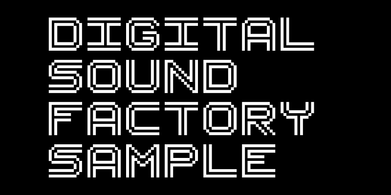
PF Uniform is a very distinct monospaced pixel font which shines in titles. It was originally created for web applications but it can work equally well in print. By varying the spacing you may end up with some very interesting screens. This version includes Latin, Greek and Cyrillic. Alternately, you may use it in Photoshop to create gif files –mostly titles and buttons- for web pages.
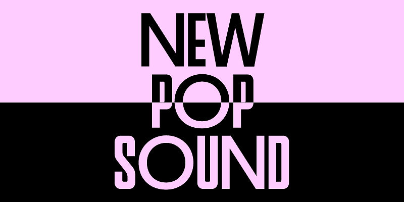
PF Venue takes its cues from several sans serif type styles of the twentieth century particularly the more subdued and sleek geometric styles of the Art Deco movement, characterised by the low and high-waisted monostroke designs. Venue is a quite large x-height set of 2 families with alternate letterforms, which manifest a unique texture when set in uppercase. The daring combination of non-uniform structures such as the normal narrow forms with the alternate wide forms exudes a striking eye-catching personality. Consider using these for posters, ads, book covers and imaginative fashion editorials. Venue draws inspiration from numerous condensed grotesques used by music album covers since the fifties and for several decades to follow. Underlined by the avid necessity of the underground music scene for non conformity, expression, freedom of spirit, rule breaking and challenging preconceptions, this collection pays tribute to a rocker at heart! The full collection includes 2 separate families Venue and Venue Condensed which support Latin, Greek and Cyrillic. Each family consists of 6 weights including Stencil and 5 sets of alternate letterforms.
PF Videotext draws inspiration from the text found on dynamic video screens, exuding an aura of modernity and technological finesse. Its design pays homage to the digital age, where text and visuals merge seamlessly to create engaging content. Originally conceived for print applications, PF Videotext effortlessly bridges the gap between the digital and physical realms, offering versatility and adaptability in a rapidly evolving design landscape. With a keen focus on legibility and readability, PF Videotext ensures that the message remains clear and impactful, even when translated across various media. Moreover, PF Videotext embraces a vast linguistic range, accommodating the diverse tapestry of European languages including Latin, Greek and Cyrillic, gracefully adapting to ensure consistent communication across borders.


