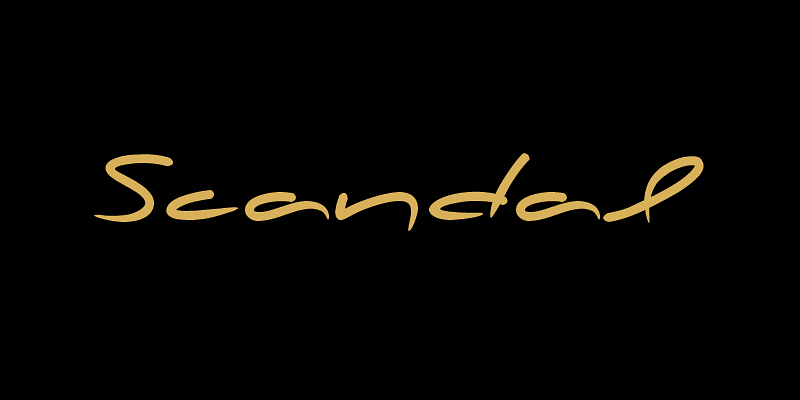
In the designer's own words “a couple of years ago, when I was designing a package for a marmelade range, I started having a go at creating a typeface that would suit the package I had in mind. The whole process was intensely appealing to me: from merely using typefaces as an intricate part of my work as an art director, I started exploring the function of each and every element that a typeface consists of. The two things on my mind in designing a typeface for a marmelade brand were firstly, that I wanted it to have a hand-written feel, so as to exude that old-fashioned, home-made quality, and secondly, that it ought to have a certain sweetness and gentleness that would match the product. However, PF Scandal managed to outgrow its original inspiration. As I continued working on it, I toned down some of its elements to make it more versatile. And so, PF Scandal evolved into a typeface that has a contemporary, and yet hand-written look, which makes it suitable for a wide range of uses. It comes with the full array of European characters including Latin, Greek and Cyrillic as well as 120 matching pictograms”.