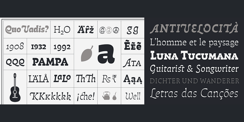
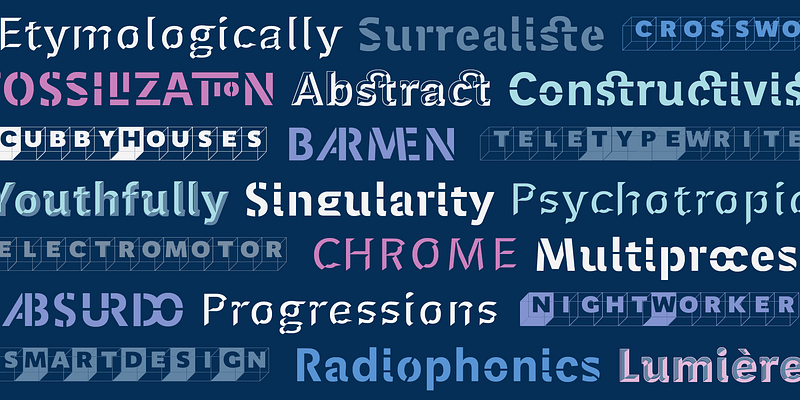
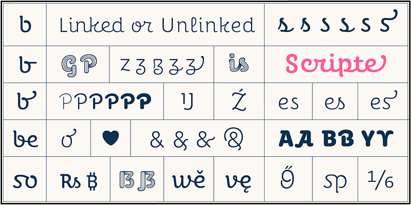
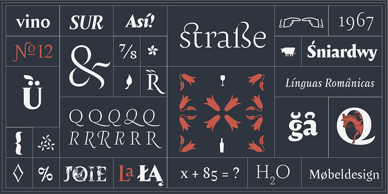
Amster is an energetic and refined design created in Chile by Francisco Gálvez. Amster combines high readability with great personality, with five weights of roman and cursive fonts, all fully equipped with smallcaps, ligatures, all kinds of figures, long and short swashes in the cursives, contextual features, symbols, smart ornaments, and more. It’s a massively robust family, usable for a wide range of applications: from screen to print, from small text to display sizes, from science to poetry. For additional license options like app, enterprise, multi-user, and self-hosted web, visit [Amster on Type Network](https://store.typenetwork.com/foundry/pampatype/fonts/amster).
PampaType
Inspired by vernacular news sheets from 19th century Chile, Amster Versal Iluminada is a set of carefully illuminated, multi-layered capitals that capture personages from natural and supernatural stories: Animals and farmers, priests and devils, citizens and drunks, victims and criminals. Ideal for creating poetic tones and when you want to stimulate readers’ imaginations. For additional license options like app, enterprise, multi-user, and self-hosted web, visit [Amster Versal Iluminada on Type Network](https://store.typenetwork.com/foundry/pampatype/fonts/amster-versal-iluminada).
Inspired by the works of Atahualpa Yupanqui, a central figure in Argentinean folk music, Atahualpa goes beyond reverse contrast, interpreting the qualities of a sturdy slab serif style with a delicate sense of drawing. This gives Atahualpa a unique spirit of power and warmth, perfectly creating gentle reading atmospheres in text as well as persuasive headings, logos, and other displays. For additional license options like app, enterprise, multi-user, and self-hosted web, visit [Atahualpa on Type Network](https://store.typenetwork.com/foundry/pampatype/fonts/atahualpa).
Explore Carolinéale designed by Francis Ramel at Adobe Fonts.
Chercán is an elegant, highly readable, relaxed typeface, making it a good choice for informal settings. Chercán was conceived for immersive reading, with strong, open letterforms and generous counter shapes. It communicates certitude with a subtly charming tone. Its tiny serifs help build an enjoyable reading experience, certainly when compared to that of a sans serif. Chercán has a positive personality, and its whims can add spiciness to headings, logos, packaging, and big bodies in general. In 2021, a complete polytonic Greek version was added to the original Latin extended. For additional license options like app, enterprise, multi-user, and self-hosted web, visit [Chercán on Type Network](https://store.typenetwork.com/foundry/pampatype/fonts/chercan).
Mexican type designer José Manuel López Rocha, in his exploration of old books, found and fell in love with this Schulfraktur, a traditional blackletter that was commonly used to compose school books in 19th century Germany. In his interpretation, on the one hand faithful to the original style and on the other hand executed with impeccable drawing, this Schulfraktur (baptized “Gorgias” after the title of the book where he first found it) added new glyphs, irresistible ornaments and even a complete set of initials of the time, all of which contribute to a proper staging of this very bookish German type style. Gorgias includes 4 versions, Regular and Black in solid and open forms. This unique typeface is intended for designers of conviction who like to captivate their readers by combining classic and contemporary elements in a special way.
This interpretation of the modern style—in the sense of Didot and Bodoni—takes the form of a sensual fat face for display use. Named after Giambattista Bodoni's widow, Margarita has four fonts: roman and italic in two variants, solid and engraved. It also includes a set of intriguing ornaments designed for elegant patterns and frames. Use Margarita for large type (or giant type—anything but small type). For additional license options like app, enterprise, multi-user, and self-hosted web, visit [Margarita on Type Network](https://store.typenetwork.com/foundry/pampatype/fonts/margarita).
Explore Octothorpe PE designed by Jorge Iván Moreno Majul at Adobe Fonts.
As a sensitive counter-response to the advance of AI in all fields, Otta aims to vibrate on a profoundly human frequency. Its gentle, organic tone seeks a return to the human sense, to the delicacy of the artisanal and the handmade. It has been carefully drawn under a criterion of rhythm that seeks to synthesize both calligraphic and typographic forms suitable for continuous reading. Like other typefaces in our library, Otta is also the result of an exploration of horizontal contrast in type design, following the example of scripts that use it as part of their tradition, such as Arabic and Greek. Otta was specifically designed by Francisco to compose his own typography book ‘Hacer y Componer’ (Making and Composing), a must-
Explore Perec Ludique designed by Alejandro Lo Celso at Adobe Fonts.
With a serene air and a hint of nostalgia, Perec Scripte is a vertical script font with a delicate persuasive tone. It comes in two styles: Unlinked (1) and Linked (2), both declined in six comprehensive weights including numerous contextual sorts, ligatures, alternates, swashes and more. Although conceived as a display font, it can be used in short text pieces, especially the Light, Regular and Medium weights. A third style of the family is Perec Scripte Deco, meant for greater graphic impact, ideal for titles, signs and unique logos. Perec Scripte Deco has three carefully hand-drawn stripes that flow throughout the alphabet giving a subtle sense of volume and creating a unique word appeal. Perec Scripte is part of the Perec superfamily, made as a tribute to the genius of Georges Perec, a singular writer of the 20th century. All Perec styles can be used together, judiciously, to achieve editorial pages rich in expression.
Perec Scripte Deco is a captivating font, ideal for unique designs, logos and headings. Part of the Perec Scripte family, the Deco version is engraved with three hand-drawn stripes which flow throughout the alphabet giving a subtle sense of volume and creating a unique word appeal. This font includes the expanded Latin char set with also alternates, two sets of figures, full monetaries, ligatures, swashes & more typographic goodies. With a serene air and a hint of nostalgia, Perec Scripte is a vertical script font with a delicate persuasive tone. The Perec Scripte family is part of the Perec superfamily, made as a tribute to the genius of Georges Perec, a singular writer of the 20th century. All Perec styles can be used together, judiciously, to achieve editorial pages rich in expression.


