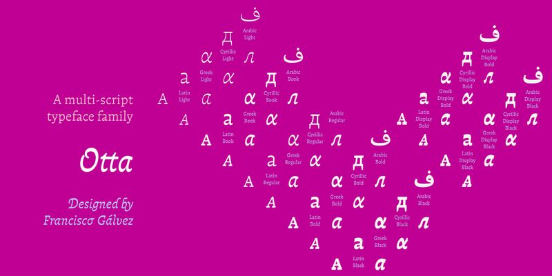
As a sensitive counter-response to the advance of AI in all fields, Otta aims to vibrate on a profoundly human frequency. Its gentle, organic tone seeks a return to the human sense, to the delicacy of the artisanal and the handmade. It has been carefully drawn under a criterion of rhythm that seeks to synthesize both calligraphic and typographic forms suitable for continuous reading. Like other typefaces in our library, Otta is also the result of an exploration of horizontal contrast in type design, following the example of scripts that use it as part of their tradition, such as Arabic and Greek. Otta was specifically designed by Francisco to compose his own typography book ‘Hacer y Componer’ (Making and Composing), a must-