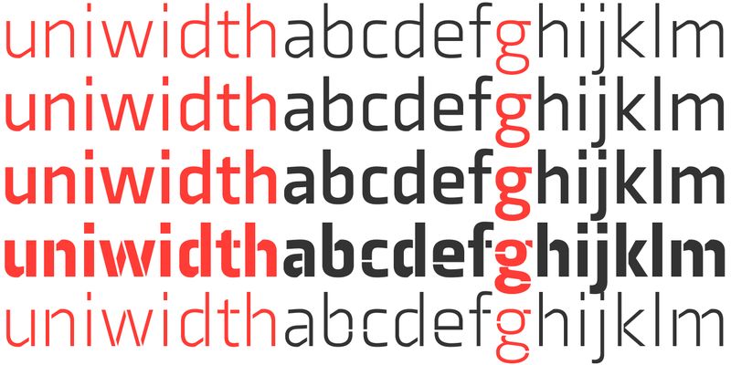
Axia is a uni-width sans serif of concise letterforms. The type consists of ten weights from light to black, each with italics and small caps. Two display styles, Stencil Light and Stencil Black feature a unique aesthetic. A distinct fragmentation of the letters gives this stencil design its particular character. The type is perfect for captivating big sizes; shapes of abstract floating parts allure the eye and form nicely proportioned type when united. Originally designed for the Rice University School of Architecture in 2011, this contemporary sans found some inspiration in the TwinCities typeface family created by Sibylle Hagmann for the University of Minnesota in 2003. Axia has been orchestrated from scratch, each the roman and italic weights harmonize perfectly in width without a changing line length. Text set in light or black results in the same, economical fit. The inner arched strokes off the stem on the lowercase ‘b’ and ‘d’, for example, progressively open the letterforms and express conceptual clarity throughout the system. A feature doing double duty, it contributes to great legibility in heavier weights, and attributes to versatility of individual styles. Axia includes many OpenType features and offers broad language support. For additional license options like app and enterprise, visit Axia on [Type Network](https://store.typenetwork.com/foundry/kontour/fonts/axia).
Kontour
Elido (Odile in reverse) is the sans counterpart to Odile, a serif type. Together they form a sans and serif superfamily with a wide range of variations for editorial and display use. Elido follows Odile’s proportions and matches the weight distribution and typographic color of its serif twin. Odile’s conceptual approach is echoed in the structure and anatomy of the Elido family. The arched stroke low off the stem reveals a script characteristic most pronounced in the Elido Upright Italic. This particular interpretation is gradually diminished in the Italic and becomes even less emphasized in the Regular style. Six balanced weights, from an elegant Light to a pronounced Black, are in tune with three display solutions and a set of beautiful Ornaments. Sans serif initials amount to a rare finding. The charming mono-linear Elido Initials come in two flavors, elaborate and rational, designed to hold their own in editorial and headline sizes. This type design boasts an extensive character set and many OpenType features. OT stylistic variants offer a one-storey ‘a’ for the roman weights, alternate ‘g’ and ‘s’ designs for the italics, and a variant glyph ‘s’ for the Upright Italic. Elido is an excellent choice for editorial and display use. For additional license options like app and enterprise, visit Elido on [Type Network](https://store.typenetwork.com/foundry/kontour/fonts/elido).
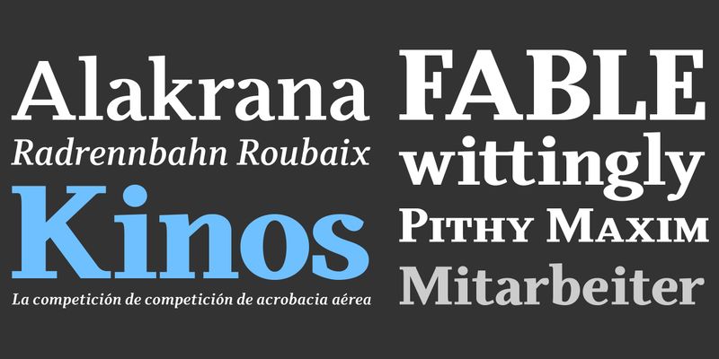
The Kopius family is a contemporary serif type that features friendly characteristics with round, open counters conveying a relaxed ambiance. The robustness of the characters supports a wide variety of applications including editorial and display use. The uniquely defined novel glyph construction and serif shapes convey an allusion to a brush stroke that bestows a contemporary, texture-rich appearance entirely in tune with functionality. The top and bottom slightly curved stems imply flow and reading direction. Kopius is an exuberant family with a genuinely multifaceted repertoire. This upbeat type comes with a multitude of weights to satisfy any fanciful appetite for a colorful typographic palette. With packaging solutions in mind the family includes sets of expandable and combinable box heading material for a boundless range of adjusted composites. In addition, pertinent labels, weight-adjusted arrows, and word logos complete the Kopius family. OpenType provides advanced layout features including figure sets, small caps, fractions, and more. Herbert Thannhaeuser’s Liberta, an Antiqua type family designed for the East German type foundry VEB Typoart between the middle to end 1950s, has stirred the initial inspiring force for Kopius. With its affable yet serious demeanor, Kopius is confidently assuming numerous tasks. For additional license options like app and enterprise, visit Kopius on [Type Network](https://store.typenetwork.com/foundry/kontour/fonts/kopius).
Odile is a text typeface with bracketed head and bracket-free bottom lower case serifs, a quality that counters rigidness most traditional slab serif typefaces possess. This contemporary design draws inspiration from an experimental typeface named Charter originally designed by the American book and type designer William Addison Dwiggins. Dwiggins contemplated Charter as the italic companion to Arcadia, Experimental No. 221. The Charter project progressed sporadic, stalled during the Second World War, and came to a halt in 1955. Assessing Charter’s whimsical design, its fragments were rethought and developed into a comprehensive text family. Odile Upright Italic reveals visible similarities shared by Dwiggins’ Charter and defines the design approach for the family. The steep calligraphic upstroke and low junctions off the stem as in the upright italic ‘h’ or ‘m’, are gradually lessened in the italic and moved up for the roman weights. The six optically balanced weights range from the delicate Light to stark Black, accompanied by display variants with flowing flair and ardent ornaments. Two sorts of Initials, one amplified with interweaving swashes, the other more restrained, both are clearly derived from the Upright Italic. The gracefully serif-ed type harmonizes perfectly with Elido, Odile’s sans serif companion. For additional license options like app and enterprise, visit Odile on [Type Network](https://store.typenetwork.com/foundry/kontour/fonts/odile).


